• Our software update is now concluded. You will need to reset your password to log in. In order to do this, you will have to click "Log in" in the top right corner and then "Forgot your password?".
  • Welcome to PokéCommunity! Register now and join one of the best fan communities on the 'net to talk Pokémon and more! We are not affiliated with The Pokémon Company or Nintendo.

The Graphics Rating Thread [READ THE FIRST POST. D:<]

Status
Not open for further replies.

/Circa

a face in the clouds.
881
Posts
16
Years
Pinocchio: The overall banner is good, but the render/image stands out WAY to much, plus the text doesn't really fit in.

Could someone c+c my SOTW banner.
vampires2copy.png
 

Gummy

by fire be P U R G E D
4,519
Posts
17
Years
Cheese: I really like it! I really don't know what else to say other than move the text somewhere else, as it's a bit too close to the render.

Newest:


1zn1hlc.jpg
 
1,396
Posts
16
Years
Gummy: Hokay first off its a pretty nice banner overall. But I dont like how there is no light source. The other thing that is bothering me is the wierd motion blur set at a blending mode over the render effect. I dunno it just doesent work in my opinion.

All of the vector brushing is cool, and the text placement is very sly haha. KIU (keep it up)

I luv me' acronyms hehehehe 'shot'd'


Could someone CnC this new one i made. Its kinda just a special one, I really like it. Hope you guys do.
Alloy-iamalone.jpg
 

Renyui!

ascender
1,402
Posts
16
Years
El Captaino:Luffly. The sharpness, blending, and text on the mouth gives it a nice touch. but I think you oversharpened that brush thingy on the left..
FTW I made a U-Bar.....Bow in it's awesomness!!!!
roy.png
 

Gummy

by fire be P U R G E D
4,519
Posts
17
Years
munna: For the first two, I like the second better for its color. However, the text REALLY stands out and I'm not sure if you even wanted me to look at the render. The second set is better but now things are just too plain. And there was really nothing added to the avatar.

A couple of small banners to fit SPPf's freaky signature rules:

2vj7l1w.jpg


1674l5v.jpg
 

Pinocchio

~\\Guiding Light//~
120
Posts
15
Years
Gummy
I will rate your second banner.
The render is in a great position and helps the flow of the banner. The background is very powerful and looks great. I love that smudging in the bottom right corner. I think the lighting is a bit bright and obvious so try lowering the opacity.

OK here is my banner, I have been told by many people I need to work on blending so here's my attempt.
w05g06.png

I have not a clue as to what text to put. Suggestions would be great.
 

THIRTY-SIX

Banned
8,174
Posts
19
Years
  • Age 36
  • Seen Nov 18, 2015
Get a nose job: I dunno if it needs text but maybe a bit more smudge work. =S

billboard.png


billboardsmall.png


billboardsmall1.png


vampiresotw.png


Credit to Arch_2008 for the photography of the child.

Edited the text.
 
Last edited:

Loki

x
6,829
Posts
18
Years
  • Seen Apr 4, 2024
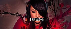
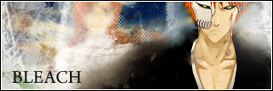
Munna: OH WAO. xD While it's creepy as heck, the billboard version is actually really cool. While it's not really... well, I don't know about the effects in the actual banner part, on the billboard it looks really natural, like it was actually there, even though the light effects are kind of different. I like the second to last version the most, since it's sharper and clearer. xD; The kid somehow looks less creepy that way. It looks more like a clown, than a vampire. x_x That's scary.

I really don't know what to say to it though, other than... it's pretty entertaining. xD

I can't find it in me to say anything productive about the Sato Takeru banner, and I shall explain why if you read on.

However, I can find it in me to tell you this: NOOOOOOOOOOO, WHY IS THAT SHIRANUI'S?!?!? ;;;;;;;;;;;;;;;;;;;;;;;;;


I'm in a slump; an all-over-all-around slump. Can't rate/comment for crap, can't make banners for crap, can't RP for crap, can't understand my finals for crap, and I'm stressing out over all this crap. :<

But Shiranui stole my IMPACT it's different this time. :x for the Sato Takeru banner I wanted to make, saw your request in munna's shop and I was like, KOHEI, KOHEI, KOHEI!! And then he went and made one from the Sato picture. xDDD I was like, "NOOO!!" But I got over it this time pretty fast my OBITO MOMENTUM. ;; because I got to see a very hawt picture of Takeru that I hadn't seen yet. <3 So Shira-chan, if you read this, thank you for the eyecandy. :D and besides, I've only been a sato fan for a few days anyway. I can wait. xD

So anyway.

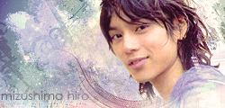
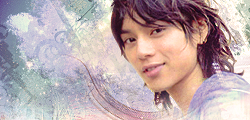
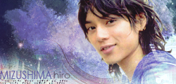
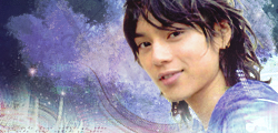
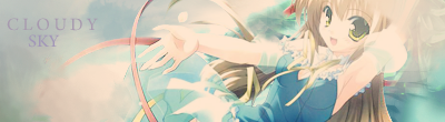
To alleviate my sadness, I made a Mizushima Hiro banner.

hiro2.png


hiro.png

I'll probably end up re-making it. <_< I spent about three hours on this. Can you tell, I'm in the biggest slump of my life? x_o I sat there for ten minutes trying to think of a place where the text could go and I was like, "...Well damn."

Yeah.
 

THIRTY-SIX

Banned
8,174
Posts
19
Years
  • Age 36
  • Seen Nov 18, 2015
It was my first c4d tag for like almost a year .o. Go easy on me xD
Oh I was doing a lot of image manip when I was in university. Though I never bothered with lighting…I left it as natural as possible and I mostly did typography there .o.
Clowns are vampires… masquerading and whatnot.
I guess you found out why .o.
Still did a better c&C job than me. xD
He simply had better colours. o.o
Make the text be a tattoo on his face Less grungy splatters better heavier typeface and a darker colour. Although textless looks good.
It's not really a slump either…
 

Motsuko Live

... pronounced Mös.
982
Posts
16
Years
@ Loki: Oh my... I haven't rated in a long time, so please don't beat me again if I do a poor job.
First of all, it's very, very small. Obviously. But, hey! Y'never know. Could be a new fad in a couple hours days.
Anyway, apart from it's size, it's pretty good! Love the colors to bits and peices. But it seems a bit plain for you. Are you, perhaps, developing a new style? *get's very excited*
Maybe a border would work? I don't know if it will look alright or not, but just a suggestion.
I really like that swirly thing near his adam's apple. I'd say that's what makes the sig.
I'd have to agree you're in a slump, Loki. S-Sorry... *cowers in fear*
6/10.

---------------------------------------------------------------

YAY! Finally got up off my lazy as-...

*ahem*

bum
, and learned how to use the pen tool.
I was going for a vector type banner (obviously):

Motsuko%20Live%3B%20Yummy.png


C+C on the "penning" pwease.
Tankyaz!
 

Loki

x
6,829
Posts
18
Years
  • Seen Apr 4, 2024
I don't know about my graphic slump (it's pretty much my worst so far munna, which is why I was making such a big deal. xD I've never been so irritated by the stuff I make) but since I did so well on my finals today, I'm in a considerably better mood than yesterday!

Munna: I'm glad I'm not going to a circus in the near future now. xD Clowns just got a little scarier. *SHOT*

Oh, a tattoo on his face? That sounds cool, even though I would never do that to my dearest-bishounen. At least, not with the stock I used in this banner. xDD As for the color, I actually did have one that was darker, here, check it out:

hiro3.png


hiro4.png

I don't know whether I like the lighter or darker ones better. xD; I think the tag's blend is worse in the darker one, but the colors and stuff I like better. *choices choices*

Motsuko Live: When it comes to real people in tags, I prefer smaller canvas' Yes, I am trying out a -kind of- new style. It's not working, as you can see. xD

The render: Adorable.
The effects: Adorable.
The text: Not so yummy. ^^;

For vector banners like this, I don't usually enjoy seeing swirly cursive fonts, and especially not at a weird angle that detracts from the flow. You could've turned the word so that it looked as though it was sitting on one of those... um... triangle things. xD That would've been pretty cool. It would've been easy to fill up the empty space with another one of those swirly things in the back. I don't know about that border you chose, but it's not so prominent that it pains me, so I'll live and let live. ;D Your colors are somewhat boring, there's no pop, but it's put together nicely.

Like munna said, I'd love to see it without the drop shadows; but I only want to see the ones on the triangles gone. It's kind of distracting as it is. xD;
 
Last edited:

THIRTY-SIX

Banned
8,174
Posts
19
Years
  • Age 36
  • Seen Nov 18, 2015
V1 of the dark one o.o It's better, on my screen.
And if you want better "blending" try out some photo filters, changing density / layer style.
 

Loki

x
6,829
Posts
18
Years
  • Seen Apr 4, 2024
Hmm, I'm too lazy to bring up the psd, but I'm pretty sure I have one or two photo filters on there. Ah, I should've added a cooling photo filter. :< Maybe I will, later on.

In the meantime, I think this turned out much better. Maybe I'm getting used to the smudge settings. I also made the canvas size a little bigger. ;>

aiba2.png


aiba1.png

I really have to stop making so many different versions of things. x_o
 

parallelzero

chelia.blendy
14,631
Posts
20
Years
@Loki: I'm still not a fan of people in banners. It just doesn't... match to me I guess. But since I have no choice in the matter, I like the second one better, if not for the edges around the face. They seem just a tad sharp on the first one, but that sharpness is eliminated on the second. There's also something about the text... It could be the sharpness. Since the background is somewhat softer, it feels... out of place? Ah, I suck at critiquing. XD

Went on a brush downloading spree. Thought I'd try one or two out.

persona.png
 

Renyui!

ascender
1,402
Posts
16
Years
Animad:I like it, but the smudging is a bit much.. the lighting is good, though,and the brushes are nice.
bleachichigocopy.png

cloudysky.png

these two, rate them. now. Now. NOW!
 

Gold19

Yes, I'm that One Guy
261
Posts
17
Years
Poke'd-I like the first banner better than the second one. The second banner has too much cloudness making it hard to see the render. So I am going to give the first banner a 7 out of 10 and the second banner a 4.5 out of 10.

------------

Okay time for my banner to be rated.
zabuza_sig.gif

It is first time using a C4D (on the bottom of the banner)!
 

Azonic

hello friends
7,124
Posts
16
Years
Gold19: If the c4d is the streaks at the bottom, then it isn't too good. It really clashes with the banner. It's too opaque to cover the render. Text should rarely overlap the render in banners. I don't like the text either, its pixelish and looks like it was crammed in there. The banner overall has bad quality. 4/10~
1211497339.png


1211497577.png

Rate themm...
 

Gummy

by fire be P U R G E D
4,519
Posts
17
Years
clade: The render blends really well and th lighting was done correctly. But other than that, I don't see much work put into it. Maybe smudging the render a bit would add more flow? And it could use some text. 7/10.

Again, I like the effects, but it still looks like 20 minute work (I apologize if it took longer). I would definitely add some smudging to go with the flow with this one. And of course, text. 7/10.

Please rate:

dyayht.png
 
Status
Not open for further replies.
Back
Top