• Our software update is now concluded. You will need to reset your password to log in. In order to do this, you will have to click "Log in" in the top right corner and then "Forgot your password?".
  • Welcome to PokéCommunity! Register now and join one of the best fan communities on the 'net to talk Pokémon and more! We are not affiliated with The Pokémon Company or Nintendo.

The Graphics Rating Thread [READ THE FIRST POST. D:<]

Status
Not open for further replies.

/Circa

a face in the clouds.
881
Posts
16
Years
Gummy: Uhh, the colours are to close together, and you sharpened the center a bit too much, so I cant tell what the render is :S. I noticed you used some line things coming from him to the right, but it looks a bit bad if you dont have some going left. Its a bit of a confusing banner.

Rate my banner: ;D.

CP.png


yes i know the center is a bit plain ftw
 

Renyui!

ascender
1,402
Posts
16
Years
CheesePeow: Nice. Simple style, luff the splatters and the lines in the corner. not much to say, but there is something wrong with the white border. Dunno what it is but it just strikes me as wrong. Correct me if im wrong.

Rate my banners. (4 versions FTW!)
v1:
wobrdrv2.png

v2.
wobrdr.png

v3.
wbrdrv2.png

v4:
wbrdrv1.png

Made a new version. I think its better and so does my mum
bordergmnt.png
 
Last edited:

Hazuki

delenda est.
976
Posts
16
Years
  • Seen Apr 20, 2011
@ Poke'd: Definitly the last one ;D

New banner:
banner-1.png

or this one:
banner2-2.png


OR this one:
banner3.png

I like the first one. Scanlines don't cut it for me. I can see you are using C4D's? I dunno, I'm not good with those. ><

Good job, you can improve a little more by adding a brush there, and a brush here, and maybe do something with Sonic.

jackbannerih6.png

This banner is made for Jack O' Neil.
 

THIRTY-SIX

Banned
8,174
Posts
19
Years
  • Age 36
  • Seen Nov 18, 2015
CP: Try adding colour to the skin please D:
Poke'd: V1… though a bit more effects that are like sparkly and stuff. Kinda like sytheteen's effects.
Kai: V1… but get rid of that yellow in the corner… an make the flames more vibrant. Warmng photo filter too!
Hazuki: Bit too noisy.
 

Nytkoi

Pokemon Copper!
1,625
Posts
16
Years
I can see youve improved too, Hazu! ;) I mastered the Blending Options as well.
I like the grundge in the background, but munna is right. Its too colorful. Mabye darken it a teeny bit.
Also bring the wrod haruhi down.
 

Pinocchio

~\\Guiding Light//~
120
Posts
15
Years
Haine Togu:
That banner doesn't have much to rate as it isn't a banner but;
I like the font. It doesn't clash or stand out but is still visible which is good. Like how only the eyes have colour, it gives a nice contrast. But just so you know, the eyes aren't the same colour. Dunno if you wanted to do that. I know the light is on one for them more but it looks kinda weird.
 

Pinocchio

~\\Guiding Light//~
120
Posts
15
Years
I know it is a graphic but I'm saying it doesn't need lots of brushes and effects so I'm not gonna tear it apart saying, "Where are the brushes and effects?"
I was saying it for your benefit. =P
 

Renyui!

ascender
1,402
Posts
16
Years
Haine Togu: The light source is good, and the font is nice, but a problem you always have is this. SHARPEN YOUR BANNERS! they dont look good blurry, and the text would look better in that one if the banner was sharpened.

So I stopped watching homestar, got off my butt and made a banner.
slump. it sucks, so do you
iiicopy.png


rate;;
 

Snivi

..•.¸¸•´¯`•.¸. ஐ
20,089
Posts
20
Years
Well I sharpened it but then there were little dots all over it so that wasn't good. So I am leaving it as is but thanks for the advice.
 

Pinocchio

~\\Guiding Light//~
120
Posts
15
Years
Poke'd
Nice banner overall. I think that if you are going to make the banner that long, you need to fill it up a bit more. So try putting some more brushes or something on the right side or just shorten the length of the canvas. Text is nicely placed and suits everything else. Great banner.

+++++++++++++++++++++++++++++++++++++++++++++++++++++++++++++++++++++++++
2po2j4l.png

Rate Please?
 

Renyui!

ascender
1,402
Posts
16
Years
Pinnochio:Well, it is good, the C4D is well placed, but remember what I said about Blending?
the bits that look like they have been cut out, and the text is a bit too bright, and you might want to try something like
ALL CAPS LOCK or A L L C A P S L O C K S P A C E D O U T ok?
so i tried to remake your banner a bit, but since it wasn't a psd, the smudging turned out bad. But at least you get what I mean at least. And i fixed the text a bit too, like the example of texts i just gave you.
v2copy-1.png

anyway, nice job.
Also try sharpening the smudging and render. This goes for you to, Haine Togu. It may look all dotty, but it actually turns out pretty nice.
 

Pinocchio

~\\Guiding Light//~
120
Posts
15
Years
My entry for SOTW "Sunshine and Sunflowers".
Mainly photo manipulation of a couple of stocks by blending them together.
Some home-made rainbows etc.
j0zeyb.png
 
Last edited:

Nell

1,767
Posts
17
Years
  • Age 31
  • Seen Sep 2, 2009
-pokes head out of manhole-
Heh, haven't been here in a while, thought I'd remind fellow graphics persons I exist. :3 Starting with...

Mostuko Live:
You and your awesome sense for matching colours. ;; Honestly, I think the colours on this banner are great, relatively speaking, btw. (I don't have a fetish for pink, or anything. >_<;) However, there seems to be lots of empty space [especially on those pink swirl things, is that the pen-tooling? O:], that you could have perhaps filled with more vector-effects~ like, for those pink swirls, I would personally add a few black vectors, probably stocks or brushing, then set the layer to overlay/soft light. I'm sorry to say I can't give you any great C & C on your pen-tooling, as I myself cannot use the pen-tool without injuring my forehead and damaging my desk simultaneously, if you catch my drift. D: text seems too plain, though the font isn't necessarily a problem~ Maybe you could work on differing sizes/positioning or some deco? :3
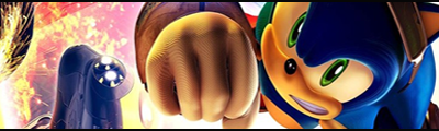
LOKI:
I dunno why I capitalised your username, acutally. o_o don't ask me why, you'll only get another 'o_o' XD; Okay, back on topic. Really, it doesn't seem like a slump that you're going through, in my eyes~ the only problem I can see with your Misosushi Hero banner is the text, and that can easily be rectified. It's a sound banner otherwise, although the textless version looks kinda empty to me D: of course, it dodes lack your usual graphic pizazz, (someone actually tell me the freaking correct spelling for that colloquialism. <_<) and I think the colours are mainly accountable for that~ it's too mild, and I think a few bold colours to contrast against the generally mild palette you used would make it much better. :3 As for the more recent Hiroki banner (yay for short Japanese names :x), I would say text is the biggest flaw D: WHAT HAPPENED TO YOUR AWSUM TXT SKILLZ?! I love the colours for this one, and the fact that the foreground smudging seems to blend in perfectly with the background~ maybe you could touch up on the smudging around his head (there doesn't really seem to be much there, ne?) and shoulders, for example, in the left side, the smudging changes rather abruptly from white to that dark green towards his neck, whereas on the right side, the soft-erasing/fading doesn't seem to fit in D: In general, I think these recent graphics of yours are fine, albeit a step down from your usual awesomeness. Don't worry yourself too much about being in a 'slump', it'll all come back soon enough. ;D
Hah, you seem to have gotten one of the bigger chunks of my rating spree. Lucky [????] you. :3

Animadversion:
Hmmm. I like the idea for this banner, but I think the blending isn't exactly top notch D: this could be credited partially to the stock used, of course~ Also, you seem to be able to blend scanlines into almost every one of your banners successfully, but I think this is an exception; it just doesn't work, in my opinion, and I can't really explain beyond that level of detail because I sux at critique. :x However the colours look good, and I do admire the positioning of your brushing, though the central upper area looks kinda empty/plain, ne? I think it's because there's too much of that one colour concentrated on the area~ text also looks fine, which is surprising, considering I would've never managed to get text right with dimensions like that XD; not that I can with many other dimensions, come to think of it. I suck at text ;_;

Poke'd:
Too much blurriness~! I think you'll find, despite their huge variations in style, most good banners have a few things in common, and I believe one of them is clarity, in one way or another. I'm referring mainly to the 'Bleach' and 'Cloudy Sky' banners when I say this. I mean, the blurriness on the Bleach banner seems to kill the focal point of it, and it doesn't look very pleasant in general; I think you could adopt a different method to achieve the result you desired with MUCH more efficiency, such as using a different form of smudging, perhaps with a more solid shape and a few altered settings~ the text also seems kinda plain, and the colour is too bold~ the same applies for the Cloudy Sky banner; in fact, my eyes actually took around a second or two to adjust when I looked at this little graphic, to distinguish any of the details~ the FML banners look a lot better. However, the blending is still a bit too blurred, and you should probably vary your smudging style to achieve the best results. The colours are great, and I think you made good use of the render's original colours. The splatters are okay, nothing special, but it doesn't make me frown either. XD I believe the antidote to these graphics of yours would be variation, sharpening and perhaps a few effects here and there, like C4Ds~

Gold19:
Hmmm. Let me try and explain this. Flat. Very, very flat. It lacks any kind of focus or perspective, and this is because, (in my humble opinion, that is) the similarity in colours and the lack of effective differentiation. I'll start with the text, as this is normally the easiest thing to shoot down rate. The font choice? .....Erm, yeah. I think it's best to keep the text simple and formal, that kind of text has the distinct property of taking attention away from the focal point of your banner in a not-so-pleasant way. :x Now, that bluefest you used to highlight the render. I think it's actually sound in terms of colours, but it lacks pizazz, and for ONCE I think I may actually know why o_o; See, instead of making it a huge, regular blue ball, you should probably spice it up with a variety of colours and effects. As for that C4D? DDD: It's much too opaque, as Clade rightly said, and the colour should probably be different, or at least bolder. The blending mode you chose for it was probably the wrong one, [try linear dodge~!] and it doesn't really add to the flow of the image, ne? Oh and btw, don't be too crestfallen after reading this, I'm a harsh arse when it comes to rating </3.

clade.:
I think the main issue I have with the first banner, the orange one, is the opacity differences of the grungy brushing, and it's overlapping, lack of sharpness/clarity gives the whole image a messy, muddy kind of look. It needs more space, I think~ for the second one, I like how you left the initial render and the background relatively clean. I think any smudging or brushing wouldn't have worked due to the lack of space, and the colours are good. But those white-effects in front of the render seem quite... pointless? o_o they don't really add impact, flow, blending, anything.... I would have replaced them with a bit of brushing, or maybe a low opacity filtered C4D~ this is where they come in handy~ :D

Gummy:
-flip horizontal-...... -flip vertical-...... eh, the focal point, where is it? ;; I can't really tell what's what in this banner, in terms of orientation, and I think the contrast in intricacy between the render and background is a problem~ I would, if I were you, clear some of those foregorund effects, slash the text, use some hard smudging around the render and in your background to reduce that detail contrast, give it a few photo filters/gradient maps and some completely empty space to fade the background into, it would give your render some direly needed emphasis~

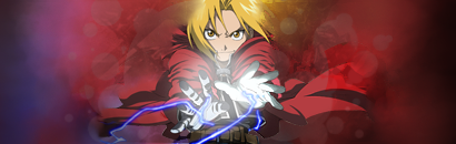
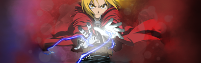
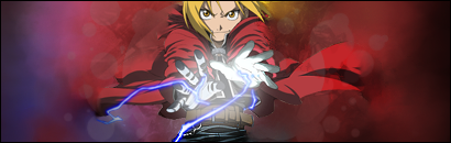
K, Ima post some of my work now too, for reasons stated below~
These two banners use the same render I have used in a previous signature, I used it as the basis for some practise~

sy3finalforrealsrslywr1.png

This one is painfully similar to the original, I've just adjusted the border, some effects, added a touch of smuding in the background, changed the lighting in one of the corners and added a near-invisible C4D~ ....okay, maybe it's not that similar... XD;

sy3experimentalfinalnp4.png

This one is the direct outcome of a tutorial that Loki linked me to, <3. Of course, I veered off into my own dark domain of graphics throughout the progression of the tutorial, as I ABHOR following tutorials step-by-step. It feels too monotonous~ but enough ranting, what do ya think? :> it's so very different to what I normally do, it's almost frightening. o_o

Okay, my parents have just announced that I am to get off the computer within the next 5 minutes if I value my life, so I'm EXTREMELY sorry to anyone I haven't critiqued yet, I will do so in the near future, and that's a promise! :3
 

Azonic

hello friends
7,124
Posts
16
Years
Tinkerbell: I like the first one better, since it has more of that red tone and looks more attractive. But the text is extremely hard to read (the english I mean. XD). It rocks anyways. :>

1211595206.png

Yes, I know I got the text wrong. :<
 

Gummy

by fire be P U R G E D
4,519
Posts
17
Years
clade: For starters, the "and sunshine" part of the text is really hard to read. I take it this is for SOTW so that extra flower is a nice tough.

Kakashi Banner:

98wmww.jpg
 

Nell

1,767
Posts
17
Years
  • Age 31
  • Seen Sep 2, 2009
Okay, back to my rating rant, like I promised. :>

CheesePeow:
Woah, I actually really, really, really like this banner~! O_O The colours look great, it's got flow, feel, originality and the focus and clarity all seems to be there. The one recommendation I could make is that you don't abbreviate your username for the text, give the other letters smaller font sizes, shift all of the text to the left a tad and maybe a tiny bit of deco to the right. The colours on the text look awesome though, in my opinion. A great job, makes my ciritquing easier 8D

Kai.:
Hmmm. In terms of those sonic banners, where's v1.5?! I mean, it would look great with scanlines in the background, but you either want to erase them completely from in front of your render, or lower the opacity and change it to a softer blending mode~ oooh, also, maybe add a fractal, or some lighting beneath his fist? You could extend it out towards the left of his face for depth/flow, too. The colours and concept are both great though, they're sound graphics overall.

Hazuki:
That render's quality is hardly great D: also, the stroke around it is all over the place, and the one around the text seems to be a tad too thick, you should reduce it to around 2 pixels and add some white splatter brushing around it~ maybe a few splatter clipping masks would also work, if you're unsure on how to use/make them, I'm quite sure Shiranui had posted a tutorial on them somewhere round here.... anyhow, it's not a bad attempt, I think you just need to touch up on some of the finer details, and get a better quality version of that render D:<

Haine Togu:
omigawllygawd, that is gigantic! XD; I suppose that's fine considering it's an LJ header, though~ wait, no.... it's not. I think your render is too big, and thus too blurred, due to the dimensions~ you could reduce the canvas size and sharpen up that render, give the eyes a bit more oomph, with... whatever you want (XD), like duplicating the eyes on a new layer, giving them a motion blur or sharpen, depending on what you want, then setting the layer to overlay and putting a monochromatc gradient map over the whole thing~ the text is in contrast with the blurriness of the rest of the image, see~ fix that, and maybe you could make the text a bit more interesting to compensate for the plain-ness of the banner, such as overlaying some effects onto only the text, like a few calligraphic swirls or whatever, and giving the text a gradient overlay? I think that might turn out quite nicely~ anyhow, it's not really awe-inspiring, but not too bad either, considering the dimensions.

Poke'd:
Ah, didn't notice that Ichimaru banner in my previous rant~ it looks pretty darn empty, although I'm pleased that this one has more of a focal point, but it's STILL TOO BLURRY. DDD:< yuz teh sharpn tul, yar? And shift the text to the right of the render, up a bit, erase some the rightside brushing and give the text some motion blur behind it, with a bit of deco under it. A photo filter would look good here as well, in my opinion~ or maybe a C4D, in the foreground.

Pinnochio:
Steelix! <3 I love that guy. Sorry, back on-topic~ <_<; You need to touch up on your rendering skills, lad! And blend a bit more, please~ That would make things a lot better. The background is too sharp, you could probably duplicate that BG layer, add a gaussian blur of maybe 1.5 ~ 2.0 and change the blending mode to lighten~ Now, that text. I think it needs some more discretion, no? :x The font choice for 'steel' is good, but maybe you should change the 'Death by' to some either more calligraphic, or just plain stiff and straight font, it currently looks awkward, and too in-between. For colour, how about you change it to a white, and change the blending mode to soft light? If it's too hard to see, just duplicate the layer. As for that SotW entry? Lulz, it's entertaining. :3 let's.. leave it at that. XD

clade:
It's alright. I would give the framed flowers some more lighting and a distinct source, like a combination of brushing, fractals and an actual lens flare or whatever~ and yeah, like Gummy said, you really have to squint hard to see that text~ ;;

Gummy:
Hmmm. To make things easier, I will tell you what I would have done, rather than point out my problems with it. Change the light source to under his hand, give it some mild red glow, extend out some effects from it [that render would be perfect for this kind of thing! ;;] like a C4D or whatnot, darken the background in general, take away the right-side white-thingamjigg, and hard-smudge the hell out of the background. :>

and.......... I think that's everyone, if I missed you out I'm sorry, I have selective sight. ;3
 
Status
Not open for further replies.
Back
Top