Damn. Database Error ate up my rating for ya Fire. :/
Let's see how much of it I remember and/or am willing to re-type.
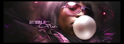
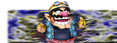
+Simplicity - It's a good style, and not over cluttering it really helps bring the focus to a render that's impossible to see.
+Flow - I can see the direction, and everything about the banner adds to the flow. While this is a little unexicting, it's definitely good in it's own sense. Everything just seems so... / and no other direction, thanks to the motion blur. D:
+Text- Font and angle are awesome. Positioning is a minus, but you'll see that later.
+Border- I will be stealing this from you now. *runs away*
-Motion Blur- It seems a little complicated for the simplicity of the banner. Or maybe it's just too undefined? I think a sharpen layer is in order, it would really help clean up the blurriness of the whole banner.
-Splatters- The solid color really bothers me. It's the perfect chance to add like, a firey texture over it to give the simple banner the pizzazz a simple banner needs to save it from being 'boring' rather than 'simple'. But seeing as it's a solid gray, it's just kind of... blah. D:
-Render- It's waaay too dark. It just looks like this blob of gray that looks kind of humanoid in the middle of the banner. I think you should first lighten it up, and then contrast it, because Ironman's colors can really pop the banner out of this boring gray rut it's in.
-Colors- Like I've been saying, I hate the color scheme. xD It's dull, boring, and nothing really catches my eye, which brings us to the next problem,
-Focus- I see one place where I could possibly focus my eyes, and that wasn't played up to it's full potential, therefore, I'm inclined to think that it's not the focal? The place my eyes go to first is the light from his chest, but that's not exactly anything special, so then I look at the light in his hand. Well, there aren't any lighting effects like lens flares operating anywhere near there, is the focal supposed to be his head? Well it's so dark and hard to see, probably not his head. The text?
The focal is never the text unless you're doing word art.
Basically, I'm not sure what I should be looking at. Because quite frankly, looking at the whole thing for a gazillion minutes to try and absorb everything isn't really in my list of things-to-do, unless I'm rating it like I am now. xD;
--
Wow, looking at this banner, I realized that a lot of things I get on other people's cases about are totally blown out of the water in this tag. xDD (AKA: They're not even there. :B)