Our software update is now concluded. You will need to reset your password to log in. In order to do this, you will have to click "Log in" in the top right corner and then "Forgot your password?".
Welcome to PokéCommunity! Register now and join one of the best fan communities on the 'net to talk Pokémon and more! We are not affiliated with The Pokémon Company or Nintendo.
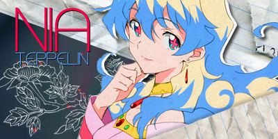
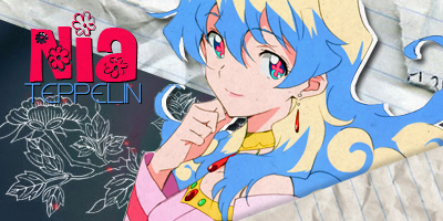
First looks really nice in a simple sort of way, but the second font fits more with the character's girlyness. Makes the banner more pretty in it a way.. so.. second one has my vote.
They both look nice, though. -torn- D:
(also, omgg I want to attempt to make a banner that creatively epic one day.. >.> ... <.< Maybe I'll try right now!)