• Our software update is now concluded. You will need to reset your password to log in. In order to do this, you will have to click "Log in" in the top right corner and then "Forgot your password?".
  • Welcome to PokéCommunity! Register now and join one of the best fan communities on the 'net to talk Pokémon and more! We are not affiliated with The Pokémon Company or Nintendo.

Lornami Iki

  • 1,467
    Posts
    17
    Years
    • Seen Jul 20, 2016

    Okay so I did something a little better than that. The melon placement looks funny but....
    I'm tired. It's just a stress thing. Does anyone else do stuff like that? Just stress work? With my copic markers I would just blend them in little circles. Made me feel better.

    Lornami Iki


    AND OH YEAH! Look at this!

    Ahh! I told you I'd watch this xD
    Great work on the watermelon by the way 8D
     
  • 2,413
    Posts
    16
    Years
    Nice shading, her hands look awkward, but I think that's just the original sprite

    Hehe, yeah the hands do look awkward on the original. Is that something to fix in a re-vamp or do you leave it alone?

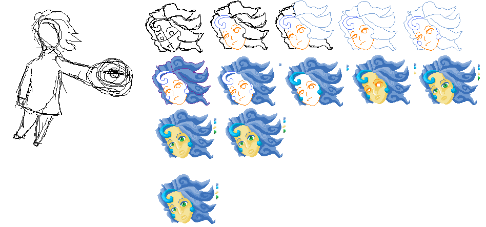
    And here are some random Misty Head stuff.
    Lornami Iki
    Lornami Iki
     

    dolce.

    divide & conquer.
  • 10
    Posts
    15
    Years
    • Seen Aug 18, 2011
    Something about your original trainer sprites feels off to me- it's probably the outlines. I'm not exactly a master spriter (actually I don't really sprite all that often,) so I can't exactly say anything more that's actually useful... but I think you shouldn't be too afraid of using black/darker colors on the outlines. It seems like the main problem, to an amateur's eyes.

    But your pixel art, like that watermelon; Drop dead gorgeous. C; I love your pixel art~
     
  • 2,413
    Posts
    16
    Years
    Something about your original trainer sprites feels off to me- it's probably the outlines. I'm not exactly a master spriter (actually I don't really sprite all that often,) so I can't exactly say anything more that's actually useful... but I think you shouldn't be too afraid of using black/darker colors on the outlines. It seems like the main problem, to an amateur's eyes.

    But your pixel art, like that watermelon; Drop dead gorgeous. C; I love your pixel art~

    I understand what you mean. I have to remind myself to put any black in there at all, because I enjoy color more than anything.
    I guess one could call it a style, but I'll see if I can work more black into my Pokemon related sprites.
     

    Hall Of Famer

    Born as Hall of Famer
  • 709
    Posts
    16
    Years
    I understand what you mean. I have to remind myself to put any black in there at all, because I enjoy color more than anything.
    I guess one could call it a style, but I'll see if I can work more black into my Pokemon related sprites.

    Here's my advice:

    If it's your style not to use dark/black color in your sprites, then stick to it. No one is supposed to ask you to change your style, and you are better and more motivated if you make sprites in your own style.

    If it's not that important to you or you simply forget to add more colors, then it might be a better choice for you to start to pay more attention on what dolce said in her post, since it won't hurt anything to make your sprites slightly darker.
     
  • 2,413
    Posts
    16
    Years
    Lornami Iki


    Don't ask, I really don't know. I just had to do something. I like the water, but not the holder so much. :[ It's just there.
     

    Hall Of Famer

    Born as Hall of Famer
  • 709
    Posts
    16
    Years
    Lornami Iki


    Don't ask, I really don't know. I just had to do something. I like the water, but not the holder so much. :[ It's just there.

    The pixel art looks very nice, I like it. And yes, the holder can be improved a little bit. You may not want to use a color so close to the color you're using for the water.
     

    <~F.M.P~>

    I got you whistling Blue Box!
  • 577
    Posts
    17
    Years
    o_0 Oh wow Lornami...You've really been doing some amazing work with these Pictures you have now. I'm truly amazed...I Was drawn to check out your thread by that HG symbol in your Avi and Your new stuff is way above what I'd expect from any one...It's above a professionals.
     

    Pokestick good times.

    [i]cheeky[/i]
  • 7,521
    Posts
    15
    Years
    Hmm. You're good.
    pretty good stuff you're making... yea...
    Who am I kiddin', it's really great, I've tried spriting, and I must say I'm pretty good for a beginner, but sheeze...
    (mmm... cheeze...)
    great, keep up good work...

    ...

    ...Ok, I just wanna keep the thread alive, Ur a really good spriter indeed, and I think I should keep it goin' if I can...
    yea.
     
  • 2,413
    Posts
    16
    Years
    So the rules have changed a bit, apparently I can revive this!
    I have two new pixel arts.

    Lornami Iki
    Sad Bucket

    and

    Lornami Iki
    Feeling Fresh Fizzy Fuzzy
     

    = GPR =

    Birding Extraordinaire
  • 655
    Posts
    15
    Years
    Lornami Iki

    Sad bucket reminds me of a picasso work called el guitarista viejo... from his perdido azul...

    anyhow, the shading, and outlining for that matter, is a bit choppy, but it gives a different edge to the piece... the fact that the light is prevailing over the shading in this piece is a bit different... many artists seem to clutter up their works with shaddows...

    the background is absolutely gorgeous! The intricate designs woven into the bottom... which i would assume is the floor, are absolutely amazing, for such a small size...

    the only thing i could crit on this piece is that there is no shaddow coming from the form and falling on the background... it's a bit poised looking...

    Regardless, it's a wonderful little piece!

    Keep up the great work!

    Keep Spriting!
     
  • 2,413
    Posts
    16
    Years
    Lornami Iki

    Sad bucket reminds me of a picasso work called el guitarista viejo... from his perdido azul...

    anyhow, the shading, and outlining for that matter, is a bit choppy, but it gives a different edge to the piece... the fact that the light is prevailing over the shading in this piece is a bit different... many artists seem to clutter up their works with shaddows...

    the background is absolutely gorgeous! The intricate designs woven into the bottom... which i would assume is the floor, are absolutely amazing, for such a small size...

    the only thing i could crit on this piece is that there is no shaddow coming from the form and falling on the background... it's a bit poised looking...

    Regardless, it's a wonderful little piece!

    Keep up the great work!

    Keep Spriting!

    I remember that picture. One of my seniors did a replica for the studio art show.

    I had first had the background as a static design but I didn't want to do that design all the way up...because I was lazy. xD So I made it more into a wall.

    o_o I finally accidentally anti-aliased somewhat correctly..

    I've really got no idea where my lighting is.
    But I added just a little shadow anyways.

    Lornami Iki
     

    = GPR =

    Birding Extraordinaire
  • 655
    Posts
    15
    Years
    You kinda anti aliased... but not really... you stil abruptly cut off the design... it went into a semi transitional design... then just went flat...

    you were starting to, but then cut off too quickly...

    maybe the bottom flat tone is much lighter than the top flat tone... which also prevents the anti aliasing...
     
  • 2,413
    Posts
    16
    Years
    You kinda anti aliased... but not really... you stil abruptly cut off the design... it went into a semi transitional design... then just went flat...

    you were starting to, but then cut off too quickly...

    maybe the bottom flat tone is much lighter than the top flat tone... which also prevents the anti aliasing...

    I did not want to anti-alias the designs on the walls and floor, I want them to stand out somewhat.

    I know I did not do it all correctly but I didn't want a million shades in the thing. I like smaller pallets. It's just that previously when I tried to add anything like it they would stick out sorely and not give any type of effect.

    ??? Am I saying it correctly?
    I still want to look at it and go "this is pixel art!", but not to be THAT sharp.
     

    = GPR =

    Birding Extraordinaire
  • 655
    Posts
    15
    Years
    i'm not sure... it's still a relatively new concept to me... i only heard of it a month or so ago... you'd probably know better than me... ^^

    anyhow, it's still a wonderful piece of art! the shading you added is again, a bit choppy, but it adds to that style...

    i love this piece, so keep it up, and great job...

    Keep Spriting!

    BTW, my 400th post... not as great as i thought it was... it'd been nicer had cody been sitting on my shoulder like usual... picking at my dogtag chain...
     
    Last edited:
  • 2,413
    Posts
    16
    Years
    My entry for the June Contest.

    I did it GB Colors for fun and to establish more contrast than before.
    Lornami Iki
     
  • 2,413
    Posts
    16
    Years
    Lornami Iki


    My Art gets more abstract by the minute...I swear.

    I was thinking of a kinda background like the Fresh Drink and did this.
    Lornami Iki


    And then it turned into a picture of it's own. xD
    Lornami Iki
     
    Last edited:
  • 2,413
    Posts
    16
    Years
    PC Withdraw. *dies*
    :| Triple post. Am I not very interesting anymore?


    Lornami Iki
    Lornami Iki


    Spoiler:
     

    ChronicEdge

    Space Lion
  • 404
    Posts
    16
    Years
    I _love_ your colored Pokemon prophiles. The shading is BEAUTIFULLY done.

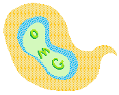
    Also, that O M G cloud is pretty effin' sweet.
     
    Back
    Top