• Our software update is now concluded. You will need to reset your password to log in. In order to do this, you will have to click "Log in" in the top right corner and then "Forgot your password?".
  • Welcome to PokéCommunity! Register now and join one of the best fan communities on the 'net to talk Pokémon and more! We are not affiliated with The Pokémon Company or Nintendo.

The Graphics Rating Thread - Read Post #1

aSeRo141414

zZJoennZz inside
377
Posts
14
Years
That, one has a really good flow, and the effects was good, but I didn't like the background, and why not blur the background a bit and sharpen the render a bit too. But overall, it's pretty good.

The smudging is good too, 7/10 :)
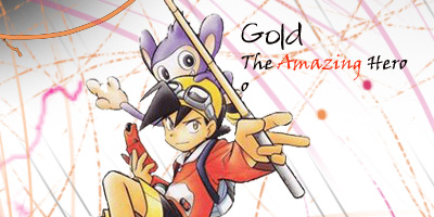
 

Alternative

f i r e f l y .
4,262
Posts
15
Years
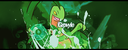
Since no one has posted a graphic, and Derozio knows what I think of that style, I thought I might post something I made.
grovyle.png


grovylenoborder.png


There's one with and without the border for you.
 

Impo

Playhouse Pokemon
2,458
Posts
14
Years
hmmm, i think it's pretty good, but just the smudge on grovyles face bugs me. maybe remove it from the focus area? (sorry, i ain't good at rating)

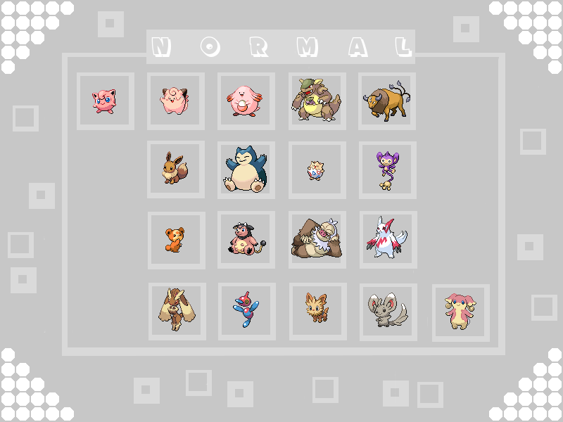
i have a background for my youtube channel here, and i thought i might get it rated.

NormalBackground.png
 

Shattered_Soul

Just Because :)
29
Posts
13
Years
  • Age 27
  • Seen Jul 27, 2011
I like what you did here. The only thing I can really say is that those squares randomly placed around don't go with the flow of the picture, because everything is so evenly placed.
(sorry it's so short, everything looks good besides that)

Just rate the one in my signature please.
 

Toony

Poopsmear.
22
Posts
13
Years
You could try to emphasize your focal point a bit more, and make the text blend with some effects, or just darken it. You have too many things that distract from the focal point. I would suggest putting something almost bright to the top or top-ish left to keep the effects from distracting you too much. I really like where you were going with it though. :)
That's just my opinion, I'm pretty sure someone else would think of it completely different.

I you could just rate my sig, even though it's about a year(or more) old. :P
 

derozio

[b][color=red][font=helvetica][i]door-kun best boi
5,521
Posts
14
Years
A little too simplistic. The stock looks high quality..but idk, I don't like the overall looks of the tag. Seems bland. And those borders don't add to it. Would've been better if you did away with them. Add some more effects and some more blending..that will probably suffice. It'll look much better, I'm sure.

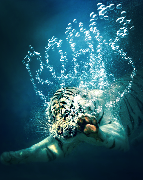
Rate this, plz:
Tiger.png
 

Xyrin

WOW REMEMBER THIS??
1,065
Posts
15
Years
Since the guy above didn't rate the guy above I'll rate him.

I really like it and it's pretty cool. I can't see what it's spelling I only see R-AB. I like the funny face the tiger is making. Nice pic. The editing is realistic and looks like real bubbles. So the only thing you really need to fix is the sloppyness of the bubbles.

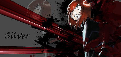
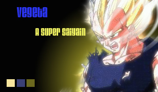
Here's mine, I just started yesterday so.... The one in my sig (you can rate it too) is from last night (when I got PS) and This one is from today (my second day) The silver one is my third and the gold is my second, Vegeta is my 4th.

gold_tag_by_xyr1n-d3dcn28.jpg


tags_by_xyr1n-d3dcmlr.jpg


vegeta_tag_by_xyr1n-d3dd15o.jpg


Looking for Criticism. (I followed tuts on the last two)
 

-Sonic~Boom-

☆彡
349
Posts
17
Years
I like the background on this, but there it's plain. It all seems kinda flat, and you could of experimented with the fonts some more.

This is my favourite. I love the grunge and splatter paint style and the colours all blend nicely. The background is a bit dull though, and the font + colour of font you used wasn't a good choice either, it's too plain.
I like the glow coming off the character (Vegeta?) but overall it's again too plain and the text you used is too plain.

To improve? I'd recommend learning how to use C4Ds (they help your work a LOT), experiment with fonts and the colours, learn adjustment layers (they're amazingly helpful) and things like smudging. Your best bet to learn what they are and get tutorials is:
http://www.pokecommunity.com/showthread.php?t=226684

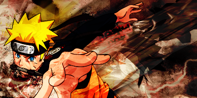
Rate plz?
Naruto-1.png
 

Precipice

I may be pure badass, but...
11
Posts
13
Years
  • Seen Jun 14, 2012
Rate plz?
Naruto-1.png


I LOVE the dynamic action in this, lost of movement there lots of crazy effects going on there and although it's quite cluttered you've made it acceptable as its not too overbearing. The text is well placed and a nice choice of colours too, I'm not sure what 'strong' brings to the picture, even if it is a translation the smoothness of the text seems out of place on such a dynamic graphic. Overall a very good graphic, I would say that it could do with a stronger focal point, the whole thing seems slightly blurred.

Rate Either one of these please:

nido-1.jpg
Tornadus.jpg
 
33
Posts
13
Years
  • Seen Jun 17, 2012
hi. i just started making signatures tonight and the one ive got as mine at the moment i just made. it took me 3 hours and the pokemon/evil dude were edited but not created by me. the rest was. can i please have peoples opinion on what is good/ bad about it(but only constructive criticism please) .

preferably i would like 2 good and 2 bad points please. but if you cant do that its fine.

from, dylanj70 (aspiring photoshopper and battling freak)
 

Skip Class

previously zappyspiker, but rainbow keeps trying t
4,717
Posts
15
Years
Well since you are new I suggest you take a look at a few more tutorials and keep working at it.

As for the criq:
Good: Well I can't really say much for anything good. Maybe balance? - but that about it
Bad: Well laying it all out you have quite a number of things to work on.
GFXers more advanced than me would say that your work is just 3 renders slapped onto a gradient blurred and with unfitting text slapped and blurred.

-I suggest working with one render(Picture) to start with rather than 3 especially since you're just starting. Also try to pick renders which are more high quality. Yours on the absol and the central picture were quite rough

-Cut out the purple circles in the corners. They distract the focus on the central image.

-I also suggest you don't start working with texts until you are confident on the signature itself knowing what texts work and what doesn't work.
Try adding C4Ds to help you add some depth in your signatures

I'm not else sure what I can to beginners say but I guess keep working at it.
Perhaps look at this thread to help you
 

Equinoxe

pleeease listen to meee
174
Posts
13
Years
  • Age 31
  • ~
  • Seen Dec 4, 2016
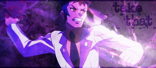
Since the previous banner got critiqued/rated already and nothing new was posted, I think I could pop in and drop something of my own for you to rate :O

takethat-1.png

I'm not a very good graphical artist and usually just do these banners and avatars whenever I feel like it (i.e. not that often) so some critique from the more advanced graphic-people would be lovely. My methods are mostly just adding layers and layers of things and hoping they'll turn out even remotely decent. :'D
things to note about the banner itself: I had to draw the rest of the [our] right had; the screenshot I cut this off of was missing about half of the fist and elbow. Another thing is that I did this in the middle of the night so the quality partially reflects that :U
 

Speed

Skyward
376
Posts
15
Years
There's really no focus on your tag. The light shining from the bottom right is very distracting, so is the text on the top right. You also don't have flow, I see all the action going on in the right, but nothing on the left. There's also bad composition, you need to have different colors, not just one; it makes the tag bland and look flat.
 

Misheard Whisper

[b][color=#FF0000]I[/color] [color=#FF7F00]also[/c
3,488
Posts
15
Years
I don't think there's anything much I can say about the banner up there that hasn't already been covered, so I'm just gonna drop this in here:
Naruto.png
 
33
Posts
13
Years
  • Seen Jun 17, 2012
umm... im not much of a critiq as i just started so......
i think its good but its hard to get the perspective 'cause of the hand.

rate mine please.
(based on but not completely following a tut, 2nd ever piece)


if this code doesnt work... sorry!

ummm dunno what to say cause im new...
i think its good but the hand messes up the perspective IMO but i may be wrong...

rate mine plz....


hmm.... maybe this will work...
[img=http://www.freeimagehosting.net/uploads/8687168109.jpg]

hmm.... maybe this will work...
[img=http://www.freeimagehosting.net/uploads/8687168109.jpg]
 
Last edited:

Speed

Skyward
376
Posts
15
Years
I don't think there's anything much I can say about the banner up there that hasn't already been covered, so I'm just gonna drop this in here:
Spoiler:

Ok, well first you have some weird distortion going on around his face, I don't know if you meant to do that, but it looks like you oversharpened just that area. He's covered by C4Ds, which isn't good either. The composition isn't good, none of the colors match the render, next time try to use the colors from the render in your tag. You don't have any flow, or depth, the effects just look like you added them on, there's also too much going on, so try to keep it from getting cluttered, but still enough effects so it looks nice.

Spoiler:


This is MUCH better then your first tag, I'll give you props for that. But it could do much better without the text on the bottom right. The circles distract a bit from the focal, and there seems to be something on the render? the light source doesn't fit, and it looks like you added it in instead of letting it come together. The colors don't fit together either, but other then that, you've improved much more.
 

Alternative

f i r e f l y .
4,262
Posts
15
Years
Since one wasn't posted above, I'll just rate this one.

Well, in comparison to your other tag, this one is much better. The render has some nice positioning to it, which is cool, and I really do like this style of tag, which really works wonders for me. The circles are a bit distracting, and maybe you should just make them thinner next time. Also the positioning, although nice, is usually best fit in the middle for a tag like this. Text is another issue with this. It distracts you from the focal, so it's best to move it closer to the focal, and make it smaller. Other than that, it's a nice attempt.


Now my tag. :)
yoko.png
 
4
Posts
13
Years
  • Seen Apr 25, 2011
Down there c: lol I was wondering what you guys thought about it :c -if i did this wrong or posted wrong place sorry Im new x.x-
Rate Please c:?
Its meant to be simple~

I guess its pretty Nice
+Color Matching
+Good Render
+Text

- Not Really Any flow I feel
I give it about 7/10

-My Graphic Is in my signature please rate? :D-
 
Last edited by a moderator:
15
Posts
13
Years
  • Seen Apr 30, 2011
It is rather simple.
I like the composition to the piece, I personally do like the "washed out", under contrasted under saturated feel in a tag.

However, what did you start with?
That would help me in giving you CnC.
 
4
Posts
13
Years
  • Seen Apr 25, 2011
Youmean what I did first well First i was thinking of making an fractal sig just with the render then I decided to add a stock and Idk It just feel into place
Basically I think itwas the stock / render
 
Back
Top