
Yume Tsuki
(/ ゚ヮ゚)/彡 ┻━┻
- 1,192
- Posts
- 15
- Years
- She/Her
- In a cardboardbox aside the main highway
- Seen today
really helpful advice


Hello everyone!
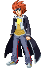
I am trying to make a new hero (and I am trying to make him look like me) and I am not very confident about my sprite work. Could I get some feedback and tips from you guys?
I know I need to do some shading but I don't know how to! I feel like the sprites aren't too bad but the hair on the back sprite has no shading, so it looks like i'm wearing a cap of some sort.
So here is the sprite:
Sorry for the size, that's just the normal size of the sprites, 64x64
Well anyway please give me some feedback! Be as mean as you'd like to be!
That's nice. It just doesn't give off a Pokemon feel to it for me. I'm really bad at that, though, so forgive me.
My sprite (Possible X and Y spoilers in here):
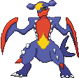
Spoiler:Here's a Pixel Over of Mega Garchomp that I did:
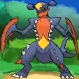
Reference:
Spoiler:

I have something here, made this earlier and i'm not good at Spriting but this is the result of my work!
I call this Pokemon as Springle.
You can tell that it's a fakemon.
I'm not good at spriting but i'm learning how to!
This Springle is a Fairy type Pokemon!


