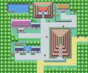
Name: Windstrong Town
Game: Nirvana
Comments: First and last town of Nirvana, as I'm not working on it anymore. Favorite map so far, full natural style, haters of natural style don't look at it, or QQ.
Credits: Kyledove, zein and me, Novus, GFreak, Wesley (for the revamped house), Laz and Zeikku (for just being there)
[map missing from new user restrictions]
P.S Yeah, I see that tile mistake in the big house's bench.
To this map, I have a few words. Firstly, well done with the trees. The look realistic in most places, although in truth it will be eons before anyone REALLY fits the perfect "naturalist" mold. In the meantime, you have a variety of "species" and sizes and positions to add a bit of randomness.
As for the town itself... that's another story. Firstly, it's cramped. I understand that in a small town, you might be going for a more intimate setting, in terms of spatial relations, but it just looks too tightly cramped. The paths are small and often not very linear, which is how a path should look. Your paths look like extensive patios that cover the entire town. In full, you might want to consider expanding the town slightly, straightening and conforming the path, and maybe organize the town a bit more.
Finally, that pool... just sticks out like a sore thumb. I'm sorry, it's a nice effect in theory, but I just don't think it fits.
For nature, I give it a 9.5/10
For urban planning, I give it a 4/10
For other graphics, I would have given it a 10/10 if it hadn't been for that pool.
Now, onto another review.
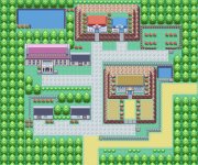
Rom base: Fire Red
Map is in the attachments
Comments: this is the 3rd city you encounter on the game. Please don't be to harsh this is first time i have mapped a city (despite mapping a few routes)
First off, for a simple Pewter City remake, it's not all that bad. However, here is a list of things you should know:
1) The raised terrain looks forced and unnecessary. Why is there a small mountain in there? It sticks right out.
2) The path just south of the "mountain" gets clipped by the flower placement.
3) Speaking of flowers, tone em down a bit. Use them in isolated patches to add some flare, but don't surround an entire mountain with them for the sake of surrounding an entire mountain with them.
4) Grass on the top terrace of a "mountain" tile base with the north side visible has always been a problem. Avoid this if possible, as you suddenly transition from grass to rock, which is a poor visual contrast and not all that realistic.
5) In terms of city planning, the Pokemon Center is not the highlight of the town. It should not be raised up on a pedestal like it is. Also, generally speaking, it should be in close proximity to the Pokemon Mart (with some exceptions)
---
---
Hope those reviews helped! I have no maps of my own made, as I'm still planning my hack out. Also, I will definitely be wanting custom tilesets, and the detail that has been put into some of the maps here in terms of tiles puts my pixel art to shame.
Moral of the story, I'ma gona need a professional spriter and tiler. And programmer. And other digital artists.
Moral of the story, Pokémon Symphonic needs a team. Join me. >=3
-Lyzák