• Our software update is now concluded. You will need to reset your password to log in. In order to do this, you will have to click "Log in" in the top right corner and then "Forgot your password?".
  • Welcome to PokéCommunity! Register now and join one of the best fan communities on the 'net to talk Pokémon and more! We are not affiliated with The Pokémon Company or Nintendo.

Poke a Dialga!'s Pixels~

Poke_a_Dialga!

EXAMS TESTS AND EXAMS QAQ
401
Posts
15
Years
  • pixel1655831517iaza.png

    All of these are scratched ;)

    treez.png

    Tree~
    lugia3.png
    ->
    lugia3.png
    ->
    lugia3.png
    ->
    lugia3.png

    Lugia
    chikoritaf.png

    Chikorita
    pokewalker.png

    PokeWalker (With my Lugia :D)
    typhlosion.png
    ->
    typhlosion.png

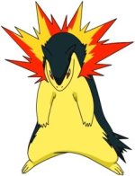
    My Mighty Leader: Typhlosion~:D
    13130755868iaza.png

    Grasy~
    22179745291iaza.png
    ->
    24286594768iaza.png

    Grasaly
    grassalo.png

    Grassalo
    erafire.png

    Erafire
    croafire.png

    Croafire
    eragon.png

    Eragon
    growslo.png
    ->
    iaza18392471230200.png

    Growslo
    iaza17498682636900.png

    Ironogon
    mushiking.png

    Mushiking in its mighty guardian mode~
    jirachia.png

    Jirachi~
    girlur.png

    Girl?
    lebronjames.png

    Lebron James
    98555344.png
    ->
    43953718.png
    ->
    43775199.png

    Girl~ whom I like <3
    boy9991171578iaza.png
    ->
    boy3895749687iaza.png

    Random Boy~
    dragon2x.png

    Dragon~
    rayquazacolor.png

    Rayquaza
    color1u.png

    Hmm... A teenager?
    Animations~

    71718565.gif

    Girl~
    _______________________________________________________________
    I will try to update as much as possible 'cos I have to go to school :P
    Living in a dorm really prevents me from spriting much =='l"
    But I'll never give up~
     
    Last edited:

    Mutt19

    Kill confuse ray not golbat
    83
    Posts
    14
    Years
    • Seen Dec 31, 2010
    Wow, MUCH better then I could've done. And I'm not that good of a critic so I apologise about that.
     

    NovaStar

    Team Malachite Spriter
    146
    Posts
    13
    Years
  • I have to admit these are great and I love your shading but there's a problem with Lugia. You might want to change the beak a bit because with the perspective your going with the head, to me it looks as if it would be turned 3/4 angle to the left while the beak suggests a side view. Just wanted to point that out and I'm loving that PokeWalker. Good luck with the spriting.
     

    Poke_a_Dialga!

    EXAMS TESTS AND EXAMS QAQ
    401
    Posts
    15
    Years
  • Wow, MUCH better then I could've done. And I'm not that good of a critic so I apologise about that.
    Thanks ;)
    I have to admit these are great and I love your shading but there's a problem with Lugia. You might want to change the beak a bit because with the perspective your going with the head, to me it looks as if it would be turned 3/4 angle to the left while the beak suggests a side view. Just wanted to point that out and I'm loving that PokeWalker. Good luck with the spriting.
    Right after I finish reading your critic, I changed it ;)
    Well, is this better or shall I change a bit more?
    lugia3.png
     
    Last edited:

    Chibi Robo

    of the entire epoch!
    854
    Posts
    15
    Years

  • The beak looks better but you need to make it wider.
    Right now it looks very skinny compared to the original design of lugia.

    lugia%5B1%5D.gif


    See how much wider it is? Now another piece of advice is that you should stay consistent with your lighting and shading. Again look at the lugia example notice how the shading on the white skin merges with the blue skin. Thats what I mean with consistency its the same thing with the lighting too. I also recommend experimenting with colors instead of using game freaks lugia colors. Otherwise its a very nice sprite, I hope this proves helpful.
     

    Poke_a_Dialga!

    EXAMS TESTS AND EXAMS QAQ
    401
    Posts
    15
    Years
  • The beak looks better but you need to make it wider.
    Right now it looks very skinny compared to the original design of lugia.

    lugia%5B1%5D.gif


    See how much wider it is? Now another piece of advice is that you should stay consistent with your lighting and shading. Again look at the lugia example notice how the shading on the white skin merges with the blue skin. Thats what I mean with consistency its the same thing with the lighting too. I also recommend experimenting with colors instead of using game freaks lugia colors. Otherwise its a very nice sprite, I hope this proves helpful.
    I see.....
    (My Lugia went on a diet :P)
    Better? Any more changes? :)
    lugia3.png

    About the colors, I'll try to experiment it on my later works ;)
    By the way, to tell the truth, I shade like I'm drawing with watercolors
    Spoiler:


    Update:
    typhlosion.png

    My Mighty Leader: Typhlosion~:D
     
    Last edited:

    NovaStar

    Team Malachite Spriter
    146
    Posts
    13
    Years
  • Looks better now. Now with your Typhlosion, it's nice and I like the shading and all but what bothers me a bit is the flame. Now on most of the sugimori art of typhlosion two colors are usually used in the flame, red and yellow. I know your going for the watercolor effect with the different shades but try to blend them as well as you can or try the first choice. Also the fire can use "quills" of varied length so it looks like real fire; use the attachment as an example and I apologize for it since I cannot post images/url until 15 posts.
     

    Attachments

    • Typhlosion1.jpg
      Typhlosion1.jpg
      17.6 KB · Views: 4
    2,697
    Posts
    15
    Years
  • I will not critisize the actual pixel part of this art, since too me, you are amazing at making pixel part, but I will critisize the anatomy of your pokemon.

    lugia3.png

    This is really good. However, one thing is wrong here. The beak. You have the top beak the same size as the bottom beak. It should be a bit longer than the bottom peak, and it would be curving downwards slightly, just like the Sugimori artwork. If you fix that, then I think it would be perfect :)

    typhlosion.png

    Basically they only thing I see wrong here is the flame. It needs to be way bigger, and also needs to be less straight. Flames are crazy, especially Typhlosion's, so make it bigger and crazier. Oh, and the arms are a bit too skinny. Make him have more muscle ;P

    chikoritaf.png

    This is just all over the place. The head is in a very weird position. I know you want to show that it is turning its head, but you are not protraying that too well, tbh. Sorry...also, the legs are very weird. You have one leg going one way, and the other going the other way. Also, the leg on the far right, why is it behind the outline of Chikorita? It shouldnt be, and should be apart of the body on the front. At least, that is the way I see it.

    I hope I have helped ;D
     

    Poke_a_Dialga!

    EXAMS TESTS AND EXAMS QAQ
    401
    Posts
    15
    Years
  • Looks better now. Now with your Typhlosion, it's nice and I like the shading and all but what bothers me a bit is the flame. Now on most of the sugimori art of typhlosion two colors are usually used in the flame, red and yellow. I know your going for the watercolor effect with the different shades but try to blend them as well as you can or try the first choice. Also the fire can use "quills" of varied length so it looks like real fire; use the attachment as an example and I apologize for it since I cannot post images/url until 15 posts.
    Spoiler:

    Read the bottom part (under Lady Gaga's quote)
    I will not critisize the actual pixel part of this art, since too me, you are amazing at making pixel part, but I will critisize the anatomy of your pokemon.

    lugia3.png

    This is really good. However, one thing is wrong here. The beak. You have the top beak the same size as the bottom beak. It should be a bit longer than the bottom peak, and it would be curving downwards slightly, just like the Sugimori artwork. If you fix that, then I think it would be perfect :)

    typhlosion.png

    Basically they only thing I see wrong here is the flame. It needs to be way bigger, and also needs to be less straight. Flames are crazy, especially Typhlosion's, so make it bigger and crazier. Oh, and the arms are a bit too skinny. Make him have more muscle ;P

    chikoritaf.png

    This is just all over the place. The head is in a very weird position. I know you want to show that it is turning its head, but you are not protraying that too well, tbh. Sorry...also, the legs are very weird. You have one leg going one way, and the other going the other way. Also, the leg on the far right, why is it behind the outline of Chikorita? It shouldnt be, and should be apart of the body on the front. At least, that is the way I see it.

    I hope I have helped ;D
    Sing Telephone for me! I want your autograph!
    So, Typhlosion's flame's the problem right?
    Well, I've changed it a bit. Nicer? Anymore problems? (My Typhlosion's on a diet too :D)
    typhlosion.png

    whoops...
    better version:
    typhlosion.png


    Lugia only has a beak...:)
    Better?
    lugia3.png


    I don't really understand the Chikorita's problem :\
    Well, I drew it as if it was walking with a pose...
    Explain it more?
    ___________________________________________________________________________________________
    Update:
    lebronjames.png

    Lebron James~
     
    Last edited:

    Poke_a_Dialga!

    EXAMS TESTS AND EXAMS QAQ
    401
    Posts
    15
    Years
  • THIS PLACE IS DESERTED.... 0.o
    Updates:
    jirachie.png

    Jirachi~
    _______________________________________________________________________________
    When I have time, I'll edit Lebron ;)
     
    Last edited:

    NovaStar

    Team Malachite Spriter
    146
    Posts
    13
    Years
  • I have only one problem with this but I still love your work.
    The problem lies with Jirachi's head; in comparison to it's "headpiece" it seems to be a bit too large and ill proportioned.
    070418jirachi.jpg
    >>
    jirachie.png

    As you can see here the head is more wide and flattened out, while yours is more elongated. When you fix that I think it will be much better. Other than that I like the background and your shading is still great. Also aren't the tags blue and not green? Just pointing out. :nervous:

    Sorry if I'm being harsh or anything in anyway. Sometimes I can't keep my touchy behavior under the radar.
     

    Poke_a_Dialga!

    EXAMS TESTS AND EXAMS QAQ
    401
    Posts
    15
    Years
  • Nice shading. I like how you positioned the closeup with the background waves and the moon peaking out from behind. That's a nice touch. The moon isn't exactly round like one would expect though.
    I noticed that :P
    I'll change it :D
    I have only one problem with this but I still love your work.
    The problem lies with Jirachi's head; in comparison to it's "headpiece" it seems to be a bit too large and ill proportioned.
    070418jirachi.jpg
    >>
    jirachie.png

    As you can see here the head is more wide and flattened out, while yours is more elongated. When you fix that I think it will be much better. Other than that I like the background and your shading is still great. Also aren't the tags blue and not green? Just pointing out. :nervous:

    Sorry if I'm being harsh or anything in anyway. Sometimes I can't keep my touchy behavior under the radar.
    As chibi robo said, I'm playing with colors~ :D
    I see that the head's wierd but I scratched this without any preference :P
    I'll change it~
    U aren't harsh.... U can really be a good critics ;)
    Edit:
    jirachia.png
     
    Last edited:

    Dorandragon

    The Pixel Master
    183
    Posts
    14
    Years
  • I think the lugia's head could still use a bit of fattening, but i think you should make the crest bigger. you've got some cool sprites here ^_^
     

    Poke_a_Dialga!

    EXAMS TESTS AND EXAMS QAQ
    401
    Posts
    15
    Years
  • I think the lugia's head could still use a bit of fattening, but i think you should make the crest bigger. you've got some cool sprites here ^_^
    I'll change when I have time ;)

    Update:
    Halfway-done beetle sprite (my comic character~)
    mushiking.png


    Finished:
    mushiking.png

    Mushiking in its mighty guardian mode~
    I tried to give it a dashing feeling but ended up like this :\
     
    Last edited:

    Dorandragon

    The Pixel Master
    183
    Posts
    14
    Years
  • pretty nice, and I really like the texture you have on it. the right half (the bug's half) of the shell doesnt have the same texture, and the right eye (bug's eye) looks to be farther back than the visible eye. There is some akward white on the shell part after the head, right under the portrusion. Also, I think, that if your going to have that horn like portrusion from it's shell, you may want to make it bigger so that it's more noticable. I hope you were able to make sense of all that :) again, its very good and I love that texture :D
     

    Poke_a_Dialga!

    EXAMS TESTS AND EXAMS QAQ
    401
    Posts
    15
    Years
  • pretty nice, and I really like the texture you have on it. the right half (the bug's half) of the shell doesnt have the same texture, and the right eye (bug's eye) looks to be farther back than the visible eye. There is some akward white on the shell part after the head, right under the portrusion. Also, I think, that if your going to have that horn like portrusion from it's shell, you may want to make it bigger so that it's more noticable. I hope you were able to make sense of all that :) again, its very good and I love that texture :D
    About the white part, it is his guardian glow~ :)
    I'll change when I have time ;)
     

    Poke_a_Dialga!

    EXAMS TESTS AND EXAMS QAQ
    401
    Posts
    15
    Years
  • post-new.png

    Ouchy news:
    Monthly test's here, so I won't be able to draw much TT
    But I'll be "back" next week so be patient~

    Did this while memorising history:
    13130755868iaza.png

    Grasy~
    Been a while since i sprited a fakemon~
     
    Last edited:

    Dorandragon

    The Pixel Master
    183
    Posts
    14
    Years
  • Grasy, I realize you were going for an interesting position, but you can really see that much of it, and he would look much better if he was facing forward.

    Grasaly, is similar in position, but hes fine, because you can tell which way he is facing. I'd like to see more emphasis on the head than the leaf, because it looks like the head is behind the leaf.

    On both Grasy and Grasaly, unless thats the style you want to go with, I feel there is too much dithering.

    I'm guessing your going for a sloth pokemon? Thats the feel I'm getting. Still very good sprites.
     
    Back
    Top