• Our software update is now concluded. You will need to reset your password to log in. In order to do this, you will have to click "Log in" in the top right corner and then "Forgot your password?".
  • Welcome to PokéCommunity! Register now and join one of the best fan communities on the 'net to talk Pokémon and more! We are not affiliated with The Pokémon Company or Nintendo.

A little too close.....

JollyRoger25

Dark Type Master
697
Posts
15
Years
  • Picture002.jpg

    Soo... this is my idea for a version mascot Legendary Pokemon, but I think that I might be taking a little too much "insperation" from the Giratina Orgin Forme, but then again this Pokemon is supposed to be from the same dimention as Giratina, soooo... your thoughts.....
     
    3,046
    Posts
    15
    Years
    • Seen May 11, 2016
    I don't really like it all that much. It looks rushed. Not only that, but it does look like a Giratina body-style rip-off or something. All the spikes on its back are oddly drawn and face inward too much. And the picture is low-quality, too.
     

    An-chan

    Whoops.
    642
    Posts
    15
    Years
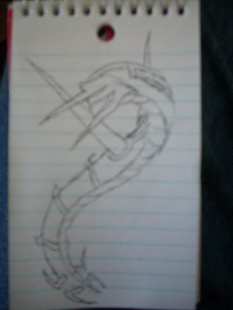
  • I actually don't think it looks like Giratina that much, really. Maybe you should bodify the head a bit so that it looks even more different from Giratina's Origin Forme... But the first Pokémon to pop in my mind when I saw this was Rayquaza. Maybe you should also make it longer and add something to the tail? Just some suggestions to make it differ from Giratina more, if you're concerned about their likeness.

    I also agree that the picture is really low quality and the drawing is a bit rushed, but I like it nevertheless. The pose is very good and I also like the general design of your Fakemon. Maybe you should try to modify it a bit, draw another version, maybe also shade it so it doesn't look as rushed, and try to get a better picture. I know it's hard to get a good picture with a camera, but I'm almost positive you can one with better quality than this. Try a better lighting and maybe take the picture from a bit further... Also, drawing on blank paper makes the result seem less rushed.

    Just some tips to make it better ^-^ I honestly think it's a very promising design, but it needs some work. So, keep at it!
     

    BHwolfgang

    kamikorosu
    3,906
    Posts
    15
    Years
  • I'm sorry, but the image is too blurry to see; but, I'll try my best.

    It does not look like Giratina O because of it's head and the formation of it's body. Even though the body is similar, it is not alike. That is good, right? You don't want to copy the exact features of a Pokémon. ;)

    Overall, I like it. It could use some improvements, as stated above, but I know you can do it. ^^
     

    Curt_09

    Also known as Chozo
    557
    Posts
    15
    Years
  • For what looks like an unshaded sketch probably done quickly in your spare time on what appears to be a very tiny notepad/notebook... Not bad. I like the design of it. It doesn't really remind me of Giratina at all (or Rayquaza.) It more resembles a Yugioh Card or maybe even a Digimon.
    Anyway, pretty nice. I agree with the others (except for ShinjisLover). It would look really sweet colored and shaded.
     

    salmence33

    I'm out here
    462
    Posts
    15
    Years
    • He/him
    • Seen Apr 26, 2024
    The picture's kind of blurry and it looks like a yugio card
    I'd give it a 4/10
     
    Back
    Top