• Our software update is now concluded. You will need to reset your password to log in. In order to do this, you will have to click "Log in" in the top right corner and then "Forgot your password?".
  • Welcome to PokéCommunity! Register now and join one of the best fan communities on the 'net to talk Pokémon and more! We are not affiliated with The Pokémon Company or Nintendo.

5th Gen The Boxart

Masterge77

Robot Mienshao
1,084
Posts
16
Years
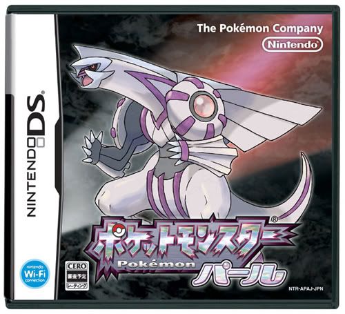
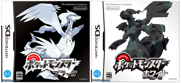
  • They are kinda bland to me compared to the amazing background detail of HG/SS, but then again, only very little main series game box arts had background detail, just the Sugimori stock art of the mascot plastered on with the Pokemon logo.......
     

    Ayselipera

    Guest
    0
    Posts
    Box art is Box art. I could care less what they put on it. To be honest out of everything about the new games this is probably the thing I care the least about.

    Simple is fine. Plus a solid colored box may be a little more eye catching in a store surrounded by fancy covered boxes anyways.
     

    Elise

    ニャーニャー
    109
    Posts
    13
    Years
  • Simple and good.
    I aren't going to complain about their packaging, the internal and the enjoyment of the game is more important.

    I completely agree. The boxart could say, "These pokemon is good. Play Dem" with a stick figure and I wouldn't care as long as the game inside was good. (Oh sarcasm. I love thee.)
     
    221
    Posts
    13
    Years
    • Seen Jun 11, 2014
    I like it.
    Plain and Simple, just the way it should be, we don't need flashing colors on Box art, it is just a Box, y'know?
     

    vibratingcat

    new username, razzbat
    417
    Posts
    14
    Years
  • i think its awesome. now i feel like getting both of them...
    either of them shall look nice on my shelf. XD
     

    xxChazxx

    It's Been a While
    593
    Posts
    15
    Years
    • Seen Sep 1, 2016
    I think it looks fine.

    Red/Blue still had the best box/cartridge art imo.
     

    derozio

    [b][color=red][font=helvetica][i]door-kun best boi
    5,521
    Posts
    14
    Years
  • [QUOTE="Ayselipera]Box art is Box art. I could care less what they put on it. To be honest out of everything about the new games this is probably the thing I care the least about.

    Simple is fine. Plus a solid colored box may be a little more eye catching in a store surrounded by fancy covered boxes anyways.[/QUOTE]
    ^ This. I pretty much agree to it.

    Even though I don't care much about the box arts, I gotta agree that they've shown that simplicity can be quite effective at times.
     

    Guy

    just a guy
    7,128
    Posts
    15
    Years
  • The box itself is simple, yet the two mascots, Reshiram and Zekrom are highly detailed. Together, the mi of simplicity and detail does the box art fairly well in my opinion. If I were to see these two games on the shelves along with other various DS games, it'll easily be a standout because of the two solid colors. So, I'm sure it would attract many people to take a look at it; the more they know about it would help too.

    What's left me curious is what the English logos will look like. My bets go to them looking like what's on the Official English Pokémon Site though - as far as font goes anyway.
     

    PiPVoda

    water, Forever
    1,306
    Posts
    14
    Years
    • He / Him
    • USA
    • Seen Dec 2, 2022
    The box itself is simple, yet the two mascots, Reshiram and Zekrom are highly detailed. Together, the mi of simplicity and detail does the box art fairly well in my opinion. If I were to see these two games on the shelves along with other various DS games, it'll easily be a standout because of the two solid colors. So, I'm sure it would attract many people to take a look at it; the more they know about it would help too.

    What's left me curious is what the English logos will look like. My bets go to them looking like what's on the Official English Pokémon Site though - as far as font goes anyway.

    Yeah they're probably going to give us the traditional English logo. Not trying to say that it's bad but it's obvious that the Japanese logos are always better and I think the English pkmn logo should be redesigned to match it...since we don't have the English b&w logos I'll compare the JP/Eng logos from D&P:
    English:
    Spoiler:

    Japanese:
    Spoiler:


    Yes the English logo doesn't look that bad...but I like the Japanese b&w logos (mainly b/c they're opposite colors) and imo they should be used for English too.
     

    MistahDude

    Primate Pokemon Master
    952
    Posts
    14
    Years
  • Well, it's not the best we've seen is it? I mean they are going back to basics, with plain Black and White and all that, but it doesn't seem as eye catching as it's predecessors. What's your take in it?
    pokemon-black-white-box-art.gif

    I guess Black sort of looks good up close.​

    The detailed designs of the legendaries go well with the simple design of the of the box.
     

    WiiMann

    I gots Heart Gold!! ^_^
    141
    Posts
    15
    Years
    • Age 29
    • Seen Mar 29, 2012
    I have but one word to describe the box and the Legends......GROSS!.....they just don't look like anything game freak would make, almost as if they hired a Digimon artist to do them. I hope that the other Pokemon are more like the starters, more like cartoony (I don't think that's a word but whatever) and like the classics, I really don't want another Sinnoh f*** up.
     

    Magik?!

    Georgums.
    85
    Posts
    14
    Years
  • I think they're going to get tons of fans no matter what, I mean... I highly doubt any pokefans are not going to buy a game because of it's cover. I actually really like those designs anyway, I think they look a lot sleeker than the past ones, perhaps aiming at an older audience?

    The contrast looks great and goes along with the whole good/evil thing, so I think it fits well and the legendaries look even better as they're the only detail on the thing.
     
    Back
    Top