• Our software update is now concluded. You will need to reset your password to log in. In order to do this, you will have to click "Log in" in the top right corner and then "Forgot your password?".
  • Welcome to PokéCommunity! Register now and join one of the best fan communities on the 'net to talk Pokémon and more! We are not affiliated with The Pokémon Company or Nintendo.

A Fresh Start

Status
Not open for further replies.
2,243
Posts
19
Years
Well, a small text update. I am working on making the water tiles a bit better. While I do like them in their current state, there is always room to improve and that's what I'm trying to do. Scarf, that includes making underwater plants and different ground textures. I am also working on a cave entrance, and another building.

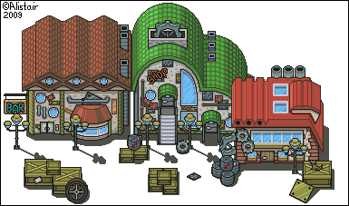
And this is a WIP. Obviously, there's a lot missing, but as I make more, this is going to become a city with every building being unique. I posted this a few days ago on dA, but I've been too lazy to post it here. Oh, and I'm working on making the shadows a bit better.

Work_in_Progress_by_TheDeadHeroAlistair.png


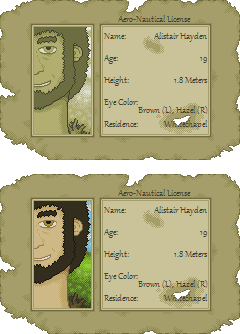
I do have a newer version of it done, but I don't really feel like posting it. There are some things I want to touch up. Oh, and I'm not going to use the tiled grid. Think pixel-based movement, not tile-based.
 

Mew~

THE HOST IS BROKEN
4,163
Posts
15
Years
  • Age 28
  • Seen Apr 13, 2016
You've got some realy great tiles but your bigger trees look more like they are from a pokemon ranger game :\
 
2,243
Posts
19
Years
I'm not in total agreement with your comment. While yes, they have a similar size, the styles are completely different. I did a short comparison for myself, so I didn't post a baseless comment.

Anyway, I have for you an update to the WIP posted above. I added some more clutter, and a new building. I will update the new tileset at some point or another (but there are too many clutter tiles to add to the sheet, haha. I might just make a branching sheet).

Work_in_Progress_by_TheDeadHeroAlistair.png


Oh, and what's hidden?
 

[NovaPirate]

And the rest went riding on.
802
Posts
18
Years
'Ello Alistair, good to see you.
I can't find your license, could you point it out to me?

And about that last WIP, the boxes on the far bottom seem almost /too/ aligned for the clutter, and it looks a bit weird to me. But it might be just me.
Really, REALLY love the new stuff, and the trees aren't so bad to me, although they are quite big.

edit;
Looked at the trees again, and you might want to fix the smaller, more spherical ones. When placed next the the giant ones they look like bushes more so than smaller trees. Whether that's a problem with the big trees or little trees I don't know.
Another small note, you might want to add some darker colors to the spherical trees, because the bigger trees have more contrast and it might make all trees look more similar.
But I think I'm wrong there.

edit2;
Another thing is that the grass looks a little /small/ next to the monstrous trees. It might be best to expand that a little too.
I looked again, and the grass looks nice with the smaller trees, but weird and undersized with the larger ones.
So those large trees are just causing problems for everyone.

edit3;
Found the license! And I love your water tiles :D
 

-Smash

Lv.86 Pixel Artist
73
Posts
14
Years
I'm not in total agreement with your comment. While yes, they have a similar size, the styles are completely different. I did a short comparison for myself, so I didn't post a baseless comment.

Anyway, I have for you an update to the WIP posted above. I added some more clutter, and a new building. I will update the new tileset at some point or another (but there are too many clutter tiles to add to the sheet, haha. I might just make a branching sheet).

Work_in_Progress_by_TheDeadHeroAlistair.png


Oh, and what's hidden?

These are probably some of the best tiles I've seen here. You got some pretty unique designs there; they set that perfect urban mood a good pokemon game should have.


You'd only have to work on the quality a bit more. Say, first off is that, there's an evident overuse of black lines in places where other colors would go perfectly.

Take house "left" as an example. The Bar sign, the pipe over the cylinder shaped outcoming, some of the plates, chimeneys, all would use some cleaning up.

House "middle" goes same, as it has the shop sign and many others, like the side curved window to the right of the sign. Instead of it having those jagged black lines, imagine how it would look if it was made like house "right"s front windows.

House right's side bricks might also need some cleaning up, as well as the gears on it.


All the boxes might look better with less to none dark lines on top, so that the lightsource would be visibly evident.

Also, having the roof edges that face us use brighter lines would be another improvement, and even better with thinner lines.


It somewhat reminds me of XD.. But We'll have to wait for the backgrounds first.
 

Conan Edogawa

One Truth Prevails
1,061
Posts
15
Years
I can't find much to critique but I did notice that the shading on the larger trees make them look squarish. Specifically the lower half. If you could round off each "level" of shading then the trees would look much more natural.
 
2,243
Posts
19
Years
Old Post:
Spoiler:


While this update is really small, I think it demonstrates what I'm going for. Like I said, I am ditching the Pokémon style that I have used for so long and I am making my own now.

Just_a_pipe_dream____WIP_by_TheDeadHeroAlistair.png
 

Andrew McKenzie

Supporting Pokemon Since 1999
356
Posts
17
Years
Alistair. Alistair. Alistair.
It's great to see you still working!

And what great work you still have!

I will, with your permission, and in giving credit, use the last of your Pokemon-esque updates.
That excludes the ones in the old topic that are marked not useable because they were made specificly for someone else's hack/game.

It is sad to hear you're going to change to a new style of pixels, but, man, great work. Keep it up, no matter what it is!
 
2,243
Posts
19
Years
Thanks for the comment. But a new style could mean improvement on my Pokémon fan-made tiles, so think about that for a minute.

Anyway, I updated the tileset with some new stuff. It's in the first post, but it'll be here, too. In addition, I added multiple languages saying "Please give me credit." I know, they probably aren't correct, so please tell me the correct way to say it if you know (Dante already told me about the Italian one, and it's fixed on the verion I have on my computer).

Latest_Tileset_So_Far_by_TheDeadHeroAlistair.png


And yes, I did take to heart the critique of Smash and Conan. I have no idea where I put the most recent editions of the buildings, though (they went through a few edits after those posts).

Oh, and finally, if anyone is wondering why there are no shadows on some of the most recent objects, it was so I could make shadows the way I needed them to fit.
 
33
Posts
14
Years
You really do bring an original flavor in your tiles.

I think the water tiles need a little something more- they appear very repetitive on the maps.
It's like the grass tiles flow really organically but the waters sort of just look like squares.
 

Esmas

General
529
Posts
14
Years
Very nice! As you know, I'm a huge fan of your sprites...especially these ones. I see that you're developing your own distinctive style, Alistair, and it looks great! The only words I could find that define your style are 'shiny' and 'definitive'.

I especially like your large trees with the vines hanging from them, and your small Cut trees (if they are Cut trees)...they're so cute! And maybe your signposts need a little work.

Your water needs some revision. I really like the nice, shiny palette, but the part where the water meets the earth doesn't look right. I mean, it doesn't exactly look like the earth is under the water, if you know what I mean. Maybe darken the palette there or something.

And I really, REALLY like your mountain tile, but the sides need improvement. The palette shades need to transition from lighter to darker as it is viewed further, but I bet you already knew that.

Lastly, like the guy above me said, black outline is evidently overused. But, to me, the black outline can be either overused or underused, which means that you should either use ALL black outline or NO black outline, and there shouldn't be much meeting between the two.

For example, where your small logs are closeby your mountain ledges, they don't exactly match. Either you remove the black outline from the logs or add black outline to the ledges.

Anyway, I can't wait to see more work from you, or at least see edits and/or improvements of these tiles. You've done great work and made much progress. Good work. :)
 
2,243
Posts
19
Years
Thanks for the crit guys. But if I didn't say it already, I am discontinuing that set. See everything in the lower-right corner? Well, that is what I'm aiming for. The old "inspiration" of Pokémon is going to be gone, which means the cartoony look and the black lines are going away, too. But I do appreciate the feedback, and if I were still working on the set, I would totally take your advice and edit it right away. I wish I had more than the outlines done on the re-styling of the original buildings to show you what I mean, but I don't. Even the outlines aren't fully complete yet, either.

Oh, and Esmas, next Saturday. Be here. I may have something for you.
 

Andrew McKenzie

Supporting Pokemon Since 1999
356
Posts
17
Years
But a new style could mean improvement on my Pokémon fan-made tiles, so think about that for a minute.

That is quite interesting.
Whatever it is you do, I'll be keeping an eye on this topic and your excellent work.
Keep it up, Alistair! =D
 
2,243
Posts
19
Years
Well, I decided to do something not tile-related. If you take a look at my avatar, you'll see. But just in case I ever change it again, here it is. Obviously myself, but I mainly did it as a practice for dithering.

Just_me____by_TheDeadHeroAlistair.png


And yeah, the ear is a bit small. I'll edit that later.
 

~Teh Panda~

Back in hacktion
918
Posts
16
Years
  • Seen Jul 20, 2022
Well, I decided to do something not tile-related. If you take a look at my avatar, you'll see. But just in case I ever change it again, here it is. Obviously myself, but I mainly did it as a practice for dithering.

Just_me____by_TheDeadHeroAlistair.png


And yeah, the ear is a bit small. I'll edit that later.

Not bad, the neck seems a tad bit long though xP. And the mouth looks a little sadistic.
 
2,243
Posts
19
Years
Never doubt the length of my neck! It is really long (seriously). ;)

But the mouth was fixed. I don't smile much, and that was just a failed half-grin. The ear, well, I'm leaving it for now. The nose was also improved, and I added a dimple for my smile.

In addition, I made an aero-nautical license for myself. See below with the updated picture (in sepia!).

My_Aero_Nautical_License_by_TheDeadHeroAlistair.png


Obviously, I didn't do the font myself. I felt it would be better if I just used the font tool this time around (the font is Gabriola, by the way).

And for anyone that would like to make their own, I have the blank.

blankaeronauticallicens.png
 
Last edited:

DreadWaffle

LOVE AND PEACE!
165
Posts
14
Years
nice one man, but i don't know how many people will use the template
but it is a nice little thing people could put in sigs is suppose.
btw is the town of ??? nice, because i didn't even know it existed 0,o(supprised bird) and anyway can you send me a postcard from the area of ???, ?
 
2,243
Posts
19
Years
Well, the residence portion of the card was just a placeholder. I changed it, because I actually thought of something. But I also made a version of the card with the color picture. Here are the updated versions.

My_Aero_Nautical_License_by_TheDeadHeroAlistair.png


I think I like the sepia version better, though.
 

Esmas

General
529
Posts
14
Years
Very nice! But, maybe just desaturate the art a bit and add a different hue, instead of adding sepia.

The only problem is, the font is kind of small and hard to read. ;_;
 
2,243
Posts
19
Years
The thing is, though, the picture is supposed to be a daguerrotype (sp?), so sepia is the only way of coloring (since daguerrotypes could only produce brown and white pictures). The colored version, well, it was really just a test to see how it would look. But you are totally right on the font. Plus, it doesn't feel right not using a font I made.

Anyway, I just made the first building in the new set. I think it turned out okay, but there are some things I want to improve on and some things I want to add. I would also like to note that yes, some shading is missing. I did not notice until I uploaded it. I'll post the updated version soon.

But cheesus crust, this thing took a long time to make.

New_House_by_TheDeadHeroAlistair.png
 
Status
Not open for further replies.
Back
Top