• Our software update is now concluded. You will need to reset your password to log in. In order to do this, you will have to click "Log in" in the top right corner and then "Forgot your password?".
  • Welcome to PokéCommunity! Register now and join one of the best fan communities on the 'net to talk Pokémon and more! We are not affiliated with The Pokémon Company or Nintendo.

#1 - Freestyle [Voting]

Winner?


  • Total voters
    13
  • Poll closed .
10,673
Posts
15
Years
    • Seen Dec 30, 2023
    {Tag of the Fortnight #1 - Freestyle [VOTING]}

    Details
    This week was freestyle, meaning the entrants could do whatever tag they wished.

    Rules

    • Do not vote for yourself
    • It is advised that you post your reasoning for voting for who you voted for.
    CZQ1M.png

    zZJoennZz - No Stock

    jackT01b.png

    TheSmartOne - Stock

    eli_tag_by_xyr1n-d3j72xx.png

    Xyrin - Stock

    scott-2.png

    Alternative - Stock

    monster.png

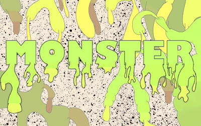
    Comic Tragedy - Used a font only

    ChesterTag.png

    Derozio - Stock
     

    curiousnathan

    Starry-eyed
    7,753
    Posts
    14
    Years
  • For this week my vote goes to Xyrin. This is because I really love how he has sharpned the image. However, osme of it is a bit confusing especially when there a few softened spots which imo; are in the wrong position or overdone.
     

    derozio

    [b][color=red][font=helvetica][i]door-kun best boi
    5,521
    Posts
    14
    Years
  • I'd go with alternative. I like the style he used. Colors are nice too. The yellow 'Pilgrim' is..not too nice but I guess the tag, overall, is pulled out nicely. So yeah, Alternative GMV.
     

    Dr.Kotov

    & the symptoms.
    213
    Posts
    12
    Years
    • Seen Dec 11, 2012
    I would have gone with Deroizo's as my second choice, but to point out a few things that disappointed me; I see the focal is still placed in the center, surrounded by yet another bokeh texture, and blasted with just too much red. I don't see what the vein is for either..

    Coming to the person I actually voted for, Comic Tragedy.
    I really like how he used pretty much nothing to construct the tag, and I admire the patience he must have put in using the pen-tool (which, btw is pretty smoothly executed) or whatever method he chose. I don't know what's with the background though. Perhaps a lighter shade of grey on the myriad of specs would have looked better.
     
    1,542
    Posts
    16
    Years
  • Comic Tragedy gets my vote! =] I would have voted for Derozio, which I like his work a lot, but yeah that weird crack/vein texture is a little unneeded. I also do admire Comic Tragedy's pen-tool work in his tag, so I really wanted to vote for him. ^..^
     

    TwilightBlade

    All dreams are but another reality.
    7,243
    Posts
    16
    Years
  • Xyrin got my vote. I'm impressed at how he made such a gray stock from The Book of Eli so pop 'n fresh. xD
     

    Xyrin

    WOW REMEMBER THIS??
    1,065
    Posts
    15
    Years
  • zZJoennZz got my vote because I love abstract and it done quite well and simplistic. I luvs eet.

    Holy crap. I got 2 votes. o_O
     

    Cherrim

    PSA: Blossom Shower theme is BACK ♥
    33,288
    Posts
    21
    Years
  • Voted for Alternative. I thought the colours used went well with the image, everything flows well, and it's easy on the eyes. Any negative space feels like it's needed and the added effects help accent the stock without commanding all the attention. The only issue really is the yellow used in "pilgrim". It's a little hard to read but it also matches the texture/aura around him so it didn't bother me too much.

    My second choice would have been Derozio because I think that one looks great too, but that crack texture is a bit distracting and since it's the only one like that, it takes a lot of attention away from the simplicity and great blending of the rest of the tag.
     
    It was a tough decision between Alternative and Derozio because both people made fantastic tags, but after some consideration I decided to place my vote with Derozio. I think Derozio used textures well, and while depth and lighting are lacking in the tag I completely appreciate the style he is going for. I ended up not voting for Alternative because I think he could've pushed the colors a little further than he did, and because of the clipping mask on the right feels like filler while it has potential to be something more (like a homage to scott pilgrim's comic origin).
     

    Alternative

    f i r e f l y .
    4,262
    Posts
    15
    Years
  • To be honest, for me it was a real toss up between Derozio and Xyrin. Both have their faults and strong points, as every tag does, but I'm going with Derozio on this one. There's just something about the tag which I love, whether it be the bokeh used or something else, it's just amazing tbh. Only think stopping me from voting for Xyrin is the fact that some of the focal is blurred out and the C4D seems to stand out more.
     
    10,673
    Posts
    15
    Years
    • Seen Dec 30, 2023
    I can tell that this is going to be a close one. It was hard to decide on who I thought had the best. The tags I liked the most were Alternative's, Comic's and Dero's, each has their good points and their flaws however.

    Anyway, to start with Alternative's. I liked the composition of the tag overall, the colours were also quite good. But it sort of lacked a decent sense of flow around the render itself, it needed to be pushed in the right direction a bit more. Though what threw me off the most was the text, which should never be stuck in a corner. Had it been closer to the focal with different placement, colour and choice of font I think the text would have been a lot better. That's just what made it lose out on the vote for me.

    Next was Comic's. I certainly liked the pentooling and the palette of the tag overall. Honestly it is quite close to perfect in my eyes. But it seriously lacked in depth. However that was the only flaw in my eyes when it came to this tag.

    Dero's was actually pretty awesome. The texture killed it though, I think that it was a bit too heavy, took away from the quality of the stock and washed it out a bit too much, as well as there being a bit too much noise from the texture. Otherwise it would have been a very, very good tag.

    So my vote went with Comic Tragedy, it lacked the area of depth but it did enough to get my vote this week. I think overall, the entries were great, and it'll be interesting to see how this pans out.
     

    moments.

    quixotic
    3,407
    Posts
    15
    Years
  • My vote was between Derozio and Comic Tragedy, but overall, I felt Comic Tragedy deserved it so much more than the other contenders for a few reasons. Firstly, I think it is underestimated the ridiculous amount of time and skill needed to do a pentooling job as good as shown in this piece, and it definitely proves deserving of success.

    As other people have said, Dero went little overboard with that crack texture, and is definitely a little too washed out. Not to mention the centred focal, which he almost pulled off, but it very rarely will ever truly work with a typical sort of tag. I felt despite some rather large flaws in his piece, it actually retained quite a good standard in general which is laud worthy. If he tidied it up a little bit in the aforementioned areas, it would've definitely proved a much, much stronger tag, and probably deserving of the win.

    But yeah, Comic Tragedy.
     
    Back
    Top