
こんにちは!はじめまして?
私 は やまと です。 どうぞようろしく。
Hi there, I'm Yamato, nice to meet you.
Introductions
---------------
Hi guys, some of you know me as Yamato from competetive Battling, Ayato in PHO (Sorry sometimes I'm too rude hahah) and Jason in real life or Facebook.
I study Music as well as drawing and I sure hope it's not as bad as I think it is.. Brass instruments are hard hahah. Apart from studying Music and other fun stuff, I'm currently studying for my SAT's and other things.. I aim to have AP classes and currently an overachiever. I hope that doesn't go.. I like trying lol.
I used to draw badly, until I shut my mouth, learned how to draw, and started actually trying.
Without furthur ado, let's begin!
Now to Actual Art
-----------------
Something gay xD
![[PokeCommunity.com] Anime that was horrible and now better](https://i972.photobucket.com/albums/ae204/Ayato_tehGDS/Jasonsfurrykiss2.png "[PokeCommunity.com] Anime that was horrible and now better")
Winterville ;)
![[PokeCommunity.com] Anime that was horrible and now better](https://i972.photobucket.com/albums/ae204/Ayato_tehGDS/Winterville.png "[PokeCommunity.com] Anime that was horrible and now better")
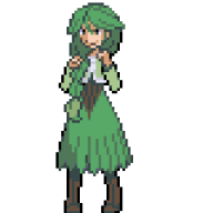
Does this look like me?
![[PokeCommunity.com] Anime that was horrible and now better](https://i972.photobucket.com/albums/ae204/Ayato_tehGDS/portrait.png "[PokeCommunity.com] Anime that was horrible and now better")
Springtime in Spring Village (one of my personal best ^ ^)
![[PokeCommunity.com] Anime that was horrible and now better](https://i972.photobucket.com/albums/ae204/Ayato_tehGDS/Spring.png "[PokeCommunity.com] Anime that was horrible and now better")
Harusawa's family
![[PokeCommunity.com] Anime that was horrible and now better](https://i972.photobucket.com/albums/ae204/Ayato_tehGDS/HarusawaFamily.png "[PokeCommunity.com] Anime that was horrible and now better")
The backround looks bad in the battlefield (Battle Frontier)..
![[PokeCommunity.com] Anime that was horrible and now better](https://i972.photobucket.com/albums/ae204/Ayato_tehGDS/BattleField.png "[PokeCommunity.com] Anime that was horrible and now better")
Hopefully I can script that (HELP!)
Still working on some of the Actual art. So guys, what do you think of it? ^ ^
Karate and Kendo, My yang (The empty hand and the way of the sword, my Ying)
![[PokeCommunity.com] Anime that was horrible and now better](https://i972.photobucket.com/albums/ae204/Ayato_tehGDS/mmmforev.png "[PokeCommunity.com] Anime that was horrible and now better")
Heaven (..I'm inspired)
![[PokeCommunity.com] Anime that was horrible and now better](https://i972.photobucket.com/albums/ae204/Ayato_tehGDS/Furry.png "[PokeCommunity.com] Anime that was horrible and now better")
My Party (Good things come in threes) (Sun abusers)
![[PokeCommunity.com] Anime that was horrible and now better](https://i972.photobucket.com/albums/ae204/Ayato_tehGDS/Myparty.png "[PokeCommunity.com] Anime that was horrible and now better")
Okay..
so that's sort of all lol
Art Updates
--------------
Art Update 7/12/11
Art Update 7/15/11
Other notes (Cross out means accomplished)
-----------------------------------------------
OW's are being changed so it doesn't look circular! Please wait (7/12/11)
Drawing! There will be an update for all of you guys, thanks. (7/16/11)
私 は やまと です。 どうぞようろしく。
Hi there, I'm Yamato, nice to meet you.
Introductions
---------------
Hi guys, some of you know me as Yamato from competetive Battling, Ayato in PHO (Sorry sometimes I'm too rude hahah) and Jason in real life or Facebook.
I study Music as well as drawing and I sure hope it's not as bad as I think it is.. Brass instruments are hard hahah. Apart from studying Music and other fun stuff, I'm currently studying for my SAT's and other things.. I aim to have AP classes and currently an overachiever. I hope that doesn't go.. I like trying lol.
I used to draw badly, until I shut my mouth, learned how to draw, and started actually trying.
Without furthur ado, let's begin!
Now to Actual Art
-----------------
Something gay xD
Spoiler:
Winterville ;)
Does this look like me?
Springtime in Spring Village (one of my personal best ^ ^)
Harusawa's family
The backround looks bad in the battlefield (Battle Frontier)..
Hopefully I can script that (HELP!)
Still working on some of the Actual art. So guys, what do you think of it? ^ ^
Karate and Kendo, My yang (The empty hand and the way of the sword, my Ying)
Spoiler:
Heaven (..I'm inspired)
Spoiler:
My Party (Good things come in threes) (Sun abusers)
Okay..
so that's sort of all lol
Art Updates
--------------
Art Update 7/12/11
Art Update 7/15/11
Other notes (Cross out means accomplished)
-----------------------------------------------
Drawing! There will be an update for all of you guys, thanks. (7/16/11)
Last edited:

![[PokeCommunity.com] Anime that was horrible and now better](https://i972.photobucket.com/albums/ae204/Ayato_tehGDS/hotday.png "[PokeCommunity.com] Anime that was horrible and now better")
![[PokeCommunity.com] Anime that was horrible and now better](https://i972.photobucket.com/albums/ae204/Ayato_tehGDS/Torayacolored.png "[PokeCommunity.com] Anime that was horrible and now better")
![[PokeCommunity.com] Anime that was horrible and now better](https://i972.photobucket.com/albums/ae204/Ayato_tehGDS/Trainer.png "[PokeCommunity.com] Anime that was horrible and now better")
![[PokeCommunity.com] Anime that was horrible and now better](https://i972.photobucket.com/albums/ae204/Ayato_tehGDS/HeartlessPic.png "[PokeCommunity.com] Anime that was horrible and now better")