
FreedomFighter011
Kit Kat
- 28
- Posts
- 14
- Years
- Kentucky, USA
- Seen Jul 21, 2010
I have modest spriting abilities, but I shall share them all the same! Don't like them? Don't bother telling me. Oh, can someone tell me the official size of Pokemon sprites? I've heard it's 80x80 pixels at the largest, but I'm not sure...
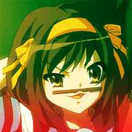
Splices
![[PokeCommunity.com] Art Corner](https://img189.imageshack.us/img189/3509/petraspritev2.png "[PokeCommunity.com] Art Corner")
![[PokeCommunity.com] Art Corner](https://img641.imageshack.us/img641/2372/zaynespritev2.png "[PokeCommunity.com] Art Corner")
![[PokeCommunity.com] Art Corner](https://img94.imageshack.us/img94/8880/joellespritev2.png "[PokeCommunity.com] Art Corner")
Trainer Cards
I'm working on a story involving Pokemon. So I randomly decided to do trainer cards for the main characters. (Templates can be found here)
![[PokeCommunity.com] Art Corner](https://img34.imageshack.us/img34/5165/petratrainercard.png "[PokeCommunity.com] Art Corner")
![[PokeCommunity.com] Art Corner](https://img413.imageshack.us/img413/4927/zaynetrainercard.png "[PokeCommunity.com] Art Corner")
![[PokeCommunity.com] Art Corner](https://img707.imageshack.us/img707/5474/joelletrainercard.png "[PokeCommunity.com] Art Corner")
PokeCharacters
I'm working on a Pokemon fanfic, and these are the characters I've made so far:
![[PokeCommunity.com] Art Corner](https://img227.imageshack.us/img227/3975/pokemoncharacters.th.png "[PokeCommunity.com] Art Corner")
The picture is like 1200 pixels wide, so I used a thumbnail. The characters are as follows:
Vaporeon = Female, Ursula | Sneasel = Male, Yusuf | Manectric = Female, Xara | Hypno = Male, Zaid | Chimecho = Male, Sorren | Glaceon = Female, Daijah | Flareon = Male, Vito | Espeon = Female, Isla | Eevee = Male, Kalum | Giratina (Shiny) = Female, Eden | Arceus = Female, Calypso
I am aware that some of these Pokemon do not have genders, but I have given them genders anyway.
Custom Sprites
I'm currently (slowly) working on creating custom sprites of all the Pokemon, at least up to R/S/E. (I'm also aware of the size problems. lol)
![[PokeCommunity.com] Art Corner](https://img10.imageshack.us/img10/2120/001bulbasaurs.png "[PokeCommunity.com] Art Corner")
![[PokeCommunity.com] Art Corner](https://img822.imageshack.us/img822/5908/002ivysaurs.png "[PokeCommunity.com] Art Corner")
![[PokeCommunity.com] Art Corner](https://img820.imageshack.us/img820/1520/003venasaurs.png "[PokeCommunity.com] Art Corner") New Versions:
New Versions:
![[PokeCommunity.com] Art Corner](https://img651.imageshack.us/img651/9876/001bulbasaursv2.png "[PokeCommunity.com] Art Corner")
![[PokeCommunity.com] Art Corner](https://img295.imageshack.us/img295/324/002ivysaursv2.png "[PokeCommunity.com] Art Corner")
![[PokeCommunity.com] Art Corner](https://img23.imageshack.us/img23/4881/003venasaursv2.png "[PokeCommunity.com] Art Corner")
![[PokeCommunity.com] Art Corner](https://img195.imageshack.us/img195/2783/004charmanders.png "[PokeCommunity.com] Art Corner")
![[PokeCommunity.com] Art Corner](https://img820.imageshack.us/img820/2971/005charmeleons.png "[PokeCommunity.com] Art Corner")
![[PokeCommunity.com] Art Corner](https://img5.imageshack.us/img5/7082/006charizards.png "[PokeCommunity.com] Art Corner") New Versions:
New Versions:
![[PokeCommunity.com] Art Corner](https://img59.imageshack.us/img59/2680/004charmandersv2.png "[PokeCommunity.com] Art Corner")
![[PokeCommunity.com] Art Corner](https://img59.imageshack.us/i/004charmandersv2.png/ "[PokeCommunity.com] Art Corner")
![[PokeCommunity.com] Art Corner](https://img130.imageshack.us/img130/1687/005charmeleonsv2.png "[PokeCommunity.com] Art Corner")
![[PokeCommunity.com] Art Corner](https://img20.imageshack.us/img20/3519/006charizardsv2.png "[PokeCommunity.com] Art Corner")
![[PokeCommunity.com] Art Corner](https://img80.imageshack.us/img80/8936/007squirtles.png "[PokeCommunity.com] Art Corner")
![[PokeCommunity.com] Art Corner](https://img808.imageshack.us/img808/9051/008wartortles.png "[PokeCommunity.com] Art Corner")
![[PokeCommunity.com] Art Corner](https://img638.imageshack.us/img638/5646/009blastoises.png "[PokeCommunity.com] Art Corner")
![[PokeCommunity.com] Art Corner](https://img401.imageshack.us/img401/3713/010caterpies.png "[PokeCommunity.com] Art Corner")
![[PokeCommunity.com] Art Corner](https://img823.imageshack.us/img823/8462/011metapods.png "[PokeCommunity.com] Art Corner")
![[PokeCommunity.com] Art Corner](https://img31.imageshack.us/img31/3636/012butterfrees.png "[PokeCommunity.com] Art Corner")
![[PokeCommunity.com] Art Corner](https://img46.imageshack.us/img46/9179/013weedles.png "[PokeCommunity.com] Art Corner")
![[PokeCommunity.com] Art Corner](https://img411.imageshack.us/img411/9094/014kakunas.png "[PokeCommunity.com] Art Corner")
![[PokeCommunity.com] Art Corner](https://img59.imageshack.us/img59/1497/015beedrills.png "[PokeCommunity.com] Art Corner")
![[PokeCommunity.com] Art Corner](https://img193.imageshack.us/img193/3753/016pidgeys.png "[PokeCommunity.com] Art Corner")
![[PokeCommunity.com] Art Corner](https://img716.imageshack.us/img716/2189/017pidgeottos.png "[PokeCommunity.com] Art Corner")
![[PokeCommunity.com] Art Corner](https://img714.imageshack.us/img714/7318/018pidgeots.png "[PokeCommunity.com] Art Corner")
![[PokeCommunity.com] Art Corner](https://img205.imageshack.us/img205/5974/019rattatas.png "[PokeCommunity.com] Art Corner")
![[PokeCommunity.com] Art Corner](https://img190.imageshack.us/img190/3879/020raticates.png "[PokeCommunity.com] Art Corner")
![[PokeCommunity.com] Art Corner](https://img822.imageshack.us/img822/7600/021spearows.png "[PokeCommunity.com] Art Corner")
![[PokeCommunity.com] Art Corner](https://img59.imageshack.us/img59/7049/022fearows.png "[PokeCommunity.com] Art Corner")
![[PokeCommunity.com] Art Corner](https://img84.imageshack.us/img84/4971/023ekanses.png "[PokeCommunity.com] Art Corner")
![[PokeCommunity.com] Art Corner](https://img443.imageshack.us/img443/5345/024arboks.png "[PokeCommunity.com] Art Corner")
![[PokeCommunity.com] Art Corner](https://img686.imageshack.us/img686/3196/025pikachus.png "[PokeCommunity.com] Art Corner")
![[PokeCommunity.com] Art Corner](https://img5.imageshack.us/img5/7135/026raichus.png "[PokeCommunity.com] Art Corner")
![[PokeCommunity.com] Art Corner](https://img84.imageshack.us/img84/2149/027sandshrews.png "[PokeCommunity.com] Art Corner")
![[PokeCommunity.com] Art Corner](https://img717.imageshack.us/img717/4447/028sandslashes.png "[PokeCommunity.com] Art Corner")
![[PokeCommunity.com] Art Corner](https://img443.imageshack.us/img443/6870/029nidoranfemales.png "[PokeCommunity.com] Art Corner")
![[PokeCommunity.com] Art Corner](https://img33.imageshack.us/img33/7766/030nidorinas.png "[PokeCommunity.com] Art Corner")
![[PokeCommunity.com] Art Corner](https://img717.imageshack.us/img717/8194/031nidoqueens.png "[PokeCommunity.com] Art Corner")
(In case anyone is wondering, the LBB is the copyright I used on my old DA , and the FF93 is the copyright on my current DA.)[/FONT]
Splices
Trainer Cards
I'm working on a story involving Pokemon. So I randomly decided to do trainer cards for the main characters. (Templates can be found here)
PokeCharacters
I'm working on a Pokemon fanfic, and these are the characters I've made so far:
![[PokeCommunity.com] Art Corner](https://img227.imageshack.us/i/pokemoncharacters.png/ "[PokeCommunity.com] Art Corner")
The picture is like 1200 pixels wide, so I used a thumbnail. The characters are as follows:
Vaporeon = Female, Ursula | Sneasel = Male, Yusuf | Manectric = Female, Xara | Hypno = Male, Zaid | Chimecho = Male, Sorren | Glaceon = Female, Daijah | Flareon = Male, Vito | Espeon = Female, Isla | Eevee = Male, Kalum | Giratina (Shiny) = Female, Eden | Arceus = Female, Calypso
I am aware that some of these Pokemon do not have genders, but I have given them genders anyway.
Custom Sprites
I'm currently (slowly) working on creating custom sprites of all the Pokemon, at least up to R/S/E. (I'm also aware of the size problems. lol)
(In case anyone is wondering, the LBB is the copyright I used on my old DA , and the FF93 is the copyright on my current DA.)[/FONT]
Last edited:


![[PokeCommunity.com] Art Corner](https://archives.bulbagarden.net/media/upload/b/bf/Spr_b_g4_027.png "[PokeCommunity.com] Art Corner")