• Our software update is now concluded. You will need to reset your password to log in. In order to do this, you will have to click "Log in" in the top right corner and then "Forgot your password?".
  • Welcome to PokéCommunity! Register now and join one of the best fan communities on the 'net to talk Pokémon and more! We are not affiliated with The Pokémon Company or Nintendo.

~Fakemon In Sugimori!~ Nyu~♥!

Nyu~♥!

Pokémon Opal Producer
  • 478
    Posts
    14
    Years
    I'm back!
    I have nothing fancy to say.
    Oh yeah.

    CRITIQUE NICELY.
    "They look terrible" is not a critique. It's an opinion or insult. TELL ME HOW TO DO BETTER.

    But anyway, some new sugimoris..

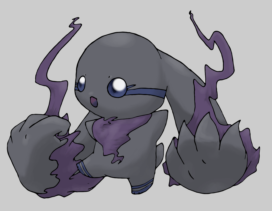
    Churisuto(my newest, probably my best, but the color messed up because my computer apparently sucks at viewing RGB)
    Spoiler:


    Boatt(2nd-best, I think)
    Spoiler:


    Flareleo(one of my worst)
    Spoiler:


    Mimibud(first time using this lineart method..)
    Spoiler:


    Vuplyro(2nd time using this lineart method, and it's not my fakemon, it's deidara-fuuka's from deviantart)
    Spoiler:
     

    gw

  • 14
    Posts
    14
    Years
    I like better boatt that the original silly water starter of the v gen.
    I also love how u drew the fox pok.

    Good job :^)
     

    blackmoonflower

    You won't like me if I'm angry
  • 271
    Posts
    14
    Years
    They all look impressive to me. Though Churisuto reminds me of Terriermon. lol. I do believe it is your best one.
     

    Hibaru

    Advanced Pokemon Trainer
  • 268
    Posts
    13
    Years
    I'm back!
    I have nothing fancy to say.
    Oh yeah.

    CRITIQUE NICELY.
    "They look terrible" is not a critique. It's an opinion or insult. TELL ME HOW TO DO BETTER.

    But anyway, some new sugimoris..

    Churisuto(my newest, probably my best, but the color messed up because my computer apparently sucks at viewing RGB)
    Spoiler:


    Boatt(2nd-best, I think)
    Spoiler:
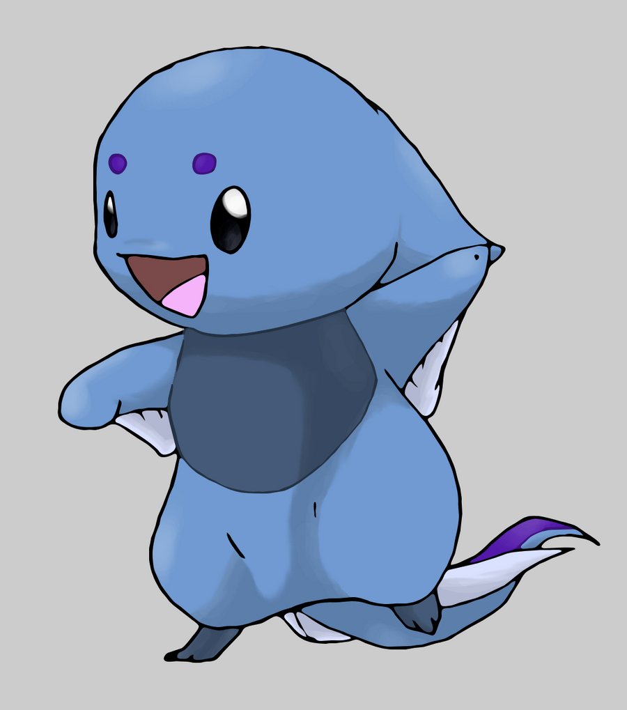

    Flareleo(one of my worst)
    Spoiler:
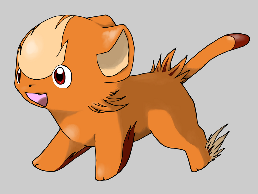

    Mimibud(first time using this lineart method..)
    Spoiler:


    Vuplyro(2nd time using this lineart method, and it's not my fakemon, it's deidara-fuuka's from deviantart)
    Spoiler:

    Oh! So you're that deidara-fuuka! I've always like Vulpyro and the others. You see, I'm that Satoshi444 guy! We're both best friends right? Hahaha! Love your works buddy!
     

    Nyu~♥!

    Pokémon Opal Producer
  • 478
    Posts
    14
    Years
    Oh! So you're that deidara-fuuka! I've always like Vulpyro and the others. You see, I'm that Satoshi444 guy! We're both best friends right? Hahaha! Love your works buddy!

    ...no.
    Did you notice that my deviantart links to someone called kitsukitty? :/
     

    CafekkoGira~

    Supreme King of Reverse World
  • 18
    Posts
    13
    Years
    Oh my shgdbykvusgkvku these are adorable! I'm in love with the first, the ebul! bunny-like creature! It reminds me of Terriarmon...Ahh, good times ^^

    Your style is quite accurate, you were imitating Sugimori-san's, yes? You've done an excellent job...
    I have to say, I'm very impressed but if you really want a critique I'd say just be a lil' more careful when tracing the lineart. Apart from that these are amazing! ^^
     

    shookie

    Often scatters things.
  • 851
    Posts
    14
    Years
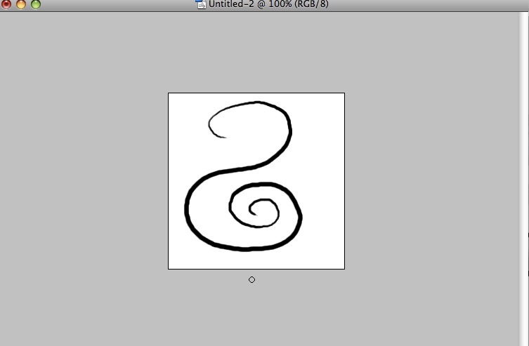
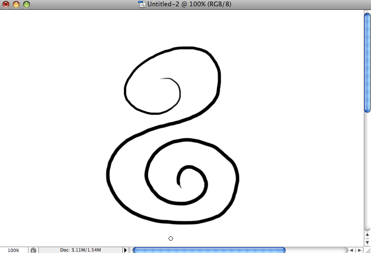
    Do you have a tablet or do you use a mouse? What program do you use, and what's your typical canvas/DPI size?

    I ask because the one thing that stands out is that some of the lines look uneven and scraggly in some places. The fix could be as simple as changing the DPI of your canvas when you work, or if you don't use a tablet, using a different tool (in this case, the pen tool).

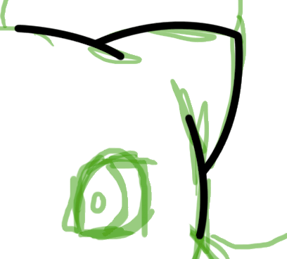
    For example, here's one picture at 250x250 px, the first at 72 DPI and the second at 300 DPI. Both are at 100% zoom and both are using the same size (8 px) brush.
    Spoiler:


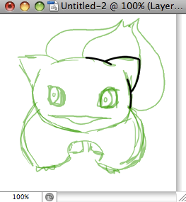
    If I were to draw Bulbasaur, for example, I'd normally use a canvas of 300 DPI. This is with the same 250x250 canvas, 10 px brush, at 300 DPI. I then resized the canvas to 72 DPI to see what it looks like if I were to upload or print it.
    Spoiler:

    You can see how the bottom of the ear is a little uneven, but once I see it at the actual size, it's smoothed out.

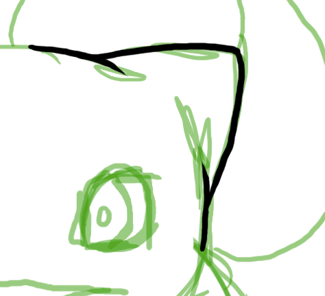
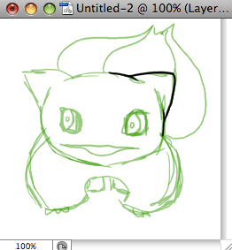
    The pen tool, on the other hand, pretty much guarantees that you'll have smooth linework once you get used to it. The real problem is exactly that, it takes a while to get used to but the results are really nice. I personally prefer this above manual digital "inking" because I have shaky hands so the brush tool makes me crazy after too long.
    Same brush size (10 px), first at 300 DPI then again at 72.
    Spoiler:

    You can add weight and use custom brushes with the pen tool as well, but for simplicity's sake I didn't do that here. :p
    (Sorry if you already know what DPI is and all of that, some people don't and it's just easier to explain it all in one go.)

    Other than that, the designs are really cute. I think Boatt is my favorite out of all of them :D
     

    Nyu~♥!

    Pokémon Opal Producer
  • 478
    Posts
    14
    Years
    Oh. Sorry then. Well, KitsuKitty is also my friend! Hahaha! A great artist she is eh?

    oh, you're that person.. who was talking about me to someone that was apparently my fan.. :/ it's a small World Wide Web.

    Oh my shgdbykvusgkvku these are adorable! I'm in love with the first, the ebul! bunny-like creature! It reminds me of Terriarmon...Ahh, good times ^^

    Your style is quite accurate, you were imitating Sugimori-san's, yes? You've done an excellent job...
    I have to say, I'm very impressed but if you really want a critique I'd say just be a lil' more careful when tracing the lineart. Apart from that these are amazing! ^^

    Yes, I'm working on the lineart. I use a .7 mm pen, I want a thinner one, but oh well. I'll have to wait.. i have to make it less thick, less wiggly..

    Do you have a tablet or do you use a mouse? What program do you use, and what's your typical canvas/DPI size?

    I ask because the one thing that stands out is that some of the lines look uneven and scraggly in some places. The fix could be as simple as changing the DPI of your canvas when you work, or if you don't use a tablet, using a different tool (in this case, the pen tool).

    For example, here's one picture at 250x250 px, the first at 72 DPI and the second at 300 DPI. Both are at 100% zoom and both are using the same size (8 px) brush.
    Spoiler:


    If I were to draw Bulbasaur, for example, I'd normally use a canvas of 300 DPI. This is with the same 250x250 canvas, 10 px brush, at 300 DPI. I then resized the canvas to 72 DPI to see what it looks like if I were to upload or print it.
    Spoiler:

    You can see how the bottom of the ear is a little uneven, but once I see it at the actual size, it's smoothed out.

    The pen tool, on the other hand, pretty much guarantees that you'll have smooth linework once you get used to it. The real problem is exactly that, it takes a while to get used to but the results are really nice. I personally prefer this above manual digital "inking" because I have shaky hands so the brush tool makes me crazy after too long.
    Same brush size (10 px), first at 300 DPI then again at 72.
    Spoiler:

    You can add weight and use custom brushes with the pen tool as well, but for simplicity's sake I didn't do that here. :p
    (Sorry if you already know what DPI is and all of that, some people don't and it's just easier to explain it all in one go.)

    Other than that, the designs are really cute. I think Boatt is my favorite out of all of them :D

    I don't know if I'd be a digital artist and not know about DPI. I used to use the pen tool and I left that method for my suigmoris to find a way to make more childlike lines, like Ken Sugimori does. I've come pretty close, but they're still too thick and awkward.
    Thanks.

    And I don't use Ps. I use The GIMP. (The GNU Image Manipulation Program) I don't have a tablet but I'm going to ask for one for my birthday or buy one after I reach $100 in my commission money.
    My DPI is 200; I scan the lineart and that's the default my scanner scans at. It just does. lol. I don't go for 300 because I save everything on my flash drive, my cpu is slow.. So that will make it save forever.. At least a minute. I'm easily angered and my computer is freezing every day, that's how it goes. My standard size is usually about half a page, but the DPI changes the print size.
    I need to sell my art for more. D: I should raise my sugimori prices..? How much would you guys pay for my sugimoris?


    Thanks for all the feedback.
     
    Last edited:

    Professor W.

    Squirtle Fan
  • 180
    Posts
    14
    Years
    Hello, Kitsu, or Nyu, anything goes, I guess. Just, uh, viewing. Ahem, allow to begin.

    Churisuto- Love the lineart, it's very smooth. The purple fuzz (?) shading texture is very good. The only thing I would change is the main body shading. Everything else is great!

    Boatt- Love this one, my favorite fake of your's ever since a younger version of mysel first saw it a year ago. Flawless, and still great. Mijumaru should be jealous of such a great design!

    Flareleo- It's not TERRIBLE, but it could use some improvement, mainly in the tail and eyes. The tail's a bit sloppy, and the eyes are, well, I dunno, a bit too flat. It's a good design and concept and design, but looks a bit too much like a Digimon. It's good though, don't get me wrong, it defiantly has good shading and body shape.

    Mimibud- Not too much to say 'bout this one. It's a bit rough on the outline, and the eyes are a bit pointy (poor thing) but otherwise it's good.

    Vulpyro- Vulpix alt evolution? I like this one, it's very smooth and has excellent shading. But, is that ear hair? O.o

    Keep up the good work, and it's great to see that you're still drawing!

    ~Prof. W.
     
  • 30
    Posts
    14
    Years
    • Seen Jul 7, 2014
    They're all so cute! xD

    Where'd you learn how to do art like that/what program? o_O
     

    Nyu~♥!

    Pokémon Opal Producer
  • 478
    Posts
    14
    Years
    Hello, Kitsu, or Nyu, anything goes, I guess. Just, uh, viewing. Ahem, allow to begin.

    Churisuto- Love the lineart, it's very smooth. The purple fuzz (?) shading texture is very good. The only thing I would change is the main body shading. Everything else is great! I actually thought the main body shading was the best part! Oh well. I've too much work to redo anything at the time.

    Boatt- Love this one, my favorite fake of your's ever since a younger version of mysel first saw it a year ago. Flawless, and still great. Mijumaru should be jealous of such a great design! Ok, thanks.

    Flareleo- It's not TERRIBLE, but it could use some improvement, mainly in the tail and eyes. The tail's a bit sloppy, and the eyes are, well, I dunno, a bit too flat. It's a good design and concept and design, but looks a bit too much like a Digimon. It's good though, don't get me wrong, it defiantly has good shading and body shape. For the record, flareleo is my worst official Hiatu fakemon. Period. I'mma re-do the art again, but probably after the demo is released.

    Mimibud- Not too much to say 'bout this one. It's a bit rough on the outline, and the eyes are a bit pointy (poor thing) but otherwise it's good. It's pretty old, it's the first time I made lineart like that.

    Vulpyro- Vulpix alt evolution? No. I like this one, it's very smooth and has excellent shading. But, is that ear hair? O.o Is there a problem with ear hair? :o

    Keep up the good work, and it's great to see that you're still drawing!

    Thanks.

    They're all so cute! xD

    Where'd you learn how to do art like that/what program? o_O

    Never ask an artist how they learned to draw "like that"...! Only the good artist knows how to draw without tracing out of a drawing book. I didn't listen to art class back in elementary school, as a matter of fact, I downright hate art class. I didn't "learn" it, I did it. And I kept doing it. I was fascinated by professional works and decided I would keep drawing(if it weren't for my sisters, I would've never started).

    I can't blame you for not knowing the program I use, I didn't put it on the first post (stupid me!) I use The GIMP. It's freeware.


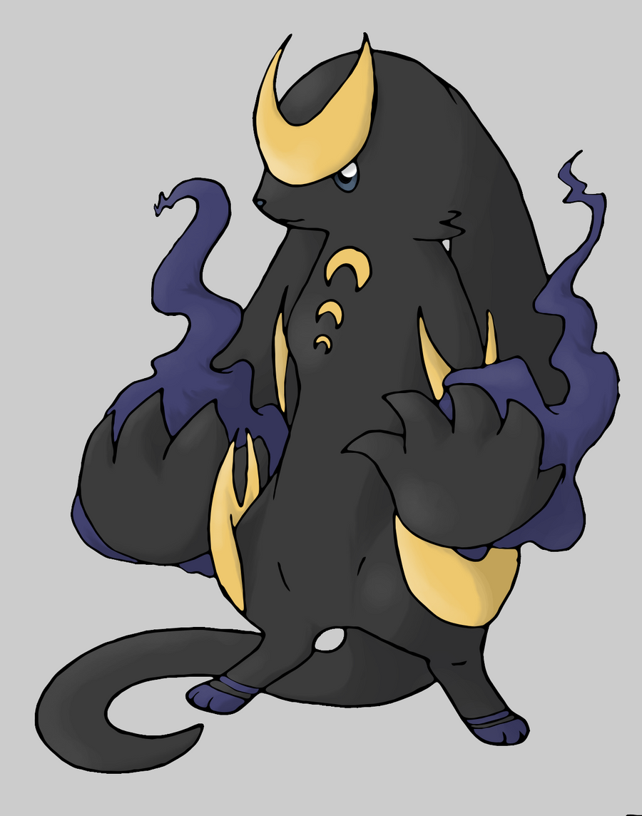
    Here's an old one I forgot to post.. D: Better size here: https://kitsukitty.deviantart.com/gallery/#/d2szqed
    Spoiler:


    One of Churisuto's evolutions.


    Back
    Top