• Our software update is now concluded. You will need to reset your password to log in. In order to do this, you will have to click "Log in" in the top right corner and then "Forgot your password?".
  • Welcome to PokéCommunity! Register now and join one of the best fan communities on the 'net to talk Pokémon and more! We are not affiliated with The Pokémon Company or Nintendo.

Forever Lasting; Profile Design

Alternative

f i r e f l y .
  • 4,262
    Posts
    15
    Years
    Forever Lasting; Profile Design


    [alink id="rules"]Rules[/alink id] // [alink id="dsgns"]Designs[/alink id] // [alink id="form"]Form[/alink id]

    Disclaimer: This is only available to supporters and staff currently, since they are the only people with access to designing their proiles with images and backgrounds.

    [a id]rules[/a id]

    Rules

    - I have the right to say no to any request if I feel I can't do it.
    - Follow all Graphics and Photography rules, as well as forum-wide rules.
    - No repetitive asking about completion of your profile.
    - Please give me high-quality images to use, if applicable.
    - For me to do your request, please fill out the form below.
    - Do not alter the profiles' images in any way, including removing the watermark credit from them.


    [a id]dsgns[/a id]

    Designs

    (Click on the images to make them bigger; to their original size)
    Forever Lasting; Profile Design

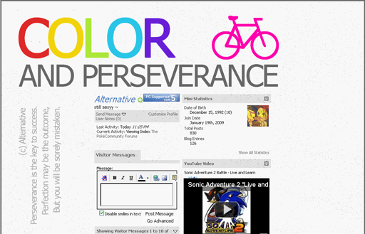
    Color and Perseverance:
    One of my earlier concepts and my entry for the latest Prettiest Profile Contest. I used a simple text style and using some deep meaning. Rainbow colours with a grey monotone are used.
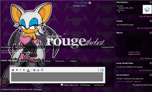

    Forever Lasting; Profile Design

    Rouge the Bat: Another one of my early deisgns. This is Rouge the Woobat Bat from the Sonic the Hedgehog series, who is a treasure hunter, and a darn good one at that. I've used a purple style to fit with the theme, and a silhouette tile background of an evil heart.
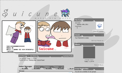

    Forever Lasting; Profile Design

    Suicune makes Eusine moist: A gimmick profile at best. It's made to make someone laugh when you view the profile though. I got the idea from someone's Nuzlocke Challenge comic, which I've used for the images. Credit to Shiny Politoed for those images.
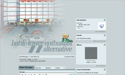

    Forever Lasting; Profile Design

    Battle Tower: My latest design. I wanted to go with a more professional design and make it more seriousness. The username is prenented there, as the username which is usually there isn't visible to people. I've used the stock images of the battle tower interior and Palmer's battle sprite.


    [a id]form[/a id]

    Form

    McPadding: Color and Perseverance ~ Extra3: Battle Tower ~ None: Rouge the Bat

    Images (if applicable):
    Padding:
    Text (if applicable):
    Extra:

    Due to me being lazy, I'm only taking three requests at a time.
    1.
    2.
    3.


    moments.

    quixotic
  • 3,407
    Posts
    15
    Years
    Good to see this off the ground finally.

    Just a comment about the Battle Tower design, the text and sprite and in areas, the main image all look bit blurry / low quality. The other designs seem to avoid this issue, but it is somewhat concerning that your most 'professional' looking one, is actually being let down a lot by bad quality images / text. Either you didn't save those images as a .png file, or it got resized automatically by the PC album thing, so either resize the original image file and reupload it, or create a copy as a .png format.

    Also, how did you manage to hide the username and supporter badges from the battle tower design? I'm guessing some CSS or something.

    Finally, for the profiles with McPadding, they look really squashed and not that appealing to be honest which is to do with your resolution. I know this can't really be changed, but this is a major reason why a lot of people still don't like McPadding. I'd invest some time designing profiles without the McPadding feature to showcase so people know the other options they can choose from when requesting. I must say, personally, I like the McPadding, but I'm using an iMac with a fairly large screen, so it barely gets squashed at all, but a lot of people don't have such computers.

    Here is a screenshot of your current profile on my resolution:
    Just so you can see the differences and that McPadding honestly looks much better on a larger resolution and should be stated in your first post so people know more about how their future profile might look, and to save you doing heaps of work and then the requestee not liking it because their resolution made it look irksome.

    Just some thoughts.
    Good luck.
     

    Alternative

    f i r e f l y .
  • 4,262
    Posts
    15
    Years
    The main image in the battle tower profile is meant to look like it was drawn, and not a graphic like you would see in the games, but if you meas as a whole, I don't know why it'd do that. I save all my things as png's and they're all the same size, so I don't know why it would do that. As for hiding my username, it's using Extra3 for padding, and making the youtube video your profile picture. :D

    As for the McPadding, my resolution is 1152 x 864 so it's pretty small for me. To be honest it was my first profile using McPadding, so I'll probably try to keep away from McPadding for a while, until my resolution can be fixed with a bigger and better computer monitor.
     
    Back
    Top