
NerdSparks
Avatar/Sig Maker
- 106
- Posts
- 15
- Years
- Seen Dec 20, 2016
I appreciate CnC, meaning please tell me what you truly think of what I've done. Tell me what you like, don't like, and how you think I could make it better. Anything labeled free to use, is free to use just let me know. And without delay:
----
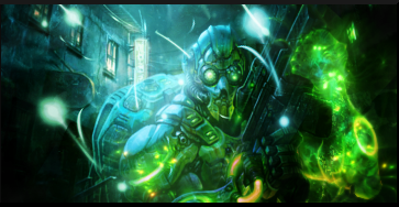
New Set
FREE TO USE
FREE TO USE
FREE TO USE
FREE TO USE
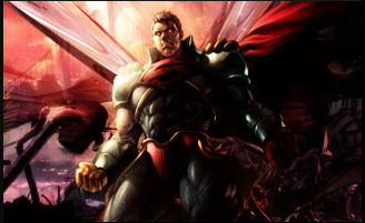
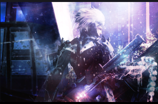
Iron Man
FREE TO USE
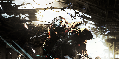
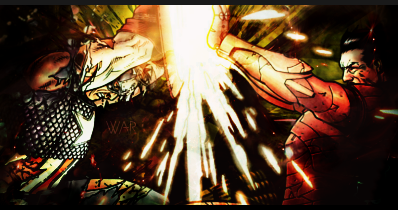
Kill Samurai
----
Old Signatures
Heatran
Itachi
Haseo
Light Yagami
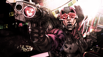
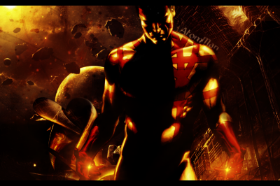
Gun Guy
Iron Man
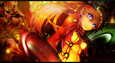
Black Rock Shooter
Couple
Revy
Monster
Bakuman
----
New/Favorite Signatures
FREE TO USE
FREE TO USE
FREE TO USE
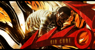
FREE TO USE
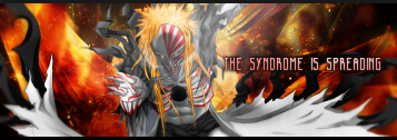
FREE TO USE
FREE TO USE
FREE TO USE
FREE TO USE
----
----
New Set
FREE TO USE
FREE TO USE
FREE TO USE
FREE TO USE
Iron Man
FREE TO USE
Kill Samurai
----
Old Signatures
Heatran
Itachi
Haseo
Light Yagami
Gun Guy
Iron Man
Black Rock Shooter
Couple
Revy
Monster
Bakuman
----
New/Favorite Signatures
FREE TO USE
FREE TO USE
FREE TO USE
FREE TO USE
FREE TO USE
FREE TO USE
FREE TO USE
FREE TO USE
----
Last edited: