• Our software update is now concluded. You will need to reset your password to log in. In order to do this, you will have to click "Log in" in the top right corner and then "Forgot your password?".
  • Welcome to PokéCommunity! Register now and join one of the best fan communities on the 'net to talk Pokémon and more! We are not affiliated with The Pokémon Company or Nintendo.

Immersion

moments.

quixotic
  • 3,407
    Posts
    15
    Years

    Alrighty. I am going to try taking requests and I am going to make these strict as pudding cause I've never done them and I don't specialise in those pokemon/anime ones which seem to be oh so popular. You must follow the form or your request will be denied.

    TAG REQUEST FORM:
    image: (provide a link to a high quality image either stock or render. It must be high quality or it is denied.)
    text: (if you want any text type it exactly as you want it or leave blank if you don't want any. Please keep text short, like a word or two, no sentences.)
    icon: (do you want a matching icon to go with it? y/n)
    other: (anything you want specifically, [vertical tag, colours etc] however I might deny some if I find it hard to fit into the tag with the given image)

    I'm not putting size in there because I make better tags when I choose a size suitable for the image. If you really want a custom size, for example if you want a vertical tag or something small or big whatever, place it in the 'other' bit.
    To reiterate, if you post a low quality image, I will likely deny on the spot.
    I will only take 2 requests at a time to avoid floodage, if you see I am full, do not request, if you are unsure, send me a visitor message and I can confirm.

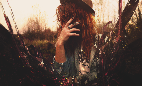
    Immersion


    Immersion


    Immersion


    Immersion


    Immersion


    Immersion

    (100% scratch.)​
     
    Last edited:

    moments.

    quixotic
  • 3,407
    Posts
    15
    Years
    *gasp*! Is all of it is your made? Coool...
    'Tis all mine, thanks for the comment! :D

    Nice work like always!

    https://30.media.tumblr.com/tumblr_l3zv9v0zug1qcql6lo1_500.png
    That one is my favorite. It gives out a special "feel" for me :3
    That was the first tag after a little break and I guessed I inspired myself to spit out a few more piece cause it was the first one I was happy with for a while. Thanks for the comment!

    No more tags just yet, gimme a bit.
     

    moments.

    quixotic
  • 3,407
    Posts
    15
    Years
    Lots of love here. D:

    Mini update, sorry I haven't been doing many cause I've been busy with other things recently.

    Immersion


    Immersion
     
  • 130
    Posts
    13
    Years
    • Seen Jan 8, 2023
    the first one is good...just remove the drip effect...secound just looks like effects (gmap and things like that) with a c4d...3rd is nice just fix the text..the rest are good except the last 2 you posted more recently.
     

    Renyui!

    ascender
  • 1,402
    Posts
    16
    Years
    'sup, just hear on a lonely saturday afternoon

    nice stuff man,
    https://30.media.tumblr.com/tumblr_l552avPCHx1qcql6lo1_500.png
    this one is really nice, good flow, good lighting, pretty much perfect XD. the only way i can think to improve on it would be maaaaaybe a bit more depth in some areas? :P

    https://29.media.tumblr.com/tumblr_l5aq4aN21O1qcql6lo1_500.png
    this one is good also, but not quite as strikingly good as the previous tag. colours are nice, and the depth is alright, but there just seems to be too much focal. i mean, like, its a bit different from you're usual style, cause like everything in the banner just jumps out at you, where as with the majority of your other tags aren't as overflowing with colours (its a good effect in some styles, but when it comes to yours, not so well) or distracting. But, pretty good man.
     
  • 13,373
    Posts
    14
    Years
    • Age 29
    • Seen Jan 28, 2019
    Immersion


    This one is pretty neat, nice color, nice render. :D

    Immersion


    For some reason I am attracted to this one XD
    Once again nice color, nice render XD
     
  • 10,674
    Posts
    15
    Years
    • Seen May 19, 2024
    I'm gonna run through some of my favourite here and just say what I like and don't like. Some of your stuff out weighs the rest in quality I must say and with each tag you seem to be improving. Though what I will say is, your style is jumping around a little bit. I can't tell if you want to be that sort of typical FringeFX artist that I see in this tag or if you want to be the pastel colour maestro I see in this one. Either way, your style is dope, if you stick around this sort of era and improve on them. In any case, I digress, onto the tags.

    My favourite by far in your opening post is this one. I'm not usually very impressed by vertical tags I'll be honest, but I've learned that the key to an effective one is; simplicity. You've acheived that here. But don't take it the wrong way, simplicity doesn't mean that it's easy to make. Simplicity is something is something I struggle with at times but you've oulled it off here and rather than doing flashy effects you've kept the flow of the original stock with a nice text placement. I imagine text was difficult though, I might have opted for a soft red but yellow works too even if it does blend a little with the flowers. In saying that any other colour might have clashed a lot. I very much like it, though I think it could have done with a little more depth, smudging, blurring and sharpening used very subtley to make this a little deeper. In any case, it's my favourite of the bunch within your first post.

    Your latest two are what I'm going to touch on, firstly I looked at this and said to myself "lights, lights, lights, bad idea". What I mean by that was, there's multiple lighting sources. I see you were trying to make them run with the flow but with that they sort of ended up diverting my eyes from where the flow is. Think of the rule of thirds for a moment, it's very seldom you will have a light source in more than one of the thirds. You have 3 or 4 lighting sources due to those brushed circles. The lighting source is directly behind his back as the rest is darker. With that said there is also the option to add effects at his elbow and at his raised hand where the action stops or changes dramatically. This tag does flow, but if you could complain about the created flow it would be that it's sort of in the wrong direction. It's like he's pulling the chains from the flow (the read brushing) which ends up going the opposite way, so this ends up going in two directions. At a first glance, I would say that it does flow nicely, but upon further observation I began to notice a few things such as the aforementioned. It was a well composed tag, however, just not in the right places. The render also seems sort of pasted and doesn't blend well on the left. If I looked at this tag and had never seen any of your other works, I would say that you very seldom work on renders as you've missed out on some of the key elements or at least muddled them up a small bit. Decent colour choices though, pity that it didn't all come together like it could have. The render also needs to be more strongly coloured or enhanced by duplication I suppose as it's a little too washed out colourwise compared to the stong red ahead of it. Some good elements of the tag, some not so good ones but I always seem to be better at picking out negativity but in saying that, it should give you an insight into what went wrong. Have a little more practice with renders if that's the way you want to go. They are great practice for working on flow and technique but can easily go wrong if you don't watch your preparation.

    I freaking love this. It's your best so far imo. The colours are tasty, the star stock works prefectly and just doesn't create more lighting spots even though it's strong, it all flows supurbly. I don't think I can find much wrong with it to be honest, though maybe a slight lack in depth again, so blur, smudge and sharpen. Contour her body a little bit, make it stand out from the background as best you can. Also bring out her face, seems to be the epicenter of the focal and should be more defined. Great work though, you should be happy with it. Keep heading in that direction, keep getting those colours (that I really can't figure out how you get though I've never seen the stock) and you'll be creating some great stuff.

    Why not try some larger pieces? You'd be used to IRL stocks by now so why not start there? I'd like to see what you come up with. Keep it up.
     

    scotlineV3

    I ♥ Krabby Patties (XDDDD)
  • 27
    Posts
    13
    Years
    • Seen Aug 15, 2014
    WOW
    Its so AWESOME all Your pictures, i really like them all, U are so PROFESSIONAL!

    Make more pics!

    See ya! :)
     
  • 177
    Posts
    13
    Years
    • Seen May 9, 2012
    Honestly, your stuff is awesome. Some neat stuff here.
    First one: The transition of colors is a bit sudden and the focal is hard to tell what it is. Clean it up a bit.
    Second one: Too bright around the trees. Add less space stocks.
    Third one: This is my favorite. Colors are pleasing to the eyes, depth is good. Nothing to criticize here.
    Fourth one: It's a bit too messy and there's too much negative space. Fractal's aren't that good in this piece.
    Fifth one: Light source is too bright and it's also messy.
    Sixth one: Nice atmo, but colors need a bit of work.
    Seventh: The red has too much threshold(something like that) and the effects aren't too pleasing.
    Eighth: Looks nice, needs to clean up the sparkles though.
     

    moments.

    quixotic
  • 3,407
    Posts
    15
    Years
    @Renyui
    Thanks for ze comments my special rowan!

    @Charizard★
    Thanks for the comments, I'm working on my colours to make them even sexier, watch out. ;P

    @Abnegation
    Holy awesome comment more people comment like this please! Anyways, you said my style jumps around, and that's cause I don't really have a style, nearly all my tags are experimental going for different aesthetics and looks and what not and I try to incorporate many different techniques I've used in the past into tags. But yeah, super thanks for comments.

    @scotlineV3
    Thanks you, I'm certainly not professional, I do what I do cause it is a release and is fun!

    @Cycle
    Thanks a munchkin for the comments, good to hear some constructive crit not all praise, so thanks a bunch!

    Alrighty firstly an update and then the juicy stuff.
    Immersion

    Immersion
    Immersion


    And a mini taste of my attempt to get back into icons. Again, a mini taste.
    Immersion
    Immersion


    Alrighty. I am going to try taking requests and I am going to make these strict as pudding cause I've never done them and I don't specialise in those pokemon/anime ones which seem to be oh so popular. You must follow the form or your request will be denied.

    TAG REQUEST FORM:

    image: (provide a link to a high quality image either stock or render. It must be high quality or it is denied.)
    text: (if you want any text type it exactly as you want it or leave blank if you don't want any. Please keep text short, like a word or two, no sentences.)
    icon: (do you want a matching icon to go with it? y/n)
    other: (anything you want specifically, [vertical tag, colours etc] however I might deny some if I find it hard to fit into the tag with the given image)

    I'm not putting size in there because I make better tags when I choose a size suitable for the image. If you really want a custom size, for example if you want a vertical tag or something small or big whatever, place it in the 'other' bit.
    To reiterate, if you post a low quality image, I will likely deny on the spot.
    I will only take 2 requests at a time to avoid floodage, if you see I am full, do not request, if you are unsure, send me a visitor message and I can confirm.
     

    Renyui!

    ascender
  • 1,402
    Posts
    16
    Years
    I'm on this like crazy.

    image: anti-venom
    text: i'unno, if you can come up with something, throw it in.
    icon: yess'm
    other: b&w pleaaase, and just go crazy with your mad style.

    FIRST FUGGIN' REQUEST

    thankies moments

    *edit
    wait, i just took a closer look at the image and it's pretty average, so here is a somewhat better one. Sorry that they are pretty average pictures ): but yeah, thaaaaanks!
     

    moments.

    quixotic
  • 3,407
    Posts
    15
    Years
    Immersion

    Immersion

    Immersion

    Renyui's request finito.
    There you go, if you want anything changed, seriously tell me and I'm happy to do it.
     

    Renyui!

    ascender
  • 1,402
    Posts
    16
    Years
    AWESOMEAWESOMEAWESOMEAWESOME

    AWESOME

    Man, that is top work right there, moments. I wasn't sure if you'd be able to pull it off, but you did, and it looks great. Thanks!
     

    moments.

    quixotic
  • 3,407
    Posts
    15
    Years
    Sorry Zirkle, I've been busy and I've tried like 3 times working with that image, but it's not great quality and it isn't easy to work with cause it's small...

    Comic, accepted. Be warned you are getting pure experimental craziness, so if it turns out a bit wack, not my fault. :P
     
    Back
    Top