You are using an out of date browser. It may not display this or other websites correctly.
You should upgrade or use an alternative browser.
You should upgrade or use an alternative browser.
Inspiration-
- Thread starter nSpire
- Start date
More options
Who Replied?- 1,396
- Posts
- 16
- Years
- The suburbs, and no I don't need to describe much
- Seen Dec 21, 2015
Im proud that you are creating "faptastic" work as a 12 year old, but at the same time I can still find a few things you must improve in your work.
Instead of bombarding you with advice, and saving me some time I decided to give you advice on only one aspect in which you suffer.
Sorry if you don't agree with my critique, but its just my two cents. Good job, and keep making graphics.
Instead of bombarding you with advice, and saving me some time I decided to give you advice on only one aspect in which you suffer.
- Color
The Color in your tags are either monotonous and bland, or clash with your focal.
Take pete.png for instance: I love the colors of the effects (and the effect itself), yet the neon-ness of the colors don't work with the focal. In forcing those colors Pete's poor skin looks awkward floating there.
In burninup.png you exhibit, once again, cool effects which's color screw you up a bit. To me it seems in this tag you found a color that worked perfectly, but over used it. Instead of using red as a "main color" (for lack of a better term) you simply only use red, making the whole sig look boring.
Sorry if you don't agree with my critique, but its just my two cents. Good job, and keep making graphics.
Inv4sion
A weakling I see, what a pity.
- 110
- Posts
- 13
- Years
- Belmont, CA
- Seen Jan 20, 2011
I dont like how you always use sparkles.
I dont like how you always use sparkles.
My sparkle fractals/stocks are awesome D:<
- 16
- Posts
- 13
- Years
- Seen Aug 6, 2010
pretty sick..keep up the good work..even i cant do em.
Inv4sion
A weakling I see, what a pity.
- 110
- Posts
- 13
- Years
- Belmont, CA
- Seen Jan 20, 2011
yeah but I dont like how almost very sig seems to look the same. The sparkles are cool it just seems too repetitive
Thanks.pretty sick..keep up the good work..even i cant do em.
That's because it's my style, yo.yeah but I dont like how almost very sig seems to look the same. The sparkles are cool it just seems too repetitive
- 24
- Posts
- 14
- Years
- Seen Dec 7, 2016
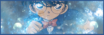
Colors is what you need to work on the most in the last three sigs imo. They all seem bland. The first one's(green one) focal is transparent basically and even though there are a whole bunch of effects none of them seem to compliment the focal.
In the CSI NY one like you said text is meh and the c4ds seem thrown on there and they cover a bit much of the focal. It seems incomplete to me.
Last one looks really plain cause all the effects that are added are barely visible and I don't like the border in it.
In the CSI NY one like you said text is meh and the c4ds seem thrown on there and they cover a bit much of the focal. It seems incomplete to me.
Last one looks really plain cause all the effects that are added are barely visible and I don't like the border in it.
harmonic ♫
red is a pain in the a'
- 53
- Posts
- 14
- Years
- Age 31
- Chicago
- Seen Aug 20, 2010

I like this one, depth looks pretty good.
- 10,673
- Posts
- 15
- Years
- Seen Dec 30, 2023
Straight up, you've gotta cut the fractals/sparkles, they're killing your tags completely. The Pete Wentz tag is where it works best yet the colours are still really off. Also, I noticed you followed a tutorial for your LP, this one, when doing tuts you should really aim for something different rather than just redoing a piece. Your latest two tags seem really low quality also, they're very blurry and I don't see any flow, something you need to work on is going with a new style other than over using sparkles and also work on keeping the quality of your stocks.
I didn't follow that tutorial, it was one I found on youtube, Iunno if that counts, and im a fractal ***.Straight up, you've gotta cut the fractals/sparkles, they're killing your tags completely. The Pete Wentz tag is where it works best yet the colours are still really off. Also, I noticed you followed a tutorial for your LP, this one, when doing tuts you should really aim for something different rather than just redoing a piece. Your latest two tags seem really low quality also, they're very blurry and I don't see any flow, something you need to work on is going with a new style other than over using sparkles and also work on keeping the quality of your stocks.
here's my latest sig, im trying to create my own style.

Aizuke
[b]long sword style[/b]
- 3,025
- Posts
- 16
- Years
- Canberra, Australia
- Seen Nov 6, 2015
Hmm, your latest work looks rather blurry. And the text is rather hard to read, I didn't even realise it was there until just a moment ago, regardless if I just woke up. But the light and darkness doesn't really work well, seeing as how the render of Vin Diesel is dark, it would have been better off with made with a dark background and what not. And also empty space, quite the downfall. :x You could chop off half the tag and not use it, since the left side of the tag doesn't really offer much.


