• Our software update is now concluded. You will need to reset your password to log in. In order to do this, you will have to click "Log in" in the top right corner and then "Forgot your password?".
  • Welcome to PokéCommunity! Register now and join one of the best fan communities on the 'net to talk Pokémon and more! We are not affiliated with The Pokémon Company or Nintendo.

just testing a card

PalkiaSpace

Panda Hugger <(^_^)>
218
Posts
14
Years
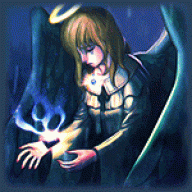
  • i was thinking about make a small 30-60 card set like this, but i wasn't sure if they were even good.

    i know i don't have the right fonts, or sizes of some things, (i'm doing this freehand on paint) so don't be rude and be like: "you have all of the fonts wrong" Yeah, i know.

    i just want to know if any body was intrested so i would make more.
    if a lot of people post and are intrested, i'll keep putting them.

    here's the first: (it lost quility because i had to save as a jpeg)
     
    3,046
    Posts
    15
    Years
    • Seen May 11, 2016
    For this one, 'paralyzed' should have a capital 'P'. And upon looking at other Electivire cards, your card's HP seems a bit too high. Perhaps it should be in the 120's or 100's?

    One last thing, you got the fonts wrong! *shot* it seems like the top and bottom of the Steel symbol has been cut off. Why is that?​
     
    3,046
    Posts
    15
    Years
    • Seen May 11, 2016
    sannythehedgehog said:
    the font doesn't really match the type of the actually pokemon cards

    Err. . *cough*

    PalkiaSpace said:
    i know i don't have the right fonts, or sizes of some things, (i'm doing this freehand on paint) so don't be rude and be like: "you have all of the fonts wrong" Yeah, i know.

    Perhaps you should read through before reviewing next time?​
     

    PalkiaSpace

    Panda Hugger <(^_^)>
    218
    Posts
    14
    Years
  • For this one, 'paralyzed' should have a capital 'P'. And upon looking at other Electivire cards, your card's HP seems a bit too high. Perhaps it should be in the 120's or 100's?​

    oh! yeah, i'll change it to 110.


    One last thing, you got the fonts wrong! *shot* it seems like the top and bottom of the Steel symbol has been cut off. Why is that?

    hmm. i'm actually not sure about that.
     

    Sonota

    ~Desu
    4
    Posts
    14
    Years
    • Seen Apr 8, 2012
    Am I the only one who can spell? Tehe, "opponent" (your spelling is oponent) is how it's supposed to be spelled..
     
    3,046
    Posts
    15
    Years
    • Seen May 11, 2016
    Electivire is much better.

    Bulbsaur's text has a lot of white dots around it, making it look really low quality. But it's overall very well done.

    Dusknoir's picture looks good, but the white dots detract from the appearance. The text at the very bottom is incredibly difficult to read. The text is just low-quality. And you spelled Pokémon with a lower-cased 'p'. And 'Duskoir lv.X' should be 'Dusknoir LV. X'.​
     

    PalkiaSpace

    Panda Hugger <(^_^)>
    218
    Posts
    14
    Years
  • Electivire is much better.​


    Bulbsaur's text has a lot of white dots around it, making it look really low quality. But it's overall very well done.

    Dusknoir's picture looks good, but the white dots detract from the appearance. The text at the very bottom is incredibly difficult to read. The text is just low-quality. And you spelled Pokémon with a lower-cased 'p'. And 'Duskoir lv.X' should be 'Dusknoir LV. X'.

    i'll try to make the quility of the text better, and i'll change the p and lv. X. they should be up later and mabey another 1 or 2.
     

    PalkiaSpace

    Panda Hugger <(^_^)>
    218
    Posts
    14
    Years
  • wooh! good news! i got better quility text on Bulbasaur and Dusknoir lv. X
    and i have a steelix and steelix lv. X in the making.
    (probably by tomarrow)
     

    Empty Pot

    a new beginning...
    1,234
    Posts
    14
    Years
  • I think they are all really good but I only find 2 things distracting me from thinking it is perfect.

    1. Renders are not the best, some have the dreaded white line.
    2. The energy symbols look jagged. Looks like some of it was cut off

    But other then that, it looks great.
     

    PalkiaSpace

    Panda Hugger <(^_^)>
    218
    Posts
    14
    Years
  • Here's steelix lv. X! the reason why where the name steelix isn't in the box at the bottom for lv. x's is becuase i couldn't write it right and it looked stupid the way i had it so i just scribbled it out with the colors.


    Coming soon is......
    Spoiler:
     

    PalkiaSpace

    Panda Hugger <(^_^)>
    218
    Posts
    14
    Years
  • heres a stupid bidoof. i got bored and drew a bidoof like a month ago and i figured, i have my own art already, so why don't i put it on a card?

    i finally found sp blanks so i'll start doing them.
     
    Back
    Top