Our software update is now concluded. You will need to reset your password to log in. In order to do this, you will have to click "Log in" in the top right corner and then "Forgot your password?".
Welcome to PokéCommunity! Register now and join one of the best fan communities on the 'net to talk Pokémon and more! We are not affiliated with The Pokémon Company or Nintendo.
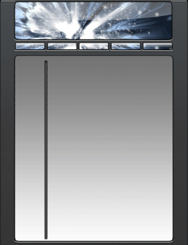
did you slice it yet? that's the real work ZD (i used to make layouts...) the background looks like they used a glow-like brush for the lights flying around, and the cluster in the middle seems like... multiple reversed gradients with Find Edges... :\ it's pretty good ^^,
It's pretty good. But you need to set margins on the area where links like "home" and "contact" are otherwise they sit right against the edge of the layout.
I love that layout. It's really good. What effects did you use and program? I don't think
your layout looks outdated. I think it looks perfectly cool. You should try those effects in a backround for banners.
The first one's kinda outdated, like Casey said. But nonetheless, it's pretty good.
The second one... well, I could go on and on about how much I dislike Times New Roman, but I won't. xD Apart from the forementioned problem, it's pretty good too.