Firstly, you need more Capital Letters™. The story is also very short; tell us more about what happens.
Secondly, 'screenshots' usually means actual screenshots, not just mock-ups; if you're going to post mock-ups, you should label them as such.
Thirdly, your colours don't go well together. Not only does using blue and orange on the battle info box look bad, it (along with the transparency and small font) makes it nearly unreadable.
Fourth, Comic Sans, as the name suggests, is designed for comics. Don't use it in a game.
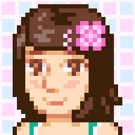
Fifth, your sprites (on the menus) need work. They lack shading and smoothing; never use pure black on a sprite. Use a darker shade of the sprite's main colour to outline. Never use Paint's shape tools, as they look a bit unnatural; if you do, tweak them after. Finally, when you recolour, keep the relative brightness of the colours the same; on the blue bag, the colours on the bag are darker than the outline. This looks really weird.
And sixth, are you sure you can make all those different menus? You need to be very good at either scripting or eventing to make a new menu. Judging by what I can see, you're pretty new at this, so I'm not sure if you're up to the job.