PokéCommunity supports the Stop Killing Games movement. If you're a resident of the UK or EU, consider signing one of the petitions to stop publishers from destroying games. Click here for more information!
Welcome to PokéCommunity! Register now and join one of the best fan communities on the 'net to talk Pokémon and more! We are not affiliated with The Pokémon Company or Nintendo.
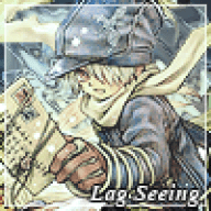
I almost always love the tidy signatures you make. This is no exception.
However I think the images it'self is slightly over sharpened or rough looking. text is nice and it's neat as usual. Nothing too innovative however. Definate 8/10
Gahh, the huge title line burns a little. x.x;
If there was a little more to your signature other then the heart and sprites I think it would look much nicer.. 6.3 out of 10
The random azelf drags it down...(Even if it looks cute, it ruins your theme.)
The spoiler is a good thing, because the pics in there don't appear to ruin the dark pic unless I click it. So, if the azelf goes into the spoiler (I am not too acurate on the siggy rules, so I don't know if you could.) your rating would go 1+ up.
8.3/10
The blue part of the text fades a bit too much into the sky, so it's a bit hard on the eyes.
The render's quality isn't too great either I'm afraid.. 6.8 out of 10