
Sonido
阿散井 恋次
- 253
- Posts
- 17
- Years
- Age 30
- Essex, England
- Seen Apr 24, 2009
I want to make this thread so people can rate me as a graphic designer. Please note some things, before you continue.
I only started making graphics recently, 2-3 weeks ago, to be precise and in that time I think I've progressed well in making some okay standard banners. Most of these, however have been following tutorials, so they don't have much creativity. I decided to open this gallery to show off some of my mediocre graphics skills and hopefully get help from other members of this forums graphics community.
Without further ado... the graphics.
Signature Sets
Please note these are in chronological order
#1
![[PokeCommunity.com] S o n i d o ' s Graphics Gallery. [Shop included]](https://i411.photobucket.com/albums/pp199/sweetspeed_bucket/Kurosakicopy.png "[PokeCommunity.com] S o n i d o ' s Graphics Gallery. [Shop included]")
Featuring Kurosaki Ichigo from Bleach. This was the day I received Photoshop, as soon as I got it, I thought "I'm going to make some world class banners." Speaks for itself, right?
#2
![[PokeCommunity.com] S o n i d o ' s Graphics Gallery. [Shop included]](https://i411.photobucket.com/albums/pp199/sweetspeed_bucket/Satoshi.png "[PokeCommunity.com] S o n i d o ' s Graphics Gallery. [Shop included]")
EEW! Just plain EEW, It's disgusting. Two Words. Smudge fail.
#3
![[PokeCommunity.com] S o n i d o ' s Graphics Gallery. [Shop included]](https://i411.photobucket.com/albums/pp199/sweetspeed_bucket/CharizardBanner.png "[PokeCommunity.com] S o n i d o ' s Graphics Gallery. [Shop included]")
I tried to implement some c4ds. I think it came out okay, however the text pretty much ruined it.
#4
![[PokeCommunity.com] S o n i d o ' s Graphics Gallery. [Shop included]](https://i411.photobucket.com/albums/pp199/sweetspeed_bucket/Weavile.png "[PokeCommunity.com] S o n i d o ' s Graphics Gallery. [Shop included]")
One of my more recent Signatures. It came out okay as well, nothing special and I could have probably done a lot better.
#5
![[PokeCommunity.com] S o n i d o ' s Graphics Gallery. [Shop included]](https://i411.photobucket.com/albums/pp199/sweetspeed_bucket/0sig_Stuntcar.png "[PokeCommunity.com] S o n i d o ' s Graphics Gallery. [Shop included]")
Probably my best sig. I tried to use the smudging and brushing to create flow and it worked okay. I didn't ruin it with text, yay!
#6
![[PokeCommunity.com] S o n i d o ' s Graphics Gallery. [Shop included]](https://i411.photobucket.com/albums/pp199/sweetspeed_bucket/Weavile2.png "[PokeCommunity.com] S o n i d o ' s Graphics Gallery. [Shop included]")
Made by following a tutorial from the Graphics and Photography tutorials thread. Thanks to Aizuke for the tutorial. It came out okay aswell.
#7
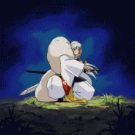
![[PokeCommunity.com] S o n i d o ' s Graphics Gallery. [Shop included]](https://i411.photobucket.com/albums/pp199/sweetspeed_bucket/Hitugaya.png "[PokeCommunity.com] S o n i d o ' s Graphics Gallery. [Shop included]")
A free sig made by me. It took me an hour to do.
Shop
If you're brave enough to ask for one
Please note before you ask for one, follow all Pokecommunity Rules and Graphics and Photography rules. Do not Flame, bash or insult anyone in the thread.
I take 2 requests at a time
->Form
Use to request, please follow.
Image: Must be a render or have a white background. Link please.
Size: Any size you want. I can attempt verticals
Effect: Any kind of specific effects done, if not leave blank
Banner, Avatar or Both (Delete as appropriate): Do you want a Banner, Avatar or Both
Text: And text in the banner?
Others: Any other effects or specifics you want for the graphic.
Final Word
Final word from me
This is my first ever time in the graphic world so the only thing I want to do is improve, I need you great graphic artists to help me do so and maybe, just maybe I could get better and improve. Thanks.
I only started making graphics recently, 2-3 weeks ago, to be precise and in that time I think I've progressed well in making some okay standard banners. Most of these, however have been following tutorials, so they don't have much creativity. I decided to open this gallery to show off some of my mediocre graphics skills and hopefully get help from other members of this forums graphics community.
Without further ado... the graphics.
Signature Sets
Please note these are in chronological order
#1
Featuring Kurosaki Ichigo from Bleach. This was the day I received Photoshop, as soon as I got it, I thought "I'm going to make some world class banners." Speaks for itself, right?
#2
EEW! Just plain EEW, It's disgusting. Two Words. Smudge fail.
#3
I tried to implement some c4ds. I think it came out okay, however the text pretty much ruined it.
#4
One of my more recent Signatures. It came out okay as well, nothing special and I could have probably done a lot better.
#5
Probably my best sig. I tried to use the smudging and brushing to create flow and it worked okay. I didn't ruin it with text, yay!
#6
Made by following a tutorial from the Graphics and Photography tutorials thread. Thanks to Aizuke for the tutorial. It came out okay aswell.
#7
A free sig made by me. It took me an hour to do.
Shop
If you're brave enough to ask for one
Please note before you ask for one, follow all Pokecommunity Rules and Graphics and Photography rules. Do not Flame, bash or insult anyone in the thread.
I take 2 requests at a time
->Form
Use to request, please follow.
Spoiler:
Image: Must be a render or have a white background. Link please.
Size: Any size you want. I can attempt verticals
Effect: Any kind of specific effects done, if not leave blank
Banner, Avatar or Both (Delete as appropriate): Do you want a Banner, Avatar or Both
Text: And text in the banner?
Others: Any other effects or specifics you want for the graphic.
Final Word
Final word from me
This is my first ever time in the graphic world so the only thing I want to do is improve, I need you great graphic artists to help me do so and maybe, just maybe I could get better and improve. Thanks.
Last edited:
![[PokeCommunity.com] S o n i d o ' s Graphics Gallery. [Shop included]](https://www.photosig.com/articles/1578/rule_of_thirds.jpg "[PokeCommunity.com] S o n i d o ' s Graphics Gallery. [Shop included]")
![[PokeCommunity.com] S o n i d o ' s Graphics Gallery. [Shop included]](https://i411.photobucket.com/albums/pp199/sweetspeed_bucket/ff1ava.png "[PokeCommunity.com] S o n i d o ' s Graphics Gallery. [Shop included]")
![[PokeCommunity.com] S o n i d o ' s Graphics Gallery. [Shop included]](https://i411.photobucket.com/albums/pp199/sweetspeed_bucket/ff1.png "[PokeCommunity.com] S o n i d o ' s Graphics Gallery. [Shop included]")
![[PokeCommunity.com] S o n i d o ' s Graphics Gallery. [Shop included]](https://i411.photobucket.com/albums/pp199/sweetspeed_bucket/Jump.png "[PokeCommunity.com] S o n i d o ' s Graphics Gallery. [Shop included]")
![[PokeCommunity.com] S o n i d o ' s Graphics Gallery. [Shop included]](https://i411.photobucket.com/albums/pp199/sweetspeed_bucket/NarutoBanner.png "[PokeCommunity.com] S o n i d o ' s Graphics Gallery. [Shop included]")
![[PokeCommunity.com] S o n i d o ' s Graphics Gallery. [Shop included]](https://img216.imageshack.us/img216/8293/flamebadgekl0.gif "[PokeCommunity.com] S o n i d o ' s Graphics Gallery. [Shop included]")
![[PokeCommunity.com] S o n i d o ' s Graphics Gallery. [Shop included]](https://img146.imageshack.us/img146/3319/tundrabadgeph2.gif "[PokeCommunity.com] S o n i d o ' s Graphics Gallery. [Shop included]")
![[PokeCommunity.com] S o n i d o ' s Graphics Gallery. [Shop included]](https://img340.imageshack.us/img340/9061/grimbadgeol7.gif "[PokeCommunity.com] S o n i d o ' s Graphics Gallery. [Shop included]")
![[PokeCommunity.com] S o n i d o ' s Graphics Gallery. [Shop included]](https://img294.imageshack.us/img294/2481/ghostbadgeur1.gif "[PokeCommunity.com] S o n i d o ' s Graphics Gallery. [Shop included]")
![[PokeCommunity.com] S o n i d o ' s Graphics Gallery. [Shop included]](https://img146.imageshack.us/img146/479/dragonbadgevf1.gif "[PokeCommunity.com] S o n i d o ' s Graphics Gallery. [Shop included]")
![[PokeCommunity.com] S o n i d o ' s Graphics Gallery. [Shop included]](https://i221.photobucket.com/albums/dd272/Espreon1/elitecrystal1.png?t=1211054699 "[PokeCommunity.com] S o n i d o ' s Graphics Gallery. [Shop included]")
![[PokeCommunity.com] S o n i d o ' s Graphics Gallery. [Shop included]](https://i221.photobucket.com/albums/dd272/Espreon1/elitecrystal2.png?t=1211043521 "[PokeCommunity.com] S o n i d o ' s Graphics Gallery. [Shop included]")
![[PokeCommunity.com] S o n i d o ' s Graphics Gallery. [Shop included]](https://i221.photobucket.com/albums/dd272/Espreon1/elitecrystal3.png?t=1211054777 "[PokeCommunity.com] S o n i d o ' s Graphics Gallery. [Shop included]")
![[PokeCommunity.com] S o n i d o ' s Graphics Gallery. [Shop included]](https://i221.photobucket.com/albums/dd272/Espreon1/elitecrystal4-alt.png?t=1211054778 "[PokeCommunity.com] S o n i d o ' s Graphics Gallery. [Shop included]")