• Our software update is now concluded. You will need to reset your password to log in. In order to do this, you will have to click "Log in" in the top right corner and then "Forgot your password?".
  • Welcome to PokéCommunity! Register now and join one of the best fan communities on the 'net to talk Pokémon and more! We are not affiliated with The Pokémon Company or Nintendo.

Shun_Kazami's Fakemon and Region

Shun1

Started Project RGSShun
  • 261
    Posts
    15
    Years
    Hello everyone,

    The following stuff is of random stuff from some of my games.

    the first one is a fakemon, I think this one is qite good what do you think?
    Shun_Kazami's Fakemon and Region


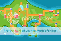
    This is the region map from my game

    Shun_Kazami's Fakemon and Region


    Also this is one of my tainer sprites.

    Shun_Kazami's Fakemon and Region


    Please tell me what you think.
     

    negative

    Life returns. Life prevails.
  • 501
    Posts
    15
    Years
    I like the whole Idea, but it needs some work:
    -the World map looks really nice:D
    -your fakemon needs a LOT of work, but I know nobody's perfect, so train a little XD
    -the same goes to the trainer!
     

    Azumi

    ★七色に光る女★
  • 1,631
    Posts
    16
    Years
    Shun_Kazami's Fakemon and Region

    I kinda like this one. It's quite creative, with the irregular-shaped lake and the structure of the island, but what's with the chopped off route below? It looks... unnatural... 8/10 here.

    Shun_Kazami's Fakemon and Region

    It's quite good when looked at separately, but when you put it all together, it's strange. Maybe the leaves are the hands, but... I don't know how to say it... Something bugs me, but I have no idea what it is...
    The shading is very good. So, overall, I give it a 7/10.

    Shun_Kazami's Fakemon and Region

    The hair is a bit strange. Maybe it's the pointy hair, I think it's really out of place, it should be put a little more right.
    Well, I'm not much of a good shader, but I THINK the dark red parts make the shirt look bad. You should colour the shirt with the lighter red, while shading with the darker red one. It looks better.
    Now, onto the belt + pants. The belt looks too normal to me. Perhaps you should add some more Pokeballs or even a bag. Yeah. The trousers are pretty normal to me.
    I'm not talking about the shoes. It's pretty normal to me.
    Overall, I give this a... 8/10. Yep.

    Keep on the good work, and you'll be a good spriter if you do more practise!!! ^o^ Let's keep it up~!
     

    Superjub

    Pokémon Aureolin
  • 2,288
    Posts
    16
    Years
    The world map looks good, however the cities, routes and stuff at the top right looks kinda cramped together. Also, I dont understand the most south-eastern route and city. How does it connect to the world map? :\

    As for the fakemon, it reminds me of Chicorita (not design wise) for some reason. Also, he leaves look awkward both being placed upwards. Maybe make it more downwards so it looks more natural? Also, is that a tail? Its design seems awkward (no offence :() but it could just be me :\
    Finally, for the trainer sprite, the right leg looks kind of chunky and short. Maybe make it more into proportion? Also, the shading is awkward and the head looks wierd. Anyway, good job and I hope you understand my post ;)
     

    Shun1

    Started Project RGSShun
  • 261
    Posts
    15
    Years
    Well Thank you for te good comments and thank you for the comments for the things I could improvve. The Fakemon was my first and to be honest I didn't really like it. the world map s for the old game which went wrong so there will be a new map soon. and the trainer does need a small improvement.
     
    Back
    Top