• Our software update is now concluded. You will need to reset your password to log in. In order to do this, you will have to click "Log in" in the top right corner and then "Forgot your password?".
  • Welcome to PokéCommunity! Register now and join one of the best fan communities on the 'net to talk Pokémon and more! We are not affiliated with The Pokémon Company or Nintendo.

Speed's GFX Showcase

Speed

Skyward
376
Posts
15
Years
  • I've been doing graphics for 3 years on and off, and while I've been in a slump, I've recently gotten back into it. It's a hobby of mine that I love, and I hope to improve more at it.

    Tags (In no order):
    Spoiler:


    Icons:
    Spoiler:


    Critique is appreciated. :p don't be too harsh though
     

    derozio

    [b][color=red][font=helvetica][i]door-kun best boi
    5,521
    Posts
    14
    Years
  • Speed's GFX Showcase


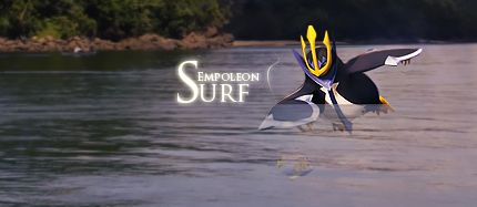
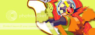
    Oh wow, a sprite tag!?! It has been quite a while since I saw one of those. :P; It is a pretty nice tag, imo. The effects match the sprite and work nicely. Colors are pretty good too. One thing that irks me though is the fact that flow seems absent in this one. The effects go very well with the sprite, I agree, but they seem a little all over the place. Then again, I have little knowledge of sprite based tags and haven't really made a single one of those yet, haha. Pardon me if I said something wrong. XD;

    Speed's GFX Showcase


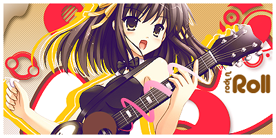
    A pretty simplistic tag with little-to-no foreground effects, hmm? Depth is absent too. But I guess that is how it is supposed to be in a tag like this one (?). I like that pink pen tool you've done on the guitar and how the text totally fits. The colors could have been fine-tuned a little, though.

    Speed's GFX Showcase

    Speed's GFX Showcase


    Well, in both of these tags, the first thing that comes to my notice is the text. If, in any of your tags, you can't seem to fit text, just leave the tag be. No need to force it. Looks like you've forced text into these two. They are hardly visible and don't really add anything to 'em. Also, the second tag lacks in the 'effects' department quite a lot.

    I, uhh, think I'll add more to this once I get more time. For now, this is it. Hope my crit was okay. XD;
     
    10,673
    Posts
    15
    Years
    • Seen Dec 30, 2023
    I'm straight up impressed by some of your work, but a lot of the rest is sub-par, but I'm aware you have a lot of your older stuff here. At any rate, I'll pick out a few pieces.

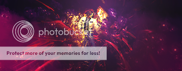
    https://i287.photobucket.com/albums/ll129/Speed_046/Sakuracopy-2.png
    This is probably your best tag, but you've got to be careful you don't over sharpen in some places, this tag is just a little too sharp, most notably around the text and scarf, as well as some of your effects such as the lines and sparks. The flow is pretty great, but be wary of text, it just kind of gets eaten up in the effects as it draws closer to the focal. You should try and avoid that if at all possible. If anything else, I think you should try blend the render a bit more as it still looks like it's just pasted onto a background. Some more effects just at the bottom of the render there, on the foreground, might do the trick. Add some more blurring here and there and boom, you have a great tag.

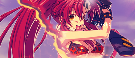
    https://i287.photobucket.com/albums/ll129/Speed_046/yoko.png
    I love the colours in this one, but the effect needs work. I think you should put some more lines like those around the tag, maybe not so smudged, just create some flow, and think strongly about simplicity here. But the colours are lush, that's what stood out to me.

    https://i287.photobucket.com/albums/ll129/Speed_046/Sigbattlecopy.png
    Perfect example of how an anime tag should be done. Honestly, I struggle to pull any bad points out of this one. Maybe you should have not sharpened so much around the edges of the hair. But other than that, it's flawless and I love the vector work. Except, you should maybe tone down the drop shadows if at all possible.

    https://i287.photobucket.com/albums/ll129/Speed_046/yoko4.png
    One of the best anime icons I have seen, I love the colours here, it dragged me in from the get go.

    https://i287.photobucket.com/albums/ll129/Speed_046/lighting.png
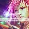
    You did too many effects on this one, icons are about complex simplicity. You don't want to crowd it, but at the same time, you need to be so careful and tactical when you approach an icon. These kind of stocks work a lot differently to anime stocks, same goes for IRL stocks. So just practice. I did some FF13 icons, you can find in this post. Photobucket is down atm though, so hopefully it'll be back up by the time you see this, but they might help for reference.

    Either way, some great work here and I urge you too keep updating!
     

    Molts

    Novice Breeder
    100
    Posts
    13
    Years
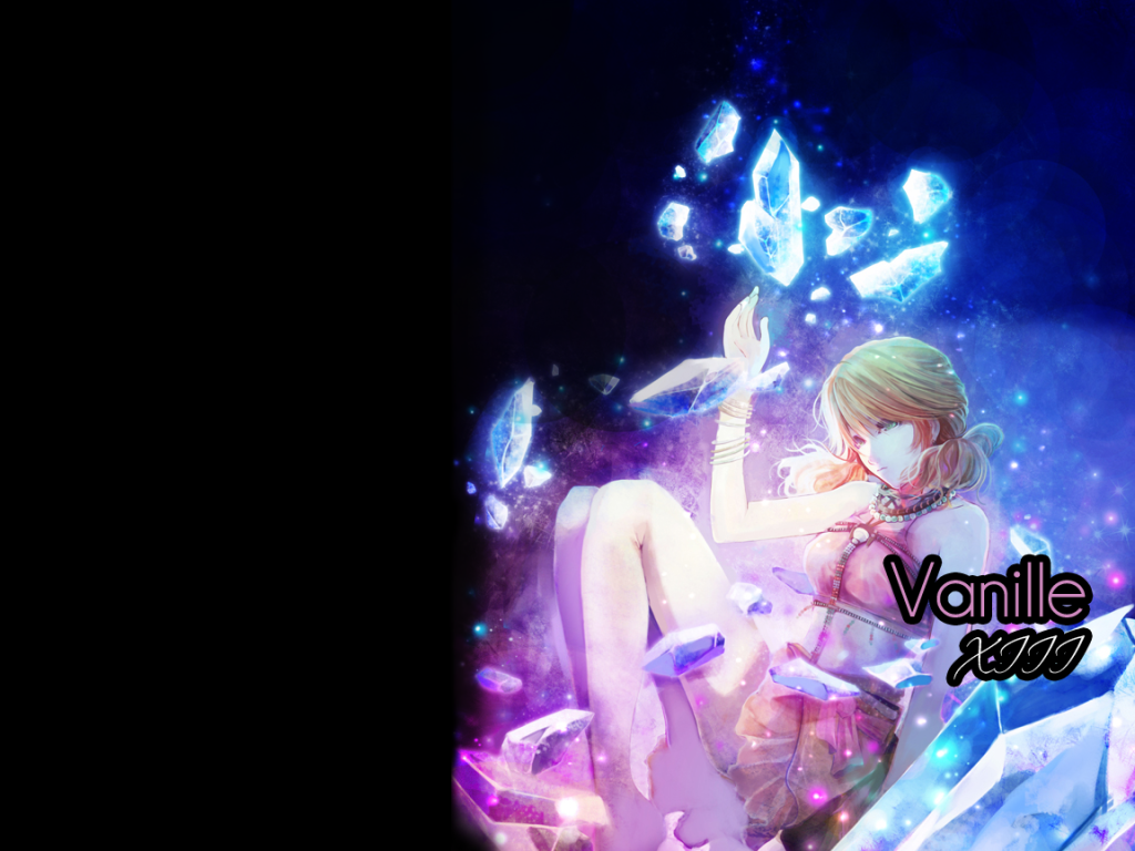
  • Your Vanille picture near the beginning of the thread is beautiful. I really love Vanille as a character, she was just so interesting to listen to most of the time, (any time Sazh and Vanille speak to each other is basically awesome). You really captured some huge emotion in her picture, and the effects really create a sense... not quite sure how to word it properly. Like a wistful innocent longing, but more than that. I'm very impressed by your work.
     
    15
    Posts
    13
    Years
    • Seen May 2, 2011
    Really cool pictures. I especially like the new one of yours, Vanille. Really creative, I gotta say.
     

    Speed

    Skyward
    376
    Posts
    15
    Years
  • Darn PC with it's DBEs... D:< New icons!

    Speed's GFX Showcase
    Speed's GFX Showcase
    Speed's GFX Showcase
    Speed's GFX Showcase
    Speed's GFX Showcase
    Speed's GFX Showcase
    Speed's GFX Showcase


    You can use them, just ask. And please don't claim as your own either. :p
     
    Back
    Top