• Our software update is now concluded. You will need to reset your password to log in. In order to do this, you will have to click "Log in" in the top right corner and then "Forgot your password?".
  • Welcome to PokéCommunity! Register now and join one of the best fan communities on the 'net to talk Pokémon and more! We are not affiliated with The Pokémon Company or Nintendo.

[VOTING] Round 1: Renyui! vs. Counterfeit

moments.

quixotic
3,407
Posts
15
Years
  • Round 1 of the graphics tournament happening. This battle is between Renyui! and Counterfeit!
    This battle had the following restrictions.

    Stock: (save image to utilise transparent background)
    Size: No restrictions.
    Colour: Primarily purple.
    Text: No restrictions.
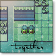

    TAG 1.
    [VOTING] Round 1: Renyui! vs. Counterfeit


    vs.

    TAG 2.
    [VOTING] Round 1: Renyui! vs. Counterfeit


    If you wish to vote, please leave a comment stating who you are voting for, and at least one reason why you are voting for them over the other. As there is no poll, votes will only count if you leave a comment. The comments don't need to be really long, having to post should not deter you from voting, it can be a simple sentence if you want. Good luck!

    Voting will last for one week after the opening of this thread.

    (N.B: The usernames are detached from the images to remove bias or anything.)
     
    Last edited:

    Shining Raichu

    Expect me like you expect Jesus.
    8,959
    Posts
    13
    Years
  • I vote for Tag 2. It's more aesthetically pleasing to me, it's more clear and clean-looking and stylish, while Tag 1 looks a little bit too busy for me :)
     

    Barrels

    The Fresh Prince of Kanto
    82
    Posts
    12
    Years
  • This is... really hard. Both tags look great in very different ways, so pretty much the only reason I'm picking 2 over 1 is that it looks to me like the wall hits the floor at the bottom of the first tag and the writing doesn't quite shift perspective enough to accomodate that. (But that is probably the most nitpicky thing I have ever said.)
     

    moments.

    quixotic
    3,407
    Posts
    15
    Years
  • I didn't even notice that Barrels. xD

    Anyways, this was ridiculously tough for me to choose. Both tags have weaknesses and strengths that mirror each other. Tag 1 is original as hell, but the execution somewhat lets it down. Not because it doesn't look like graffiti, it really is a great manipulation, but because the colours and quality are a bit let down. Meanwhile, the second tag, while not able to boast the same originality, is executed really well, and the final tag is pretty to look at. :3

    So. I'm voting for Tag 2, mainly because it is the one that I feel, overall, looks better, and I'd be more likely to use. But yeah, it was really hard to choose, both great tags!
     

    Brane

    -
    372
    Posts
    13
    Years
    • Age 30
    • Seen May 10, 2016
    The problem I have with both tags is that they don't seem well executed (like I'm one to say).

    Tag 1 is very interesting, and I love how there are the different layers of graffiti giving it a feeling of age as well as depth. However it seems to me that the pixels breaking a part are more of a focal point then the stock. And as Barrels mentioned, the text overlaps onto the ground making it impossible to tell whether there is a ground if you don't look closely enough. If the stock was probably a different colour and stood out more, it definitely would have got my vote.

    However, tag 2 does. The one thing that puts me off is that I can't really tell what is supposed to be happening, and the bleeding light is too much and turns into the focal instantly. I don't think the warning fits in as well to the bottom left, especially how it's blurred out so much, contrasting everything else in the tag. And this is a personal thing, but I don't like that the tag is mono coloured in THAT colour :P

    Tag 2 wins for me, both were very original though.
     
    177
    Posts
    13
    Years
    • Seen May 9, 2012
    tag 2 gmv, first had a better concept but lacked the execution in the second one, which was what really got the vote for me
     

    Rest

    Showstealer Pro: Trial Version
    353
    Posts
    12
    Years
  • Going for Tag 1.

    It's more creative, and the colors (however faint they are), are just overall better than the monotone, washed colors of Tag 2.
     

    moments.

    quixotic
    3,407
    Posts
    15
    Years
  • Voting's over guys! The winner is Renyui!!
    [VOTING] Round 1: Renyui! vs. Counterfeit


    5-1

    Thanks to everyone who voted, hope you'll all make another appearance in the next week or so for the second round of voting!
     
    Back
    Top