• Our software update is now concluded. You will need to reset your password to log in. In order to do this, you will have to click "Log in" in the top right corner and then "Forgot your password?".
  • Welcome to PokéCommunity! Register now and join one of the best fan communities on the 'net to talk Pokémon and more! We are not affiliated with The Pokémon Company or Nintendo.

Graphic Rating Thread

Status
Not open for further replies.

The dawn Witch Lucia

WTF YOU STALKER DAWG?!
146
Posts
17
Years
    • Seen Dec 10, 2007
    Rate this.
    Graphic Rating Thread

    and this:
    Graphic Rating Thread

    rate and which is better?
     

    Pikabloo

    ...
    4,628
    Posts
    19
    Years
    • Seen Sep 8, 2010
    Mizuki: It's not my favourite either, eheh. I was just bored, and I felt like messing with some smudge stuff... I any banner I make from now on will most likely have the same colour scheme DD:

    BreD: Yeah. You can get the same quality with JPEG. Buuuuuut I don't know whether it takes less space o.o

    Ryouki: Lawls. Someone (obviously) missed having Photoshop xD That's a lot of banners...

    But I think I'm going to rate all of them in one go because they're all fairly similar and I'm feeling a bit too lazy to rate each and every one of those DD:

    Okay, I think I've already stated one problem. They're all really similar Dx You should experiment with different banner sizes, image positions and text positions, instead of sticking to the same one again. The effects are also fairly similar (with the faded image in the background, and then the simple brushed on background) and the text looks like it's just been slapped on there for the sake of it DD: Although the colours match, so I guess that's good. And yeah, some of them need borders, eheh. I can't really blame you for sticking to the same formula (I used to do that >x<), but experimentation is the key to making good graphics. And following tutorials, of course xD -shot'd-

    The dawn Witch Lucia: Nice banner. I'm really liking the background. And the faded image in the background is okay, but I think the opacity should be reduced a bit, because it stands out too much. As for the sprite in the front, I think it's better off without the animation, because it looks awkward for some reason (it looks like it's missing some frames) and it's going too fast. Oh, and the end of his fist (and the mug of coffee) is cut off when his arm's in the air xD Anyway, the sprite looks extra weird (animated or not) since it's slightly transparent, and it's placed on top of the image's hand. Also, the top left area of the banner looks empty. Maybe add text or something? But other than that, the colours are very nice, and as I said in the beginning, the background is lovely ^^
     

    RYOUKI

    survive the world.
    3,252
    Posts
    17
    Years
  • Ryouki: Lawls. Someone (obviously) missed having Photoshop xD That's a lot of banners...

    But I think I'm going to rate all of them in one go because they're all fairly similar and I'm feeling a bit too lazy to rate each and every one of those DD:

    Okay, I think I've already stated one problem. They're all really similar Dx You should experiment with different banner sizes, image positions and text positions, instead of sticking to the same one again. The effects are also fairly similar (with the faded image in the background, and then the simple brushed on background) and the text looks like it's just been slapped on there for the sake of it DD: Although the colours match, so I guess that's good. And yeah, some of them need borders, eheh. I can't really blame you for sticking to the same formula (I used to do that >x<), but experimentation is the key to making good graphics. And following tutorials, of course xD -shot'd-

    Hmm, Well...I think I'm gonna find some new tutorials...i actually made that step by myslef..so It's a little stiff-y, but atleast I made a beginners backround, right? xD
     

    Marauding Master

    Interdimensional.
    185
    Posts
    19
    Years
  • ummm, rather large, and not to my liking at all...lol

    1/10

    Here are some that I did on Paint Shop Pro V9:

    Graphic Rating Thread


    Graphic Rating Thread


    Regards,

    ~M51

    I don't like them for several reasons;

    1. You have too much going on, which isn't always bad but it distracts from the render and doesn't give a clear focus on what you want us to look at. Try making the background calmer and making the render pop out more.

    2. Your renders are blended in very poorly, it's like you just stickered them on.

    3. The text is way too big for a standard signature and the colors don't blend in well. If anything, it's almost an eyesore.

    Try to avoid these things and you'll make better stuff. I also recommend getting Photoshop.
     

    Loki

    x
    6,829
    Posts
    18
    Years
    • Seen Apr 4, 2024

    PC Community Rules said:
    Posts must have at least 25 characters and 4 words.
    All posts are required to have 4 words. The community has a physical 25-character limit to each post. No exceptions are given to this rule, and no one is allowed to override the limit (no "*stupid character limit*", filler text or anything like that), except for in forums which have a description saying you can. The Diamond and Pearl Battling and Trade forums, for example, permit it.

    Please do not bypass the 4 words limit.

    The dawn Witch Lucia; I'm sorry, but that was quite spammish as well. It is our choice as to who's banners we rate, and who's we do not, so if you would like to point out that we've overlooked your banners, please rate one of our banners in return. An eye-for-an-eye.
     

    The dawn Witch Lucia

    WTF YOU STALKER DAWG?!
    146
    Posts
    17
    Years
    • Seen Dec 10, 2007
    Please do not bypass the 4 words limit.

    The dawn Witch Lucia; I'm sorry, but that was quite spammish as well. It is our choice as to who's banners we rate, and who's we do not, so if you would like to point out that we've overlooked your banners, please rate one of our banners in return. An eye-for-an-eye.
    I see.
    I'll try doing that next time~
     

    Marauding Master

    Interdimensional.
    185
    Posts
    19
    Years
  • I see.
    I'll try doing that next time~

    You missed the opportunity just now, too.

    The dawn Witch Lucia
    The enlarged second render style is quite old and after a while I just begun to think of it as unfitting and not good. Try to use only one render and shift focus to it. I don't like the proportions(Too big), no border and the background looks a bit plain because you hardly made an effort to blend your renders in. I'll go with a 4.5/10.

    мizuκi
    I really like this one. It has a nice mixture of colors and the render is blended in originally as well. As for the things you could improve on. I'd say make it less big next time,(Big signatures are outdated =/) and blend his left arm(right to us) in more with the blood. 8/10.
     

    Loki

    x
    6,829
    Posts
    18
    Years
    • Seen Apr 4, 2024
    MM; Thanks... for most of the comments. xD I don't know what you mean about the blood and the hand though...? either way, it's not in use here anymore... But. D: Big banners are like, my <3. *fish'd* Yeah, I know it was too big. xD; I was freaking out over that myself, but I didn't want to resize it in case some details got killed, and it hadn't started out as an actual banner. *just a test for the tutorial I used on it, but it turned out so well...* I just had to use it. xD

    And I don't think you asked for a rate, but your banner is amazing. :x *even though the render kind of creeps me out. xD;*

    Sawyer; That's really cool. I love the colors, the placement, and the blend. The depth and perception is really nice as well, contrast is good, and it looks awesome. I'll take it you did it by scratch, like you did with the last banners you posted here? ^^

    The dawn Witch Lucia; I already discussed that last post with you over PM. ;< But, delete it, or edit in a rating, like I asked. Whichever you choose is fine.

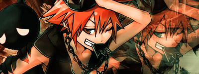
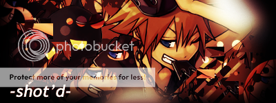
    As for your most recent banner, I can't say I like the positioning. The render looks like it was plastered on top of a random background- the mosaic doesn't fit very well either. The render doesn't really stick out either. It's hard to pick him out from the background. Dx

    Well, here's something of the same style, except I touched it up with a few of my own elements. Very small amount though, since that tutorial is very... specific. Dx

    Graphic Rating Thread
     

    RYOUKI

    survive the world.
    3,252
    Posts
    17
    Years
  • @The dawn Wich of Lucia: Hmm, Okay...
    I like the backround and all, but it's too plain, I think the image should have like been resize, and add some text, I seriously would like it if it wasn't too plain. I dunno maybe for me plain is a mirror of my own work? xD

    @mizuki: Seriously, you post way more faster than me, YOU BEATEN ME! DD: Anyways -ehem- I like the banner, the backround the green-ness but then the gradient map (or atleast if you put it) is seems, uber. because well...I just realized that there is Black Mokona in the image just now, I think that well you should get the (white) brush tool in Mokona's Body, So it would seems the Mokona is (a God) visible. xD
     
    Last edited:

    THIRTY-SIX

    Banned
    8,174
    Posts
    19
    Years
    • Seen Nov 18, 2015
    The focal (circle thing to me) looks like its bigger than what it should be, making the depth a little less than what it originally can look like. Also make it have a tad too much magenta. The yellow, purple blue c4d part kinda ruins the colour system too. Nice c4d'ing though.
     

    Marauding Master

    Interdimensional.
    185
    Posts
    19
    Years
  • мizuκi
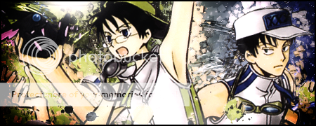
    Thank you. If you could link me to the tutorial you used, that would be cool. I love seeing new styles and trying them out. As for your current signature, I don't like it near enough as your last one for a few points.

    The characters aren't blended in enough. You should try duplicating their layers and applying filters, then setting them to whatever blending mode that looks good with it.
    The light source isn't very believable. Try adding a black and white radial gradient at the same spot as your light source, then setting them to a blending mode that accompanies the lighteffect. Reduce the opacity of your light source if you have to.
    Try to desaturate the renders a little bit, and maybe desaturate the entire work a little(Maybe -20) as well(Make a new layer, then go to image > apply image to have a new layer with all your stuff on one layer.).

    Hope I make sense and hope it helps. I still like it, though. 6.5/10.

    Sawyer
    I'm not that interested in c4d abstracts and I honestly don't see the beauty in this work either. It looks very empty and hallow, and I don't see any depth in it at alll. That just might be me though. 6.5/10 for it.
     

    Loki

    x
    6,829
    Posts
    18
    Years
    • Seen Apr 4, 2024
    Ryouki; More faster. xD I didn't really want Black Mokona to stick out, so I didn't add anything to make it stick. xD;; But thanks for the comments, I'll see if I can make Mokona more easily seen.
    Marauding Master; Yeah. The light source. Dx; I'll try out why you suggested. As for the blending, I was going to use the method in the tutorial, but it honestly just made the whole thing look blurry. I'll fiddle with the layer effects and see if I can fix it up though~ And the -20 desaturation doesn't do much. xD But I was sort of going for the bright colors effect.

    This render didn't really fit the style of the tutorial as well as the last render did, so there were a few issues. (I think it looks more appropriate for a less blended background, but I don't know. xD;)

    And unfortunately, I can't link you to the tutorial I used; it's at a different forum, and linking out to different forums isn't allowed. :/

    edit;; And now I've tried to fix everything you said, and it just doesn't look right after I do. xD; If I could, I would get rid of the light source, but the burning is on an applied image, so if I get rid of the light source, I get rid of the burn, and I just can't figure out how to re-create the burn in a nice-looking way. </3 Like I said earlier, the desaturation didn't do much, and the gradient to make the light source look more believable made Doumeki's skin like... brown. o_o; Thanks for the help, but I guess this banner's done. Dx; Can't really do much without it turning out the opposite of the way I wanted it to look. I didn't blend them in because I think I messed up a little on the smudging.... and when I blend them in, their lines disappear. x_x;

    The light source is probably unbelievable because there are two light sources. :/

    Thanks for the comments though, I'll try fiddling around with the layer effects and filters more next time. :O
     
    Last edited:

    Marauding Master

    Interdimensional.
    185
    Posts
    19
    Years
  • PM it to me(I'm sure that'll be allowed.). It's a stupid rule if you ask me. You should be able to link to other forums as long as it's not advertising.
     

    RYOUKI

    survive the world.
    3,252
    Posts
    17
    Years
  • Ryouki; More faster. xD I didn't really want Black Mokona to stick out, so I didn't add anything to make it stick. xD;; But thanks for the comments, I'll see if I can make Mokona more easily seen.
    It feels weird whn someone with far more greater Photoshop Skills, follow my advised o.o;;
    Anyways, I followed this tutorial...and I think my banner looks kinda like nothing in the tutorial..DD:
    I realized that I forgot to put a border in it, So uh...I know it looks better with a border, xD
    Graphic Rating Thread

    Graphic Rating Thread

    I always use that image, I dunno why..xD​
     
    Last edited:

    Marauding Master

    Interdimensional.
    185
    Posts
    19
    Years
  • It feels weird whn someone with far more greater Photoshop Skills, follow my advised o.o;;
    Anyways, I followed this tutorial...and I think my banner looks kinda like nothing in the tutorial..DD:
    I realized that I forgot to put a border in it, So uh...I know it looks better with a border, xD
    Graphic Rating Thread

    Graphic Rating Thread

    I always use that image, I dunno why..xD​

    The second one is the one you want rated, right?

    In that case, it's alright but some errors:

    The lightsource is way, way, way off. That is not where the light is falling on the render. It should be at the upperleft of the render.
    Multiple use of same render, I don't like it but it may just be a style thing
    The test is too plain and simple and it doesn't compliment on the work at all. Try blending it in, try different colors and fonts. Nice typography and text utilization is one of the hardest things when it comes to designing so find your own style.

    I've been doing nothing but rate stuff so I'll give something to be rated.

    Graphic Rating Thread

    -
    Graphic Rating Thread
     

    Shika

    F o r e s t Wizard
    1,192
    Posts
    17
    Years
    • Seen Sep 18, 2009
    @Marauding Master: I don't know how to rate as I'm a beginner but I admire you graphics~ =]

    I made some more~

    Graphic Rating Thread


    Graphic Rating Thread
     
    Status
    Not open for further replies.
    Back
    Top