• Our software update is now concluded. You will need to reset your password to log in. In order to do this, you will have to click "Log in" in the top right corner and then "Forgot your password?".
  • Welcome to PokéCommunity! Register now and join one of the best fan communities on the 'net to talk Pokémon and more! We are not affiliated with The Pokémon Company or Nintendo.

must update this soon

Alternative

f i r e f l y .
4,262
Posts
15
Years
  • Divide
    I'm not too sure on this tag to be honest. Sure the visual effects are amazing and it looks like you've used lots of lighting effects, and to me, it even looks a little similar to Aurora Borealis, but still something baffles be. I just feel as if you went and tackled this tag just as maybe a little fun thing, which just turned out to be really good. Also I feel as if you didn't really use a focal point. I don't exactly know where to start when I'm looking at it. Another thing I don't like so much is the text. With the visual display you've decided to use for the tag I think the text kind of loses out to it, expecially when it's standing out like you've made it. I mean sure if you decide to use something like overlay then it's okay for text to fade into the tag, but this way I just don't think it works. The visual effects you've used seem to be just too much for the text.

    I'd also critique your photography, but I'm not so knowing with that stuff.
     
    10,674
    Posts
    15
    Years
    • Seen yesterday
    Well, thanks for the crit, but I'll just stop to point out that the focal point is the light source, bottom middle, flow extracts from that. Text was hard, but abstract things are usually pretty experimental tbh.
     

    derozio

    [b][color=red][font=helvetica][i]door-kun best boi
    5,521
    Posts
    14
    Years
  • I do agree with alternative that the text stands out too much. But keeping the fact that its pretty hard to put text in a tag like that in mind, its okay. But yeah, apart from the text, the tag looks hot. I actually wanna know how you did that from scratch. A tut, maybe?
     
    10,674
    Posts
    15
    Years
    • Seen yesterday
    must update this soon


    Well, I actually lost the .psd, since my computer crashed as I was making this, hence the text laziness. But at any rate I managed to take the text out without the PSD without messing it up (I've gotten too used to losing my work). But, I might make another tag like this and do a tut for it. Scratch.
     
    10,674
    Posts
    15
    Years
    • Seen yesterday
    This is a horribly messy WIP. but it's nearing 2AM so someone can point out what's going wrong for me to look at tomorrow :D

    must update this soon
     

    moments.

    quixotic
    3,407
    Posts
    15
    Years
  • Regarding the latest LP, the only thing that I can think of that could be tweaked or revamped or whatever is the colouring. The text is wonderfully coloured, but the guy is so desaturated / warm compared to the fairly cold colours of the effects and stuff. He just looks a bit of of place / not really blended in to the scheme of the piece as a whole.

    Also, that main body of C4Ds, not the very top right, but just under that (main effects under the text), that sort of reddish purple colour you've got going on, in my opinion, is not too complimentary. I think bringing out the blacks more / more contrast / a darker purple (like the top right corner) might sit better with the rest of the piece.

    On the note of him looking bit out of place, did you erase / feather the guy? The edge looks a bit blurry, particularly left side of his head / hoodie.

    Just as a note regarding the overall colour of the whole thing, I seriously believe one or two gradient maps could benefit quite a lot. I know you are sort of against them because they aren't accurate or whatever, but it really will help blend all the colours together more effectively. If you can help blend the colours of the guy in with other colour adjustments, by all means do that if you prefer, but looking at this piece if it was mine, I'd whip out the gradient maps... Have a look into a black to white gradient on Multiply and lower opacity as needed, also a pale yellow to white on multiply.

    Not a bad piece, just colouring really that is off for me.
     
    10,674
    Posts
    15
    Years
    • Seen yesterday
    Colouring is usually my strong point too! Lmao. But yeah, I have to agree that this piece isn't fantastic. Too much technique and too little time considering the basics imo. I didn't render him but I did sloppily bur around him to bring him out. I think this was one of those pieces where I was simply like "I JUST DON'T CARE ANY MORE AAAAA LOSING MY TOUCH" etc.

    But, I may go back and make some refinements though, the stock was pretty dull as it was, I couldn't do much about it, so I made some poor choices there. I dunno moo, my latest stuff has sucked, I'm gonna have to bring it all back with a new piece. I should start drawing my concepts again.

    Anyway, I appreciate the feedback dude. As always <3
     

    Speed

    Skyward
    376
    Posts
    15
    Years
  • I really like your tags, I think you are really good with color, it seems to match in just about everything you do.

    must update this soon


    I think that one's probably my favorite though.

    And where did you get the Haley Williams stocks for those icons? :p
     
    Last edited:

    derozio

    [b][color=red][font=helvetica][i]door-kun best boi
    5,521
    Posts
    14
    Years
  • Aww, I wish I you hadn't lost that tag's psd. I really wanted to know how you did that. :<

    And I'm really digging this one, Gav. It is smexy. The text, the flow, the lighting, the colors...everything. I really like it.
     

    Alternative

    f i r e f l y .
    4,262
    Posts
    15
    Years
  • https://i54.tinypic.com/9lki6c.png
    I'm actually really unsure on whether I'm digging this or not. I know you've said that it's a CD cover so it's meant to be busy, but I don't think it's the problem with me. I think it looks great that you've made it busy! One thing I just don't really like is what you've done with the focal point in ordinance with the C4Ds and other effects. I think for my taste that you've chosen colours which represent brightness and that bring out something, but I don't think it works, with it being a semi-dark LP. Unless it's based on something which is meant to be like that (such as blue plasma from some Halo thing), then I don't really think it works much too good. Another thing which really bothers me about this is that you've gone for effects which look so rendered, that they look like they're animated in a sense, whereas you're using a semi-realistic stock, and I don't think it works too well. That, along with the bright colours I think really kills it. Not one of your best work I'm afraid.
     
    10,674
    Posts
    15
    Years
    • Seen yesterday
    I really like your tags, I think you are really good with color, it seems to match in just about everything you do.

    *snip*

    I think that one's probably my favorite though.

    And where did you get the Haley Williams stocks for those icons? :p

    Awh man, I hate that tag, it's so old! The concept was good, but I couldn't pull it off at all. Either way, at least someone likes my old stuff!

    Uhm, various places really.
    Shutterstock

    flickr

    weheartit
    vi.sualize.us

    Photobucket
    And any time she appears at an award thingy like the VMA's, have a look for photoshoots and the likes.


    Aww, I wish I you hadn't lost that tag's psd. I really wanted to know how you did that. :<

    And I'm really digging this one, Gav. It is smexy. The text, the flow, the lighting, the colors...everything. I really like it.

    I can do another one, but it's just all brushing and a few filter effects really. But I'll try make one for you soonish :]

    Thanks, I'm sort of heading in that direction now, I like tags again XD

    https://i54.tinypic.com/9lki6c.png
    I'm actually really unsure on whether I'm digging this or not. I know you've said that it's a CD cover so it's meant to be busy, but I don't think it's the problem with me. I think it looks great that you've made it busy! One thing I just don't really like is what you've done with the focal point in ordinance with the C4Ds and other effects. I think for my taste that you've chosen colours which represent brightness and that bring out something, but I don't think it works, with it being a semi-dark LP. Unless it's based on something which is meant to be like that (such as blue plasma from some Halo thing), then I don't really think it works much too good. Another thing which really bothers me about this is that you've gone for effects which look so rendered, that they look like they're animated in a sense, whereas you're using a semi-realistic stock, and I don't think it works too well. That, along with the bright colours I think really kills it. Not one of your best work I'm afraid.

    Well I've gotten a mixed bag of reviews on this one. But I agree that it's not one of my better works, but it's definitely not one of my worst and I will always argue that as there's only a few minor things wrong, and I would disagree that the C4D's don't go with the image, people use C4D's with real life stocks all the time, they're not meant to look realistic. Not that I'm defending my own work, but the point is just a little under sighted. At any rate, I wanted to say to you, that you're just gonna have to watch out with how you critique, personally I appreciate it, but you need to offer suggestions or at least reduce how blunt you are when you give crit, as for many artists, it's hard to take crit, especially when it's not thrown across in a positive conversational language. Keep doing it, but just try and offer a few more suggestions and just avoid seeming blunt it all n_n

    Anyway, thanks for the support. I'm maybe taking a small break from LP's, as no new concepts are coming to mind. So I'll probably work on making a few more advanced tags, just to keep the juices flowing.
     

    moments.

    quixotic
    3,407
    Posts
    15
    Years
  • Really nice new LP Gav! There are a few things that bother me, they are just minor and it may just be me, but they feel weird. Firstly, that pixelation filter or whatever where the two halves meet. I think if you get rid of that and make it nice and crisp and smooth it will go better with the rest of the piece. Unless you want to add more pixelation, I think that much, right there in the focal is a bit off putting...

    Next, just to each side of the middle is a like 1px bright orange circle outline. Not sure if that really adds anything to the piece, and being the brightest colour in the area, it sort of steals attention. Make it darker or remove possibly.

    Lastly, lighting. It is pretty good, but it is a bit flat and while the focal is obviously the middle, the lighting doesn't really enhance/support it. I think some burning / dodging, just on an applied image to make the middle pop more would do more good than you'd think.

    Nice piece, love this type of abstracts, and you've almost nailed it!

    Edit: Just looking at it a bit closer, it actually looks quite low quality in some areas (the edges of the black circle shapes, and the small like particles). Try and watch quality, especially on a piece like this!
     

    ~Ryukaa

    total nerd
    1,328
    Posts
    16
    Years
  • I personally can't choose a favourite out your icons. xDD;;
    They all look really great.

    Your tags, however...
    must update this soon


    I took a liking to this one.
    I really don't know why. xDD;;
     
    10,674
    Posts
    15
    Years
    • Seen yesterday
    Thanks Ryu, such an old tag though.

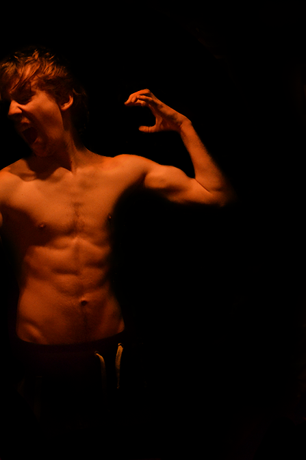
    Anyway, this is not my usual style, but here's a stock/self portrait I needed to do for my portfolio. Un-edited photography. Active D lighting, spotlight.

    The Struggle Within

    Spoiler:
     

    Lor

    Banned
    4
    Posts
    13
    Years
    • Seen Mar 6, 2011
    So much talent.. I need to crack open photoshop again :) Thanks for the inspiration
     

    Silver

    Kyle
    504
    Posts
    20
    Years
  • Thanks Ryu, such an old tag though.

    Anyway, this is not my usual style, but here's a stock/self portrait I needed to do for my portfolio. Un-edited photography. Active D lighting, spotlight.

    The Struggle Within

    Spoiler:

    Love the composition of this.
    But, depending on what the temperature of your light source was, I think you white balance is a bit off. I know you said it's unedited, but fixing the white balance is really easier if you have it as a RAW.
     
    10,674
    Posts
    15
    Years
    • Seen yesterday
    Yeah you're right, I think I had my white balance set to something silly to be honest. And the lighting was very orangey in any case. It's something I want to work on, but it was my first attempt at something like this, and for a start, it wasn't bad. Hopefully I'll be doing some photoshoots soon however :]
     
    Back
    Top