• Our software update is now concluded. You will need to reset your password to log in. In order to do this, you will have to click "Log in" in the top right corner and then "Forgot your password?".
  • Welcome to PokéCommunity! Register now and join one of the best fan communities on the 'net to talk Pokémon and more! We are not affiliated with The Pokémon Company or Nintendo.

some of my old pixel art

5,256
Posts
16
Years
  • here is my crappy pixel art
    some of my old pixel art
    some of my old pixel art
    some of my old pixel art
    some of my old pixel art
    some of my old pixel art
    some of my old pixel art

    some of my old pixel art
    some of my old pixel art
    some of my old pixel art
    some of my old pixel art
    some of my old pixel art
    some of my old pixel art

    some of my old pixel art
    some of my old pixel art
    some of my old pixel art
    some of my old pixel art
    some of my old pixel art

    some of my old pixel art

    some of my old pixel art
    some of my old pixel art
    some of my old pixel art
    some of my old pixel art
    some of my old pixel art
    some of my old pixel art

    some of my old pixel art
    some of my old pixel art
    some of my old pixel art
    some of my old pixel art
    some of my old pixel art
    some of my old pixel art
    some of my old pixel art

    some of my old pixel art
    some of my old pixel art
    some of my old pixel art

    some of my old pixel art

    some of my old pixel art
    some of my old pixel art
    some of my old pixel art
    some of my old pixel art

    some of my old pixel art
    some of my old pixel art
    some of my old pixel art
    some of my old pixel art
    some of my old pixel art

    some of my old pixel art
     
    Last edited:

    Dots

    Temporary Avvie. ^^'
    99
    Posts
    14
    Years
    • Seen Apr 23, 2012
    some of my old pixel art
    some of my old pixel art

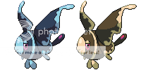
    Pignite. Thanks to LassLaura for the name.

    It's pretty fine for a sprite, but the proportions are a little off at some parts and it misses the characteristic head pokemon are usually identified by. I'd round out the shading and make the outline smoother if I were you. I don't understand what's covering it's eyes since the golden part looks more like a mask like portion of the skin.
    I'd definitely enlarge the head if I were spriting this as a fakemon, and you might want to make the mask more like markings to give it a natural feel.

    some of my old pixel art
    some of my old pixel art

    Razoboar. Thanks to Ninja Caterpie for the name.

    Something is really off in this design as far as I could tell. It does have a large head and somewhat of a memorable face, but the shading really irks me at parts. Rounding out the shading is a must here because the neck really look unnatural with the shading there. I also think you might want to remove the back's shading since the light source wouldn't really illuminate it in that manner.

    some of my old pixel art
    some of my old pixel art

    Proton. Thanks to sushiekat of deviantart for permission to use the concept.

    You done quite some work on this one, and I like the end result although you could improve it. I love the glowing sphere effect too.
    First, color the outlines (especially at the place where the hair meets the head) and you'll notice a drastic change in the quality of the sprite. I've noticed that from the way you shade, you seem to think a lot about it that it doesn't flow naturally anymore. Relax a little and just shade it the way you think the light source would reflect on it.

    some of my old pixel art

    Psykinesis.

    This is my favorite from the bunch of sprites you have. I like everything about it, and I can't seem to spot any obvious mistakes. Good job on this one. ^^

    I've got some other concepts ready, so you may see some more fakes.

    I'm looking forward to that. ^^
     

    Chibi Robo

    of the entire epoch!
    854
    Posts
    15
    Years
  • You forgot to mention that I helped you with the shading/outline on pigmite and razoboar ;D
    But anyways nice sprites the only one I would worry about is proton.
    some of my old pixel art


    Now lets look at the outline on this. First of all its pretty rough, which we don't want we want some smooth lineart so it looks more appealing and not so scratchy. I found a tutorial on lineart that should help you on it. link
    I would also take away the lines that hold the little atom balls. It seems to get in the way of the sprite and in my opinion it would look much better without it.

    Lets get on with the shading, You have literally the shading and the lighting literally all over the place. On the upper portion of the body it should have more lighting less shading and on the lower portion more shading and little to no lighting. Remember the sun is always facing in the top left hand corner and if any body parts get in the way of it, there should be shading in the shadow of the body part.

    Now I like the overall design I just feel its missing arms :/
    Otherwise its fairly nice.

    Anyways some things you might want to work on Haroun otherwise its a fairly decent sprite <:
     
    5,256
    Posts
    16
    Years
  • It's pretty fine for a sprite, but the proportions are a little off at some parts and it misses the characteristic head pokemon are usually identified by. I'd round out the shading and make the outline smoother if I were you. I don't understand what's covering it's eyes since the golden part looks more like a mask like portion of the skin.
    I'd definitely enlarge the head if I were spriting this as a fakemon, and you might want to make the mask more like markings to give it a natural feel.


    Something is really off in this design as far as I could tell. It does have a large head and somewhat of a memorable face, but the shading really irks me at parts. Rounding out the shading is a must here because the neck really look unnatural with the shading there. I also think you might want to remove the back's shading since the light source wouldn't really illuminate it in that manner.


    You done quite some work on this one, and I like the end result although you could improve it. I love the glowing sphere effect too.
    First, color the outlines (especially at the place where the hair meets the head) and you'll notice a drastic change in the quality of the sprite. I've noticed that from the way you shade, you seem to think a lot about it that it doesn't flow naturally anymore. Relax a little and just shade it the way you think the light source would reflect on it.


    This is my favorite from the bunch of sprites you have. I like everything about it, and I can't seem to spot any obvious mistakes. Good job on this one. ^^


    I'm looking forward to that. ^^
    Thanks, Dots. I'll try and improve them when I've got the time (and/or motivation). So probably tomorrow.

    You forgot to mention that I helped you with the shading/outline on pigmite and razoboar ;D
    But anyways nice sprites the only one I would worry about is proton.
    some of my old pixel art


    Now lets look at the outline on this. First of all its pretty rough, which we don't want we want some smooth lineart so it looks more appealing and not so scratchy. I found a tutorial on lineart that should help you on it. link
    I would also take away the lines that hold the little atom balls. It seems to get in the way of the sprite and in my opinion it would look much better without it.

    Lets get on with the shading, You have literally the shading and the lighting literally all over the place. On the upper portion of the body it should have more lighting less shading and on the lower portion more shading and little to no lighting. Remember the sun is always facing in the top left hand corner and if any body parts get in the way of it, there should be shading in the shadow of the body part.

    Now I like the overall design I just feel its missing arms :/
    Otherwise its fairly nice.

    Anyways some things you might want to work on Haroun otherwise its a fairly decent sprite <:
    Thanks, Max. That tutorial's helpful. As I said to Dots, I'll try and fix it at the weekend.

    Anyway, thought I'd might has well post this. It came third in the MPC, so it must be relatively good. XD

    some of my old pixel art
     
    13,373
    Posts
    14
    Years
    • Age 29
    • Seen Jan 28, 2019
    Nice work.

    some of my old pixel art


    I like the coloring on this one. Must have took some time to make it.
     

    Arolu

    Time to cut some slack...
    77
    Posts
    13
    Years
    • Seen Sep 15, 2010
    I think you could work on the anatomy of the boar-evolution line (maybe use a base of another Pokemon?) as they are lacking, slightly.
    The other Fakemon are really nice and I think you should make much more like them.

    :)
     
    5,256
    Posts
    16
    Years
  • some of my old pixel art

    Furrboi. Not a Pokémon. An enemy for a platforming project I'm doing. Crit appreciated.
    Pretty simple fur thing. Takes a jump on the head to kill :D.
     
    Last edited:
    10,769
    Posts
    14
    Years
  • some of my old pixel art

    Furrboi. Not a Pokémon. An enemy for a platforming project I'm doing. Crit appreciated.
    Pretty simple fur thing. Takes a jump on the head to kill :D.
    Tangrowth's cousin? It's kind of ugly-cute, if that makes sense. I wouldn't have thought it was 'furry' from just looking at it, but I see it now with the highlights and such. The left foot looks a little bigger than the right foot. One eye has a round highlight under it, another has a square-ish one. Are the eyes meant to look like they're looking in different directions? Am I going to keep spouting the first things to come to my mind?
     
    5,256
    Posts
    16
    Years
  • some of my old pixel art

    Fixed left leg. Fixed the eye shadows highlights. Added some fur things to give a more... furry feel, including a sort of eyebrow covering the top eye. I actually didn't realise the similarities with Tangrowth and Tangela, so he's not related to them in any way. And yeah, the eyes are meant to be looking in slightly different directions. I'm trying out different palettes as we speak, but I don't think they're working tbh.
     
    10,769
    Posts
    14
    Years
  • some of my old pixel art

    Fixed left leg. Fixed the eye shadows highlights. Added some fur things to give a more... furry feel, including a sort of eyebrow covering the top eye. I actually didn't realise the similarities with Tangrowth and Tangela, so he's not related to them in any way. And yeah, the eyes are meant to be looking in slightly different directions. I'm trying out different palettes as we speak, but I don't think they're working tbh.
    Oh, I like the palette you have. It just reminded me of those pokemon. Blue makes it look more like a monster since it's not a color you normally see in nature. I think the texture is a lot clearer now.
     
    5,256
    Posts
    16
    Years
  • Oh, I like the palette you have. It just reminded me of those pokemon. Blue makes it look more like a monster since it's not a color you normally see in nature. I think the texture is a lot clearer now.

    I know, but changing the palette might differentiate (SP?) mah Furrboi from Tangela/rowth. Here's one palette I quite like:
    some of my old pixel art


    Anyway, I've (finally) tried to redo Proton to look slightly better. I might need to revisit the hair, as it doesn't look much like hair atm.
    some of my old pixel art
    some of my old pixel art
     

    Dankesque

    Ace Trainer
    24
    Posts
    13
    Years
  • some of my old pixel art

    For the WPC. It's a badly-done Kakunashkan (Generation Four's Kangaskhan x Kakuna). Blame tCoD's random generator. :D
    Haha, that looks great. The only thing that bugs me is the 'plate' where the mouth should be. It makes the head look misshapen. I can't think of exactly how to fix it, besides changing the 'plates' to form more of a snout shape.

    Proton's hair reminds me of NiGHTS from NiGHTS into Dreams. Are you trying to make the hair look like a ponytail shape?
     
    5,256
    Posts
    16
    Years
  • Haha, that looks great. The only thing that bugs me is the 'plate' where the mouth should be. It makes the head look misshapen. I can't think of exactly how to fix it, besides changing the 'plates' to form more of a snout shape.

    Proton's hair reminds me of NiGHTS from NiGHTS into Dreams. Are you trying to make the hair look like a ponytail shape?

    Are you talking about this plate?
    some of my old pixel art


    As for Proton, I think the design is mean to be ponytails (or is it pigtails in that style? idek), so yeah. Haha, it does remind me of NiGHTS, actually. :D
     

    Dankesque

    Ace Trainer
    24
    Posts
    13
    Years
  • Yes, that's the one. It just short of sticks out and... ugh I don't know.

    And oh gosh, I just noticed the red star on Proton's chest! TOTALLY A NiGHTS PRE-EVOLUTION. Also you're right, pigtails.

    If you want to make it look like pigtails, I'd... uh... well, make the dark part of the head outline come further up the head, to make the 'pigtail' parts look like they're behind the head instead of extending from it. Right now you have some shadows there, but they're not quite enough to make the shape pop.
     

    Dankesque

    Ace Trainer
    24
    Posts
    13
    Years
  • I like the improvements you made to Kakunaskhan and Proton.

    Scizoxys looks amazing, and Wobbuffloon makes my heart melt with cute.
     
    Back
    Top