• Our software update is now concluded. You will need to reset your password to log in. In order to do this, you will have to click "Log in" in the top right corner and then "Forgot your password?".
  • Welcome to PokéCommunity! Register now and join one of the best fan communities on the 'net to talk Pokémon and more! We are not affiliated with The Pokémon Company or Nintendo.

The Graphics Rating Thread [READ THE FIRST POST. D:<]

Status
Not open for further replies.

TheFire's[Inside]

Too. Damn. Smexy.
32
Posts
16
Years
  • Seen Jun 18, 2012
I see. :P
Yeah, thats a common GIMP displacement, based off of a default brush. ^^'
My bad. I'm no PS'er, but I should try it with my 7.0, eh? xD

Yeah, bizarre borders are EPIC.
I quickly got "OMFG IF I SEE ANOTHAH PLAIN BORDER IMA GONNA BARFZ". x3

Yeah, I could easily find those in brushes.
But, is there a path function on the version of PS you were using? I presume thats what you used. x3
 

Loki

x
6,829
Posts
18
Years
  • Seen Apr 4, 2024
Path function would be the pentool, and while I use it occasionally, I didn't use it in this particular banner. I usually use it for the same purpose though; shiny lines. :B Or rendering.

But for the smudging, the settings I used actually doesn't work with 7.0. (It took me about an hour to figure out why I couldn't achieve the same results as the example. <_<) Only CS+, I believe.
 

Hazuki

delenda est.
976
Posts
16
Years
  • Seen Apr 20, 2011
No one's above me. D:

ICON TIME
kimiavatarww4.gif

Made for Ayumi-chan

Now for Pokemon icons (CONTESTSHIPPING FTW)
dawniconjh3.png
contestshippingavvi1zj2.png
contestshippingavvi2pa7.png
dawnicon2uq3.png
 

PiSToLZ

One tough cookie XD
46
Posts
15
Years
  • Age 29
  • Seen Feb 27, 2011
^^
How did you do the rain effect?
ok one thing is its too bright
you should also make the text blend more with the icon
the pokemon ones look like stocks with text. i dont really see any effects
i dont mean to come out harsh but i dont like them

my newest animation
sonciandfriendsanimation.gif
 

Unforgettable

Melodies of Life
1,620
Posts
16
Years
Hazuki: I am in love with the first one. the rain is subtle and nice. It make me feel as if I am outside with an umbrella. But it may be just a tad bit bright.... Make me one please? XD

Hokay. The Pokemon ones.
I like the saturation of the Dawn one. But it seems a bit plain for me.
I like the second one alot. It's bright and the coloring is well done. :3
The third one is good, I love the text and the coloring. I think it is my favorite of the 4.
The last one I don't really like. It's hard to tell what is going on because of the white bar with the text.

Over all, these are all well done. Keep up the good work :3
 

Gummy

by fire be P U R G E D
4,519
Posts
17
Years
Pistolz: I'm definitely no expert when it comes to animation, but yours has a lot of random pixels that could easily be taken out. Also, I don't really understand the animation. It starts off okay but around the time Amy makes her appearance, it gets very choppy.

~~~~~

Okay, first time ever using textures. I think I did it wrong because it didn't take too long to make this banner (unless thats what textures are supposed to do XD)

14sif40.png
 

PiSToLZ

One tough cookie XD
46
Posts
15
Years
  • Age 29
  • Seen Feb 27, 2011
new animation
mewtwoanimation.gif

thewaft.gif

gummy-nice use of brushes and filters
i like how the text blends with the sig itself
the only bad thing i have to say is that only some of the sig is blended.
 
Last edited:

Snivi

..•.¸¸•´¯`•.¸. ஐ
20,089
Posts
20
Years
@PiSToLZ - Try using a transparent background. It would look better.

Untitled-1.png

Opinions? Not a lot going on yet. Would like advise on what to do with it.
 

Phanima

That servant of the evil one
1,567
Posts
18
Years
  • Age 34
  • Seen Oct 11, 2011
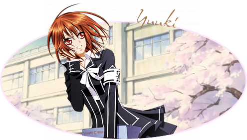
@Togu: I like the use of transparency in general, so I love how you cropped the image to encompass Yuuki. The thing I think needs attention is the amount of space on the right side of the image. The text covers it well but it still looks kind of plain. Not sure what you could add, maybe a quote or you could re-crop the size of the ellipse, but that might deter away from the alignment of the image in the end. >< Still, I think it looks great as it is, just a little empty.

712f166be694d499fd8ad059e6fd3894fec.gif


This be my profile pic~ I have no idea how to make scan lines so I just lowered the opacity of a hatching fill pattern to give it a similar effect. I also used some gradient maps to make it a brighter blue, since the original image was all dull and grainy.
 

TheFire's[Inside]

Too. Damn. Smexy.
32
Posts
16
Years
  • Seen Jun 18, 2012
Nice flare on this one, mate. :3

The scanlines are a little unnecessary, IMO, but its techy-look deserves the scan effect in some ways.
Either way, the transparency trick in the corner is really a cool add-on to what you have. Sets it apart from other icons.
But, still, try erasing the line effect on the face and jacket of the character. ;3

Overall, a hearty 8.9/10. ;D


Well, I feel like I'm in rut, so I'm trying many techniques on this, most of which cannot be seen.
Like those swishy thingies.

psychsig.png


And yes, I realize the BG needs more, but I had stuff, and my comp crashed... so.
Laziness prevailed.
 

Motsuko Live

... pronounced Mös.
982
Posts
16
Years
@ The Fire's [Inside]: It's nice, but it's seems a little bit... plain :/
As much as I like that vector border you added, it seems to be lacking some things in the center background of the banner.
Also, the two renders are confusing my eyes... I don't know what I'm suppose to look at! a.k.a, the focal point needs a bit of work.
I absolutely love the pen stroke... that is a pen stroke, is it not?

Anyway, pretty nice banner. I'd try adding a little more brushes in the background etc, and the color is a little dry. What I've found (through many trial and errors), is that it's best to use full, bright colors when working with vector art. It helps add to the image.
I'd say this is a 7.4/10.

~~~

Wow, with this new shop, I haven't had much time to make anything for myself :/
But I did manage to squeeze this in;

Motsuko%20Live%3B%20Spirit.png


I'm probably going to remove that grid... it's starting to really annoy me.
 

Unforgettable

Melodies of Life
1,620
Posts
16
Years
@ Live: It's well done. But as you said, I would remove the grid... I don't like it on the render... but the grid on the background isn't so bad.
I would like to see it without the grid cause it keeps my attention on it. ^^;
But other than that... I would say 8//10 ;D
I think the lighting is a little weird on the left side... too yellow... XD
 

Motsuko Live

... pronounced Mös.
982
Posts
16
Years
Reply to Yuna:

Ok, I removed the grid. The edited one is in my signature (too lazy to re upload it, blah blah blah).

And you just drew that yellow spot to my attention. Back to Photoshop, I guess :/ (in the morning)
 

Unforgettable

Melodies of Life
1,620
Posts
16
Years
Reply to Live:
That looks so much better!!!! Now maybe the yellow. XDDD
But yeah, it is fine even if you don't change the yellow. It's a 9//10 now for reals. I like how the green stands out.
 

Motsuko Live

... pronounced Mös.
982
Posts
16
Years
@ Gummy: You're getting a lot better. It seems like just yesterday I was helping you out with your "Photpshop Problem" xD.
Anyway, I like this one. It would look alot better without the arrows, though. Also, the text is a little... odd. It's red and green. :/
Those colors just stick out way to much for me.

Good job on the blending. You may want to ease up on the sharpening, but I like the position of the render.

Anyway, like I was saying, you're getting really good. Keep it up! 8/10.
 

Gummy

by fire be P U R G E D
4,519
Posts
17
Years
Reply to Motsuko: Thanks Motsuko, and I know what you mean. I can't thank you enough for helping me with that "problem." XD. About the arrows... I mistakenly merged it with the background before I started smudging, and I didn't want to under the nice smudging just to remove the arrows. I guess I should have made the clipping mask a darker green. And I those the text colors were nice, since the red part is right under the blood splatter and the majority of the banner is green.

Anyways, thanks for the advice and comments!
 

THIRTY-SIX

Banned
8,174
Posts
19
Years
  • Age 36
  • Seen Nov 18, 2015
It's full of colour :O
You posted the same image xD;… wait you changed it or I'm seeing things xD;
Eh the smudging could use more work so it has a proper looking direction… or the edges were sharper to look like they were cut out and pasted ._.
I'd like to see more of the black & white polka dot effect.
 

/Circa

a face in the clouds.
881
Posts
16
Years
It's full of colour :O
You posted the same image xD;… wait you changed it or I'm seeing things xD;
Eh the smudging could use more work so it has a proper looking direction… or the edges were sharper to look like they were cut out and pasted ._.
I'd like to see more of the black & white polka dot effect.

I never really was good at smudging ;P. Thats why im trying it over and over.
And yes, the edges were sharpened a bit, I was trying to add some depth by bluring the left side of the sig, but it looked bad.
Plus, the polka dot was the stock with a clipping mask, But I do think it would look good somewhere o.o Thanks though.
 
Status
Not open for further replies.
Back
Top