• Our software update is now concluded. You will need to reset your password to log in. In order to do this, you will have to click "Log in" in the top right corner and then "Forgot your password?".
  • Welcome to PokéCommunity! Register now and join one of the best fan communities on the 'net to talk Pokémon and more! We are not affiliated with The Pokémon Company or Nintendo.

Graphics School

moments.

quixotic
3,407
Posts
15
Years
  • Just in regards to typography in general, and in relation to your signature's tag Alternative, whenever I am adding text to my piece, I try out a ridiculous amount of fonts to find the one which looks good on that piece. Yes, you might have a particular style in mind, or even a specific font, but still I urge you all to try out as many as you can, because chances are, you will find one that just looks better, even if marginally.

    With that tag of yours Alternative, you've got the text over a busy area, (neck of guitar / hand) which makes it harder to see, plus it is down the bottom, away from the focal point, which would be the face or the strumming hand. If it were my piece, I would've moved the text up to around the middle of the vertical axis and a tiny bit more right of where it is now so perhaps one and a bit letters are over his bicep. Again, it's really trial and error to find the best spot, but if you put it there in a solid white, and then used a chunkier font, possibly just add bold, I can imagine it looking a bit more rounded.

    Also, don't be afraid to use those simple fonts, you don't always have to use a different font for every piece, and you definitely don't need to find sort of decorative / obscure ones. Sometimes decorative ones do look good, but generally I find if you have a busy piece, with effects and busy background, generally a solid, simple font is safer and can look more effective. Remember, the typography isn't the focal point, it just needs to support it and fill some empty space.

    Let's hope Gav makes that tutorial, and I will try and put together a comparison tutorial thing comparing one tag with different fonts / colours and positioning to show you how to find the best combination for typography and whatnot.
     

    flamz321

    Redefining the arts...
    34
    Posts
    13
    Years
    • Age 27
    • Seen Jan 13, 2024
    What name you go by: Flamz
    Link to your gallery on PC: N/A
    Why you would like to join the graphics school: To get better at graphical design
    Describe your experience with graphics: I just mess around with photoshop sometimes
    What you feel is your best piece and why:My title screens for my game Pokemon Cobalt because I actually kinda tried :P
    What you think you need to improve on:Anything you can teach me
     
    682
    Posts
    14
    Years

    1. What name you go by: mizzy
    2. Link to your gallery on PC: N/A
    3. Why you would like to join the graphics school: I would love to learn graphics :D
    4. Describe your experience with graphics: I have started getting pictures and making them glow etc. but thats it. I use Paint.NET
    5. What you feel is your best piece and why: COMING SOON
    6. What you think you need to improve on: I don't really know how to do any effects, just make them glow.
    Graphics School
    here, these three are just glows, i don't know whT else to do.
     
    Last edited:

    Aquacorde

    ⟡ dig down, dig down ⟡
    12,512
    Posts
    19
    Years
  • What name you go by: Anna

    Link to your gallery on PC: https://www.pokecommunity.com/showthread.php?t=253445

    Why you would like to join the graphics school: I feel like working basically by myself isn't going to help me much. This could be a fun way to learn with other people and pick up a few things.

    Describe your experience with graphics: Umm, I started doing graphics only a short time ago, mainly with icons and such because I am a self-sufficient person and like to make everything that I use in my sig and avatar. I love icons and feel I am fairly good at them, but I'm not-so-great at tags and it frustrates me.

    What you feel is your best piece and why: https://i1091.photobucket.com/albums/i395/misssmartsies/tags/evilteamT001.png or https://i1091.photobucket.com/albums/i395/misssmartsies/tags/jackT01.png
    The first one is just nice and light and I feel like I used effects pretty well and I do like the background. The second is my most recent one and I love it because it's Jack and I think the coloring is good. And I feel like I finally used the flow of the thing fairly well.

    What you think you need to improve on: Tagging. How things come together and what kinds of effects, how to use C4Ds and smudging/blurring better, and those kinds of things. And of course typography because that's hard.
     

    Oryx

    CoquettishCat
    13,184
    Posts
    13
    Years
    • Age 31
    • Seen Jan 30, 2015
    So there was this picture that I thought could be really good as some kind of tag, and I had a general idea of what I wanted to do, but not exactly, and since I'm here I thought I would try it and get some critique on it. xD I'm planning on adding words to it (haven't decided yet what), but I wanted to get critique before I did that on the picture itself so I could make it better. Stock is here.

    Graphics School


    :x So, advice?

    Edit: Looking at it now, I think I'm going to move the left starry part up some...the line that the right part starts just kinda breaks. xD
     
    Last edited:

    moments.

    quixotic
    3,407
    Posts
    15
    Years
  • Regarding all the people mentioned, if I sound harsh, I don't mean to be, it's just more productive, I find at least, if I tell you what could use work rather than just being flowery and praising everything. Nobody learns from comments like those. So yeah, I'm not intending to be mean or nasty, just trying to help!

    What name you go by: Flamz
    Welcome to the school. The kind of graphic you've got in your signature are really quite simple, did you want to learn about tags and stuff with more effects and colours and stuff? If you just want to keep learning userbars, you've pretty much got it all down, but yeah.


    1. What name you go by: mizzy
    2. What you think you need to improve on: I don't really know how to do any effects, just make them glow.
    Graphics School
    here, these three are just glows, i don't know whT else to do.
    Firstly, if you are only going to be using Paint.net, it is going to be hard for us to teach you much because we both use Photoshop, and I don't know about Gav, but I've never used Paint.net in my life, so I don't actually know what you can do on there. You can stay enrolled and just take the general sort of tips from us and apply them to paint.net, but we won't be able to give you many specific tips and tricks unfortunately...
    Regarding the icons though, those ones are all washed out when you made them glow. Generally in an icon, you should try and make the colours more vibrant and bright. I don't know how or if you can do that on Paint.net, but yeah.

    What name you go by: Anna
    Link to your gallery on PC: https://www.pokecommunity.com/showthread.php?t=253445

    What you feel is your best piece and why: https://i1091.photobucket.com/albums/i395/misssmartsies/tags/jackT01.png
    The second is my most recent one and I love it because it's Jack and I think the coloring is good. And I feel like I finally used the flow of the thing fairly well.

    I'll just comment on the second tag (jackT01.png) because I feel it is a better tag than the other one. :P
    So firstly, you definitely have done a good job of creating flow with the C4Ds.
    The first thing I would tweak would be some colour alterations, only because it is quite monotonous and all just blue, except for the guy. If you are using Photoshop, you can press Ctrl+U or Command+U (windows or mac) to bring up the hue/saturation menu where you change the colours of C4Ds or smudging or other elements. Then try and invite new colours in, not just crazy random colours, but like some white, perhaps black and some different shades of blue just to make it a little more interesting.

    Lastly, I'm assuming you have done little to no colour adjustments. This is a step everybody MUST do for every tag! The stock and effects may look good without any, but you can always make it better, even with just a few adjustments. If you know how to use gradient maps, they will help blend the focal into the background and effects, especially those sort of 1px white lines around parts of the stock that didn't get rendered properly. Also play around with Curves and Selective Colouring.

    So yeah, quite a good tag, the only real changes that need making are some colour adjustments.


    Graphics School


    :x So, advice?

    Edit: Looking at it now, I think I'm going to move the left starry part up some...the line that the right part starts just kinda breaks. xD

    So first off, you have chosen a fairly difficult stock to work with as it doesn't give you many options in terms of flow. However, you have done a great job of tweaking the contrast/colours on the stock and it does look much better from the original!

    First of all, the tag is too simple and needs some more elements to really make it good eye candy. :P
    So yeah, regarding the star effects which I am assuming are brushes, they look quite low quality, and could go some sharpening, and also the colours are quite bland and monotonous. As a general tip, it helps to take colours directly from the stock, which it looks like you did (from the background) however I would've advised you to take from the girl herself. Brushing with black and orange from her hair would've been much more dynamic and interesting.
    Also, when adding effects, you need to add some in the background, which you have done as it goes 'behind' her, however you also need to go in front of the focal just a little bit to help blend it together and just look a little better. So just around the bottom of the tag and moving towards her shoulders could have a few effects on top of them without completely covering.

    So yeah, very good attempt, but you might've chosen a stock that only made your job a lot harder.

    1. What name you go by: Ink Heart, Ink, Inky..

    5. What you feel is your best piece and why: Probably this one.. Because it's my first complete work without any actual guides to help me, and well.. I got many likes on it on Facebook, lol. xD But, I do know that I have to improve on it, since I am not quite good.

    Ok well first of all as a MUST DO, if you are making a piece that you want to post online, make the format .png instead of .jpg. It keeps better quality online. If you are printing or anything other than posting online, .jpg is the one to use.

    So yeah, a fairly simple piece, I would've mixed up the colours a little bit, because you've got the one shade of purple on different opacities, where you could have all different shades of purple, perhaps some black and white in there which would look good with the skulls and definitely make the text stand out more. Regarding the text, it feels a little clunky with the text on an angle, and just feels a little messy. I'd go with a rectangle with low opacity under the text to make it stand out more, then a straight aligned black or white text.

    Also, just with ideas you could try and use elements which highlight what you've said in the writing. Maybe some pictures of anime characters or some gaming references just because I'm afraid it does look a bit like random shapes and brushes put all over.

    Nevertheless, a very good early attempt and you definitely have the basics down in Photoshop, so hopefully you can learn something from here.
     

    Oryx

    CoquettishCat
    13,184
    Posts
    13
    Years
    • Age 31
    • Seen Jan 30, 2015
    So first off, you have chosen a fairly difficult stock to work with as it doesn't give you many options in terms of flow. However, you have done a great job of tweaking the contrast/colours on the stock and it does look much better from the original!

    First of all, the tag is too simple and needs some more elements to really make it good eye candy. :P
    So yeah, regarding the star effects which I am assuming are brushes, they look quite low quality, and could go some sharpening, and also the colours are quite bland and monotonous. As a general tip, it helps to take colours directly from the stock, which it looks like you did (from the background) however I would've advised you to take from the girl herself. Brushing with black and orange from her hair would've been much more dynamic and interesting.
    Also, when adding effects, you need to add some in the background, which you have done as it goes 'behind' her, however you also need to go in front of the focal just a little bit to help blend it together and just look a little better. So just around the bottom of the tag and moving towards her shoulders could have a few effects on top of them without completely covering.

    So yeah, very good attempt, but you might've chosen a stock that only made your job a lot harder.

    Y U SO MEAN

    But thanks. :3 The Sharpen tool for Photoshop is really strange tbh, I like the slider on GIMP better xD;; But is this any better?

    Graphics School
     
    10,674
    Posts
    15
    Years
    • Seen yesterday


    Y U SO MEAN

    But thanks. :3 The Sharpen tool for Photoshop is really strange tbh, I like the slider on GIMP better xD;; But is this any better?

    Graphics School
    I'm sure moments might pop in and add his comments, but I'll just throw out my opinions here too. Firstly, brushes tend to be quite low quality. As you can see they're quite blurry, which you could make better by sharpening the layer you brushed on. The piece lacks a little depth too and I think that this still looks like a WIP as you need to add a few more effects to fill out the tag. Try adding some more colour edits and gradient maps also.
     

    Alternative

    f i r e f l y .
    4,262
    Posts
    15
    Years
  • I had a graphics block. x(

    Anyway, I had taken on the major advice of choosing a focal point in a stock/render and focusing on that by putting text and stuff there. I'm on another forum which I have a graphics shop there and had a request which I took on some advice about the focal point. I have been using more effect C4Ds and I came out with a result which I really do like myself. I used more lighting and tried to use more of a focal point for this, so it's not like my normal style.

    Graphics School


    Just a question though, are any of you good with smudging? I think I'm okay at it, but not too great, and I would love to get better at it. :)
     
    10,674
    Posts
    15
    Years
    • Seen yesterday
    Graphics School


    Right, well what I want to say first off is, that the text is in a corner. Which is bad, the focal point is no where to be seen really. I think the focal point happens to be his sword and the text and it's just very messy. But this tag, by large, is a clash of style. A bad thing to do is to mix 3D effects and such, with a render like this which is very much 2D. If I were to have used this stock I actually would have went with a smudge tag. I am able to smudge, but it's something I don't do often, however smudge tags are something you need to work on as every artist finds their own way to do it. I would recommend going in a complete new direction with that render. Not to mention that you have some rough, pixelated edges that came out. It's not an easy render to work with, but it's not something you should practice C4D's with. Game renders and IRL stocks are your best bet when you use these sort of effects.

    Regardless, to help you with smudging I have a few places you can go. I highly recommend this tutorial for learning the basics of smudging. However, this might require you to download some new brushes. This tutorial really goes down to the bone on complete smudging glory, their outcome is a little monotone, but the approach is correct, I recommend going with more contrast and different colours. This tutorial is actually quite good, they failed to make the stock work with the tag, but this would be a nice way to actually learn to do smudge tags from scratch.

    So work on those few things and see what you come up with. I'm thinking of giving an assignment soon, if anyone is interested?
     

    Renyui!

    ascender
    1,402
    Posts
    16
    Years
  • What name you go by: Rowan, Renyui, whatever you feel you can call me.
    Why you would like to join the graphics school: School holidays, was stalking PC, got bored of not being at school i guess?
    Describe your experience with graphics: I've been going since early '08 on PC, i believe moments remembers me? I hope that's enough, I've been kind of wanting to get back into the good ol' days.
    What you feel is your best piece and why: To be honest, I don't really know what the standards are here, so here's one of the most recent on my photobucket
    What you think you need to improve on:I don't know, I haven't done this in a while, maybe someone could tell me? Thanks!

    I hope it's not too late to apply, thanks guise !
     

    derozio

    [b][color=red][font=helvetica][i]door-kun best boi
    5,521
    Posts
    15
    Years
  • What name you go by: Derozio, Derodero or Vikalp. Vik would be fine too. Anything, really! XD;
    Why you would like to join the graphics school: To improve. I wanna get better at places where I suck. Like smudging, text and stuff?
    Describe your experience with graphics: Been doing gfx for two years now. Started out with some VERY ugly works but I've gotten decent at it. :)
    What you feel is your best piece and why: Hmm, I guess it'd be this: https://i862.photobucket.com/albums/ab183/ASC303/ChesterTag.png, this: https://i862.photobucket.com/albums/ab183/ASC303/DanteTagFinal1.png or this: https://i862.photobucket.com/albums/ab183/ASC303/HibariTag12.png. Confused between these three. First because..well, it is my first RL tag which looks really good, imo. Dante tag because it is one of my only few works where I used a render and did all the effects in the background myself. I usually work with stocks. :P; And as for the third tag..well, I like the depth, colors and the simplicity of the tag.
    What you think you need to improve on: Smudging and the effects department, I guess. And I suck at RL tags. I'd wanna improve on 'em too! Oh oh, and the text placement thing! I suck at that too! xoxo
     

    Alternative

    f i r e f l y .
    4,262
    Posts
    15
    Years
  • So work on those few things and see what you come up with. I'm thinking of giving an assignment soon, if anyone is interested?
    That'd be nice I guess. Most people have been asking about effects and how textures should be used, so maybe something based on that? Just explain how it should be done and set something based on just getting that effect out.


    Aside from that I've been working on something else. :)

    Graphics School


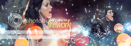
    It's meant to be a SotW for somewhere else but it doesn't hurt to get some critique in. I really focused this time on more colour and bringing out the best in it, and also text placement, which is meant to be where the fireworks are coming out from. I think it turned out nice, except for that clipping mask I used. I should probably move that somewhere. :P
     

    moments.

    quixotic
    3,407
    Posts
    15
    Years

  • Ok, first of all, that clipping mask with her face is a nono. I know it's like a fad, but I seriously don't see the point in duplicating a focal point which just draws attention. If you want it, you could like desaturate it, or distort the edges using filters or do something to make it more of an effect that just a distraction for the eyes. Sorry if that was harsh, I just really hate it when people do it. :P

    Anyways, text is really good! The only thing I would change, is to move it a little bit lower. Currently it is bang in the middle of the vertical axis, and it sits funny because of something to do with eyes seeing things just under the middle more aesthetically pleasing, or seeing that as the middle or something, so yeah, try and avoid going for the very middle, but it just needs to be moved down a little bit, perhaps like 10~ pixels, and that should just sit a little better. You might have to move it to the right a little as well if it is obstructed by Katy's shoulder, but yeah, mostly down. Other than that, good font choices, good positioning in relation to the focal, and good colouring and stuff.

    The last thing I would advise is some more dynamic lighting because it just feels a little bit flat to me. Basically what you want is almost a vignette, so using the burn tool, or just brushing solid black with a soft brush and putting the layer on Soft Light, go around the sort of the areas furthest from the focal, so that top right corner, a little bit in the bottom left as well. And then, using the dodge tool, and probably a nice big 100px~ soft brush, dodge around her face and where the fireworks are coming from. This should just make it pop.

    I might do a tutorial on lighting and using it to create both depth and pop in pieces, because I am willing to bet a lot that barely anybody here adds this kind of lighting in their pieces.
     

    Alternative

    f i r e f l y .
    4,262
    Posts
    15
    Years
  • I knew those clipping masks were out of place, I don't even know why I did it. :x But I took on your advice and it looks so much better than it already did, especially now that it doesn't have that lame clipping mask. I wasn't too sure on the dodging though, but I added it in. :)

    Graphics School
     

    Alternative

    f i r e f l y .
    4,262
    Posts
    15
    Years
  • Wait a minute, I already posted about what sort of assignment you could give, it'd be a waste of time to say it again. :P

    Anyway, I've been on a bit of a graphics block as of late, which totally sucks I know, so I went anc checked out some tutorials that I could follow. I found one which I didn't mind, and made a signature based upon it. I just want to know what you guys think of it. The tutorial really went over fractals, so that was the focus. :)

    Graphics School
     

    TwilightBlade

    All dreams are but another reality.
    7,244
    Posts
    16
    Years
  • What name you go by: Twilight, Blade, TB

    Link to your gallery on PC: n/a

    Why you would like to join the graphics school: I don't want my progress so far to go to waste. I also have basic knowledge of my main gfx program. There's little reason to not try and improve my work. ^^

    Describe your experience with graphics: I've played with Photoshop CS2 for about 5 years. I've upgraded to Photoshop CS5 and I'm just starting to explore its new features. I do lack motivation to create banners. I often make banners like, once a month on average. I've skimmed through tons of tutorials.

    What you feel is your best piece and why:
    Graphics School

    It's a more recent work and I think I've performed well in the flow+color department.

    What you think you need to improve on: I need to continue learning about properly applying textures, c4ds, adjustment layers, smudging, etc. I really need help on text, flow, depth, lighting, and especially color. I'd also like to learn how to use real-life stocks instead of resorting to Pokemon/other anime and games. Finally, I'd like to cut back on having too much going on in a piece.
     

    Circuit

    [cd=font-weight: bold; font-style: italic; backgro
    4,815
    Posts
    16
    Years
  • Well, I think this is exactly what I need :P

    What name you go by: Aiden/Firestar, whatever you're more comfortable calling me
    Why you would like to join the graphics school: Because I want to be able to create something people will look at and think "Wow" but right now, I can't do that. I would like to be able to create graphics that people will admire, and this seems a great way to get further!
    Describe your experience with graphics: I have created a fair few banners, mainly for myself, and created the emblems for the 'Post Theme-athlon' for PC's gt8.
    What you feel is your best piece and why:
    Graphics School

    I thought it turned out very well for my first ever stock image. It turned out the best, and was completely different from my other graphics.
    What you think you need to improve on: Everything xD Well, I want to be able to create really deep pieces, like those that use a lot of c4ds. I also want to be able to successfully use light textures, and make good pieces using stocks. Everything along those lines is what I'd like to get better in.

    This is a brilliant idea by the way, thanks guys! ;)
     

    RetroRoller

    Trailer Trash
    111
    Posts
    12
    Years
  • I was thinking of applying for this but... I've changed my mind. I might apply if there's spots open but right now I'd like to enjoy summer :) It looks really awesome :P
     
    Last edited:
    Back
    Top