Woah I don't understand why you don't have any comments!
I really like the style you use in your icons and tags-- it may be a personal bias, but I find it very enjoyable to look through your wonderful works!
I think my main recommendation is for you to perhaps try to not use your renders so plainly-- for example, you should play around with the liquify too bend something to match the flow of the rest of your tag, or something like that? I also think you should be a bit more careful in color selection. Umm let me be more specific haha-
https://i.imgur.com/pMPp7.png
^ That white render with the straight edge-- I feel it disrupts the flow as it is, and if it were bent a little more to match the contours of your stock, it would be awesome.
And
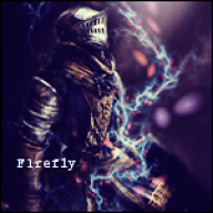
https://i.imgur.com/kREHU.png
^ The pale cyan/blue of the surrounding render is disappointing, since I'm a huge fan of that red-green going on. Though for this one, I think you could've done with making the area directly behind him a bit darker as well, for a bit more sense of depth.
https://i.imgur.com/5MxrV.png
^ This one is also one of my favorites, though I wish the type in the very front wasn't lowered in opacity like that.
Overall though, I really love your gallery-- it brings me back to the days when I did graphics as well. Thanks for sharing! ^^