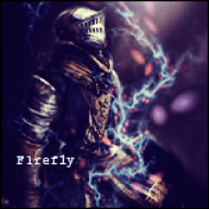
Woah I don't understand why you don't have any comments!
I really like the style you use in your icons and tags-- it may be a personal bias, but I find it very enjoyable to look through your wonderful works!
I think my main recommendation is for you to perhaps try to not use your renders so plainly-- for example, you should play around with the liquify too bend something to match the flow of the rest of your tag, or something like that? I also think you should be a bit more careful in color selection. Umm let me be more specific haha-
https://i.imgur.com/pMPp7.png
^ That white render with the straight edge-- I feel it disrupts the flow as it is, and if it were bent a little more to match the contours of your stock, it would be awesome.
And
https://i.imgur.com/kREHU.png
^ The pale cyan/blue of the surrounding render is disappointing, since I'm a huge fan of that red-green going on. Though for this one, I think you could've done with making the area directly behind him a bit darker as well, for a bit more sense of depth.
https://i.imgur.com/5MxrV.png
^ This one is also one of my favorites, though I wish the type in the very front wasn't lowered in opacity like that.
Overall though, I really love your gallery-- it brings me back to the days when I did graphics as well. Thanks for sharing! ^^

![[PokeCommunity.com] S c a r l e t](https://i.imgur.com/n1oCy.png "[PokeCommunity.com] S c a r l e t")
![[PokeCommunity.com] S c a r l e t](https://i.imgur.com/lYWE3.png "[PokeCommunity.com] S c a r l e t")
![[PokeCommunity.com] S c a r l e t](https://i.imgur.com/MNb5b.png "[PokeCommunity.com] S c a r l e t")
![[PokeCommunity.com] S c a r l e t](https://i.imgur.com/l9TyO.png "[PokeCommunity.com] S c a r l e t")
![[PokeCommunity.com] S c a r l e t](https://i.imgur.com/KeyPk.png "[PokeCommunity.com] S c a r l e t")
![[PokeCommunity.com] S c a r l e t](https://i.imgur.com/rZPxe.png "[PokeCommunity.com] S c a r l e t")
![[PokeCommunity.com] S c a r l e t](https://i.imgur.com/geoWq.png "[PokeCommunity.com] S c a r l e t")
![[PokeCommunity.com] S c a r l e t](https://i.imgur.com/K7DHS.png "[PokeCommunity.com] S c a r l e t")
![[PokeCommunity.com] S c a r l e t](https://i.imgur.com/E0kNv.png "[PokeCommunity.com] S c a r l e t")
![[PokeCommunity.com] S c a r l e t](https://i.imgur.com/2pXuW.png "[PokeCommunity.com] S c a r l e t")
![[PokeCommunity.com] S c a r l e t](https://i.imgur.com/VRPCy.png "[PokeCommunity.com] S c a r l e t")
![[PokeCommunity.com] S c a r l e t](https://i.imgur.com/htVjM.png "[PokeCommunity.com] S c a r l e t")
![[PokeCommunity.com] S c a r l e t](https://i.imgur.com/2QMxk.png "[PokeCommunity.com] S c a r l e t")
![[PokeCommunity.com] S c a r l e t](https://i.imgur.com/mAijo.png "[PokeCommunity.com] S c a r l e t")
![[PokeCommunity.com] S c a r l e t](https://i.imgur.com/uKCL1.png "[PokeCommunity.com] S c a r l e t")
![[PokeCommunity.com] S c a r l e t](https://i.imgur.com/sZs6E.png "[PokeCommunity.com] S c a r l e t")
![[PokeCommunity.com] S c a r l e t](https://i.imgur.com/Zqg0R.png "[PokeCommunity.com] S c a r l e t")
![[PokeCommunity.com] S c a r l e t](https://i.imgur.com/z7KLH.png "[PokeCommunity.com] S c a r l e t")
![[PokeCommunity.com] S c a r l e t](https://i.imgur.com/AMOcF.png "[PokeCommunity.com] S c a r l e t")
![[PokeCommunity.com] S c a r l e t](https://i.imgur.com/Io451.png "[PokeCommunity.com] S c a r l e t")
![[PokeCommunity.com] S c a r l e t](https://i.imgur.com/z1M3V.png "[PokeCommunity.com] S c a r l e t")
![[PokeCommunity.com] S c a r l e t](https://i.imgur.com/smi4q.png "[PokeCommunity.com] S c a r l e t")
![[PokeCommunity.com] S c a r l e t](https://i.imgur.com/HPtXs.png "[PokeCommunity.com] S c a r l e t")
![[PokeCommunity.com] S c a r l e t](https://i.imgur.com/HnztP.png "[PokeCommunity.com] S c a r l e t")
![[PokeCommunity.com] S c a r l e t](https://i1110.photobucket.com/albums/h454/Sanaki-GFX/Lunasa.png "[PokeCommunity.com] S c a r l e t")
![[PokeCommunity.com] S c a r l e t](https://i1110.photobucket.com/albums/h454/Sanaki-GFX/Lyrica.png "[PokeCommunity.com] S c a r l e t")
![[PokeCommunity.com] S c a r l e t](https://i1110.photobucket.com/albums/h454/Sanaki-GFX/Merlin.png "[PokeCommunity.com] S c a r l e t")
![[PokeCommunity.com] S c a r l e t](https://i.imgur.com/b733Z.png "[PokeCommunity.com] S c a r l e t")
![[PokeCommunity.com] S c a r l e t](https://i1110.photobucket.com/albums/h454/Sanaki-GFX/Couple%20icons/IN/Wriggle.png "[PokeCommunity.com] S c a r l e t")
![[PokeCommunity.com] S c a r l e t](https://i1110.photobucket.com/albums/h454/Sanaki-GFX/Couple%20icons/IN/Mystia.png "[PokeCommunity.com] S c a r l e t")
![[PokeCommunity.com] S c a r l e t](https://i.imgur.com/XmzkQ.png "[PokeCommunity.com] S c a r l e t")
![[PokeCommunity.com] S c a r l e t](https://i.imgur.com/YqSkb.png "[PokeCommunity.com] S c a r l e t")
![[PokeCommunity.com] S c a r l e t](https://i.imgur.com/Hi8n5.png "[PokeCommunity.com] S c a r l e t")
![[PokeCommunity.com] S c a r l e t](https://i.imgur.com/pHuoh.png "[PokeCommunity.com] S c a r l e t")
![[PokeCommunity.com] S c a r l e t](https://i.imgur.com/wb8wc.png "[PokeCommunity.com] S c a r l e t")
![[PokeCommunity.com] S c a r l e t](https://i1110.photobucket.com/albums/h454/Sanaki-GFX/Couple%20icons/IN/Kaguya.png "[PokeCommunity.com] S c a r l e t")
![[PokeCommunity.com] S c a r l e t](https://i1110.photobucket.com/albums/h454/Sanaki-GFX/Couple%20icons/IN/kaguya2.png "[PokeCommunity.com] S c a r l e t")
![[PokeCommunity.com] S c a r l e t](https://i.imgur.com/J0YUh.png "[PokeCommunity.com] S c a r l e t")
![[PokeCommunity.com] S c a r l e t](https://i.imgur.com/d6fNG.png "[PokeCommunity.com] S c a r l e t")
![[PokeCommunity.com] S c a r l e t](https://i.imgur.com/Bdtsu.png "[PokeCommunity.com] S c a r l e t")
![[PokeCommunity.com] S c a r l e t](https://img716.imageshack.us/img716/5935/inflamescopy.png "[PokeCommunity.com] S c a r l e t")
![[PokeCommunity.com] S c a r l e t](https://i1110.photobucket.com/albums/h454/Sanaki-GFX/Tags/MK.png "[PokeCommunity.com] S c a r l e t")
![[PokeCommunity.com] S c a r l e t](https://i1110.photobucket.com/albums/h454/Sanaki-GFX/Tags/FIRE.png "[PokeCommunity.com] S c a r l e t")
![[PokeCommunity.com] S c a r l e t](https://i1110.photobucket.com/albums/h454/Sanaki-GFX/Tags/immortalsmoke.png "[PokeCommunity.com] S c a r l e t")
![[PokeCommunity.com] S c a r l e t](https://i.imgur.com/d4jVv.png "[PokeCommunity.com] S c a r l e t")
![[PokeCommunity.com] S c a r l e t](https://i.imgur.com/x6MfR.png "[PokeCommunity.com] S c a r l e t")
![[PokeCommunity.com] S c a r l e t](https://i1110.photobucket.com/albums/h454/Sanaki-GFX/Tags/DollinmyHandV2.png "[PokeCommunity.com] S c a r l e t")
![[PokeCommunity.com] S c a r l e t](https://img248.imageshack.us/img248/9459/ascendingintonaught.png "[PokeCommunity.com] S c a r l e t")
![[PokeCommunity.com] S c a r l e t](https://i1110.photobucket.com/albums/h454/Sanaki-GFX/Tags/ScarletDevil.png "[PokeCommunity.com] S c a r l e t")
![[PokeCommunity.com] S c a r l e t](https://img694.imageshack.us/img694/5819/dreamf.png "[PokeCommunity.com] S c a r l e t")
![[PokeCommunity.com] S c a r l e t](https://i.imgur.com/pdxSJ.png "[PokeCommunity.com] S c a r l e t")
![[PokeCommunity.com] S c a r l e t](https://i.imgur.com/pMPp7.png "[PokeCommunity.com] S c a r l e t")
![[PokeCommunity.com] S c a r l e t](https://img806.imageshack.us/img806/8193/messiahv4.png "[PokeCommunity.com] S c a r l e t")
![[PokeCommunity.com] S c a r l e t](https://i.imgur.com/X4CFa.png "[PokeCommunity.com] S c a r l e t")
![[PokeCommunity.com] S c a r l e t](https://i.imgur.com/ersAM.png "[PokeCommunity.com] S c a r l e t")
![[PokeCommunity.com] S c a r l e t](https://i.imgur.com/kREHU.png "[PokeCommunity.com] S c a r l e t")
![[PokeCommunity.com] S c a r l e t](https://i.imgur.com/uwAhE.png "[PokeCommunity.com] S c a r l e t")
![[PokeCommunity.com] S c a r l e t](https://i.imgur.com/YGrKh.png "[PokeCommunity.com] S c a r l e t")
![[PokeCommunity.com] S c a r l e t](https://i.imgur.com/DTmSJ.png "[PokeCommunity.com] S c a r l e t")
![[PokeCommunity.com] S c a r l e t](https://i.imgur.com/mmTPM.png "[PokeCommunity.com] S c a r l e t")
![[PokeCommunity.com] S c a r l e t](https://i.imgur.com/PE8ic.png "[PokeCommunity.com] S c a r l e t")
![[PokeCommunity.com] S c a r l e t](https://i.imgur.com/5MxrV.png "[PokeCommunity.com] S c a r l e t")
![[PokeCommunity.com] S c a r l e t](https://i.imgur.com/ba1Ee.png "[PokeCommunity.com] S c a r l e t")
![[PokeCommunity.com] S c a r l e t](https://i.imgur.com/FM7bw.png "[PokeCommunity.com] S c a r l e t")
![[PokeCommunity.com] S c a r l e t](https://i.imgur.com/oTLHk.png "[PokeCommunity.com] S c a r l e t")
![[PokeCommunity.com] S c a r l e t](https://i.imgur.com/VsecK.png "[PokeCommunity.com] S c a r l e t")
![[PokeCommunity.com] S c a r l e t](https://i.imgur.com/Evv6j.png "[PokeCommunity.com] S c a r l e t")
![[PokeCommunity.com] S c a r l e t](https://i.imgur.com/4BkRU.png "[PokeCommunity.com] S c a r l e t")
![[PokeCommunity.com] S c a r l e t](https://i.imgur.com/ygDjJ.png "[PokeCommunity.com] S c a r l e t")
![[PokeCommunity.com] S c a r l e t](https://i.imgur.com/4hX47.png "[PokeCommunity.com] S c a r l e t")
![[PokeCommunity.com] S c a r l e t](https://i.imgur.com/8008o.png "[PokeCommunity.com] S c a r l e t")
![[PokeCommunity.com] S c a r l e t](https://i.imgur.com/Zkt0o.png "[PokeCommunity.com] S c a r l e t")

![[PokeCommunity.com] S c a r l e t](https://eemoticons.net/Upload/Cute%20Sheep/Cute%20Sheep%20Emoticon%20002.gif "[PokeCommunity.com] S c a r l e t")
![[PokeCommunity.com] S c a r l e t](https://eemoticons.net/Upload/Cute%20Sheep/Cute%20Sheep%20Emoticon%20004.gif "[PokeCommunity.com] S c a r l e t")