You are using an out of date browser. It may not display this or other websites correctly.
You should upgrade or use an alternative browser.
You should upgrade or use an alternative browser.
Map Showcase and Review Thread
- Thread starter abnegation
- Start date
- Status
- Not open for further replies.
More options
Who Replied?Harvey_Create
Pokemon Apex Team Member
- 187
- Posts
- 11
- Years
- Iowa
- Seen Jul 12, 2015
I've been mapping again since i came back. And I has curious if any one noticed the changes in my maps.
So here is a map. with sprites edited in.

Mountain and grass - Magiscarf
Tree and sign - Kyedove
Rest - Me
So here is a map. with sprites edited in.
Spoiler:

Mountain and grass - Magiscarf
Tree and sign - Kyedove
Rest - Me
Rayquaza.
Lead Dev in Pokémon Order and Chaos
- 702
- Posts
- 12
- Years
- United Kingdom
- Seen Jan 24, 2021
I've been mapping again since i came back. And I has curious if any one noticed the changes in my maps.
So here is a map. with sprites edited in.
Spoiler:
Mountain and grass - Magiscarf
Tree and sign - Kyedove
Rest - Me
Very plain, very simple. That isn't always a bad thing, there isn't any nitpicking I can do with space although, why is there only 1 trainer on the route? Also, the stairs look a bit unrealistic (Like they're painted on). They should overlap the cliff by about 1/4 of a tile.
Harvey_Create
Pokemon Apex Team Member
- 187
- Posts
- 11
- Years
- Iowa
- Seen Jul 12, 2015
Very plain, very simple. That isn't always a bad thing, there isn't any nitpicking I can do with space although, why is there only 1 trainer on the route? Also, the stairs look a bit unrealistic (Like they're painted on). They should overlap the cliff by about 1/4 of a tile.
Yeah, I need to make better ones. I've been procrastinating them. But thanks for the criticism!
Actually, I kinda like that map, Harvey. XD Though there are a few points on the map that seem quite narrow and cramped, like the place where you enter the first patch of tall grass. Add just a little extra space, and it'd be a really nice map.
Varion Bluefire
A.K.A The Glitch
- 655
- Posts
- 11
- Years
- Seen Jan 3, 2015
Spoiler:

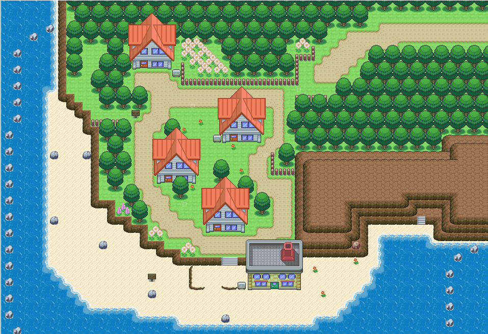
The home town to something I'm working on.
Been making it the past few days making small changes here and there.
Like the trees patterns changed from Game Freak's style, to this one.
Etc Etc.
- 84
- Posts
- 10
- Years
- Seen Jun 11, 2022
Spoiler:
The home town to something I'm working on.
Been making it the past few days making small changes here and there.
Like the trees patterns changed from Game Freak's style, to this one.
Etc Etc.
I think this is a really nice map, really natural looking. I do think that the grass and the mountain tile should blend in together better on the cliff though. Try putting two or three boulders on top of the mountain as well, so it doesn't look as plain/flat on top, and/or maybe add another layer of elevation onto the left side of it to give it a nice asymmetrical look. If you have rocks that match the mountains I think they might look nicer on the beach as well, rather than the other 'stoney' looking ones.
- 378
- Posts
- 11
- Years
- Seen Oct 18, 2017
Spoiler:
The home town to something I'm working on.
Been making it the past few days making small changes here and there.
Like the trees patterns changed from Game Freak's style, to this one.
Etc Etc.
The rocks are a bit strange. Do you have any 4x4 rocks in your tiles? If so, use them instead.
Varion Bluefire
A.K.A The Glitch
- 655
- Posts
- 11
- Years
- Seen Jan 3, 2015
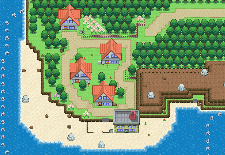
Spoiler:

Added new custom rocks, and added grass edges.
Etc Etc Etc.
TBM_Christopher
Semi-pro Game Dev
- 448
- Posts
- 14
- Years
- Age 30
- Lincoln, NE
- Seen Apr 12, 2018
One thing I'm simply not a fan of on this map is the south most building(presumably a pokemon lab?), since it seems to be placed directly on the sand with no sort of foundation. And while I love the white rocks you've added individually, I don't think that they're appropriate for this map due to their color, especially when they contrast so much with the brown of your mountainous terrain
- 8
- Posts
- 10
- Years
- Seen Mar 30, 2017
Hi, I've started making my own game a while ago, but I'm really new to RMXP (and mapping, for that matter) so I need all the help I can get from you guys :)
Below's how Route 1 look like. Since it's Route 1 and it isn't planned for any significant storyline, I wanted it to be linear. Is it overly so though?
One thing I didn't like on my map was the rocks.. they looked somewhat weird on the map, but I dunno what I want to replace them with (without them it seems too empty, and I can't find any appropriate rocks to replace them).
I didn't show the NPCs on the map - currently there are 4 trainers. Too little? Too much? If so, about how many NPCs should be on a map of this size?
Any criticism is welcome - thanks :)
tImE
It's still me, 44tim44 ;)
- 673
- Posts
- 17
- Years
- Somewhere in Scandinavia...
- Seen Mar 25, 2023
Hi, I've started making my own game a while ago, but I'm really new to RMXP (and mapping, for that matter) so I need all the help I can get from you guys :)
Below's how Route 1 look like. Since it's Route 1 and it isn't planned for any significant storyline, I wanted it to be linear. Is it overly so though?
One thing I didn't like on my map was the rocks.. they looked somewhat weird on the map, but I dunno what I want to replace them with (without them it seems too empty, and I can't find any appropriate rocks to replace them).
I didn't show the NPCs on the map - currently there are 4 trainers. Too little? Too much? If so, about how many NPCs should be on a map of this size?
Any criticism is welcome - thanks :)
For just having started, I'd say the map is very well done.
There are a lot of things that you should learn, though.
First off, the top area is WAY too big. You should make the the "paths" where you place wild grass a maximum of 5-6 tiles wide.
Also, don't use the "random wild-grass placement".
It doesn't look very good using the standard Pokémon tiles, so stick to the regular grass-placement. (Check original maps from FRLG)
Furthermore, the entrance area to the top left is VERY uninteresting and way too big. Make it a maximum of 4 tiles high. The same can be said about the south path, although the size problem isn't as big there. It's still very uninteresting. Add a path and some flowers or things like that.
And lastly, before making a map altogether you should make a concept-map showing the path the player is supposed to take through the map.
In your map it's kind of confusing as to where the player wants to go. You're also using the ledges wrong. Ledges should be used to give the player an easier path to use when backtracking to earlier maps.
Check Route 1 from FRLG here.
Spoiler:
The path the player should take is marked out by the sandpath showing him the way between the grass.
The ledges are placed so that the player can return to Pallet Town, without stepping in grass.
In my opinion, the best way to make a map isn't to make it realistic. It's to make it good gameplay-wise.
It should be easy for the player to find his way through the map (unless it's a maze or puzzle, ofc) and it should be easy for the player to remember the map. Make it distinct from the other maps in the game.
I wish you luck with your game!
Varion Bluefire
A.K.A The Glitch
- 655
- Posts
- 11
- Years
- Seen Jan 3, 2015
Does anyone know where I can find any of the tiles you're using?
What kind of tiles are you on about?
- 3
- Posts
- 10
- Years
- Seen Apr 18, 2014
Grass tiles, Path tiles, building tiles, and tree tiles.What kind of tiles are you on about?
- 8
- Posts
- 10
- Years
- Seen Mar 30, 2017
For just having started, I'd say the map is very well done.
There are a lot of things that you should learn, though.
First off, the top area is WAY too big. You should make the the "paths" where you place wild grass a maximum of 5-6 tiles wide.
Also, don't use the "random wild-grass placement".
It doesn't look very good using the standard Pokémon tiles, so stick to the regular grass-placement. (Check original maps from FRLG)
Furthermore, the entrance area to the top left is VERY uninteresting and way too big. Make it a maximum of 4 tiles high. The same can be said about the south path, although the size problem isn't as big there. It's still very uninteresting. Add a path and some flowers or things like that.
And lastly, before making a map altogether you should make a concept-map showing the path the player is supposed to take through the map.
In your map it's kind of confusing as to where the player wants to go. You're also using the ledges wrong. Ledges should be used to give the player an easier path to use when backtracking to earlier maps.
Check Route 1 from FRLG here.
The path the player should take is marked out by the sandpath showing him the way between the grass.
The ledges are placed so that the player can return to Pallet Town, without stepping in grass.
In my opinion, the best way to make a map isn't to make it realistic. It's to make it good gameplay-wise.
It should be easy for the player to find his way through the map (unless it's a maze or puzzle, ofc) and it should be easy for the player to remember the map. Make it distinct from the other maps in the game.
I wish you luck with your game!
Hey thanks a lot! A few points like the ledges one and the paths one never even crossed my mind. Now I hope this looks better? The bottom left corner now looks problematic but I'm not sure what to do to make it look less empty.. Or am I wrong?
tImE
It's still me, 44tim44 ;)
- 673
- Posts
- 17
- Years
- Somewhere in Scandinavia...
- Seen Mar 25, 2023
Hey thanks a lot! A few points like the ledges one and the paths one never even crossed my mind. Now I hope this looks better? The bottom left corner now looks problematic but I'm not sure what to do to make it look less empty.. Or am I wrong?
Wow, that is a massive improvement!
Amazing job, mate!
And yeah, the bottom left corner is a little awkward.
Try extending the trees to the left of the southern exit upwards so that they reach the ledge.
I think that'd make it look a little less awkward.
Still, you've exceeded expectation!
This is a really great map now!
I'd say you have some really good mapping potential.
Good luck with your project! :D
tImE
It's still me, 44tim44 ;)
- 673
- Posts
- 17
- Years
- Somewhere in Scandinavia...
- Seen Mar 25, 2023
i want to know how to change map titles
If you are using RMXP, right-click the map and click on "Map Properties".
There you can change the name.
If you meant tiles, you should look at tutorials.
Either way, this is the wrong place to ask.
Harvey_Create
Pokemon Apex Team Member
- 187
- Posts
- 11
- Years
- Iowa
- Seen Jul 12, 2015
I am messing with maps using Default RMXP Graphics. How do you like?


- 99
- Posts
- 14
- Years
- Seen Jan 16, 2023
Hey thanks a lot! A few points like the ledges one and the paths one never even crossed my mind. Now I hope this looks better? The bottom left corner now looks problematic but I'm not sure what to do to make it look less empty.. Or am I wrong?
It's nice, but you should remove the small ledge at the top on the road and modify the way the ledges are laid down around the house
- Status
- Not open for further replies.
