
You are using an out of date browser. It may not display this or other websites correctly.
You should upgrade or use an alternative browser.
You should upgrade or use an alternative browser.
[Showcase] I n s o m n i a c
- Thread starter Isaac.
- Start date
More options
Who Replied?


derozio
[b][color=red][font=helvetica][i]door-kun best boi
- 5,521
- Posts
- 14
- Years
- Akihabara
- Seen Jun 27, 2020
Wow, quite a lot of stuff on display here. Plus, I really like your work so far and I can sense a lot of hidden potential here. :DD
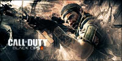
If I had to pick my fave, I'd go with this: http://i1295.photobucket.com/albums/b625/bennypoop805/BlackOps2_zps32713976.png
This piece avoids looking as monotonous as the rest. And I really like how you've successfully blended him in the background and it looks so natural. You have smudged a bit too, right? It shows. lD The only major flaw I can see in here is the text. Doesn't quite fit in there. Although, admittedly, it is still better than all the other works where the text just looked tacked on because the font style didn't match the contents of the tag. Here, the font and stuff is alright, but positioning is irksome. I'd advise you to expand your canvas size a bit so that text doesn't become a problem. It becomes increasingly difficult to add text in narrow tags. As it stands now, I can't suggest a perfect place for text to be placed in that tag. Also, the lighting is a little heavy on "Duty"'s 'y'. :p
Another problem I see with your works is that you tend to, at times, work with low quality images. Never do that. It really undermines all your hard work if the quality of the stock spoils the whole tag. This and this piece really look bad due to the render/stock quality, really. Some of your tags are a little monotone too. When you go for monotone, depth is needed. But your tags can't seem to pull of monotone look. So yeah, go for different colors, I'd say. And spam selective colors like I do! lol This is all my opinion, though. So don't feel bad if you feel I'm trying to undermine your hard-work or something because that's not what my aim is. I speak what I think and I really wanna see you improve a lot as a graphic artist. <3;
Seriously though, some really good work here. I can see you go places. :]
Edit: In this one, I can see you went overboard with a gradient map or contrast. It looks a little choppy and lighting is all over the place. Some parts of the render are totally dark while some are really bright. If you try to keep stuff like this in check you'll end up with better stuff, imo.
Last edited:
- 23
- Posts
- 11
- Years
- Seen Jul 23, 2014
Wow, quite a lot of stuff on display here. Plus, I really like your work so far and I can sense a lot of hidden potential here. :DD
If I had to pick my fave, I'd go with this: http://i1295.photobucket.com/albums/b625/bennypoop805/BlackOps2_zps32713976.png
This piece avoids looking as monotonous as the rest. And I really like how you've successfully blended him in the background and it looks so natural. You have smudged a bit too, right? It shows. lD The only major flaw I can see in here is the text. Doesn't quite fit in there. Although, admittedly, it is still better than all the other works where the text just looked tacked on because the font style didn't match the contents of the tag. Here, the font and stuff is alright, but positioning is irksome. I'd advise you to expand your canvas size a bit so that text doesn't become a problem. It becomes increasingly difficult to add text in narrow tags. As it stands now, I can't suggest a perfect place for text to be placed in that tag. Also, the lighting is a little heavy on "Duty"'s 'y'. :p
Another problem I see with your works is that you tend to, at times, work with low quality images. Never do that. It really undermines all your hard work if the quality of the stock spoils the whole tag. This and this piece really look bad due to the render/stock quality, really. Some of your tags are a little monotone too. When you go for monotone, depth is needed. But your tags can't seem to pull of monotone look. So yeah, go for different colors, I'd say. And spam selective colors like I do! lol This is all my opinion, though. So don't feel bad if you feel I'm trying to undermine your hard-work or something because that's not what my aim is. I speak what I think and I really wanna see you improve a lot as a graphic artist. <3;
Seriously though, some really good work here. I can see you go places. :]
Edit: In this one, I can see you went overboard with a gradient map or contrast. It looks a little choppy and lighting is all over the place. Some parts of the render are totally dark while some are really bright. If you try to keep stuff like this in check you'll end up with better stuff, imo.
I hated the text on that one too... eww... (shop order XD)
And about the "monotone" look, i really try to match colors and coloring, I am not into colorful things in general, also i am not really a C4d fanatic, thats why most of my recent sigs consist of smudging and fractals and slight c4ds.
Whenever i worked with low quality images, it was because it was a shop order or a contest... I know, i would rather work with high quality pics too.
In you last critique, on the high contrast sig. IT LOST SO MUCH QUALITY. But i do agree the lighting is REALLY weird on his face haha. As for his body, intese light make a silohouette (spelling) look....
derozio
[b][color=red][font=helvetica][i]door-kun best boi
- 5,521
- Posts
- 14
- Years
- Akihabara
- Seen Jun 27, 2020
Hmm, can totally understand if they are shop requests, I guess. XD; I tend to refuse requests if stock is low quality so I never face that problem. :p
I know it isn't your style to go full-blown color. But you ought to work more on your depth in order to prevent flatness. Monotonous stuff requires more effort in the depth department, imo. And I don't see you pulling off monotone yet. Also, I'm not saying you gotta go 'rainbow' with your tags. Just 2-3 complimentary colors are fine. Selective colors not only means you can saturate colors and make it pop out - it also enables the user to mess with colors a great deal more than one can normally do. You'd be surprised at the difference it can bring about in a tag.
And yep, if you can see what's wrong with it, I hope you'll prevent it from happening in the future. :p

- 3,666
- Posts
- 16
- Years
- Age 28
- He/Him
- Philippines
- Seen May 8, 2024
I like your tags. :) They look very familiar for some reason, I think it's because I see tags like these (or of a similar style) everywhere when I lurk other forums, particularly the ones unrelated to Pokémon or any particular video game series, which is odd, haha. My personal favorites would be these two. I think that the others have a little too much going on in the background, and don't really have a general feel, apart from being flashy and having a certain hue. Which is okay, but it makes it a bit bland, sort of like how Derozio feels I suppose. What makes those two different is that they sort of go simple and to the point, while having more of a direction, and something like a concept behind it than just having a render and an amount of good-looking C4Ds.
I think you're more experienced than me in making graphics, though, so I know you know a lot about it. ;D But I wanted to comment on what I thought about the stuff you had here, because I thought they looked cool. B) And you're also really awesome, you know, I mean you can maintain a shop! I know you have lots of great stuff ahead of you, because you're really good. I'm definitely looking forward to seeing you improve even more.
I think you're more experienced than me in making graphics, though, so I know you know a lot about it. ;D But I wanted to comment on what I thought about the stuff you had here, because I thought they looked cool. B) And you're also really awesome, you know, I mean you can maintain a shop! I know you have lots of great stuff ahead of you, because you're really good. I'm definitely looking forward to seeing you improve even more.

Kotone
someone needed a doctor?
- 2,787
- Posts
- 15
- Years
- somewhere ;]
- Seen Jun 29, 2018
lots of tags here (: they're all very cool!
the one problem i see with all of them is that they seem very flat and one solid color. i would try to somehow make the c4d's and textures pop. try using some different colors to give it more effects!
the pictures are a little low quality like Derezio was saying. try to find some high quality images like on a render site or if you can't try to duplicate the image and overlay it. also, sharpening an image helps too.
also, the text could stand out, or sometimes adding text could not help the tag at all.
the tags are very nice overall, but i would try using different colors to make your tags pop.
cant wait to see more.