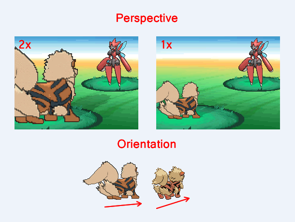
You guys need to understand something very important about these sprites that you're using. And I don't know how it doesn't bother you, but it bothers me a lot. The whole system is designed to give off a sense of perspective. Backsprites are closer to the player, hence closer to the actual "screen", so in order to give off a sense of perspective they
have to be larger than the front sprites (objects closer to your eye appear larger than objects in the distance). So shrinking the backsprites, and using them in the same ratio as the frontsprites is absolutely
stupid and looks
ugly as hell. You completely destroy the sense of perspective that I've been aiming to achieve. Gen 6 Pokemon models were
not designed to be used as sprites in a 2D battle scene.
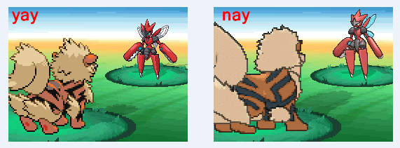
On top of all the issues of the perspective, there is a glaring issue of direction. The gen 6 Pokemon models weren't ripped and compiled with the appropriate "tilt" to be used in a gen 5 environment. The gen 5 sprites were drawn to be facing a certain direction, and hence further emphasize the ongoing sense of perspective.
Conclusion: Those gen 6 "sprites" look bad in Essentials overall. Due to their design, scaling and orientation.
mega Scizor by
Falgaia
P.S. You also need a bigger screen size to accommodate those bigger gen 6 "sprites".