• Our software update is now concluded. You will need to reset your password to log in. In order to do this, you will have to click "Log in" in the top right corner and then "Forgot your password?".
  • Welcome to PokéCommunity! Register now and join one of the best fan communities on the 'net to talk Pokémon and more! We are not affiliated with The Pokémon Company or Nintendo.

[Game] ? THE GREAT ART WAR ?

Status
Not open for further replies.
2,413
Posts
16
Years
⚔ THE GREAT ART WAR ⚔

⚔ ART WAR ⚔

Are you ready?


Welcome to the ART WAR!

True to your sign-ups, you should all be ready for some fast pace battling! Here's how it works:

  • You have been matched against the best candidate base on media and experience.
  • You will have 24 hours to create a work of art with the theme and media of your pairing.
  • You will PM your entry to Nina, unless of course you're fighting me. PM it to fairy instead.
  • I will PM entries as they come in to the judges, but there will be a phase change post that will show all the artworks while the judges have 6 hours to pick their winners and give some comments.
  • Judges will post their results as they finish, individually. Do not mistake one post from a judge as the verdict of all judges.
  • The winners will be announced and in 30 minutes the next prompt will be given.
  • Post here if you have any questions!

Judges: fairy, [g="daily"]Pebbles[/g], JohnnyMustang

Tournament Table

There is an error in the table!
killer150 has dropped out, and I have changed the table far too many times. Elektra Heart and Merlin will be battling against each other in the first phase. 02.2 will not take place and the winner of 01.4 will move on to 03.2.
BpkBvej.png

PHASE 1

I'm going to trust you guys to start at the correct time and not early on this prompt. Here's a countdown timer until Phase 1 is over! Don't start until the countdown has 1 day, 0 hours, and 0 minutes left!

PROMPT: Starry Sky

  1. Lize vs zappyspiker: Graphics (intermediate)
  2. Juno vs CDB: Graphics (intermediate)
  3. machomuu vs BOOMchika: Graphics (beginner - intermediate)
  4. Merlin vs Elektra Heart: Traditional Art, Pencils (beginner - intermediate)
  5. Lost vs Gigadweeb: Pixel Art (beginner - intermediate)
  6. Nina vs Anastasia.R: Digital Art (advanced)

Time Table

WHAT TIME IS IT?

  • Midnight 3rd - Midnight 4th : PHASE 1
  • Midnight 4th - 5:30 AM 4th : Judgement / Phase Change
  • 6:00 AM 4th - 6:00 AM54th : PHASE 2
  • 6:00 AM 5th - 11:30 AM 5th : Judgement / Phase Change
  • Noon 5th - Noon 6th : PHASE 3
  • Noon 6th - 5:30 PM 6th : Judgement / Phase Change
  • 6:00 PM 6th - 6:00 PM 7th : PHASE 4
  • 6:00 PM 7th : Final Judgement
 

Gigadweeb

[b][i]The Black Swordsman[/i][/b]
319
Posts
9
Years
I just realised I only get like 3-4 hours at most for each one to do everything due to school

damn timezones
 
2,413
Posts
16
Years
2 hours and a half left! However, I have received a request for an extension and still am missing multiple entries. How is everyone doing? Do we need more time?

Edit: Elektra Heart and Merlin have agreed to move their battle to Phase 2 because of scheduling issues and I have allowed it due to the skip in the phase battles for them. They will keep the same prompt.
 
Last edited:
2,413
Posts
16
Years
PHASE 1 IS OVER.


I still need CDB's, machomuu's, and BOOMchika's art! Please get it in asap while the judges are still deciding.

EDIT: Judges are offline and I should be going to be soon so...everything's just gonna be postponed until we get our ducks in order. Get things in if you can!
 
Last edited:
2,413
Posts
16
Years

Entries So Far


Get them in or forever hold your peace! But really, don't feel too bad if you didn't get it in guys. This was mostly an experiment in this format, so it's alright, we're all learning.

LIZE VS ZAPPYSPIKER

LIZE


Starry Sky
Lize's Art War Entry
Header Text
Lorem ipsum dolor sit amet, consectetur adipiscing elit. Fusce vel ex a lorem tincidunt laoreet non sed enim. Morbi iaculis tellus dolor, vitae tincidunt lectus molestie a. Phasellus sem lectus, tempor at vulputate nec, finibus at dolor. Maecenas vulputate placerat velit vel bibendum. Integer sagittis massa urna, vel pellentesque massa mattis vel. Curabitur nisi tellus, laoreet sed aliquam non, gravida a lorem. Aliquam blandit aliquam consequat
Bonus Song
The Stars
Lorem ipsum dolor sit amet, consectetur adipiscing elit. Fusce vel ex a lorem tincidunt laoreet non sed enim. Morbi iaculis tellus dolor, vitae tincidunt lectus molestie a. Phasellus sem lectus, tempor at vulputate nec, finibus at dolor. Maecenas vulputate placerat velit vel bibendum. Integer sagittis massa urna, vel pellentesque massa mattis vel. Curabitur nisi tellus, laoreet sed aliquam non, gravida a lorem. Aliquam blandit aliquam consequat
100 billion stars per galaxy
Starry Night CSS Template | CSS by Lize

ZAPPYSPIKER


iM2cgjZ.png

JUNO VS CDB

JUNO

(click on the constellations)

[a id]up[/a id][alink id="aquarius"]
XG1IBji.png
[/alink id][alink id="pisces"]
K9WxSNG.png
[/alink id][alink id="aries"]
UrwpCUb.png
[/alink id][alink id="taurus"]
c3CdEnu.png
[/alink id]

[alink id="gemini"]
Ja5N7aJ.png
[/alink id][alink id="cancer"]
hqpI5qg.png
[/alink id][alink id="leo"]
YMMUCLa.png
[/alink id][alink id="virgo"]
CDkrOVU.png
[/alink id]

[alink id="libra"]
XcJhaAv.png
[/alink id][alink id="scorpio"]
nBoKzie.png
[/alink id][alink id="saggitarius"]
XCTXB0u.png
[/alink id][alink id="capricorn"]
EE95nXe.png
[/alink id]

[alink id="about"]
9N0IQ53.png
[/alink id]


[a id]aquarius[/a id]

AQUARIUS

January 21 - February 19

Aquarians don't always care what others think about them. They take each opportunity they have and work towards formulating new ideas.

[alink id="up"]back[/alink id]


[a id]pisces[/a id]

PISCES

February 20 - March 20

Those who are Pisces are extremely sensitive and reserved. They like to escape from reality. A Pisces is a very good listener and friend.

[alink id="up"]back[/alink id]


[a id]aries[/a id]

ARIES

March 21 - April 20

Those who are Aries are independent and courageous. They enjoy leading others and bringing excitement into the lives of others. An Aries is enthusiastic and very goal-oriented.

[alink id="up"]back[/alink id]

/7L84wPv.png?1[/cimg]

[a id]pisces[/a id]

PISCES

February 19 - March 20

Those who are Pisces are extremely sensitive and reserved. They like to escape from reality. A Pisces is a very good listener and friend.

[alink id="up"]back[/alink id]


[a id]taurus[/a id]

TAURUS

April 21 - May 21

Those who are a Taurus are solid and fight for what they want. A Taurus is very easy going but can also be stubborn. A Taurus can be procrastinators but also have a good-work ethic.

[alink id="up"]back[/alink id]


[a id]gemini[/a id]

GEMINI

May 22 - June 21

Geminis have many sides and are known for their energy. They are very talkative and are considered social butterflies. A Gemini will always take their lives in the direction they want to go.

[alink id="up"]back[/alink id]


[a id]cancer[/a id]

CANCER

June 22 - July 22

This sign is marked by inconsistency. They enjoy security but also seek adventure. A Cancer is not very predictable and always keep others guessing.

[alink id="up"]back[/alink id]


[a id]leo[/a id]

LEO

July 23 - August 21

Leos have high self esteem and are very devoted. They are also very kind and generous. A Leo is known for being hot tempered yet forgiving.

[alink id="up"]back[/alink id]


[a id]virgo[/a id]

VIRGO

August 22 - September 23

Virgo is very mind oriented. They are constantly analyzing and thinking. They enjoy bettering themselves and those around them.

[alink id="up"]back[/alink id]


[a id]libra[/a id]

LIBRA

September 24 - October 23

Libras are known for their diplomatic nature. They get along well with everyone and are ambitious. They have very expensive taste and work hard to make money.

[alink id="up"]back[/alink id]


[a id]scorpio[/a id]

SCORPIO

October 24 - November 22

Scorpios are very intense. They like to question everything and work hard at making sense of things. Scorpios treat others with kindness and loyalty.

[alink id="up"]back[/alink id]


[a id]saggitarius[/a id]

SAGGITARIUS

November 23 - December 22

A Sagittarius has a very positive outlook on life. They have vibrant personalities and enjoy meeting new people. They can also be reckless.

[alink id="up"]back[/alink id]


[a id]capricorn[/a id]

CAPRICORN

December 23 - January 20

Those who are Capricorns are marked by their ambitious nature. They have very active minds and always have to be in control of their lives.

[alink id="up"]back[/alink id]


[a id]about[/a id]

ABOUT

I don't believe in astrology and know nothing about it, just thought this was a fun thing to make that matched the theme! The zodiac signs actually start with Aries, but I went by date instead. :P

If I had more time I would have dressed up the individual "pages" more, but I'm going to a wedding during this art war so I'm doing this before I leave for the day, lol.

All images used were drawn by me in Inkscape, and all horoscopes info was taken from here.

[alink id="up"]back[/alink id]​

CDB


N/A

MACHOMUU VS BOOMCHIKA

MACHOMUU


78yBxTX.png

BOOMCHIKA


N/A

LOST VS GIGADWEEB

LOST


N/A​

GIGADWEEB


CpFlN7Y.png

MERLIN VS ELEKTRA HEART

MERLIN


TLPndXx.jpg

ELEKTRA HEART


mYvnYAM.png


NINA VS ANASTASIA.R

NINA

yxZOLVc.png

ANASTASIA.R

tumblr_o9s33fBbHc1tittlho1_1280.png
 
Last edited by a moderator:

Circuit

[cd=font-weight: bold; font-style: italic; backgro
4,815
Posts
16
Years
Okay let's see:

Lize - Zappyspiker: Even though I personally don't like these two I'll have to go with Zappy's. Lize CSSs is pretty, but although CSS is meant to be pretty and not much else, it needs to follow a structure, in most cases, this structure is HTML. This template structure wouldn't make a great structured CSS, the fixed background is pretty and all, but it would complicate colors in the long run. The reason I pick Zappy's signature is because it serves its purpose, even if it could've been a lot better. The tag is overall blurry, no depth, no flow and no clear lightning source, it has one on the left side but there's a light reflecting the render at the right side.

I'm not gonna beat around the bush. Your review in both cases is absolute rubbish lmao.

Art, when created, doesn't exist to serve a purpose. That's what electronics, engineering and technical applications are for. Cause and effect. Art lies outside of this line of thinking, so applying that mindset to judging a piece of art is really, really wrong. Even if a design tool has guidelines to what looks good and bad in application, such as CSS, when it comes to producing a piece for appearance alone and quality of creation, these guidelines and standards for what makes a good/bad use of the tool become irrelevant. What Lize has done is create a piece of art via CSS, that could be used to make an outstanding looking title thread, or who knows what. It has so many possible applications but that's not what should be judged here. What should should be judging is how all the pieces within the main CSS body work together, how they compliment each other, how they reflect the artists interpretation of the theme, and how the relevance of the theme has been kept to, among other things. Now on to the nitty gritty which really wound me up.

"although CSS is meant to pretty and not much else, it needs to follow a structure"

Okay. And where doesn't it? I take one glance at this layout, and I see:
TITLE - Bold, text contrasts to the background even as you scroll, drop shadow to push the text forward, really setting it apart from the background.
Topic Summary - Tells what the piece/post is presenting you, very quickly. As a presentation type submission should.
Header #1 + main body text - Here is where your topic will be outlined, summarised with more detail than the summary, and prepare you for more details later on.
Picture/Video relating to the topic - In any presentation, breaking up large sections of text with pictures/videos or anything to give the reader/viewer a break is a very good idea, as large bulks of text with no break will bore the reader viewer immensely.
Header #2 + main body text - Here you can see a topic would be specified and talked about in detail, as previously would be outlined in Header 1.
Break - After large bulks of text comes a break, here with a short fact about the previous topic and an image to distract the reader/viewer from the large amounts of text and to allow them to focus on one thing.

"the fixed background is pretty and all, but it would complicate colors in the long run"

The colours are extremely well blended together, because there are so few of them. Less is more, and this example really proves it. The colours almost ALL come from the background image, which has been blended through a white/black box, with reduced opacity as needed. These differences in opacity have all the contrast needed between one another for one to differentiate easily and quickly between boxes, and allow text to vary in colour to distinguish between different sections of the piece. For example, if one sees white text they can immediately notice that it is reserved for titles. If one sees black text, they know it's a header + main body text. This means that the viewer/reader must not actively try to determine what category of text they are currently reading, which is always a positive. If she sticks to the colour scheme when adding to the page this CSS might be used on (if used for that purpose), which a designer should ALWAYS try to do anyway, she would have no issues keeping the colours from providing contrast issues, and they would still look extremely pleasant to the eye, as they do now, since all colours stem, as previously said, from the background image. The other images used stay true to the scheme, differing not much from the background image, but enough to give the viewer/reader something new to look at. This use of opacity and one single image is an extremely simple yet very effective way to provide contrast, whilst keeping additional colours to a minimum to reduce conflicts.

"The reason I pick Zappy's signature is because it serves its purpose, even if it could've been a lot better"

Erm. This sentence doesn't belong in a critique. It really doesn't. It's incredibly rude, and also very disheartening to the persons you are critiquing. It also, might I add, is no reason for choosing one piece over another.

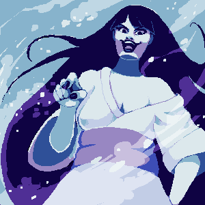
"The tag is overall blurry"

Granted, it could have used some sharpening, and is a low quality file. But it's not blurry.Don't mistake the render style for a mistake by the artist. Not in tags. It's tough, but don't do it. I will eat you. With regards to blurring, this tag goes back to roots, with blurring at the tip of the left sleeve, along with the bottom of the jacket to the right of it. That, and near the right shoulder, on the hair. These really accentuate a feeling of depth in the piece, and really make the focus seem like she's moving towards the viewer.

"no depth"

Lol no. My last point countered this, but if you feel there is no depth there, I wonder if you're looking at the same piece I am. There is a more than adequate sense of depth emanating from this piece, via lighting and blurring and so on. I'm not even going into this.

"no flow"

Again, what? By saying "no" to mean none, that would mean the artist hasn't even attempted to put in any effects that even loosely follow one direction. Which she has. To great extent. The big block off effects to the left of the focal all go towards creating a sense of flow, as if the render is moving towards the top left corner of the piece (I keep mixing up left and right typing this because she is facing the other way >_<). Similarly, the red light effects to the right of the focus follow a similar direction, "pushing" the focus in the direction I mentioned before.

"no clear lightning source, it has one on the left side but there's a light reflecting the render at the right side."

Stop with all the "no" because that would mean that the piece is simply two images one on top of the other, and even then a light source would still be present. And how you saw that light on the right side as a light source I'll never know, when it's so much dimmer, and is also a lens flare, which extends from the source. I'll admit that the lens flare doesn't really fit, but it's no way confusing the light source here.


To conclude;

"Your piece is shit mate"

Is basically what your review contained, in nicer words. The effect it gives across is the same though.

As a judge you should be really thinking about the artistic themes and devices used to create the piece, from a design sense or whatever. You should spend waaaaaay more than 30 seconds analysing a piece to give your review on it. You need to pick out every different theme the artist has incorporated into their piece, and also the feelings and emotions put into it. Your reviews, for both this battle and the other you reviewed (which I wont go into cause I'd be repeating myself mostly), are very lacking, and aren't very accurate in terms of the points you picked out and commented on. To critique a piece, especially from someone with a higher skill than yourself, you need to make sure you can identify all techniques used, how they were used, where, why and so on. Especially with more technical pieces like tags and CSS. You should go into detail on everything you noticed. Not just point out the bad, but tell the artist what they did well, why you liked a certain part, what stood out and what makes the piece the best it could be. Then with the negatives you need to definitely NOT say that there is "none" of an effect because that is rarely the case, unless you are dealing with a monkey or a troll. Even a three year old has the ability to apply minimal design themes, drawn from images they have seen previously. So saying that a very experienced member put "no" effects in is nothing short of rude, and shows you didn't look at the piece in any sort of detail at all. Dare I say, you didn't even look at it. But what I can say is that you stepped up for being judge which really is no small feat. But if you want to judge someone else's art, make sure you judge it to 120%. 110% isn't enough, because that person is relying on you to tell them accurately what is good and bad, they will take your advice and use it to improve. Your word is law. So if you tell them everything is bad and give them no advice to use to improve, how will that feel for them? Don't do that, instead give them a reason to motivate themselves to make more art, and give them a reason to believe that they can achieve it. If you never felt like you could achieve something, why would you even bother? THAT is what you need to always do as a judge. It's the same for moderators of a creative section, as they have basically the same roll, just less as imposing as a "judge" seems. But the jobs they do are the same. And it's not easy I can tell you that.
 
2,413
Posts
16
Years
Aiden has a right to say he doesn't agree, and Johnny is right that he is the judge and I didn't give them any guidelines or rules to judge by. If there are a few issues about maybe more personal attacks, we can continue that elsewhere.

But for now!

fairy said:
Pebbles said:

Jo, I need you to post me and ana's drawings and for both of you I need some judgements!

Oh and if anyone else is scared off, you can totally talk about what you think of all these works right now too. It's there for everyone to see and talk about!
 

Circuit

[cd=font-weight: bold; font-style: italic; backgro
4,815
Posts
16
Years

Youre quite right. Im not the judge. Hence I havent judged any of the pieces. I also never personally attacked you. I also never said you explicitly said "your pieces are shit" rather that is how your review comes across when read.

I do admit my wording could have been better, but it was irritating to see. But yeah. There are no attacks against you in there have no fear
 

Pebbles

BE YOUR OWN HERO
960
Posts
8
Years
WINNERS PICKED BY PEBBLES SO FAR
- lize = even though the video doesn't fit in really well, perhaps smaller size video would of been better, i think the css layout you made is looking nice! You focused very much on the theme and thats good, you used different starry images and the fixed background image is a nice touch. well done.
- gigadweeb = very cool pixel work. nice choice of colors you used, the mountains are a bit difficult to see, had to move my screen about but they also look very nice. the idea behind this work is quite original id say and the fact you made it in pixel style makes it even more fun and cool to look at, great job.
- ELEKTRA HEART = the emotions you put in there make your art very beautiful. The stars in the hair like that, the kids sitting on the grass and the mom looking down on them. This drawing is very elegant and pretty, well done.
- ANASTASIA.R = This is so cute and beautiful, your style is awesome and the way you made it about the pokemon and the trainer and then still in the background lovely sticked with the theme by creating a beautiful starry sky, stunning art!
 
Last edited:
17,133
Posts
12
Years
  • Age 33
  • Seen Jan 12, 2024
Got the Nina v Ana entries up in the above post! Sorry for the delay y'all know how life can be. Judgement to come soon! Done!

LIZE VS ZAPPYSPIKER
While both pieces are great entries, I'm going to have to side with zappy on this one. I love the colors and the overall piece feels well balanced (something that, I feel, is harder to do in tag creation than it is with CSS). I appreciate that zappy wasn't afraid to really use contrast, using dark blacks and light yellows and just making it work. Though, I have to point out that Lize's static background creates a beautiful illusion of color change and I find that to be both resourceful and inspired. While I give my vote to zappy, you better believe you'll be seeing Lize's CSS soon enough!

MERLIN VS ELEKTRA HEART
I'm feelin this one. And not just because I also lost my mother! It tells a story - somewhat literally - but mostly figuratively. You can sense the mother's love, the ethereal and omnipresent care a mother has for her children. I like the effort put into creating an entire image too - background and all.

NINA VS ANASTASIA.R
Don't make me choose. Do I really have to? REALLY? Ugh.. fine. If you say so..

NINA VS ANASTASIA.R
This one was hard - but I gotta give props to the new Pokemon. Even if Nina's entry is incredibly thought provoking and contemplative - themes I have an incredibly hard time separating myself from emotionally. I just love the soft, pastel, outline-less look of Ana's entry. Looking at it just makes me feel happy dammit, and incredibly hyped for Sun/Moon too! It's tangible, reminds me of my own excitement when I think about Pokemon, and I appreciate that.
 
Last edited:
2,413
Posts
16
Years
I would say all we need is Johnny's input on me vs ana, but since it's already a 2 vote, the winner is clear!

zappy, elektra, and ana have won their battles! The rest scoot forward with less of a fight, but some nice work!

4QlcWeZ.png


PHASE 2


PROMPT: Fairy Tales & Folklore

machomu and Elektra Heart will not be in Phase 2 and will return in Phase 3.

  1. zappyspiker vs Juno: Graphics (intermediate)
  2. Gigadweeb vs Anastasia: Pixel Art (intermediate)

TIMELINE?

Well, since those 24 hours went terribly how about we just...try and get it in within a day or so? As always PM me with your entries.​

 
2,413
Posts
16
Years
This will be moving forward. I'm giving final notice and then soon we'll be judging.

Sorry guys, not only did the time get messed up, but I had to take a mini-hiatus.
 

Gigadweeb

[b][i]The Black Swordsman[/i][/b]
319
Posts
9
Years
Bah, I hurried my submission because I thought the 1-day deadline would be in effect, and never bothered to resubmit it.

It was a good run boys. That looks fantastic, Anastasia.
 
4,683
Posts
10
Years
  • Age 29
  • Seen Mar 22, 2024
I believe the mirror should be a little more detailed, or have a little more going on, since it's your main point of focus in this piece.
There are some ladies in the mirror if you click the words on the right. :P Although you might be talking about the portraits too, since the hue is higher in those as well - but I did do that deliberately since I wanted the focus on mirror, as you said. But if you were talking about the frame itself, then yeah, I can see that the gold is a bit bright.
 

Pebbles

BE YOUR OWN HERO
960
Posts
8
Years
juno - wtf this is so cute and nice! really well done!!
you made it so that girls appear when clicking which is a nice touch, all colors go well together and the images are absolutely fabulous, especially the mirror. aside from missing the ''on the wall'' text i personally cannot say i see anything that could improve ^_^

Anastasia.R - creepy looking haha but certainly nice looking pixel art.
its nice how you made the background neutral and put wind effects in front of her. colors are fitting and the shadow details are great. also, well done gurl :)
 
17,133
Posts
12
Years
  • Age 33
  • Seen Jan 12, 2024
Juno & Anastasia are my votes. The other judges said everything I wanted to say and more. Brilliant work, both of you! 8)
 
2,413
Posts
16
Years
Good to go for Phase 3. Issue is my internet is down till maybe monday so touch and go with mobile it is.

;w; Can soneone tag all phase 3 contestants for me? Ana will be doing traditional art vs elektra. Theme is Eternal Moonlight.
 
Status
Not open for further replies.
Back
Top