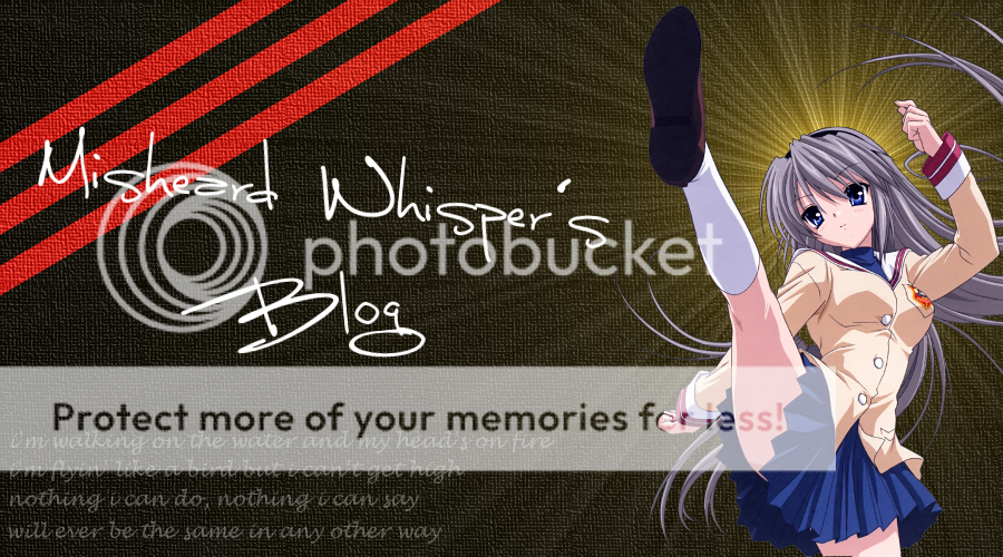
• Our software update is now concluded. You will need to reset your password to log in. In order to do this, you will have to click "Log in" in the top right corner and then "Forgot your password?".
  • Welcome to PokéCommunity! Register now and join one of the best fan communities on the 'net to talk Pokémon and more! We are not affiliated with The Pokémon Company or Nintendo.

Alex's Artses (Graphics)

Status
Not open for further replies.

Misheard Whisper

[b][color=#FF0000]I[/color] [color=#FF7F00]also[/c
3,488
Posts
15
Years
picture.php

All renders used in this thread are from Planet Renders unless otherwise specified.

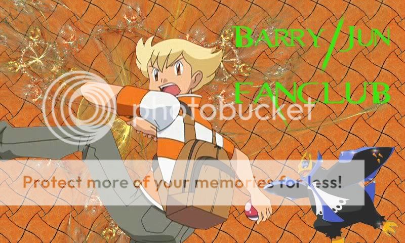
Ok, this time I've got the right forum (I think). Eep.

So, to start off, a little bannery thing I made recently, with Negi and Kotarou from Mahou Sensei Negima.
Spoiler:


This one, I'm fairly pleased with the turnout. The original version was so much experimentation (in my album if you're curious), but I redid it, and it came out better (ie: you can read the text =P).

Then this one (Rin and Len Kagamine from Vocaloid in Servant of Evil) is my new theme, now that my name change has come through.
Spoiler:


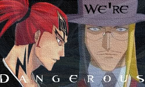
The second banner I like even more. All I've done here is blur the roses in the foreground and sharpen the couple in the background, before cropping/resizing and adding text (which I feel very clever for coming up with =P). As I said, this is my new theme, along with . . .

The matching avatar, from the same . . .
Spoiler:


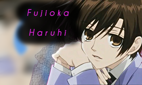
This avatar, I also like. It's from the same video as the former, but a different shot, and I reckon the text came out nicely. :3 What do you guys think?

Then there's this one . . .
Spoiler:
This one is a Mahou Sensei Negima banner I just whipped up in about ten minutes. It's very simple and makes use of the stock patterns that come with GIMP. The text is intentionally blurry, btw. It also brings this up to the 4 pictures I need for this to be legal >_>
 
Last edited:
6
Posts
14
Years
  • Seen Oct 6, 2009
To be honest, these looks effortless. You need to put more work to be critiqued. At the moment, I can't say much other than pointing out what you obviously lack. You need to put more concept or action into your sigs. They just look very style monotone.
 

Misheard Whisper

[b][color=#FF0000]I[/color] [color=#FF7F00]also[/c
3,488
Posts
15
Years
Well, they're supposed to be fairly simple. I'm not going to go 'Wah wah wah I'm a beginner be nice to me!1!one!!', but the fact remains that these are the first banners I've ever made, and I expect the quality to improve once I get used to all the tools. I'm working on it, trust me.

And I'm not sure exactly what you mean by 'need to put more work to be critiqued' or 'more concept or action'. ^_^?

OK, newsflash. Missy has officially learned how to use renders. Yes, I'm slow. Now, my banner qualities will hopefully increase drastically. Like this one, maybe? You tell me. No text on this one, as the text I had was a ghastly, clashy yellow. I'll go put some in now that's not a crime against fashion.

Spoiler:


I also have an imageshack account now. :3

EDIT: Here's the version w/ text. I don't like it that much. Will change, but for now, here ya go.

Spoiler:


This is a quick banner I made for the Shinji/Paul club. The Shinji image is self-rendered, so the total make-time would have been about an hour.

Spoiler:


Another one, this time for the Barry/Jun fanclub. I'm not that happy with the terracotta (or the green text), so this is on the 'redo later' list.

Spoiler:
 
Last edited:

Bay

6,388
Posts
17
Years
I actually think these banners are pretty good for a first timer using GIMP. Don't worry too much as I too am trying to get the hang of using GIMP. :P

I want to mention real quick the Black Rock Shooter banner definitely looked better without the font. If you still want a font for it, though, perhaps something more smaller and elegant? Eh, not too hot with fonts either. XD

The font for the Barry banner I would say the same thing about Black Rock Shooter. I'm just not feeling it. ^^;

The Shinji one you seemed to used the same effects as the Black Rock Shooter one. Also, not liking how the effects covered half of Paul's face. XD The flow isn't well executed, as the more advanced graphic artists would say. XD Try to have the render stand out more, basically.

If you want better effects for the banners, I think you can goggle GIMP tutorials, maybe find ones on how to do c4d effects for GIMP (here I keep hearing you have to use that effect instead of just doing brushes if you want your banners to be high quality D: ). Perphaps I should do that too when I have time tonight or tomorrow. XD Have fun looking more into GIMP, though. :) Hope my comments are all right, considering I suck at GIMP. Trust me, you're better at me with it already. XD
 

Misheard Whisper

[b][color=#FF0000]I[/color] [color=#FF7F00]also[/c
3,488
Posts
15
Years
=D Thanks for responding!
I actually think these banners are pretty good for a first timer using GIMP. Don't worry too much as I too am trying to get the hang of using GIMP. :P
Thanks! I certainly hope to improve, though.

I want to mention real quick the Black Rock Shooter banner definitely looked better without the font. If you still want a font for it, though, perhaps something more smaller and elegant? Eh, not too hot with fonts either. XD
Agreed. I also need to work out how to do two-colour font (ie font with a different colour around the outside so you can see it on any background)

The font for the Barry banner I would say the same thing about Black Rock Shooter. I'm just not feeling it. ^^;
MM-hmm. I'm getting worse as I go along, it seems =P Definitely one to redo A.S.A.P., especially considering the fact that the Jun fanclub is awaiting approval right now.

The Shinji one you seemed to used the same effects as the Black Rock Shooter one.
Yeah, I quite like that style. >_>
Also, not liking how the effects covered half of Paul's face. XD The flow isn't well executed, as the more advanced graphic artists would say. XD Try to have the render stand out more, basically.
Gotcha. *makes note to lower opacity on top layer + move swirls slightly*

If you want better effects for the banners, I think you can goggle GIMP tutorials, maybe find ones on how to do c4d effects for GIMP (here I keep hearing you have to use that effect instead of just doing brushes if you want your banners to be high quality D: ). Perphaps I should do that too when I have time tonight or tomorrow. XD Have fun looking more into GIMP, though. :) Hope my comments are all right, considering I suck at GIMP. Trust me, you're better at me with it already. XD
Tutorials sound like a good idea. XD Thanks for dropping by!

This one was made for my good friend Kyuu-chan, a Bleach fan. I made sure to lower the opacity of the swirls here drastically and ensure they didn't obstruct the faces. Text fits better on this one too, I think. I also ran this through a Canvas filter just before I put the text in, which I think adds a lot to it. I rendered Cloud myself, so a bit iffy on that one maybe? I think it's OK, I just smudged it a bit.

Spoiler:


WARNING! Huge image approaching! Still experimenting with the Canvas filter here. I think this came out really nicely, and the supernova behind Tomoyo's head gives it some depth.

Spoiler:
Made for my blog, obviously. I liked making this, especially since I found this splendid Clannad render to go on it.

This one, I like. It's my current theme, after all. I simply layered 'Sapphire Lightning' (my favourite fractal render - I've used it a few times) on top of a plain blue fill. Then I whacked three Mikus on top, staggered them and lowered the opacity on two of them. A little sharpening and a nice font off dafont.com finished it up. I am proud of doing this (even though it's pretty amateur compared to some of the big names here.) and it's definitely my favourite banner so far.

Spoiler:


This one, I did while semi-following a tutorial. When I say semi-following, I mean I followed the first two steps, then realised I couldn't be bothered downloading the plugins I needed and just winged it from there on in. It's Fujioka Haruhi from Ouran KouKou Host Club, and yes, the text bubble-thing is hiding a spot where the render was crap.

Spoiler:
I'm giving this one away, so if you want it, drop me a VM or post in the Graphics Giveaway thread.
 
Last edited:
Status
Not open for further replies.
Back
Top