• Our software update is now concluded. You will need to reset your password to log in. In order to do this, you will have to click "Log in" in the top right corner and then "Forgot your password?".
  • Welcome to PokéCommunity! Register now and join one of the best fan communities on the 'net to talk Pokémon and more! We are not affiliated with The Pokémon Company or Nintendo.

▪ lisztomania ▪

8,279
Posts
15
Years
    • he/him
    • Seen yesterday
    Welcome to Dogfart's gallery! Don't expect much, since I am a beginner. :> Inspired by G&P's artists, other forums, and random stuff I have been working on graphics occasionally for a year or two (barely), but not enough to make me anything less of a beginner. So, I do appreciate comments and criticism like everyone else does. I've been disappointed in G&P's inactivity too, since this used to be one of the main forums I lurked back then (and now). Enough chit-chat, now for the graphics. :o

    newest to oldest

    Tags

    ▪ lisztomania ▪

    I did have more effects, but they looked tacky. I got to use the textures/C4Ds moments and Abnegation posted too (thanks for those). ;)

    Spoiler:

    Probably a LP, but whatever lol.

    ▪ lisztomania ▪

    Don't comment on the pen tool...I've gotten better with it haha.

    ▪ lisztomania ▪


    No icons for now, all of my past ones are too outdated.

    And of course, if you want to use these for some reason, ask me.
     
    Last edited:

    derozio

    [b][color=red][font=helvetica][i]door-kun best boi
    5,521
    Posts
    14
    Years
  • Glad to see you finally made a gallery, Wolflare. But..there's a bit of problem here. For some reason, all the images appear as a 'frog frozen in an ice cube' with a message 'Unregistered domain'. I can't see any image. :B
     
    8,279
    Posts
    15
    Years
    • he/him
    • Seen yesterday
    Glad to see you finally made a gallery, Wolflare. But..there's a bit of problem here. For some reason, all the images appear as a 'frog frozen in an ice cube' with a message 'Unregistered domain'. I can't see any image. :B
    Huh... Well, should be fixed now, I used Photobucket instead. :<
     

    derozio

    [b][color=red][font=helvetica][i]door-kun best boi
    5,521
    Posts
    14
    Years
  • Haha yeah, they're all visible to me now. Thank you for taking the trouble of uploading them again! o/; Anyway, let us get started, shall we?

    Firstly, I don't know if you're using GIMP or PS. I'm not really familiar with GIMP and its features, to be honest. But still, to me, it seems like you've used the 'lighten' blending option in most of your tags. Although almost all of them have flow, what they really lack are good effects. They just don't seem to fit. Miku tag..it looks like you just put a flowing render over her and tried using some blending option. Instead of doing that, you could've put some c4d behind her or in front of her, blurred/sharpened it or tried some sorta texture or something. Some really awesome resources are available here in the resource threads in G&P itself. You might try using those to spice up your tags. Really, the miku tag is kinda bland with no depth, weird colors, weird lighting (the lighting at the top-right corner is too over-powering, imo) and lack of spicy effects. As far as the tag with BW pokemon (idk his name) goes, the main problems with it are pretty much the same as with the Miku tag.

    Now moving onto your 'better' works...

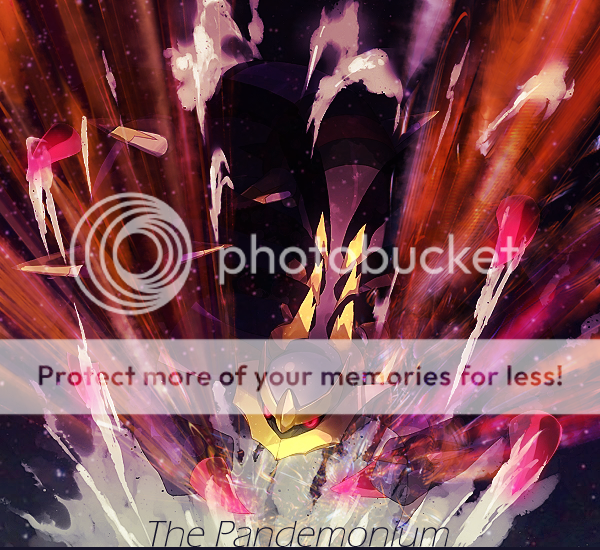
    https://i904.photobucket.com/albums/ac245/Wolflare/giratinawhoosh.png
    ^ that is pretty good. I like the effects (although slightly messy) used and the colors are fine too. But yeah, the opacity of the c4ds below giratina's face and above its 'claw/hand/wing/tentacle' at the bottom-right side is weird. I would've preferred it if you had erased some parts.

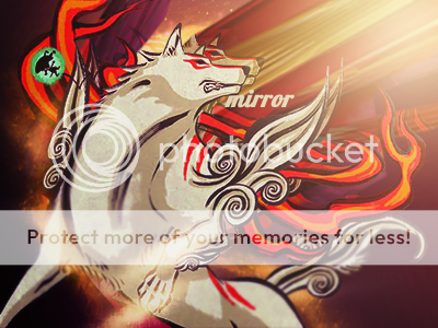
    https://i904.photobucket.com/albums/ac245/Wolflare/mirror.png

    Out of your tags, this is, by far, your best. I'm sure you know that as well! XD; But yeah, simply duplicating a render and placing it alongside the main render isn't really a good practice. I tend to do that too, but I kinda resize it a bit so that the duplicate layer is either a miniature version or a bigger version of the original. XD; What it needs is perhaps a little more effects? Text placement..umm, I won't comment on that. Text placement tend to be a very hard job on most tags anyway. I'd advise you, like someone awesome advised me a little while ago, that you make two versions of every tag you make. One with and one without text. You can post both the versions in your gallery. ;)
    Oh and yeah, that green circle thingy at the left side looks kinda iffy. It doesn't really fit the mood of the entire tag. But I'm assuming it was a part of the stock/render, yes? Also, stay away from low quality images. They end up ruining the whole tag. Okami, at some places in the tag, looks low quality. Try to go for HQ images when searching for stocks.


    Anyway, that's it from me for now. Hope I didn't go horribly wrong in my crit. I'm not really good at this anyway. :<
     
    Last edited:
    8,279
    Posts
    15
    Years
    • he/him
    • Seen yesterday
    Firstly, I don't know if you're using GIMP or PS. I'm not really familiar with GIMP and its features, to be honest.
    Oh sorry, I use PS. I'll add that to the first post.

    But still, to me, it seems like you've used the 'lighten' blending option in most of your tags.
    I actually don't, I use a lot of gradient maps though. Most of the time I use either Soft Light or Overlay, but I'm starting to experiment with other layer options now.

    Although almost all of them have flow, what they really lack are good effects. They just don't seem to fit.
    I agree with that, I haven't spent much time looking for other C4Ds and such. :x

    Miku tag..it looks like you just put a flowing render over her and tried using some blending option.
    I actually used like...5 C4Ds, but I think I should make them less subtle.

    Instead of doing that, you could've put some c4d behind her or in front of her, blurred/sharpened it or tried some sorta texture or something. Some really awesome resources are available here in the resource threads in G&P itself. You might try using those to spice up your tags. Really, the miku tag is kinda bland with no depth, weird colors, weird lighting (the lighting at the top-right corner is too over-powering, imo) and lack of spicy effects. As far as the tag with BW pokemon (idk his name) goes, the main problems with it are pretty much the same as with the Miku tag.
    Ah okay.

    Now moving onto your 'better' works...

    https://i904.photobucket.com/albums/ac245/Wolflare/giratinawhoosh.png
    ^ that is pretty good. I like the effects (although slightly messy) used and the colors are fine too. But yeah, the opacity of the c4ds below giratina's face and above its 'claw/hand/wing/tentacle' at the bottom-right side is weird. I would've preferred it if you had erased some parts.
    I was wondering if I should erase them or out myself too lol.

    https://i904.photobucket.com/albums/ac245/Wolflare/mirror.png

    Out of your tags, this is, by far, your best. I'm sure you know that as well! XD; But yeah, simply duplicating a render and placing it alongside the main render isn't really a good practice. I tend to do that too, but I kinda resize it a bit so that the duplicate layer is either a miniature version or a bigger version of the original. XD;
    Never thought of that actually, I might edit the original with that instead. :o

    What it needs is perhaps a little more effects?
    True, I need to spend more time on learning how to make more effects / download some other resources.

    Text placement..umm, I won't comment on that. Text placement tend to be a very hard job on most tags anyway. I'd advise you, like someone awesome advised me a little while ago, that you make two versions of every tag you make. One with and one without text. You can post both the versions in your gallery. ;)
    Okay, I'll start doing that. ^-^

    Oh and yeah, that green circle thingy at the left side looks kinda iffy. It doesn't really fit the mood of the entire tag. But I'm assuming it was a part of the stock/render, yes?
    Yeah, that's Issun, part of stock.

    Also, stay away from low quality images. They end up ruining the whole tag. Okami, at some places in the tag, looks low quality. Try to go for HQ images when searching for stocks.
    The stock was pretty high quality, I just blurred it in places at the bottom for depth I guess.

    Anyway, that's it from me for now. Hope I didn't go horribly wrong in my crit. I'm not really good at this anyway. :<
    Nah, you did fine. Thanks for the crit, I appreciate it. :)

    Wow. I really like your style. :O
    That Okami banner turned out especially nice.
    I'm really impressed. xDD;;
    Thanks!
     
    Back
    Top