• Our software update is now concluded. You will need to reset your password to log in. In order to do this, you will have to click "Log in" in the top right corner and then "Forgot your password?".
  • Welcome to PokéCommunity! Register now and join one of the best fan communities on the 'net to talk Pokémon and more! We are not affiliated with The Pokémon Company or Nintendo.

[Game] ♔ ART BATTLE #2 ♔ Elecktra Heart VS Shadowflare : Fakemon

Who wins?


  • Total voters
    19
  • Poll closed .
2,413
Posts
16
Years
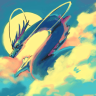
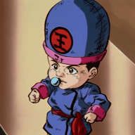
ELEKTRA HEART VS SHADOWFLARE
LET'S DUEL


The specifications:
Digital fakemon drawing. "a single stage 'mon based on an endangered animal, has to be part Fairy type"​

Here are your choices! We're keeping the anonymous this time, so different choices!

zwgZmLO.png
fn0ja6f.png

FISH VS BIRD

Voting lasts for one week!
Use the poll, but go ahead put your thoughts about the work in the thread!

[progress-yellow=100]♔ Day 7 ♔[/progress-yellow]

Don't forget that you too can sign up for your own art battle here!
Get in the queue today!​
 
Last edited:

CDB

148
Posts
8
Years
  • Age 26
  • Seen Mar 13, 2023
I'm voting for the fish! I love the incorporation of a lyre into its tail & the fairy-feathery-fins haha The bird is nice as well but the concept and execution are a bit ambiguous
 
2,413
Posts
16
Years
I'm not actually voting because I know who's is who's! fyi. I'll give my thoughts during the end. : )
 

mew_nani

Pokécommunity's Licensed Tree Exorcist
1,839
Posts
14
Years
Well they're both decent. The harp for a tail sorta seems disadvantageous for swimming, but I suppose the winged flippers would make up for that. The bird's wings resemble that of a butterfly, and the crest on the head looks rather neat.

Unfortunately the bird seems to have a few design flaws; the eyes are positioned almost like a flounder's, appearing to be on one side of the face as opposed to being where eyes on a bird would normally be. The feet also are too small to support a body of that size, and there's no highlights on the bird at all, only a few shadows that are too dark in color and don't give enough of an effect.

I'll go with the dolphin mon due to it being designed nicely and having a nice musical motif to it, but the bird isn't too shabby either. Good job guys! ^^
 

Nimsy

Jackal The Ripper
1,415
Posts
10
Years
I like both of them, but I can't see either as a single stage pokemon. They both look like they're supposed to evolve.

The whale looks super cute, but it doesn't look like a pokemon to me, it feels more like a rune factory monster than anything else.It's colors also feel a little too dull.

I enjoy the high contrast of the bird, but its head plumage also doesn't make much sense to me, they look more like vines than anything else. The eye is also a little wonky, but I feel like that's an execution problem rather than a design flaw.

Over-all I prefer the bird's design, but I prefer the art of the whale.
 

Etherion

Guest
0
Posts
kudos to both Bac and Shadowflare, they both did great mons'
for me, it came down to which one was most interesting, and I have too say that the fish got my attention~ ^^
 

Al3x

Pokémon Fan
278
Posts
14
Years
Really tough choice. I like them both but after thinking about it I decided to vote for the bird.
The fish/whale is really awesome and I think it's cute but the harp is a turn off for me. If it weren't for the harp though there would be no indication that the pokemon was fairy type.
The bird is awesome. It gives me a sort of hoothoot vibe because it's crazy looking eyes, and bed head hair. It does remind me of Spritzee though.
I gotta agree with what Etherion said though. They don't seem like single stage pokemon. The whale could probably pull it off if it was like the same size of a wailord though.
 
37
Posts
19
Years
You know, I'd love to do a redesign with all these helpful crits as soon as the voting is over. I can't really say much, but I'd definitely like to make it look more single-stage-y at least.
 
17,133
Posts
12
Years
  • Age 33
  • she / they
  • Seen Jan 12, 2024
Gosh this is hard. What we have here folks are two extremely well matched artists in both style, form, and composition. I've been looking at these two since yesterday just trying to digest everything, but I've yet to come up with an easy choice. Honestly, the designs of these two fakemon are so satisfying and complete that it's impossible to distinguish them from one another, even. Like, if you were to tell me these were done by the same person, I would believe you. And I mean that in a good way! Obviously both Elektra Heart and Shadowflare have an excellent grasp on the challenge, evidence everything that makes a Fairy type unique by use of design and color, conceptually they're both very strong, and they understand the lighthearted playfulness required truly make the fakemon enjoyable to look at. Neither of them scream "classic Sugimori style" - and that's honestly what I like most about both of them because they're so organic to the respective artist, and so similar in their

Man, this is tough. If it wasn't technically unfair I'd use my moderator status to give myself the ability to vote for both, haha.

I'm going to vote for the bird just on the basis that it resonates with me more. I wish I had a more complex and sound reason as to why I'm voting for it - but since these two are so evenly matched it's hard to come up with anything other than "it's just working for me". I dunno, I'm just feelin' the bird right now! But in reality these are both fantastic entries and each artist should be very proud. :)

Okay I'm done ranting thumbs up to everyone in this cause you guys rock. o/
 
3,830
Posts
14
Years
  • Age 27
  • OH
  • Seen Feb 26, 2024
It's shocking how similar the two images are in style. It was a hard choice to decide, but I ultimately went with the bird because I liked its design better. The fish looks OK up until you reach the face, which looks oddly misshapen compared to the rest of the body. The wings on the bird are lopsided but I like the colors.
 

Abby

#freecoffee
3,256
Posts
10
Years
I'll be going into this, judging based on the topic provided-Fakémon! Now, while both of these pieces have their flaws, I would like to give a huge congratulations to both our artists-Elektra Heart and ShadowFlare!

Now, starting with the whale, the first thing I noticed is the colour scheme, which seems well thought out and is aesthetically pleasing. However on close inspection, the body seems to be contorted in a rather convoluted manner. The whole design just seems to... twist between the head and the tail. Speaking about the tail- the musical instrument, obviously a large part of the design seems to be placed in an arbitrary position, it would be a lot better if it followed the flow the tail did have. Moving on to the fins/wings, While it does seem to blend in with the design-adding to the fairy type element-I feel they are placed slightly too low, rather impractical for actual transport. Now, unfortunately, the face is.... rather boring and expressionless- the mouth being one straight line in particular bothers me.

Moving on to the bird, I have one word to say about this, Aromatisse. I'm guessing that was your main source of inspiration? Despite this obvious parralel, There's still a lot I can mark on. The first of these points is obvious- The wings are rather inconsistent in size, It just looks... unrefined. Another thing is the legs- They are positioned in such a way, that it makes the bird appear unstable, and the talons aren't uniform. My main criticism however is how bland the idea is, A pink and purple bird? It just lacks the creativity that a musical whale does- and as I said at the start, I'm voting based on how it would feel as a pokémon, with more refining.
 

SmokedPaprika

Basically Garbage
177
Posts
8
Years
  • Age 28
  • Seen Apr 2, 2019
I believe both of these are good starts - but only as starts. I feel like these are concept ideas first, designs second.

The fish - the cleaner design. The wing sizes do a good job of telling you how thin it is, and I appreciate the harp at the end of the tail, to give it some sort of distinction in its design, but it's just not something that's very interesting to look at. The head almost comes off as impersonal - the eye is plain, the shape is plain, its mouth is simple and inexpressive. While there are Pokemon who have similarly inexpressive designs, you always get the impression you they have an expressive range - like, you can make them smile, or pout, and they'll look completely different. When I move this fish's mouth line up, or down, I get the impression that I've pretty much found this guy's emotional range.

The bird - ditto on the emotional range. Though I'll blame that on the simplistic eye design here. Not that bird Pokemon generally have the most complex, interesting eyes ever, but I get the impression you're trying to make more than a basic bird Pokemon with this, and I'm not sure the beady eyes are helping much. I appreciate the color scheme quite a bit - I think using a darker red under the wings and a lighter blue on the feather would help it appeal to the eye a little more. The anatomy feels a little bent, and I understand the bird is moving it's upper body forward, but it's just not tilted enough, and looks paralyzed or stunned in its position instead. Also, I'd make the legs a tad longer for consistency with the body size - it looks like they can't carry the weight and they're getting ready to snap.
 
Last edited:
2,413
Posts
16
Years
You've only got 3 and some change days left to vote! Make sure you get it in by then. : )

I'm glad everyone is posting their thoughts on these!
 
17,133
Posts
12
Years
  • Age 33
  • she / they
  • Seen Jan 12, 2024
Congratulations Shadowflare! Amazing work, both of you. :) This was a great art battle.
 
37
Posts
19
Years
Thank guys! And thank everyone for the crits and comments and votes. Mine was the 'fish', as you now see. It was based on a vaquita and the "flying whale" trope.
 
Back
Top