• Our software update is now concluded. You will need to reset your password to log in. In order to do this, you will have to click "Log in" in the top right corner and then "Forgot your password?".
  • Welcome to PokéCommunity! Register now and join one of the best fan communities on the 'net to talk Pokémon and more! We are not affiliated with The Pokémon Company or Nintendo.

A gallery to speed up reactions

Gabri

m8
3,937
Posts
17
Years
Katalyst's graphics gallery
Graphics sell... but who's buying?

So, here am I. Again. My two previous showcases have unfortunately been made while on G&P's downfall, making them get almost no attention at all. It might also happen with this one, but well, it's not like you'll be losing much anyways.

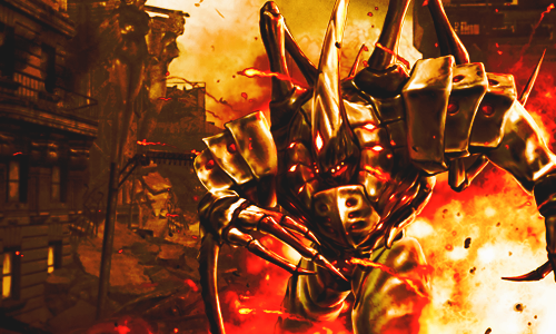
I have slowed down lately and haven't worked on Photoshop for a while (mainly because of the lack of inspiration), but I may get back at it if I feel I can do any good or get better at this. The style I've developed more and the one I feel better with is smudging. I do a lot of smudging in my work and layer effects to get backgrounds (I rarely use color adjustment layers) and to keep things within a certain color range. One thing I suck at is using C4D's, and you'll realize why. I always hated using those.

So, after hours tearing my Photobucket account upside down, I'll be showing you most of the work I've done after my last showcase. And feel free to give criticism, be it good or bad. Or just plain dumb. Bring'em in.

NekuBannerV2.png

HorseLinkBanner.png

SaberSwordBanner.png

FarCry2Banna.png

VeritaBanner.png

IchigoBanner.png

nekubanner2.png
BRSBanner.png

DestructionBanna2.png

sabertagga.png

AngelTagg-1.png

Untitled-22.png

Swordgirlb.png


UPDATE 28-02-2011, 22:29PM
dmbanner.png

Yes I know there's a not so low number of them, but well. It's been a while since my last gallery was made. I tried to choose the best of different styles I've done (which are not so different) but now... you tell me what you think. :D
 
Last edited:

moments.

quixotic
3,407
Posts
15
Years
DestructionBanna2.png

Alright, in my opinion, this is your best. I can't quite tell how much you have actually added to the original image, but despite the colours being a fraction monotonous, it really is quite a nice manipulation.

I think colours are one of your weaker points. Some of your tags are brought down nearly alone by the colours.
Untitled-22.png

As an example is way to monotonous, and while you have coloured the whole tag, including the focal the same sort of purple, it just looks really flat and unnatural... I just want to mention a lack of lighting here because it might actually help with your colouring. I don't know if you are on Photoshop or GIMP, but if you are Photoshop use the burn and dodge tools more. You can start simple, dodge where the focal points are, brighten them up a bit, and burn the edges / sides that are away from the focal. This should give darker and lighter shades of your colours just helping to break up like flat and solid colours.

Anyway, however you coloured that first one I commented on, and did the effects and stuff, keep doing that, and maybe try experiment, but keep some of those techniques / tricks you used in that one in more of your works.

Keep it up!
 

Speed

Skyward
376
Posts
15
Years
DestructionBanna2.png


That one is probably my favorite too. The colors work well together, but most of your tags have smudged backgrounds, and it throws off the flow.

This one is probably the best example of that, it has good flow but then the smudged background kills it, because the flow isn't going sideways like the background is. I know you said you hate C4Ds, but it doesn't hurt to try to use them.
 

Gabri

m8
3,937
Posts
17
Years
I'll take off the tags so that this post doesn't take up too much space.
[QUOTE="moments., post: 6474805, member: 98871"][URL="http://i46.photobucket.com/albums/f109/Katalyst_12/DestructionBanna2.png"]http://i46.photobucket.com/albums/f109/Katalyst_12/DestructionBanna2.png[/URL]
Alright, in my opinion, this is your best. I can't quite tell how much you have actually added to the original image, but despite the colours being a fraction monotonous, it really is quite a nice manipulation.

I think colours are one of your weaker points. Some of your tags are brought down nearly alone by the colours.
[url]http://i46.photobucket.com/albums/f109/Katalyst_12/Untitled-22.png[/url]
As an example is way to monotonous, and while you have coloured the whole tag, including the focal the same sort of purple, it just looks really flat and unnatural... I just want to mention a lack of lighting here because it might actually help with your colouring. I don't know if you are on Photoshop or GIMP, but if you are Photoshop use the burn and dodge tools more. You can start simple, dodge where the focal points are, brighten them up a bit, and burn the edges / sides that are away from the focal. This should give darker and lighter shades of your colours just helping to break up like flat and solid colours.

Anyway, however you coloured that first one I commented on, and did the effects and stuff, keep doing that, and maybe try experiment, but keep some of those techniques / tricks you used in that one in more of your works.

Keep it up![/QUOTE]

Yeah I liked doing that first tag. I did something different from what I have done until then, and used a stock as background instead of smudging one by myself. All I've added was the smoke coming out from the windows on the left. Other than that, I tried to manipulate the colours to give that atmosphere of destruction and everything burning everywhere, kind of a nuclear explosion or something.

About the colors, they might be one of my weak points, because I can't manipulate them really well like I've seen many people here do it. I try to keep within a certain color scheme and not to go all into rainbows and too contrasting colours. Yeah, that purple tag isn't the best I've done with colours, but it was an attempt to get back into Photoshop after some time not working with it.

About the burn and dodge tools, I've never messed much with them, mostly because I'm not really sure about what they do, but I might mess with them later. I've tried them already on a new tag of mine, which I'll show later.

Thanks for the comment btw :D

[QUOTE="Speed, post: 6474918, member: 138317"][FONT="Trebuchet MS"][SIZE="2"][URL="http://i46.photobucket.com/albums/f109/Katalyst_12/DestructionBanna2.png"]http://i46.photobucket.com/albums/f109/Katalyst_12/DestructionBanna2.png
[/URL]
[FONT="Trebuchet MS"][SIZE="2"]That one is probably my favorite too. The colors work well together, but most of your tags have smudged backgrounds, and it throws off the flow.

[URL=http://i46.photobucket.com/albums/f109/Katalyst_12/HorseLinkBanner.png]This[/URL] one is probably the best example of that, it has good flow but then the smudged background kills it, because the flow isn't going sideways like the background is. I know you said you hate C4Ds, but it doesn't hurt to try to use them.[/SIZE][/FONT][/SIZE][/FONT][/QUOTE]

I have already stated most of what I think about that first tag before, but now I'll say about the flow: As you probably have noticed, I tend to make the render occupy most of the canvas and then make it sort of blend with a smudged background. So I don't worry about the flow much, because the render pretty much defines the flow by itself. The smudge style I use doesn't help the flow much anyways. But I'll try to take flow more into consideration on upcoming work.
On the second tag, I understand what you mean and I know that the background blurring sideways (it's motion blur btw, and not smudged) doesn't help very much. I liked the final result mainly for the colors, and didn't pay much attention to make it match the flow again.
Thanks for the comment! :)

[QUOTE="~Ryukaa, post: 6480005, member: 51880"][size=1][URL="http://i46.photobucket.com/albums/f109/Katalyst_12/SaberSwordBanner.png"]http://i46.photobucket.com/albums/f109/Katalyst_12/SaberSwordBanner.png[/URL]

This one's my favourite of the lot.
I think I just like the color scheme and the effect you use. :3[/size][/QUOTE]

That color scheme is also one of my favourites. Blue ftw! :D
But, in my opinion, it's also a proof that I'm not really good at using C4D's. The fact is that, when using them, I don't have enough freedom to manipulate the thing enough to blend it with the main render, which is the style I'm most confortable with. That's one of the reasons why I don't like C4D's: They don't match my style.

Thanks for commenting :D

---

Now I'll post here my first (!) experiment using real people... and a non-rendered image.
[IMG]http://i46.photobucket.com/albums/f109/Katalyst_12/dmbanner.png
Features my favourite musician, Dave Mustaine. |m/
Probably not really good, but hey it's the first time I do this style of tag. Original picture here.

More comments please :D
 

moments.

quixotic
3,407
Posts
15
Years
dmbanner.png
Actually a very good start to using real life stocks! Firstly, the colours on this are good, except for the guy which seems a little like pasty. Look s like you used the selective colour / curves and brought out the cyan/green on white areas. It isn't bad, but it just looks a bit strange. You could've erased those adjustments from the face a little bit so he looks a bit more natural. :P

Anyways, the effects are quite nice, however they are a bit messy and look a bit random. Always with effects, you should be trying to create flow or like direction within a tag.

Otherwise the adjustments are quite good! Contrast is nice and really helps to make the focal pop, so props to you. The only thing I would possibly change is to add some blurring and just enhance the depth a bit more. Some of those things in the background, like the yellow/red effects to the right of his head are quite sharp, sharper than the focal in fact and could use some blurring a bit so they don't pull the eye away from the focal.

Anyways, a great start to working with real life stocks! Keep it up, you'll have no problems!
 
Back
Top