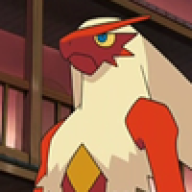
Royal
Artist and Writer
- 698
- Posts
- 16
- Years
- New York City
- Seen Jun 23, 2019
I've decided that I was going to redesign all of my Fakemon from my numbered 001 to 154, from the beginning, with a similar style to Ken Sugimori.
#001
![[PokeCommunity.com] Fakemon Redesigns](https://i516.photobucket.com/albums/u325/Outcasters-Images_2008/001Wanitou50percent.png "[PokeCommunity.com] Fakemon Redesigns")
Japanese Name: Wanitou
English Name: ???
Type: Grass
Classification: The Young Crocodile Pokemon
Evolution: Shonhachuu
#002
![[PokeCommunity.com] Fakemon Redesigns](https://i516.photobucket.com/albums/u325/Outcasters-Images_2008/002Shonhachuu50percent.png "[PokeCommunity.com] Fakemon Redesigns")
Japanese Name: Shonhachuu
English Name: ???
Type: Grass
Classification: The Fang Pokemon
Pre-Evolution: Wanitou
Evolution: Mizukuchi
#003
PICTURE COMING SOON
Japanese Name: Mizukuchi
English Name: ???
Type: Grass/Ghost
Classification: The Voodoo Pokemon
Pre-Evolution: Shonhachuu
More are to come soon!
#001
Spoiler:
Japanese Name: Wanitou
English Name: ???
Type: Grass
Classification: The Young Crocodile Pokemon
Evolution: Shonhachuu
#002
Spoiler:
Japanese Name: Shonhachuu
English Name: ???
Type: Grass
Classification: The Fang Pokemon
Pre-Evolution: Wanitou
Evolution: Mizukuchi
#003
Spoiler:
PICTURE COMING SOON
Japanese Name: Mizukuchi
English Name: ???
Type: Grass/Ghost
Classification: The Voodoo Pokemon
Pre-Evolution: Shonhachuu
More are to come soon!
Last edited: