Laterna
Dream-Weaver
- 74
- Posts
- 15
- Years
- Sunyshore City
- Seen Apr 9, 2011
Hey guys ^.^
Hope I've done this correctly, new to this part of forum XD
Anyways, I just wanted to display three banners that I had/have created for my Pokémon fic Rocket Frontier. Basically, when it started, I made my own banner for it and then updated it several chapters later as the story progress, and as such the banner required updating. However, the fic then flopped and, almost a year later, I've decided to reboot it and have created a brand new banner for the series. Here, I would like to display all three of them in order and get some feedback on how each looks, how they've imrpoved from one to another, and maybe what hasn't improved, and how I could progress from the latest one I have done.
Each character is supposed to be between the ages of 17 and 20, they are all experienced trainers and co-ordinators and have a full compliment of 6 Pokémon.
Alright, here goes:
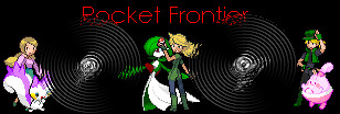
The girl on the left is Mimi Mair, she focuses on Contests. In the middle is Kimi Mair, who is collecting Frontier Symbols. At the end is Will DeAmbos, a breeder with a mixed intrest in Contests and trainer battles.
What I've done here is re-coloured the Pokémon myself using my own palette of colours to make them my own in a sense. The characters have been based on the standard trainer sprites from D/P, which were selected and re-coloured to match that characters personality and style.
After several chapters had been completed, I decided to update the banner and modify it with new Pokémon and text:
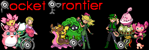
In this banner, I decided to utilise the Unown more due to their prominant role in the story and moved the text up to the top because it would be better to not have it as obscured as it was in the first banner. I also took the opportunity to reposition the characters and display some of their other Pokémon (including some that were yet to be showcased in the story) as well as using the Unown to show who each character was. As well with this banner, I felt it was better to leave the Pokémon as they were, however I did have to re-colour Tangrowth and Aipom myself as I could not find a sprite that worked.
This was the final banner that I did for the fic befoe it's popularity significantly declined, causing me to stop writing.
Lately, I've been working on revamping the series and, with the availability of Platinum sprites, I decided that it would be best to create a new banner to place in my signature as a place-holder and advertisement for the rebooted series while I worked on the remaining chapters:
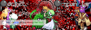
This banner features total redesigns for the characters, utilising the new Platinum sprites to better display their age and maturity as well as selecting poses and appearances that are better sutied to their overall personalities. The Dahlia sprite for Mimi allowed me to show-off her style and grace as she strikes a pose with her Pachirisu and Roserade. Argenta is used for Kimi to show that she is cool, yet mature and a strong and skilled battler. Will is based off Lucian for the simple reason that Lucian's sprite, the pose and hair, looked most like who the character is based on, but I did chance to change his outfit to match what he wore in the original banners and left them in their regular colours. The background was simply created using three colours sprayed across the white and then inverted to become cylindrical and to create a black halo around Kimi, signifying a crucial part of her character's abilities and nature.
Phew... sorry I wrote so much, I just wanted to detail my thought processes and techniques for each banner to give you all a thorough breakdown before you assess my work.
All I'm really looking for is to be told how I've improved over the three, or how I have not improved, and what I could do to make them better, how can I progress from that last one and make an even better banner for when the fic actually hits the forums?
Also, a quick question, I've put the prefic to [Discussion] because I want this to be a discussion obviously, but would I am I allowed to post (or amend this post) other things in this thread and receive more feedback on other ideas, or would I have to create a new thread for that? I know it's probably a stupid question, but it doesn't hurt to ask and be sure ^.^
Thank you for your time x
*cookies*
Hope I've done this correctly, new to this part of forum XD
Anyways, I just wanted to display three banners that I had/have created for my Pokémon fic Rocket Frontier. Basically, when it started, I made my own banner for it and then updated it several chapters later as the story progress, and as such the banner required updating. However, the fic then flopped and, almost a year later, I've decided to reboot it and have created a brand new banner for the series. Here, I would like to display all three of them in order and get some feedback on how each looks, how they've imrpoved from one to another, and maybe what hasn't improved, and how I could progress from the latest one I have done.
Each character is supposed to be between the ages of 17 and 20, they are all experienced trainers and co-ordinators and have a full compliment of 6 Pokémon.
Alright, here goes:

The girl on the left is Mimi Mair, she focuses on Contests. In the middle is Kimi Mair, who is collecting Frontier Symbols. At the end is Will DeAmbos, a breeder with a mixed intrest in Contests and trainer battles.
What I've done here is re-coloured the Pokémon myself using my own palette of colours to make them my own in a sense. The characters have been based on the standard trainer sprites from D/P, which were selected and re-coloured to match that characters personality and style.
After several chapters had been completed, I decided to update the banner and modify it with new Pokémon and text:

In this banner, I decided to utilise the Unown more due to their prominant role in the story and moved the text up to the top because it would be better to not have it as obscured as it was in the first banner. I also took the opportunity to reposition the characters and display some of their other Pokémon (including some that were yet to be showcased in the story) as well as using the Unown to show who each character was. As well with this banner, I felt it was better to leave the Pokémon as they were, however I did have to re-colour Tangrowth and Aipom myself as I could not find a sprite that worked.
This was the final banner that I did for the fic befoe it's popularity significantly declined, causing me to stop writing.
Lately, I've been working on revamping the series and, with the availability of Platinum sprites, I decided that it would be best to create a new banner to place in my signature as a place-holder and advertisement for the rebooted series while I worked on the remaining chapters:

This banner features total redesigns for the characters, utilising the new Platinum sprites to better display their age and maturity as well as selecting poses and appearances that are better sutied to their overall personalities. The Dahlia sprite for Mimi allowed me to show-off her style and grace as she strikes a pose with her Pachirisu and Roserade. Argenta is used for Kimi to show that she is cool, yet mature and a strong and skilled battler. Will is based off Lucian for the simple reason that Lucian's sprite, the pose and hair, looked most like who the character is based on, but I did chance to change his outfit to match what he wore in the original banners and left them in their regular colours. The background was simply created using three colours sprayed across the white and then inverted to become cylindrical and to create a black halo around Kimi, signifying a crucial part of her character's abilities and nature.
Phew... sorry I wrote so much, I just wanted to detail my thought processes and techniques for each banner to give you all a thorough breakdown before you assess my work.
All I'm really looking for is to be told how I've improved over the three, or how I have not improved, and what I could do to make them better, how can I progress from that last one and make an even better banner for when the fic actually hits the forums?
Also, a quick question, I've put the prefic to [Discussion] because I want this to be a discussion obviously, but would I am I allowed to post (or amend this post) other things in this thread and receive more feedback on other ideas, or would I have to create a new thread for that? I know it's probably a stupid question, but it doesn't hurt to ask and be sure ^.^
Thank you for your time x
*cookies*
