• Our software update is now concluded. You will need to reset your password to log in. In order to do this, you will have to click "Log in" in the top right corner and then "Forgot your password?".
  • Welcome to PokéCommunity! Register now and join one of the best fan communities on the 'net to talk Pokémon and more! We are not affiliated with The Pokémon Company or Nintendo.

Gal's Gallery of Graphics

Uecil

[img]https://i.ibb.co/4jfYrCT/tHdpHUB.png[/img]
2,568
Posts
14
Years

  • Gal's Gallery of Graphics

    It's been a long time, I've been practicing and improving some of my skills and yet I'm still a bit off putted by some of these ones, but I'll leave that for you to decide.
    Programs used:
    ~ Photoshop CS2
    ~ Macromedia Fireworks (mainly for rendering)

    Tags/Signatures

    Newer tags/signatures:
    Spoiler:

    Older tags/signatures:
    Spoiler:

    Icons/Avatars


    Gal's Gallery of Graphics
    Gal's Gallery of Graphics
    Gal's Gallery of Graphics
    Gal's Gallery of Graphics

    Wallpapers

    Spoiler:

    Some of them I'm not so sure on at all. Please rate and comment.
    (HTML/CSS work done by myself)
    ~Galukxy.


    Shattered_Soul

    Just Because :)
    29
    Posts
    13
    Years
    • Seen Jul 27, 2011
    Nice gallery!

    Galukxy said:

    I really like this one. There's lots of flow, lighting, and the focal is really distinct. The only thing that I think could be worked on is the depth, allthough it's pretty good as it is. I would blur the left side just a little bit.

    As for the rest of your gallery, majority of them need more depth.

    That's about it. Great work so far! Keep it up!
     

    Uecil

    [img]https://i.ibb.co/4jfYrCT/tHdpHUB.png[/img]
    2,568
    Posts
    14
    Years
  • Nice gallery!


    I really like this one. There's lots of flow, lighting, and the focal is really distinct. The only thing that I think could be worked on is the depth, allthough it's pretty good as it is. I would blur the left side just a little bit.

    As for the rest of your gallery, majority of them need more depth.

    That's about it. Great work so far! Keep it up!

    Thank you :3
    and thanks for the advice!

    Update:
    Gal's Gallery of Graphics


    21/03/2011
     

    Uecil

    [img]https://i.ibb.co/4jfYrCT/tHdpHUB.png[/img]
    2,568
    Posts
    14
    Years
  • With this one, I like the focal, depth, but the flow is hard to find, and the borders is bad.
    Yeah :/
    I didn't know what to add as a finishing touch for that banner.

    I haven't made anything new, but I'm just going to post up a couple of previous themes.
    Gal's Gallery of Graphics

    Gal's Gallery of Graphics
     

    derozio

    [b][color=red][font=helvetica][i]door-kun best boi
    5,521
    Posts
    15
    Years
  • Glad to see you open a gallery, Galukxy! I'm gonna crit those tags of yours. Icons..nah, not them. I suck at icons myself. Hence, can't really say anything much about them. Anyway, lemme get to it, then!


    Gal's Gallery of Graphics


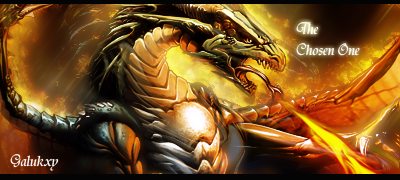
    I don't really know. This tag is a little too bright for my liking. The effects don't work too well with the stock. A lot of 'em are there but like all of them have been blurred to add depth. You should've left some of them unblurred. That black shadow-ish thing below the white mass of effect kinda ruins it too. The stock itself doesn't seem too prominent to me. I think it would've looked better if the stock was centralized. Then again, that is just my preference. XD; In future, try not to let the effects be too bright. They mess up the lighting of the tag. And stay away from excessive blurring. Doing it where it is required helps but overdoing it would just ruin the tag.

    Gal's Gallery of Graphics


    Another one which is too bright. The text really, really ruins it too. I'd advise you not to add text till you are totally confident of the fact that adding text wouldn't take away from the looks of your tag.

    Gal's Gallery of Graphics


    This one here has more than one light sources. Not a good idea. A tag should always have a single light source. Try not to overuse the renders too. This one has way too many of them on the left side. Not really required. It also lacks flow. I think dodging/burning might help you. For example, you can burn the left side of the tag and dodge the areas near the stock in order to concentrate the lighting on the stock. Seriously though, it seems like you are abusing the 'lighten' blending option too much. Try not to do that too much.

    Gal's Gallery of Graphics


    This is...very yellow. The focal is like..submerged under all that yellow. Text is a mess. I think you know all other tags of yours are better than this one..

    I think I'll add more crit if I get time. I apologize if anything I said was offending or came out as rude to you, though. I'm not the most polite person when doing crit, I suppose. And certainly not the best. I hope my crit helps you. I actually suck at it, like I have said a lot of times in the past..

     
    Last edited:

    Uecil

    [img]https://i.ibb.co/4jfYrCT/tHdpHUB.png[/img]
    2,568
    Posts
    14
    Years
  • Glad to see you open a gallery, Galukxy! I'm gonna crit those tags of yours. Icons..nah, not them. I suck at icons myself. Hence, can't really say anything much about them. Anyway, lemme get to it, then!


    Gal's Gallery of Graphics


    I don't really know. This tag is a little too bright for my liking. The effects don't work too well with the stock. A lot of 'em are there but like all of them have been blurred to add depth. You should've left some of them unblurred. That black shadow-ish thing below the white mass of effect kinda ruins it too. The stock itself doesn't seem too prominent to me. I think it would've looked better if the stock was centralized. Then again, that is just my preference. XD; In future, try not to let the effects be too bright. They mess up the lighting of the tag. And stay away from excessive blurring. Doing it where it is required helps but overdoing it would just ruin the tag.

    Gal's Gallery of Graphics


    Another one which is too bright. The text really, really ruins it too. I'd advise you not to add text till you are totally confident of the fact that adding text wouldn't take away from the looks of your tag.

    Gal's Gallery of Graphics


    This one here has more than one light sources. Not a good idea. A tag should always have a single light source. Try not to overuse the renders too. This one has way too many of them on the left side. Not really required. It also lacks flow. I think dodging/burning might help you. For example, you can burn the left side of the tag and dodge the areas near the stock in order to concentrate the lighting on the stock. Seriously though, it seems like you are abusing the 'lighten' blending option too much. Try not to do that too much.

    Gal's Gallery of Graphics


    This is...very yellow. The focal is like..submerged under all that yellow. Text is a mess. I think you know all other tags of yours are better than this one..

    I think I'll add more crit if I get time. I apologize if anything I said was offending or came out as rude to you, though. I'm not the most polite person when doing crit, I suppose. And certainly not the best. I hope my crit helps you. I actually suck at it, like I have said a lot of times in the past..


    Thanks! and no need to apologize, I need the criticism so I can learn on how to improve.

    Gal's Gallery of Graphics


    Gal's Gallery of Graphics


    No text this time.
    The first one I have used 1 gradient map for and the second one I think I used 2.

    Still. No focal point, I know. I've gotta' find some more C4Ds that work well with some of these.
     

    derozio

    [b][color=red][font=helvetica][i]door-kun best boi
    5,521
    Posts
    15
    Years
  • Well, glad to know I could be of help. :)

    As for your new tag..all I wanna say is that you should stay away from low-quality stocks/renders. That stock/render looks horribly low quality. Go for HQ images. Always.

    Hmm, you want more c4ds? I'd advise getting some from the resource threads available over here, on PC. You may also get some good ones on DeviantArt. Apart from these two sites, you can get loads of them from planetrenders and from signaturestop. :)
     
    19
    Posts
    13
    Years
    • Seen Aug 13, 2011
    I really like the Dragon Ball Z one, the lightning looks so real. And Flygon was perfected in a way i've never seen.
     
    Back
    Top