• Our software update is now concluded. You will need to reset your password to log in. In order to do this, you will have to click "Log in" in the top right corner and then "Forgot your password?".
  • Staff applications for our PokéCommunity Daily and Social Media team are now open! Interested in joining staff? Then click here for more info!
  • Welcome to PokéCommunity! Register now and join one of the best fan communities on the 'net to talk Pokémon and more! We are not affiliated with The Pokémon Company or Nintendo.

Contest: Map Making Competition - April 2015 [VOTING]

Map Making Competition - April 2015 [VOTING]

  • Snaggle P.

    Votes: 0 0.0%
  • laflacapkm

    Votes: 4 14.3%
  • nick5000

    Votes: 1 3.6%
  • joexv

    Votes: 0 0.0%
  • anonyboy

    Votes: 0 0.0%
  • Laidjon*

    Votes: 1 3.6%
  • kearnseyboy6

    Votes: 1 3.6%
  • E.C.

    Votes: 5 17.9%
  • Mentalink

    Votes: 2 7.1%
  • GoldenKHRP

    Votes: 4 14.3%
  • Johto_Legend

    Votes: 0 0.0%
  • Deokishisu

    Votes: 10 35.7%

  • Total voters
    28
  • Poll closed .
Status
Not open for further replies.

Sefuree

Canada Goose
  • 3,183
    Posts
    10
    Years
    Welcome to April's Voting Round!

    Rules:

    · You may only vote once per month.
    · Asking or bribing others to vote for your map, will be dealt with accordingly.
    · Creating new accounts to vote will be dealt with accordingly.
    · Voting via the thread is not counted, only votes via the poll count.

    Maps:

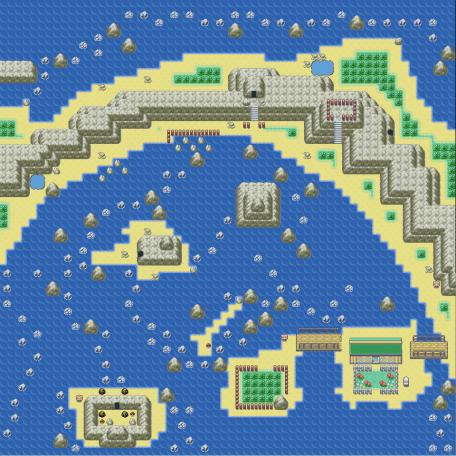
    1. Snaggle P.
    Map name: Route 240
    Comments: I've only had access to the Fire Red Rom tile sets, and I do plan on making my own eventually, but for now I have only these, but I think they are quite beautiful standard tile sets anyways. This is a tropical route on the far northern side of the region. It connects to another open water route down towards the south, to the west is another route that is the tip of the land peninsula shown here and the rest of the map extends out into a water route, to the east the land extends out into the mainland and opens up into a beach camp/village. The cave entrances lead into underground caverns that have a lot of surfing required in them as well as rock smashing and traveling up waterfalls. The grass areas, although few, hold rare tropical pokemon and are even watched over and maintained by a pokemon researcher who lives in a beach side cottage on his own small island. The sun is always shining intensely here.
    Credits: "Fire Red" ROM, Nintendo
    Spoiler:

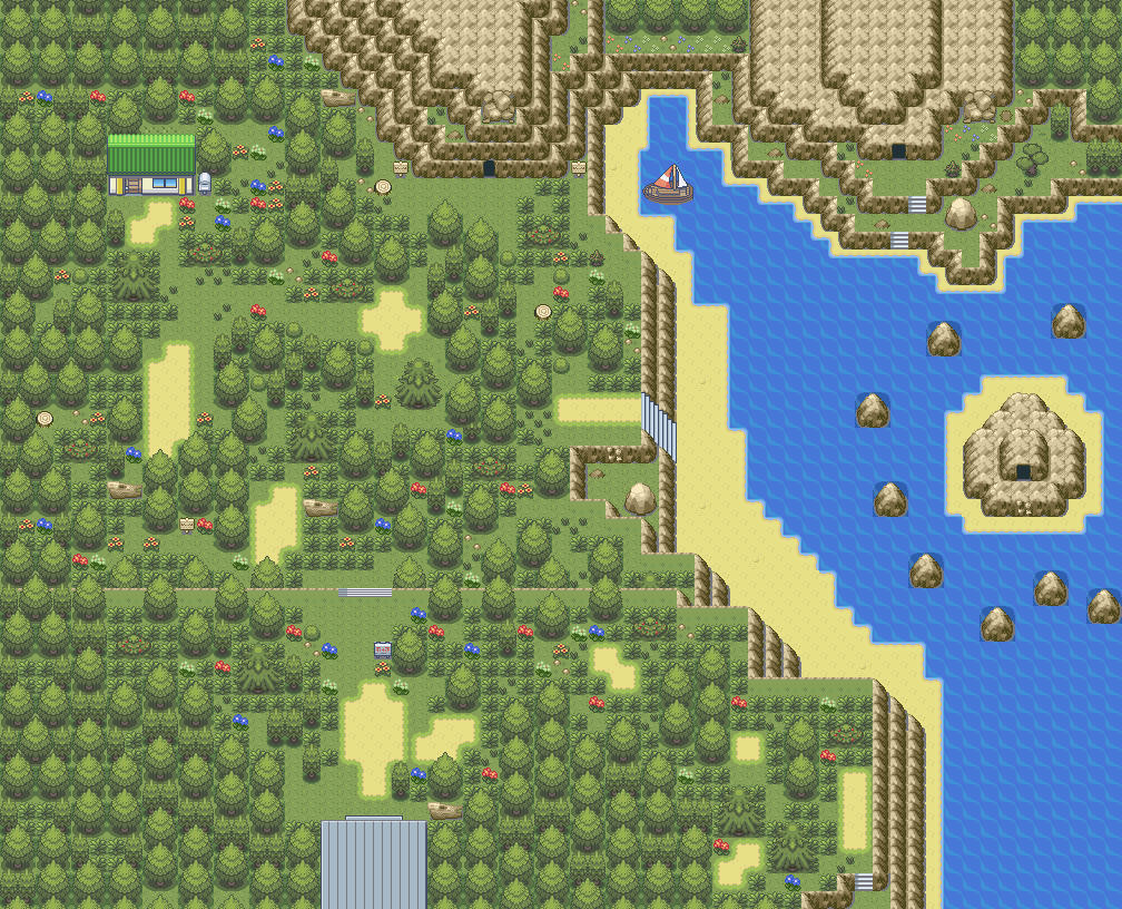
    2. laflacapkm
    Map name: Route 103
    Comments: This was a map that i made for my Hoenn Remake [still OR/AS arrives]
    Credits: Nintendo, Zein, laflacapkm
    Spoiler:


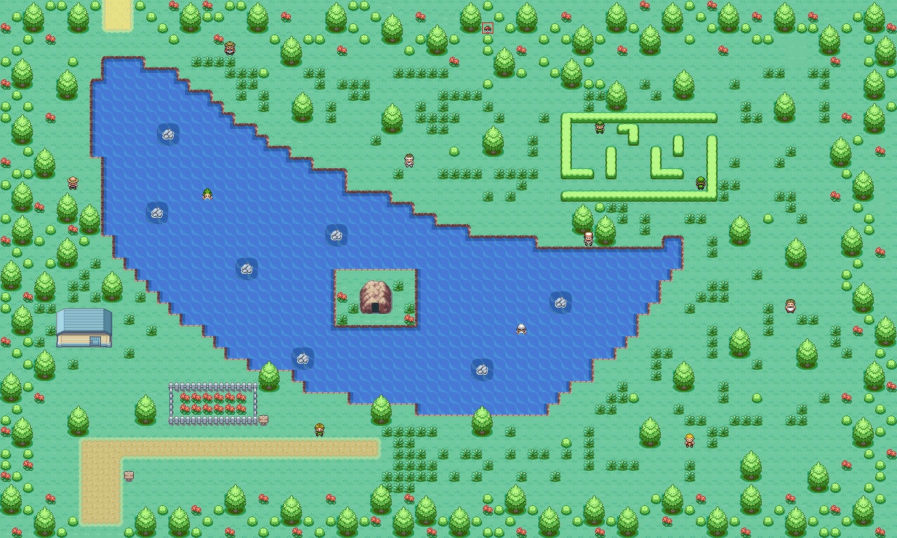
    3. nick5000
    Map name: Crescent Lake
    Comments: This map is basically a route connecting two towns. In the center is obviously a huge lake shaped sort of like a crescent moon, thus the name Crescent Lake. However, this map is very forest-like. You can find a lot of grass/bug pokemon such as Bellsprout, Wurmple, Shroomish, and more. This map took me just under two hours to make.
    Credits: Just the basic Pokemon Fire Red sprites and textures.
    Spoiler:


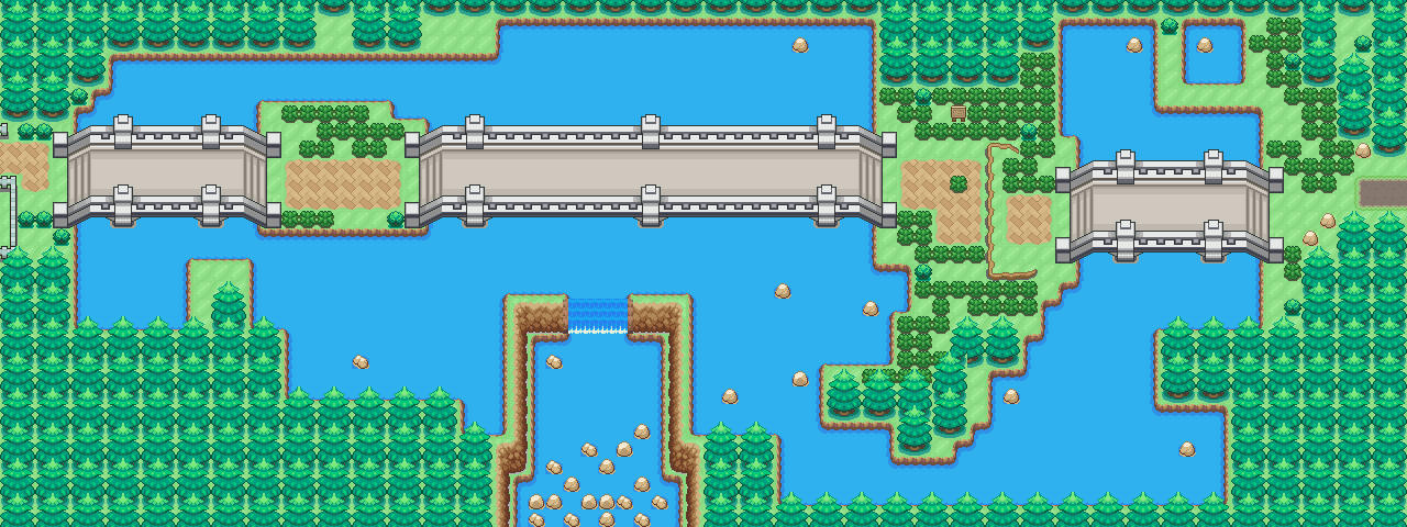
    4. joexv
    Map name: Route 6.0
    Comments: This is a remake of the Rout 6 I had in the first Blackened Night alpha back in 2013.
    Now that its gen 5/4 style it got lots more lovein.
    Credits: ChaosCherry tileset + Everyone from that set, Kyledove, weselyfg, Cope, Thatssowitty, me
    Spoiler:


    5. anonyboy
    Map name: Route 103
    Comments: This map is of my hack (currently in hiatus), Pokemon Aerial Emerald.
    Credits: Redzb1 for the HGSS Rom base i've upgraded. lightbulb15: Little Tree Tiles+Waves that i've recolored
    Spoiler:


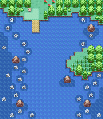
    6. Laidjon*
    Map name: Route 005
    Comments: This map was made for a popular Pokemon MMO (Pokemon Omega). Nintendo killed it.
    Credits: FireRed rom-base
    Spoiler:


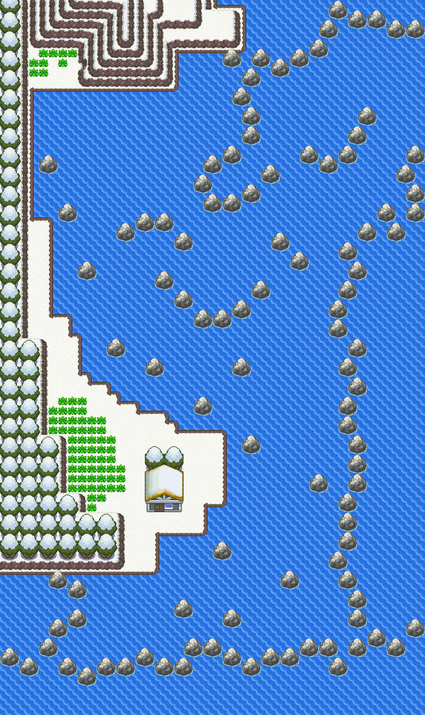
    7. kearnseyboy6
    Map name: ???
    Comments: ???
    Credits: ???
    Spoiler:


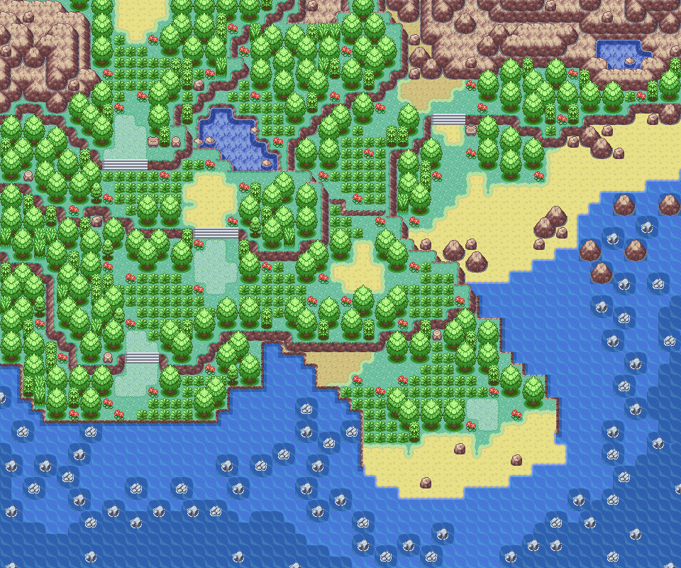
    8. E.C.
    Map name: map competition map
    Comments: The player starts from the top left side of the map and follows the path down and uses surf to get around the island. There are 2 different routes where the player can go to. One on the bottom and the other to the top right.
    Credits: Alistair, War8, Zein, WesleyFG, Trevor.
    Spoiler:


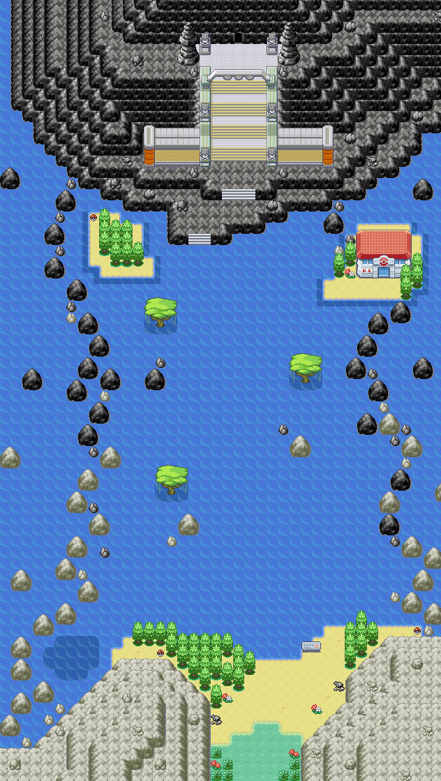
    9. Mentalink
    Map name: Stiflywave Route
    Comments: Basically a very straightforward route acting like a water corridor between a very long route and Victory Road. As you can see Victory Road is in a volcano and there's a black and white theme to the map.
    Credits: FireRed, Pokémon Essentials (RPGMaker XP)
    Spoiler:


    10. GoldenKHRP
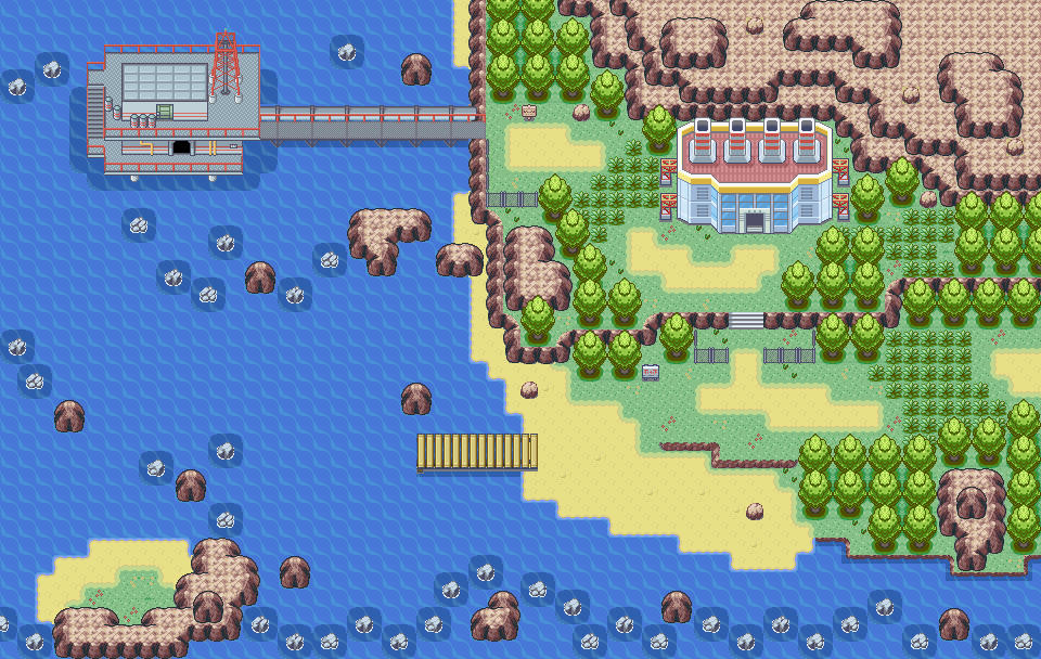
    Map name: Blackgold Coast
    Comments: This is a coastal kind of route with an oil rig. it is part of a land that is on the brink of civil war. The factory near the oil rig is used to process the oil and make fuel and maybe military stuff (depending on the plot which I still have to write/complete).I made the tiles for the oil rig myself. It is the first time I made and inserted my own tiles so I know they are not perfect. But I learned a lot of trying it anyway. Comments and Feedback are always welcome
    Credits: Credits to Alistair and ChaoticCherryCake (ChaoticCherryCake used tiles from a lot of different mappers. A complete list can be found here: https://chaoticcherrycake.deviantart.com/journal/Credits-for-Tiles-367931482).
    Spoiler:


    11. Johto_Legend
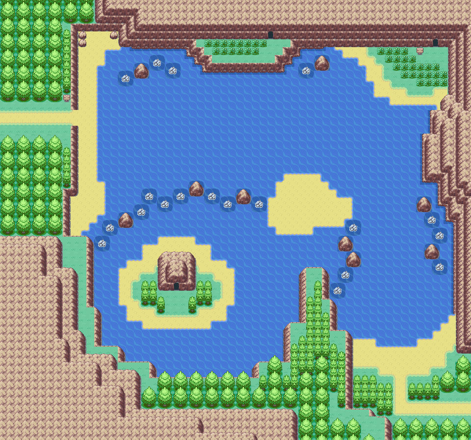
    Map name: Valley Water Passage
    Comments: Nothing too special, the route theme did prove to be quite a challenge
    Credits: Nintendo
    Spoiler:


    12. Deokishisu
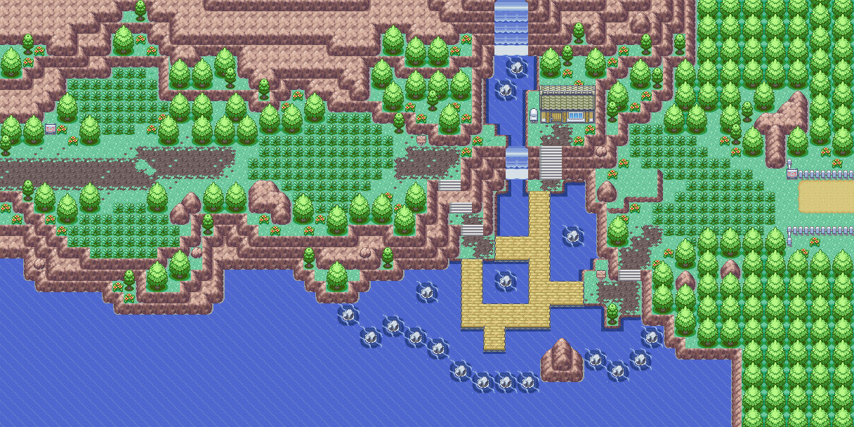
    Map name: Route 2
    Comments: This route is on the southern coast of an island in the region of the ROMHack I've been doing on and off for several years. It's been remapped at least four times since its original creation. This is its latest and likely final incarnation. The only thing that will probably change is the color of the path tiles, because that is a pretty intense shade a brown. I may soften it in the future.
    Credits: Game Freak and myself. The path tiles were ripped from the Pokemon TCG2 Japanese Gameboy Color game and heavily modified by me.
    Spoiler:


    So, Pick your favorite map!
     
    Last edited:
    A lot of the maps were too plain for my liking, but I really liked E.C.'s and Deokishisu's maps. Voted for Deokishisu's.

    Though may I suggest not having so many options available for the poll? Twelve maps are way too many, in my opinion. You could pick the three, or five if there are a lot of entries, that you find the best.

    Thanks for the feedback!
     
    Well It's too bad I haven't gotten any entry for april, I'm looking forward for May's competition! c:
    As for the maps.. a lot were too common and scattered. I understand it's theme is water route but yeah. Enlarging the map won't make it beautiful from pictures with water tiles. But anyways the last entry seems the best from the rest. Voting Deokishisu's map.
     
    I do some hardcore critiquing of the competition entries in this post. If you're an entrant, CTRL+F your username and you'll see my general opinion of it as the first result, and then a more indepth critique as the second. Unless you're Metalink or GoldenKHRP, which are like right below this.

    Whilst Deo's map is good, I feel that GoldenKHRP's map makes better use of the 'water route' theme. :) /vote

    I totally agree that my map only has one toe in the water (to make a pun) when it comes to the theme. I thought of adding a puddle or two to a land route and submitting that as a giggle, actually. I wouldn't have submitted the map that I did unless I read all of TheRealOCD's posts in the thread which authorized coastal maps.

    I voted for me, because like, I'm pretty sure all of the creators voted for themselves and I wanted to equalize the effect of that (If we all vote for ourselves, it's as if none of us voted at all).

    But, had I not voted for me, I would've voted for Mentalink's map, with GoldenKHRP's map as my second choice. Though all of our maps could be improved (and Mentalink's is no exception) I really liked the theme that the map had going on. The duality of the route was great, I loved the trees in the water, and I like the two-tone flower tiles. Among some of the things that I think can definitely be improved are the grass patches at the very bottom of the route. There's literally only 7 tiles of grass down there, and they're spread out with seemingly no thought to their placement. That's not enough grass to feasibly give the player a comfortable ability to catch the Pokemon in there. I'd remove the grass from here, or extend the map slightly on the bottom to give room for that area to have a proper grass patch if you really want to keep it there. I personally am not a big fan of the Firered skinny tree, and apparently neither is GameFreak because it was never used anywhere. The way you have them in the sand with that awkward green bottom looks a little strange as well. Might I suggest ripping the Dewford Trees from Emerald or Ruby? I personally think that the Emerald ones would look perfect here, as they're a bit spikier and I think they would play off the smooth in-the-ocean trees well. Another thing is that the contrast between the Elite Four--I guess you would call them--lead up tiles and the black mountain tiles is really jarring. My suggestion (since darkening the E4 lead up tiles would be a hassle) would be to very slightly lighten the shade of the mountain to soften the contrast. And if that cave is the entrance to Victory Road, I would suggest sprucing it up just a bit more as well. The Pokemon Gym statues are a nice touch, maybe bring them closer to directly sandwich the entrance? I'm not sure, maybe experiment a little with this. Overall, I like this map a lot, and it may inspire me to play with a similar concept in one of my future maps. Good job!

    As for GoldenKHRP's map, the thing I immediately noticed is how badly I dislike your basic tree tiles. Well, it's not so much the tiles that are bad, it's that they need their own palette to work. The default palette makes them look muted and very disproportionate because of the shading it's forcing on the tree. I'd even go so far to say that it makes them look flat, destroying the illusion of depth in your map. I'd really suggest a palette change. It would be a huge improvement to the look of ALL of your maps that use this tree. The second thing I noticed was how awesome your oil rig tiles look! The fact that you made them yourself is even more impressive. The only things I would suggest is to, one, give the railings a darker outline to distinguish them from surrounding tiles and, two, put a shadow (the one that the top level is casting) onto the floor tiles of the bottom level with the hole opening. This will give your tiles an illusion of depth and help to make them pop against the relatively busy background of the ocean tiles behind the rig. I'm not sure the proper name for it, but that red tower thingy sitting on the top level looks very 3D and very good. Might want to experiment with a darker outline there too, as it may make it look even better. I'm not 100% on that one, though. Your tall grass patches look mostly good, but the leftmost one looks a bit skimpy. Might want to extend it out a bit and cut the path tiles back a tad to accommodate the now bigger grass patch. The bottom right one looks a bit too square as well. I feel like if you removed the leftmost grass tile in the topmost row, and then put a singular grass tile in that same column underneath the lowest grass tile in that column, it would look much better. I know that that's pretty specific and nit-picky, but try it out! It will make a difference! I would also consider experimenting with the shape of the top right grass patch with the hidden item in it too, but I'm not sure if a change there would make it look better. It just looks a bit awkward as it is now. I would also clarify a bit what path the player is supposed to take when surfing to the connecting map to the left by messing with the barrier rocks. I could see myself getting confused as to where I'm supposed to be going. Should I see if I can get underneath and up passed the oil rig? Why are these two rocks separating the top and bottom portion of the ocean on the leftmost side and does it matter whether I'm on the top or the bottom? Because of the way ocean areas are bland and wide open, it's generally better to imply a direction and try not to confuse the player by mixing that implied direction up. You can get away with it on land because of the variety you have in the tiles, but not really on the ocean. Unless you're going for a water maze, but that has to be communicated to the player beforehand. I loved this map and the oil rig concept. Good job as well!

    As for the other maps, they were either too plain/poorly structured (nick5000, kearnseyboy6, Johto_Legend), too busy or chaotic/poorly structured (laflacapkm, E.C., Snaggle P.), a map which the "creator" was not responsible for its structure (anonyboy), or just too plain/uninteresting (joexv, Laidjon*). Some specific things I'd like to mention:

    Snaggle P., while your map was a bit of a mess structurally (and probably has to be scrapped and redone), I feel like the concept was amazing had it been applied well. The half-circle top of the map that cut off the player was a great idea and I think you should definitely try again and incorporate that feature. However, I wouldn't make that area walkable. I'd put an opening somewhere in the crescent shape that the player can surf out of to explore the areas to the north of it. Still, it was very unique and I loved it.

    laflacapkm, your palettes are too muted and drown the entire map out. It's difficult to see where anything is through the baby-poo-green filter the map appears to be washed in. Furthermore, you need to work on your grass patches, make the corridors your players need to follow more clearly defined, and tone down the detail. It's just too busy. Natural maps cannot and should not be free-for-alls. Natural maps need to be even more rigidly structured than the squarish "GameFreak" style maps BECAUSE a truly natural map is a nightmare to play through for the player. This map is one of those nightmare maps with little playability. The ocean part of the map seems okay, but you don't have any barrier rocks preventing the player from sailing the high seas in any direction they want, and you should have the top of cave openings like you do on the leftmost cave opening, with a wall on top of them so they don't look awkward. The map is definitely salvageable and you shouldn't scrap it. It's another one of those maps that is a fun concept.

    nick5000, I'm sorry, but this is really bad. I can tell that you're a beginner, so I would suggest studying that maps that GameFreak has already included in the Pokemon ROMs so that you can get a feel for the general style and--I guess--guidelines that will make a map structurally sound and look good. Your trees all have tile errors (those left-middle and left-bottom tile in all of them is wrong, they should only be used when they're adjacent to another tree), your map is way too big and way too empty, and everything is placed randomly. Play through this map in your emulator and see how horrible and disorienting actually playing this map actually is. Seriously, study the maps that are already in the game and try again while applying the concepts you learned from doing so. The map you make afterwards will be 100x better. You got this!

    joexv, your bridge and jumpable ledge tiles are very flat looking and lack depth. I feel like the palette for the water is too intense a shade of blue and should probably be softened a bit by lightening the shade a hair. I feel like your tree tiles clash badly with your plain grass tiles (not the tall grass, the ground-grass). In fact, I feel like palette editing them to be closer to the shade of green that your tall grass tiles are would be a huge improvement and I would urge you to experiment with the color in that direction before trying other avenues. Structurally, I feel like the map is very plain and will be boring for the player to trudge through. Perhaps vary the position of those islands a bit so that the player is forced to change direction a bit instead of following a relatively straight horizontal path? I would also suggest you shore up your grass patches, as they're too patchy and scattered right now. Good concept, but I feel by looking at this map that you have the skill to execute it better.

    anonyboy, this is not your map. You shouldn't've been allowed to enter the competition with this one, because you didn't make it, you just changed the dressing on it. Fortunately, the voters noticed this as well, because as of the time of this writing, you don't have any votes. The tiles are nice, but you have tile errors on Altering Cave. When there is a tile competition, you could enter this map in it, but this one is about how well a map is structured and executed, not just how it looks. You didn't structure or execute this map.

    Laidjon*, your map is cute. It's a shame that that's all I can really say about it structurally. Because of its size and how plain it is, it didn't take much skill to pull off. Though, I can see from how you placed those trees and how you did that tiny island on the right that you do have talent. Next time, please select a map to enter that showcases some of it to us! As for the map itself, the bases of most of your trees have tile errors, when they're directly adjacent to each other, they need to use the other set of tree base tiles. Quick fix, and the only "typo-like" error I found.

    kearnseyboy6, your map is entirely too big, too empty, and because of this is directionless. You could literally cut 70% of the space out of this map and lose nothing of value, which is something I'd suggest you do if you don't plan on sprucing anything up. Why is that tiny cave up there with the grass patch so far removed from the actual focal point of the map (the house area)? Why is the ocean so vast and maze-like for no discernible reason? I mean, it's not like the ocean has any interesting features to justify its size. I would suggest you condense the grass-patch-cave-island and the house-island into one smaller area, and then cut a majority of the space in this map to give it more clarity and direction. As it is, it just doesn't work.

    E.C., the flower placement is what killed this map. I know, it seems like a minor thing, but you have flowers placed everywhere randomly and it just scatters the focus for those looking at it. GameFreak never places flowers like that for good reason. Try to keep them in clumps of two, and try to keep them diagonal from each other. Otherwise, though a bit busy (I think the long grass interspersed in the treeline may be overkill), I feel like this map would be fun to explore and play through as the player. In the southern portion, I would change that rocky brown pathing to sand pathing, but the rocky brown pathing at the top of the map looks fine as is. I'd also prune back the extra barrier rocks a bit in the bottom left, as it makes that area of ocean feel too cramped. But really, it's the flower placement that makes this not aesthetically pleasing on the eye, and also what's probably costing you the high opinion that this map rightfully deserves.

    Johto_Legend, I want to start by saying that this map is okay in theory. The concept is just interesting enough to work and be engaging for the player, I think. Unfortunately, the way it was executed doesn't work and won't be engaging for the player. For technical errors, you use one kind of ground-grass tile throughout the entire map. That's a big no-no with the default Firered tiles and makes your map boring and tiresome in a way that isn't always immediately obvious to the player or the hacker. Because Firered's default grass tiles are a hassle and suck to use effectively, many hackers (including myself) ax them for a single tile that can still be interesting when placed in the blanket fashion that the ground-grass needs to be placed in. Your trees have tile errors. The topmost "free" tree in a row should have the tiles that aren't dark green behind them. Study Firered's stock Route 1 trees, as they illustrate how they should be used quite nicely. On the left, you cannot open a ledge like you did to allow the player to walk through it. If you don't have the right tile, you'll have to jut out the ledge so that you can put a vertically-oriented stair to allow your player to get down. Your ocean area is very bland and it could probably be shrunken by moving everything of interest a few tiles closer to the middle of the map without losing anything of value. Again, not a fan of those skinny-trees, but that's a personal thing. I feel like the default Emerald skinny-trees would look way better here. Everything is a bit square, and I feel like if you slightly rounded the edges of this map it would be better. Because this map is plain both in looks and in structure, it's hard to pinpoint more exact ways to improve it. It's just boring-looking unfortunately, and it makes me tired to look at immediately after opening the spoiler. I know that's a bit harsh, but that's my perception.

    As for my map, it's very difficult to look at my own work objectively, and would appreciate someone to be just as constructively critical of it as I was constructively critical here. But totally post any revision y'all make to your maps somewhere if you do decide to make them! I'd be interested in seeing the improvements!
     
    @Deokishisu Your map is the best,but there are a few things that you can do to improve it:

    -Shade the trees properly -_-
    -Try to replace the bridge tiles with those which exist in the data of Lavander town.
    -And do NOT soften the mountain path tiles' colours.If this place is intended to be a part of a mounatain it will look stupid with soft colours.

    I'm eager to see this month's theme and maps. ^_^
     
    -Shade the trees properly -_-
    Wait, what? They are shaded properly. There are two incorrectly shaded trees on the bottom right right next to the water, but those are out of the player's field of vision and fixed regardless in my ROM (I noticed it like an hour after the voting thread was posted). Where the trees are offset by one tile from each other (like the last column of trees on the top right of the map and the column directly to the left of them) I basically had to make up a standard shading method, because GameFreak never has their trees like that and doesn't provide an example. Is that what you're referring to?
    -Try to replace the bridge tiles with those which exist in the data of Lavander town.
    Personally, I really dislike Lavender Town's bridge tiles, but I do want to experiment with them here now that you've suggested it. I'll give it a shot. (I'm not sure where I'm going to find the tileset space for it though. This is on Emerald. Maybe I'll doctor it up in paint to see how it looks to let me decide whether or not I want it without all of the insertion.)
    -And do NOT soften the mountain path tiles' colours.If this place is intended to be a part of a mounatain it will look stupid with soft colours.
    The path is implied to be the original path that the settlers of this region put down like 250 years ago, which is why it looks so degraded. The island that this route is located on is rich in colonial history, because the settlers found it before they found the mainland. I was thinking about possibly making it the same colors/shades as the berry soil.

    Thank you for the feedback though, I didn't initially think of experimenting with Lavender's bridge tiles. They may very well look better when used here.
     
    E.C., the flower placement is what killed this map. I know, it seems like a minor thing, but you have flowers placed everywhere randomly and it just scatters the focus for those looking at it. GameFreak never places flowers like that for good reason. Try to keep them in clumps of two, and try to keep them diagonal from each other. Otherwise, though a bit busy (I think the long grass interspersed in the treeline may be overkill), I feel like this map would be fun to explore and play through as the player. In the southern portion, I would change that rocky brown pathing to sand pathing, but the rocky brown pathing at the top of the map looks fine as is. I'd also prune back the extra barrier rocks a bit in the bottom left, as it makes that area of ocean feel too cramped. But really, it's the flower placement that makes this not aesthetically pleasing on the eye, and also what's probably costing you the high opinion that this map rightfully deserves.

    First off I just wanted to say thank you for taking your time to write down a review for my map. I've been mapping for years but I know that I still have a lot of errors in my maps so I appreciate it when others criticize my work and give me tips on how to improve. Anyways I have to agree with you with the flowers being spread out and placed randomly. I did notice that detail when I first posted the map but I wasn't sure whether others would find it that displeasing when they saw it. I also have to agree with you on the maps being a bit "busy" mostly between the trees that the player can't get to. You haven't been the first person to notify me of this before and others have mentioned that my maps always seem to have a lot going on that cause my maps to lose their appealing. It seems to be something that always happens by itself when I make my maps and I never pay attention to it until someone brings it up. I'll have to keep that in mind next time I create a map so I won't make the same mistake again.

    As for my vote I won't be voting for myself or for anyone else on the poll. I really think the non competitors are the only ones who should decide the winner of the competition, but if I had to pick I would vote for Deokishisu or GoldenKHRP's map.
     
    Johto_Legend, I want to start by saying that this map is okay in theory. The concept is just interesting enough to work and be engaging for the player, I think. Unfortunately, the way it was executed doesn't work and won't be engaging for the player. For technical errors, you use one kind of ground-grass tile throughout the entire map. That's a big no-no with the default Firered tiles and makes your map boring and tiresome in a way that isn't always immediately obvious to the player or the hacker. Because Firered's default grass tiles are a hassle and suck to use effectively, many hackers (including myself) ax them for a single tile that can still be interesting when placed in the blanket fashion that the ground-grass needs to be placed in. Your trees have tile errors. The topmost "free" tree in a row should have the tiles that aren't dark green behind them. Study Firered's stock Route 1 trees, as they illustrate how they should be used quite nicely. On the left, you cannot open a ledge like you did to allow the player to walk through it. If you don't have the right tile, you'll have to jut out the ledge so that you can put a vertically-oriented stair to allow your player to get down. Your ocean area is very bland and it could probably be shrunken by moving everything of interest a few tiles closer to the middle of the map without losing anything of value. Again, not a fan of those skinny-trees, but that's a personal thing. I feel like the default Emerald skinny-trees would look way better here. Everything is a bit square, and I feel like if you slightly rounded the edges of this map it would be better. Because this map is plain both in looks and in structure, it's hard to pinpoint more exact ways to improve it. It's just boring-looking unfortunately, and it makes me tired to look at immediately after opening the spoiler. I know that's a bit harsh, but that's my perception.

    Thank you very much for the critique. I too noticed all those issues within my map after submitting it, and I view it as a bad example of what I am capable of. I originally hadn't plan to enter the contest this month, but last minute decided to do so, and this was the result. I do agree and honestly believe that in theory, this map has huge potential, but I was unable to put in the polish it needed to be a great map. I'll take your criticism to heart and only enter the contest with maps I am truly proud of, thank you for that.

    I do want to bring up the topic of judging though, because I feel that some maps that are good are often missed. I think maps should be judged according to a few categories:
    • Execution of Theme
    • Playability
    • Style/Appearance

    This would make the competitions feel more like a real competition. Voters should keep these in mind while voting which is honestly the best map. In addition there can be a separate popular vote like what we have been doing so far. I only bring this up because this month's theme was Water Routes, and many of the maps featured aren't designed around the theme, but appear to be more of an after thought. Just my two-cents.
     
    As for GoldenKHRP's map, .......

    Thank you for the elaborate feedback! It really helps me out :)
    I was (and still am) experimenting with the palletes so your feedback on the trees really helps. I hope that I can fix this issue for the map of next month. regarding the oil rig feedback, I did make additional tiles for proper shading and for the outlines of the railings. The problem was the lack of space to insert these tiles. I had to make a selection of the tiles that I needed and those tiles just didn't fit anymore. Hopefully I can fix this in a later stage of my ROM-hack. As for the rocks in the water, they are not meant to separate the map, though I can see why you think that. The only function of these rocks is to prevent the player from surfing in a straight line. I should have put that in the description. The position of these rocks will be reconsidered.


    Now for my vote. I had a hard time choosing the best map. My three favorite maps were the ones from Laidjon*, E.C. and Deokishisu.

    Laidjon*'s map has a great design. I am not the biggest fan of the FireRed tiles. However, This map has to be an exception.
    It looks like a nice and quit little route with a good amount of detail.

    E.C.'s map has a good design as well. What stands out the most to me are the water tiles that were used for those puddles in the mountains. Those look awesome.
    The biggest downside I see is that the map looks very busy. Other that that I think it is a great map

    Deokishisu's map looks nice too. I really like the house on the cliff. The tiles themself look good too. However, like you said, the paths are pretty intense.
    This is in my opinion the biggest flaw of this map. One other thing I noticed (And I could be wrong) is that the waves around the rocks in the water are different than the waves in the sea/ocean. But I am not sure about that one.

    Deokishisu's map got my vote.
     
    Last edited:
    And the winner is........Deokishisu!

    Congratulations on winning April's Map Making Competition! Sorry i'm a little late!
     
    Status
    Not open for further replies.
    Back
    Top