Gary the Magic Fairy
Banned
- 2,799
- Posts
- 19
- Years
- Age 32
- Your Mother
- Seen Jun 29, 2010
The Top 6 Entries have been chosen. The remaining entries will be judged tomorrow.
![[PokeCommunity.com] March Pixel Art Contest - Results](https://i41.tinypic.com/2vw5nyh.png "[PokeCommunity.com] March Pixel Art Contest - Results")
The winner of this month's contest is... Lornami!
 This is.. amazing. There's just so much detail. The reflections in the water, the bark on the trees, the random metapods in the background, the way the light is shining on the moving water..
The only major flaws I can see are a few little problems with the outlines, mostly on the Budew. Very well done.
![[PokeCommunity.com] March Pixel Art Contest - Results](https://i44.tinypic.com/2m2etug.png "[PokeCommunity.com] March Pixel Art Contest - Results")
Second Place goes to Nicolas.
 This is also very good, though it's hard to tell what's going on. Is it squinting, sleeping, or what? Well, whatever is going on, it's shaded nicely, and without too many noticable errors.
One thing I notice is that the anatomy is a little off. The flower seems to be too far forward, and one foot seems a lot bigger than the other. Also, having the shadow shaped to be more flower-like would have been a nice touch.
![[PokeCommunity.com] March Pixel Art Contest - Results](https://i44.tinypic.com/4hvc45.png "[PokeCommunity.com] March Pixel Art Contest - Results")
Third Place goes to Kinarii.
 This is practically flawless. The shadows make sense, the shading is wonderful... there's really nothing bad to say about it.
This was definately first place before those last 2 entries. However, they are more complicated and detailed, even if they do have a few flaws.
![[PokeCommunity.com] March Pixel Art Contest - Results](https://i44.tinypic.com/16beu1i.png "[PokeCommunity.com] March Pixel Art Contest - Results")
Fourth Place goes to FoxHound!
Again, this is nearly flawless, it's just.. more simple than some other entries.
I really like your take on the theme. It isn't just something colored green. I also enjoy this minimalistic style.
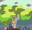
![[PokeCommunity.com] March Pixel Art Contest - Results](https://i43.tinypic.com/flymw9.png "[PokeCommunity.com] March Pixel Art Contest - Results")
Fifth Place goes to Electramite.
![[PokeCommunity.com] March Pixel Art Contest - Results](https://i42.tinypic.com/6s5c8o.png "[PokeCommunity.com] March Pixel Art Contest - Results")
Sixth Place goes to rhevarhe_duh.
 I've had a very hard time judging this one. It's been in every place from 3rd to 12th at some point in time. At first, I thought "why is it all bumpy?" then later I noticed Australia and finally realized. "OMG, they're mountains. It's geographically correct?!" It's funny how something I initially thought was a flaw was actually a detail.
The detail on this is amazing. The rough outlines kinda bug me, though, and the "leaves" don't really look that much like leaves. Still, I'm impressed by the attention to detail.
![[PokeCommunity.com] March Pixel Art Contest - Results](https://i44.tinypic.com/29772p.png "[PokeCommunity.com] March Pixel Art Contest - Results")
These are the remaining entries. They are not necessarily 7th, 8th, 11th, etc, just an approximation.
 This is quite detailed for a small piece, but the detail isn't all that apparent unless you zoom in. The shading seems a little too subtle, especially on the grass and trees. The grass just looks like a solid color unless you zoom in and pay close attention.
Also, the swamp or whatever that yellow-green stuff is seems.. oddly shaded. It's a bunch of random dots that don't seem to make any sense. Still, it's a good piece of pixel art.

This is a fairly good entry. The edges are a little rough, but other than that, no major flaws. It's just... so simple.

My thoughts on this are about the same as the one above.

My only big problem with this is the things above it's eyes. They look like eyebrows, but I'm not sure they are. It kinda throws off the "happy plant fairy" thing your description implied. To me, it looks angry.
 The one on the left is shaded nicely, but the right one seems like it should be shaded in the same way the other is. You did a nice job hiding how it was copied/flipped, though.

Cute. The outline shading needs some work, though. The head has mostly black outlines, which doesn't really make sense.

I'm not certain what this is, but.. it's nice, I guess. It doesn't really fit the theme very well. I mean, yeah, it has some green in it, but.. the "green" part isn't very apparent.
 Again, not really anything wrong with it, it's just small and kinda simple.
The winner of this month's contest is... Lornami!
This is.. amazing. There's just so much detail. The reflections in the water, the bark on the trees, the random metapods in the background, the way the light is shining on the moving water..The only major flaws I can see are a few little problems with the outlines, mostly on the Budew. Very well done.
Second Place goes to Nicolas.
One thing I notice is that the anatomy is a little off. The flower seems to be too far forward, and one foot seems a lot bigger than the other. Also, having the shadow shaped to be more flower-like would have been a nice touch.
Third Place goes to Kinarii.
This is practically flawless. The shadows make sense, the shading is wonderful... there's really nothing bad to say about it.This was definately first place before those last 2 entries. However, they are more complicated and detailed, even if they do have a few flaws.
Fourth Place goes to FoxHound!
Again, this is nearly flawless, it's just.. more simple than some other entries.
I really like your take on the theme. It isn't just something colored green. I also enjoy this minimalistic style.
Fifth Place goes to Electramite.
*image removed* This is a very interesting piece of pixel art. I enjoy the contrast between the two parts. One part is in full color, and the other in shades of green. I also really like the shading on the green parts.
A few things bug me, though. The outlines and shading on the head seem a little rough. Then something about the outline on the part of Bulbasaur's bulb that covers part of the hoie. And the hole itself.. something about the shape seems a little off, but it's nothing major. Good Job.
A few things bug me, though. The outlines and shading on the head seem a little rough. Then something about the outline on the part of Bulbasaur's bulb that covers part of the hoie. And the hole itself.. something about the shape seems a little off, but it's nothing major. Good Job.
Sixth Place goes to rhevarhe_duh.
I've had a very hard time judging this one. It's been in every place from 3rd to 12th at some point in time. At first, I thought "why is it all bumpy?" then later I noticed Australia and finally realized. "OMG, they're mountains. It's geographically correct?!" It's funny how something I initially thought was a flaw was actually a detail.The detail on this is amazing. The rough outlines kinda bug me, though, and the "leaves" don't really look that much like leaves. Still, I'm impressed by the attention to detail.
These are the remaining entries. They are not necessarily 7th, 8th, 11th, etc, just an approximation.
gp_arts39
This is quite detailed for a small piece, but the detail isn't all that apparent unless you zoom in. The shading seems a little too subtle, especially on the grass and trees. The grass just looks like a solid color unless you zoom in and pay close attention.Also, the swamp or whatever that yellow-green stuff is seems.. oddly shaded. It's a bunch of random dots that don't seem to make any sense. Still, it's a good piece of pixel art.
Alistair
This is a fairly good entry. The edges are a little rough, but other than that, no major flaws. It's just... so simple.
HFI
My thoughts on this are about the same as the one above.
riceeman
My only big problem with this is the things above it's eyes. They look like eyebrows, but I'm not sure they are. It kinda throws off the "happy plant fairy" thing your description implied. To me, it looks angry.
Destrozone
The one on the left is shaded nicely, but the right one seems like it should be shaded in the same way the other is. You did a nice job hiding how it was copied/flipped, though.pokemon xd
Cute. The outline shading needs some work, though. The head has mostly black outlines, which doesn't really make sense.
tbone1094
I'm not certain what this is, but.. it's nice, I guess. It doesn't really fit the theme very well. I mean, yeah, it has some green in it, but.. the "green" part isn't very apparent.
Jappio
Again, not really anything wrong with it, it's just small and kinda simple.
Last edited:


![[PokeCommunity.com] March Pixel Art Contest - Results](https://www.insidehoops.com/forum/images/smilies/cheers.gif "[PokeCommunity.com] March Pixel Art Contest - Results")