
You are using an out of date browser. It may not display this or other websites correctly.
You should upgrade or use an alternative browser.
You should upgrade or use an alternative browser.
.Mini's Graphics(:
- Thread starter .Mini
- Start date
More options
Who Replied?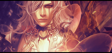


Looking at your tags as a whole, you definitely have a knack for the flow of things. However, most of the effects and colors you use for each tag make it appear a bit monotone. There's nothing that specifically stands out in them, and the main focus of it becomes too well blended into the effects. Also, don't be afraid of your text that you decide to put in. I notice a lot of it is pretty small and sort of hard to see, because it's also pretty blended into the tag itself. So, those are just a few things to think about and work on as you show more of you work.
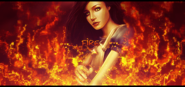
My favorite piece so far is Blue Goddess. This is a perfect example of what I meant about how well you keep the flow of the tag, but it's also a good example of what I mean by your work seems pretty monotone. However, you did play with the effects very nicely. It could have probably been better off without the black border though. Actually, looking at things again, all of your work has some sort of border. Sometimes it's best not to have them at all.
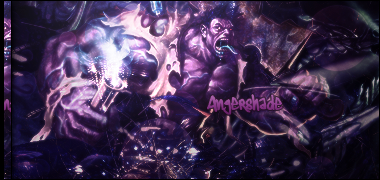
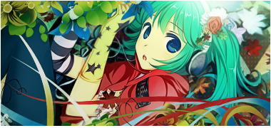
As for your latest tag, it definitely has more color to it, but at the same time it lacks some of those special effects and C4Ds that made the others stand out. The colors could have been adjusted a bit more to stand out, but I'd suggest playing around with the curves, levels, and saturation more.
My favorite piece so far is Blue Goddess. This is a perfect example of what I meant about how well you keep the flow of the tag, but it's also a good example of what I mean by your work seems pretty monotone. However, you did play with the effects very nicely. It could have probably been better off without the black border though. Actually, looking at things again, all of your work has some sort of border. Sometimes it's best not to have them at all.
As for your latest tag, it definitely has more color to it, but at the same time it lacks some of those special effects and C4Ds that made the others stand out. The colors could have been adjusted a bit more to stand out, but I'd suggest playing around with the curves, levels, and saturation more.


