• Our software update is now concluded. You will need to reset your password to log in. In order to do this, you will have to click "Log in" in the top right corner and then "Forgot your password?".
  • Welcome to PokéCommunity! Register now and join one of the best fan communities on the 'net to talk Pokémon and more! We are not affiliated with The Pokémon Company or Nintendo.

Nyu, Nyu~♥! I'm back and better!

Nyu~♥!

Pokémon Opal Producer
478
Posts
14
Years
  • 1ba06c6baf0c82ed1db4425f61db7f21.gif

    Nyu's Scratch Sprites!
    (yes, i'm back.. with copyrights.)


    I left because I forgot to post for over a month. XD I decided, why not start out new? ^^
    But you dunt care! You just wanna see how bad I sprite so you can fry me, eh?
    Well, that's a bummer because I don't sprite nearly as bad as when I first started posting here on PC. They're all copyrighted under Pokémon Opal(game I am producer of), so don't you dare touch them...

    Rules regarding mys sprites:
    No re-posting
    Don't even TRY to post them on auto-copyright sites
    No using them in games without my permission
    Don't download and/or save them without my permission
    In other words, DON'T USE THEM IN ANYWAY WHATSOEVER WITHOUT MY PERMISSION, PERIOD!

    ..as for now, nothing else.
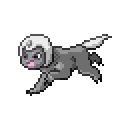
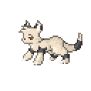
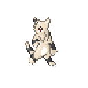
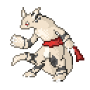
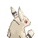
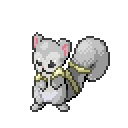
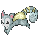
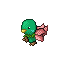
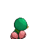
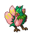
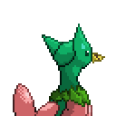
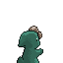

    Take a look!

    Newest, rate me on these:

    Spoiler:


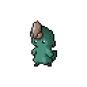
    These are kinda old(try not to rate me on these):

    Spoiler:


    That's all for now.
    I'm sorry they're all so big, the game requires them too be that big.
    byeeee! (and please, leave NICE critique!)

     
    Last edited:

    The Original Darkwiz787

    Stuck with text below my name.
    317
    Posts
    15
    Years
    • Seen Jun 24, 2014
    The Pokemon name is also copyrighted, so you can get sued for using it ^.^
    Just sayin'.

    The sprites are nice. I don't like some of the poses they are in, as they aren't facing bottom left. Other than that, I like 'em/
     

    Nyu~♥!

    Pokémon Opal Producer
    478
    Posts
    14
    Years
  • The Pokemon name is also copyrighted, so you can get sued for using it ^.^
    Just sayin'.

    The sprites are nice. I don't like some of the poses they are in, as they aren't facing bottom left. Other than that, I like 'em/

    not the name.. I mean the game is copyrighted.. If that were true the whole of PC would be shut down by now.. all the fangames.. 0_0'
    I can't copyright the name of anything. <_<'
    In other words, everything that was made original for the game is copyrighted.. not the idea of "pokemon"
    And please, I would like it best if people didn't go correcting things that aren't about the sprites.. I hate it when people go through and pick every single little thing I did wrong( you didn't, though), and it happens so much here on PC, it's annoying as hell.

    err, yup, *double-check* they are, actually... ^^' Thank you, though.
     
    Last edited:

    Conan Edogawa

    One Truth Prevails
    1,061
    Posts
    15
    Years
  • I really like your sprites. you seem to like mammals a lot, since the majority of your sprites are. I don't care for the second back sprite though, it looks much bigger than the front sprite and seems to be an evolution. I aslo think you use dithering to often, but other than that your sprites are really good.
     

    Raibutai

    Pixels and Pikachus. Bliss.
    280
    Posts
    15
    Years
  • Okay, okay. Your sprites... The fronts look messy. Your lines mix together a lot, and jut off in odd directions. Also, your Fakemon have small eyes, which isn't exactly Pokemon-like. (but that's for you to decide)

    At the risk of repeating the above post, many of your backsprites look like evolutions of the Fakemon they are trying to depict.

    Let's take an example:

    036.png

    036b.png


    See, the tail, ears and body look a bit bigger than they should, and give the impression of an evolution.

    Yet, some of the dithering looks messy too...

    Little nit-picky thing:

    Spoiler:
     
    Last edited:

    Nyu~♥!

    Pokémon Opal Producer
    478
    Posts
    14
    Years
  • I really like your sprites. you seem to like mammals a lot, since the majority of your sprites are. I don't care for the second back sprite though, it looks much bigger than the front sprite and seems to be an evolution. I aslo think you use dithering to often, but other than that your sprites are really good.

    yeah. ^^; I dither.. too much(maybe it's fun to me XD)

    Okay, okay. Your sprites... The fronts look messy. Your lines mix together a lot, and jut off in odd directions. Also, your Fakemon have small eyes, which isn't exactly Pokemon-like. (but that's for you to decide)

    At the risk of repeating the above post, many of your backsprites look like evolutions of the Fakemon they are trying to depict.

    Let's take an example:

    036.png

    036b.png


    See, the tail, ears and body look a bit bigger than they should, and give the impression of an evolution.

    Yet, some of the dithering looks messy too...

    Little nit-picky thing:

    Spoiler:

    Thanks for your crits..
    I agree with you. I make them too big. -.-' I should redo some.


    about the suing thing, guys.. it's just a joke. <_<' as if I would do something as dumb as that over a sprite(unless they were using it to make BIG money.. somehow.. I don't think that's possible over my sprites XD)
    I don't mean art theft here, all over the place. Visit deviantart, you'll understand.. people are getting their art stolen in contests, and yet they can't even contact the person organizing it. -shrug-

    I'm seriously removing that suing thing since only one person seemed to get the point of it.. in other words, it means "don't use my art without my permission".. I'm starting to get irritated.(sorry, but I'm easily irritated)
     

    Raibutai

    Pixels and Pikachus. Bliss.
    280
    Posts
    15
    Years
  • yeah. ^^; I dither.. too much(maybe it's fun to me XD)


    Thanks for your crits..
    I agree with you. I make them too big. -.-' I should redo some.


    about the suing thing, guys.. it's just a joke. <_<' as if I would do something as dumb as that over a sprite(unless they were using it to make BIG money.. somehow.. I don't think that's possible over my sprites XD)
    I don't mean art theft here, all over the place. Visit deviantart, you'll understand.. people are getting their art stolen in contests, and yet they can't even contact the person organizing it. -shrug-

    I'm seriously removing that suing thing since only one person seemed to get the point of it.. in other words, it means "don't use my art without my permission".. I'm starting to get irritated.(sorry, but I'm easily irritated)

    Sorry about that, I should have put something there to mention I was joking, too. ^^; It's hard to make people know you're joking, without actually denoting it with a footnote. I would just remove it, and just replace it with "please no stealing" and our community will police it. Pretty well, at that.

    Well, this post is mostly off-topic, so I'll add one more thing.

    Your newest looks very nice, compared to your older ones, but there is a bit of inconsistency here and there. To be specific, it's most obviously in its eye.The eye in the front is proportionally wider than the one in the front, making it look rather different. This is pretty obvious when it's blown up to accommodate a (non-hack) fan-game, like yours.

    That's it. Thanks in advance, for understanding.

    Spoiler:
     
    485
    Posts
    14
    Years
  • I wish you wouldn't double the size when you uploaded. It makes it really hard to see -_-'

    Anyway, it does show up that you've used a bright red on its belly which doesn't look right. Also, some of your outlines, especially on the brown area, are too light, which is something I see on a lot of your other sprites, too. You should always use black outline in the darkest areas, too.

    My main point, though, which is something Rai was alluding to, is that your concepts are not really Pokémon like. Pokes have big faces and eyes (in most cases), especially mammals, and I think drawing them on too small a canvas might not be helping. The actual body of your sprite is less than 50x50 (scaled down), so you're already wasting about 7 pixels on every side. Granted, not all sprites are that big, but mammals are normally a decent size, so don't be afraid to make them bigger. Especially faces. I also know you're working with Essentials, so 80x80 isn't something useful for you, but you might want to try it out to get comfortable with making larger sprites.

    Still, your shading and palettes are generally good, although your lines are untidy occasionally, which has been said already. Keep at it! :)
     
    10,769
    Posts
    14
    Years
  • I know your game needs them to be big, but it would be nice if we could see them at normal size. Anyway, it's a nice pose and the fire-cub concept is good, but I think you need to be more careful with the line work and choice of colors.

    If you look at the forehead area on the backsprite you'll see the outline is a couple of 90 degree angles. You could get a much smoother look without so many of those, more so the ones that angle outward since the outline gives you the overall impression of a sprite, but the inner ones could be changed without affecting the outline if you don't want the outline changed. It could also help if it wasn't all the same color like you did with the forward paw on the front sprite.

    As for the palette, it's very noticeable on the ears. The backsprite's ear is three white pixels thick for about the top half and only two thick for the bottom half. This wouldn't bother me if the colors didn't contrast so much. It's a very dark red you're using and the grey is still pretty light. I see you put in a lighter red area between them to transition the colors, and that's good, but it's still a fairly dark red. The sprite is pretty dark overall. The lightest shade of orange is still about midway between light and dark and all the shades of brown are dark. I think you have a good range of light and dark shades on your green/pink bird sprite so I would use that as a rough guide.
     

    CRaTeR

    Emperor of Aragon
    34
    Posts
    14
    Years
    • Seen Oct 21, 2015

    I'm confused as to the light source on this sprite. The chest fur and legs would lead one to believe that the light is coming from straight ahead of the sprite, but the head clearly contradicts that. The upper part, which should be shadowed, is instead lit and the lower part, which would be in the light, is shadowed.

    The outlining on your back sprite is not good at all. You have the darkest shade of red outlining the lightest shade. In this case, you should switch the medium to medium-dark shade to outline with. It also appears to have a very oddly shaped cheek bone. Not to mention that the eyes on the back sprite are much smaller than the ones on the front sprite. It's important to maintain proportions.
     

    Nyu~♥!

    Pokémon Opal Producer
    478
    Posts
    14
    Years
  • New sprites!

    016b.png
    016.png


    Please, critique nicely!


    Sorry about that, I should have put something there to mention I was joking, too. ^^; It's hard to make people know you're joking, without actually denoting it with a footnote. I would just remove it, and just replace it with "please no stealing" and our community will police it. Pretty well, at that.

    Well, this post is mostly off-topic, so I'll add one more thing.

    Your newest looks very nice, compared to your older ones, but there is a bit of inconsistency here and there. To be specific, it's most obviously in its eye.The eye in the front is proportionally wider than the one in the front, making it look rather different. This is pretty obvious when it's blown up to accommodate a (non-hack) fan-game, like yours.

    That's it. Thanks in advance, for understanding.

    Spoiler:

    s'ok. Welcome, thank you.

    woah, nice scratches, good job on the shading, nothing like what i've seen x3

    You're really, really wrong. These are horrible. But thanks for making me feel betetr than I should D:


    I wish you wouldn't double the size when you uploaded. It makes it really hard to see -_-'

    Anyway, it does show up that you've used a bright red on its belly which doesn't look right. Also, some of your outlines, especially on the brown area, are too light, which is something I see on a lot of your other sprites, too. You should always use black outline in the darkest areas, too.

    My main point, though, which is something Rai was alluding to, is that your concepts are not really Pokémon like. Pokes have big faces and eyes (in most cases), especially mammals, and I think drawing them on too small a canvas might not be helping. The actual body of your sprite is less than 50x50 (scaled down), so you're already wasting about 7 pixels on every side. Granted, not all sprites are that big, but mammals are normally a decent size, so don't be afraid to make them bigger. Especially faces. I also know you're working with Essentials, so 80x80 isn't something useful for you, but you might want to try it out to get comfortable with making larger sprites.

    Still, your shading and palettes are generally good, although your lines are untidy occasionally, which has been said already. Keep at it! :)

    Too bad, it's going to be that way.
    I'll try making them bigger. I had no idea my lineart was so bad. D:
    Thanks!

    I know your game needs them to be big, but it would be nice if we could see them at normal size. Anyway, it's a nice pose and the fire-cub concept is good, but I think you need to be more careful with the line work and choice of colors.

    If you look at the forehead area on the backsprite you'll see the outline is a couple of 90 degree angles. You could get a much smoother look without so many of those, more so the ones that angle outward since the outline gives you the overall impression of a sprite, but the inner ones could be changed without affecting the outline if you don't want the outline changed. It could also help if it wasn't all the same color like you did with the forward paw on the front sprite.

    As for the palette, it's very noticeable on the ears. The backsprite's ear is three white pixels thick for about the top half and only two thick for the bottom half. This wouldn't bother me if the colors didn't contrast so much. It's a very dark red you're using and the grey is still pretty light. I see you put in a lighter red area between them to transition the colors, and that's good, but it's still a fairly dark red. The sprite is pretty dark overall. The lightest shade of orange is still about midway between light and dark and all the shades of brown are dark. I think you have a good range of light and dark shades on your green/pink bird sprite so I would use that as a rough guide.

    Once again, nyo. Sometimes, but no. I don't have so much time. I'm so busy that I barely ever think of resizing twice.
    Ok. Thanks for your crits.


    I'm confused as to the light source on this sprite. The chest fur and legs would lead one to believe that the light is coming from straight ahead of the sprite, but the head clearly contradicts that. The upper part, which should be shadowed, is instead lit and the lower part, which would be in the light, is shadowed.

    The outlining on your back sprite is not good at all. You have the darkest shade of red outlining the lightest shade. In this case, you should switch the medium to medium-dark shade to outline with. It also appears to have a very oddly shaped cheek bone. Not to mention that the eyes on the back sprite are much smaller than the ones on the front sprite. It's important to maintain proportions.

    Yeah, light sources are one thing that beats me up. ^^; I'll have to think harder next time! Thanks.

    could I use a couple of your sprites in my game? Its only for me and 2 of my friends but we all suck at spriting

    "A couple" doesn't tell me which, and I don't even know which game you're talking about. 0_0' No thread, nothing? Sorry, but, no.
     
    44
    Posts
    13
    Years
    • Seen Jun 14, 2010
    Yay another spriter that makes larger sprites! /High five!

    Hehe, anyway, I really love the new ones, the only thing I have to say on the bottom ones back looks a few pixels too messy.
    Other then that, great <3
     

    Nyu~♥!

    Pokémon Opal Producer
    478
    Posts
    14
    Years
  • Yay another spriter that makes larger sprites! /High five!

    Hehe, anyway, I really love the new ones, the only thing I have to say on the bottom ones back looks a few pixels too messy.
    Other then that, great <3

    *high-fives back*
    Oh fail. I just happened to upload a 64x64 one just now XD
    Ok. I'll keep it in mind!

    Well I tried not to make the shading contradicting and I tried my best to stay away from 90 degree angles on my lineart XD
    I kept it 64 by 64 just for you guys having to put up with all my crappy art and stuff.
    048.png


    Critique away!~
     
    97
    Posts
    15
    Years
    • Seen Oct 3, 2016
    Wow, this sprites (fakemons) are very good.
    I specially like the green bird at the first post!
    And about the last post, i don't like the blue sprite... but the white sprite, (the sprite that seems a cat), its really nice.
    Well good luck.
     

    mr. ck

    कुछ मीठा हो जाये
    308
    Posts
    14
    Years
  • I'm not the best critique...
    But please post them in the original size... You are unnecessarily making them look pixelated / edgy.
     
    10,769
    Posts
    14
    Years
  • <_<

    SOme more.

    029b.png
    029.png
    Nice backsprite, but a couple of small things jump out at me. There's a little bump on the left side that makes the head slightly less round looking. I'd think it was part of the ear, but the ear is too low for that. I also can't help but wonder if it could look better if it weren't so dark all around. The eyes for one are hard to make out from the head. Dark blues and purples are pretty similar to dark greys.

    What is it, exactly? That flower-shaped part on the front sprite look like... well, a flower from that angle, but from the back it looks more like the furry end of an ear or a tail.
     
    Back
    Top